

 Customer Reviews
The earliest written reports belong to ancient civilizations like Mesopotamia and Egypt. Though not formal, these reports hold great significance for human history. They document and communicate information about activities, scientific discoveries, businesses, government, arts, etc. With time, the significance and value of these documents increased, and nowadays, they are valuable assets for businesses.
A Report and Its Place in Business
A report is a document organized in a well-defined format to present information to a specific audience and purpose. In business, reports help to communicate information about a company’s operations, performance, and finances to stakeholders, management, employees, customers, and regulators.
Types of business reports include but are not limited to financial, marketing, sales, and operational reports. Each serves a specific purpose and meets the needs of a particular audience. A financial report, for instance, is prepared to provide information about the company’s financial performance and health to stakeholders, accountants, and management. In contrast, a marketing report helps management analyze marketing efforts and their effectiveness.
The value of a report depends on how precise, quick-to-read, and easy to understand it is. While its precision is a matter of knowledge, facts, technique, and writer, the latter two depend on its presentation. No matter what kind of report or data it holds, a reporting dashboard will be your ideal option.
A Smart Way To Present — Report Dashboard
A Dashboard is a visual presentation tool comprising graphs, charts, metrics, tables, and insights. These elements make data presentation clear and concise, which helps the audience interpret and understand reports. The dashboard view of a report helps the reader grasp the key points and trends at a glance. Quick yet data-driven informed decisions result.
Let’s look at some Pre-designed Report Dashboard Templates that you will be your partners in presenting comprehensive business reports in an easily understandable format.
1. Business Report Dashboard For Product Comparison PPT Template
This presentation template enables businesses present comparison reports for two or more products or services. It exhibits metrics like share of profit in total revenue, profit vs. quantity, product line, etc., in a pictorial manner. You will be able to present the business report data using color-coded pie charts and bar graphs. Get it now!
Here is the link for another bonus template for the business report dashboard that helps you analyze company assets!

2. Project Report Dashboard Presentation Template
One part of project management is creating, analyzing, and presenting reports to stakeholders, management, and clients. This PPT Template is ideal for fulfilling project manager needs for data reporting. It creates a reporting dashboard that presents and compares insights from multiple projects. Prepare a dashboard highlighting the projects’ tenure, overall progress, hours planned vs. spent, and each project’s issues. Download it now!

A timeline is an integral part of project management and strategic planning. We have developed this project timeline and task report dashboard template to help you manage projects well.
3. Financial Report Dashboard Presentation Template
This dashboard PPT Template is an easy way to read, understand and present the financial health of the business to stakeholders and management. It helps you to manage a business investment portfolio based on months, allocations, sectors, regions, holdings, historical data, and transactions. Get it now!

4. Weekly/Monthly/Annual Performance Report Dashboard Templates
Tenure-based performance reports are crucial documents to forge business growth and development strategies. These help organizations understand the impact and trends of their business/strategy/investments/other critical aspects. These report dashboard templates are examples of annual and monthly performance data presentations. Get these now from the download links given along!


5. Sales Report Dashboard With Revenue Presentation Template
Do you know the difference between a sales manager and a successful sales manager? A good sales manager knows how to record, read, and analyze sales data. While a successful sales manager knows how to sort and present data. This sales report dashboard is the way to understand, implement, and fall into the better category. It helps managers present data based on yearly trends, daily sales in a month, regional figures, and each product category sales. Get it now!

As soon as people interact with your brand, they enter the sales pipeline. Your funnel optimization will determine how many of these interactions turn into loyal customers. Use these sales pipeline dashboard templates to optimize the complete funnel for maximum sales & return with minimum investment and resource use.
6. Digital Marketing Report Dashboard Presentation Template
Think of the customer as a person living on the 60th floor of a building. Regular marketing strategies are like staircases, while digital marketing strategies are like accelerators/lifts to reach that floor. This dashboard template will be your lift usage guide and help you understand complex functions. It entails the critical metrics of a digital marketing report like Cost Per Click (CPC), Click-through-rate (CTR), Cost-per-million-impression (CPM), Analytics data, and other insights. Get it now!

7. Marketing/Business Intelligence Report Dashboard PPT Template
Marketing intelligence (MI) and business intelligence (BI) are two ways to understand the industry, customer, and business needs using data-driven insights. Multiple reports fall and overlap in these two categories. One such type is a Customer Satisfaction (CSAT) Report. The given template is an example of a CSAT report dashboard that helps businesses understand consumer expectations and issues with the brand through simple questions and survey data. It presents insights into the Net Promoter Score (NPS) and Customer Effort Score (CES), along with trends over a month. Grab it today!

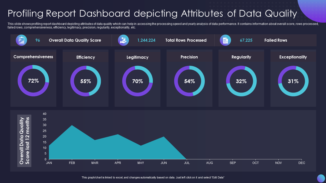
8. Data Profiling And Quality Report Dashboard Template
This dark-themed professional report dashboard design helps businesses understand the quality attributes of data profiling. It allows you to present a concise report with metrics like data comprehensiveness, efficiency, legitimacy, precision, regularity, and exceptionality. With this PPT Layout, you have access to pre-designed graphs to present month-wise scores and trends of annual data profiling quality reports. Grab it today!
9. HR Report Dashboard Template With Employee Headcount
Human resource managers and recruiters prepare most reports in the office, irrespective of the industry and business. They are the ones who are most in need of intelligent data presentation and management tools like the dashboard. This presentation template is curated after extensive industry research and considers staffing personnel reporting needs. It is a customizable HR dashboard template with metrics like engagement index, internal promotion rate, absent cost, quality of hires, turnover rate, etc. Download it today!

10. Team Performance Report Dashboard Presentation Template
Executive and team performance reports are like the newspaper for managers that they read daily. It allows them to devise team-specific strengthening strategies. This template is a panel to read, examine and share team performance reports with members and management. It helps you present the impact of your team’s performance on overall business growth using metrics like contact resolution rate, occupancy rate, Net Promoter Score, top performers, their strengths, and figures. Grab it today!

11. Executing Report Dashboard Template with Revenue KPIs
Some reports are compact and focus only on one aspect, while others hold in-depth details of steps, tenure, variables, essential elements, and results of an activity or business. An executing report is one such detailed report that focuses on the execution of steps and their outcomes. This template provides a simple-to-read dashboard for a finance sector executing report. It exhibits data on annual revenue, net profit margin, debt-to-equity ratio, returns on equity, and gross profit margin of a business. Grab it now!

12. Production/Operation Report Dashboard PowerPoint Template
Day-to-day operations or production process in a business is the backbone of its success. Production or operation reports help management monitor and optimize critical business processes. This dashboard template is ideal for weighing data for three production lines, overall summary, weekly figures, trends, and distribution. Get it now!

13. Status Report Dashboard PPT Presentation Template
The two types of most popular or frequently used reports in business are — progress and status reports. This template represents a sample status report that records and analyzes data from a business’s global/continental spare part inventory. It presents statistics on available stock, delivered parts, en route delivery numbers, SKUs, monthly orders trends, average profit, etc. Get it now!

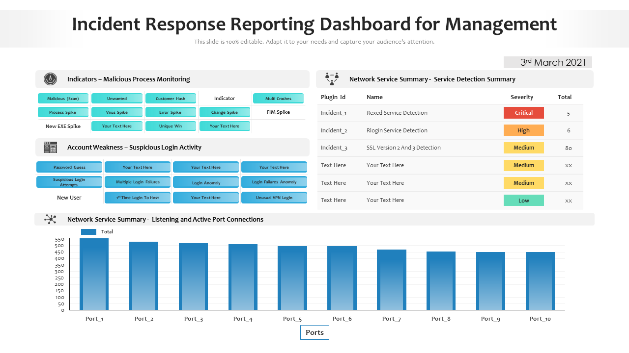
14. Incident Report Dashboard PowerPoint Presentation Template
Preparing a report is an integral part of incident handling and is necessary for preparation if a similar happening reoccurs. This dashboard template will help the incident handling team to prepare and present reports in a succinct manner. It is a home for data on malicious process monitoring/indicators, account weakness, and network service summary. Grab it today!
15. IT Risk Management Report Dashboard Presentation Template
The risk of cyber threats and IT failures increased with the integration of regular businesses into digital platforms. While organizations spend hefty amounts of money to mitigate these risks, preparing a report to record and learn from these risks is also important. This template will design a reporting dashboard that reflects the narrative of IT risk incidents and helps you draft a strategic mitigation plan. It shows the organization and industry risk thresholds, risk analysis progress, response progress, top eight vulnerabilities, and their threshold. Grab it today!

Significance of Reports In Business
Reports are an essential tool for businesses as they allow documentation and communication of information in a clear and organized manner. They are also valuable for tracking progress, identifying problems or opportunities, and making informed decisions. Reports make businesses more transparent and accountable to stakeholders, with a record of the company’s activities and performance.
Our Report Dashboard Templates are the ideal support for such business-critical tools. These will only add value to your report data and insights with their easy-to-read and grasp visuals.
Sync your business reports with these dashboard templates today and start analyzing them smartly!
FAQs on Report Dashboards
1. How do I create a report dashboard?
There is no pre-defined process to create a report dashboard; however, you should follow these steps:
1. Dashboard purpose: What do you want to communicate/track, and who is the audience for the dashboard? Understanding the purpose, which in this case is presenting the report data, and audience, will help you determine what data and visualizations to include.
2. Data gathering and organization: Identify data sources like reports and gather relevant data for the dashboard. Next, organize it in an easy-to-visualize and interpret manner.
3. Choose a dashboard software or tool: Software options available for creating dashboards include Excel, Google Sheets, Tableau, Power BI, etc. Choose the tool that best fits your needs and capabilities. SlideTeam’s report dashboard templates are one of the best options you will find to present your business and project reports.
4. Dashboard layout/design: Consider visualizations/graphics/charts that will best communicate the data with aesthetics that aid in the interpretation of your meaning.
5. Create the report dashboard: Use the chosen software or tool to create the dashboard. This involves creating visualizations, formatting the layout, and adding report data, text, or annotations.
6. Testing and refinement: Once the dashboard is complete, test it to ensure it functions and provides desired accurate insights. Make required adjustments to improve the dashboard’s effectiveness.
Share the dashboard with the desired audience and start using it to record, read, and analyze reports!
2. What are the three types of dashboards?
Dashboards are used in industries like financial dashboards, marketing dashboards, HR dashboards, project dashboards, etc. The three most popular dashboards are:
1. Operational dashboards: Managers and ground-level executives use these dashboards to monitor and track the performance of day-to-day operations.
2. Strategic dashboards: Used to track progress toward long-term business goals and objectives. They include data on key performance indicators (KPIs) and are used by executives and senior management to make strategic and informed decisions.
3. Analytical dashboards: Helps explore and analyze data to identify trends and patterns. Data analysts and researchers use them to gain insights and inform decision-making.
3. What should a dashboard report include?
Specific dashboard report components depend on the purpose, audience, and available data. Some common elements that are a must are:
1. Key Performance Indicators (KPIs): Metrics used to measure the performance of an organization/process. Some examples of KPIs include but are not limited to financial metrics, like revenue and profit, or operational metrics, such as customer satisfaction or efficiency.
2. Visualizations: Graphs, charts, and maps visual elements of a dashboard report to communicate data in a clear, understandable way. For example, line graphs, bar charts, pie charts, etc.
3. Filters and drill-downs: Filters or drill-down options enable users to view data with a focus on specific subsets of data.
4. Annotations and text: Adding annotations or text to a dashboard report provides context or explanations.
5. Alerts and notifications: Alerts or notifications in the dashboard inform users of significant/unusual events or trends.
A dashboard report aims to provide a clear and concise overview of essential information and trends that help users make informed data-driven decisions.


![25+ One-Page Performance Reports for a Result Driven Assessment [Free PDF Attached]](https://www.slideteam.net/wp/wp-content/uploads/2022/03/1013x441no-button-18-1013x441.jpg)

![Top 10 Management Report Templates to Draw Company’s Growth Roadmap! [Free PDF Attached]](https://www.slideteam.net/wp/wp-content/uploads/2022/07/1013x441no-button-5-2-1013x441.jpg)
![Top 5 Feasibility Report Templates with Samples and Examples [Free PDF Attached]](https://www.slideteam.net/wp/wp-content/uploads/2022/10/Feasibility-Report-Templates-1013x441.jpg)