


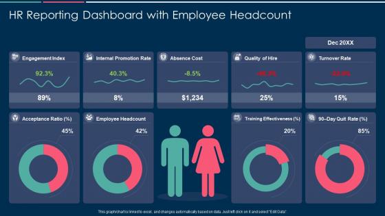
Hr reporting dashboard with employee headcount


Try Before you Buy Download Free Sample Product
 Impress Your
 Audience
Editable
of Time


Our HR Reporting Dashboard With Employee Headcount are topically designed to provide an attractive backdrop to any subject. Use them to look like a presentation pro.
People who downloaded this PowerPoint presentation also viewed the following :
Hr reporting dashboard with employee headcount with all 7 slides:
Use our HR Reporting Dashboard With Employee Headcount to effectively help you save your valuable time. They are readymade to fit into any presentation structure.


FAQs for Hr reporting dashboard
Honestly, just track what your leadership team actually cares about. Headcount changes, turnover by department, how long it takes to fill roles - that's your bread and butter. Engagement scores are gold because they catch problems early. Then add cost-per-hire, who's calling out sick, performance ratings across teams. Oh, and diversity stuff is big now for exec reporting. But seriously, don't go crazy at first. Pick like 6-8 metrics they're always asking about anyway. Once you've got those running smooth, then you can get fancy with more data.
Honestly, HR dashboards are pretty customizable - you can track whatever's actually causing you headaches. Struggling with turnover? Add widgets for retention rates and exit interview feedback. Hiring taking forever? Throw in some recruitment pipeline stuff and time-to-fill metrics. You can drag and drop different charts, filter by department, even change colors to match your branding (which someone in marketing will definitely care about). Most tools let you set different access levels too. Executives get the bird's-eye view while managers see their team details. Just list your biggest HR problems first, then build around those.
Okay so for HR dashboards, keep it simple and focus on what people actually need to see. Put your big metrics like headcount and turnover right at the top where they can't miss them. Group similar stuff together - all your retention data in one spot, recruiting metrics in another. Bar charts and line graphs work way better than cramming everything into tables. Oh, and definitely add filters by department and date ranges - that's honestly where people spend most of their time digging around. Don't get too fancy with the visuals though. I've seen dashboards that look amazing but nobody can figure out what they're actually showing.
So basically, live data integration makes your HR dashboard actually useful instead of just pretty charts sitting there. You're getting real-time updates on headcount, turnover, attendance - all that stuff - without having to manually update a million spreadsheets (which honestly nobody has time for). The cool thing is you can catch problems early instead of finding out about issues weeks later. Your leadership won't be bugging you for last-minute reports anymore since they can just check the numbers themselves. Trust me, once you have it running smoothly, you'll wonder how you ever managed without it.
So for HR dashboards, I'd probably go with Power BI or Tableau first - they're solid and play nice with most HR systems. Google Data Studio is free which is nice, but honestly it can be annoying to work with sometimes. If your team isn't tech-savvy, maybe try Monday.com instead? Excel with pivot tables works too if you're feeling old school. I'd just pick whatever connects easiest to your current setup and go from there. Way less headache that way.
So basically, HR dashboards pull all your people data into one spot - turnover rates, survey results, promotion tracking, exit feedback, the whole thing. You can break it down by team or manager to see where problems are brewing. The cool part? You can actually connect the dots between different metrics. Like, low engagement scores today usually mean people quit in 3-6 months. Wild how predictable it is sometimes. Set up alerts when numbers get wonky so you can jump in before your best people bail. Way better than flying blind and wondering why everyone's suddenly updating their LinkedIn.
Look, garbage data = garbage decisions, period. Your headcount's wrong? Budget's screwed. Bad turnover numbers? Your retention plan falls apart. I've watched entire teams chase meaningless metrics for months because nobody bothered checking if their source data was actually reliable. Here's what works: pick your most important metrics first, then trace them back to where they're coming from. Clean those up before you worry about anything fancy. Also - and this might sound boring - but you really need someone owning data quality, not just hoping it stays accurate on its own.
Honestly, start by picking specific metrics for each thing you're trying. Like with that new onboarding program - track retention rates, how fast people get productive, satisfaction scores, the usual stuff. Get your baseline numbers first, then check in monthly or quarterly. The dashboard will make it pretty obvious what's actually working versus what's a total dud. I always forget this part, but having those visual trends makes it way easier to spot when something's not worth continuing. Quick pivots are your friend when the data's telling you to bail.
Ugh, data quality will be your biggest headache - everything's spread across HRIS, payroll, performance tools, etc. Cleaning that mess takes forever. Stakeholders are another pain point because HR teams are already drowning and don't want more reporting work. Then there's the whole KPI nightmare where everyone wants different metrics, most of which are honestly useless for actual decisions. Oh, and leadership changes their mind about what they care about every quarter, which is fun. Start super small though - pick like 3-4 metrics leadership actually looks at, prove it works, then build from there.
So basically, those messy spreadsheets you deal with? Turn them into visual dashboards that actually look nice. Management suddenly pays attention when there's charts involved - weird how that works, but whatever. Set it up so the data updates automatically, then you won't have to create new presentations every single month explaining the same turnover trends. The executives can just log in and see everything themselves. It's honestly kind of funny how they'll trust a colorful graph more than your verbal reports, but hey, if it gets them to actually look at workforce metrics, that's a win.
Honestly, real-time reporting is a game changer. You'll catch problems right when they happen - like if turnover suddenly spikes or attendance gets weird. Way better than finding out weeks later when you can't do anything about it. Executives will randomly ask you stuff in meetings (happened to me yesterday actually), and you can just pull up fresh data instead of scrambling. No more updating spreadsheets manually every morning either. Set up alerts for your main metrics so you're not always reacting to fires. Trust me, being ahead of problems feels so much better.
Role-based access is huge - only let people see what they actually need for their jobs. Encrypt everything because HR data breaches are basically career suicide for whoever's responsible. Your dashboard vendor better be SOC 2 compliant too. Track who's looking at what with activity logs, and honestly? Do a quick cleanup of current user permissions first - you'll probably find random people still have access from like three jobs ago. Also make sure you're covered on GDPR stuff. The whole thing sounds like a pain but it's worth doing right.
So predictive analytics can forecast turnover and spot flight risks before people actually quit. Pretty cool - you'll see which employees might bail in the next 6 months or what skill gaps are coming. But honestly? The data needs to be super clean or your predictions will suck. There's also bias issues with algorithms making career decisions, which gets messy fast. Oh, and people hate feeling "scored" for retention risk - can you blame them? I'd start with boring stuff like seasonal hiring patterns first. Way less drama than predicting who's about to leave.
Set up surveys that trigger automatically after big moments - onboarding, promotions, people leaving, stuff like that. Then pull all that feedback straight into dashboard widgets. You'll see sentiment trends, satisfaction scores, themes from comments. Real-time data beats those painful annual surveys every time, trust me. When satisfaction scores tank, you want alerts going off immediately so you can jump on it. The trick is making feedback super easy for employees to give while actually giving leadership something useful they can act on. Makes such a difference when it's seamless.
So operational dashboards are your daily bread and butter - headcount, open roles, time-to-fill, attendance stuff. Strategic ones zoom out to show bigger trends like retention, diversity numbers, engagement scores over months. One's "what's happening today" while the other's "where are we actually going?" You really need both tbh. I'd start with operational though since you'll be checking it constantly (learned that the hard way). Once your data's flowing smoothly, then tackle the strategic dashboard. Way easier to build the big picture view when you're not still fighting messy data feeds.
-
Presentation Design is very nice, good work with the content as well.
-
The Designed Graphic are very professional and classic.
-
Perfect template with attractive color combination.
-
Great product with effective design. Helped a lot in our corporate presentations. Easy to edit and stunning visuals.
-
Great designs, really helpful.