


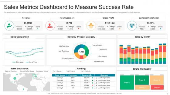
Sales metrics dashboard to measure success rate




Try Before you Buy Download Free Sample Product
 Impress Your
 Audience
 100%
100% Editable
 Save Hours
 of Time


Our Sales Metrics Dashboard To Measure Success Rate are topically designed to provide an attractive backdrop to any subject. Use them to look like a presentation pro.
People who downloaded this PowerPoint presentation also viewed the following :
Sales metrics dashboard to measure success rate with all 2 slides:
Use our Sales Metrics Dashboard To Measure Success Rate to effectively help you save your valuable time. They are readymade to fit into any presentation structure.
FAQs for Sales metrics dashboard to
Start with the big four: revenue, pipeline value, conversion rates, and average deal size. Sales velocity is clutch too - shows how fast deals actually move (took me way too long to figure that one out lol). Activity stuff like calls and emails matter, plus quota attainment keeps everyone motivated. Win/loss ratios are solid, and customer acquisition cost if you're already tracking it. Honestly, don't go overboard at first. See what your team actually looks at daily, then add more specialized metrics later.
Honestly, sales dashboards are game-changers because everyone can see the numbers in real-time. No hiding from your quota anymore! Your team naturally gets competitive when they can check where they stand versus everyone else. Managers love it too - they spot problems way faster instead of waiting weeks to figure out who's struggling. I've seen teams completely turn around just from having that visibility. Quick wins get celebrated right away, and you can jump on issues before they get worse. Set it to update daily and watch people actually start caring about hitting their numbers.
Tableau and Power BI are the big names but honestly they're overkill unless you're doing complex stuff. Google Data Studio is free and works pretty well for most teams. If you're using HubSpot already, just stick with their dashboards - way easier integration. I've worked with teams that spend forever making these gorgeous visualizations when a good Excel dashboard would've been fine lol. Salesforce Einstein or Klipfolio are solid too if you want automation. My advice? Pick whatever connects easily to your current sales tools. You won't use it otherwise, trust me.
Daily updates are your sweet spot, but real-time is even better if you can swing it. Honestly, I wouldn't stress about hourly changes since you're not gonna overhaul your whole strategy based on minor blips anyway. Just be consistent about it - your team needs to know when fresh numbers are coming. Weekly? Way too slow, especially when you're pushing toward month-end targets. You'll be totally in the dark. Set up automated refreshes so you don't have to mess around pulling reports manually every morning. That gets old fast.
Bar charts are perfect for comparing team performance or different time periods. Line graphs? Those are money for tracking trends like monthly revenue. Market share breakdowns look great in pie charts, though honestly everyone goes crazy with those things - less is more. Color coding helps you spotlight wins or call out problem areas. Always throw in real numbers with your labels, not just percentages (managers hate that). Oh, and tables are clutch when people need to dig into the details. Put your biggest KPIs up front and make sure it doesn't take forever to load.
Check your pipeline velocity, win rates, and deal sizes over time - that's where you'll see the patterns. Seasonal stuff becomes obvious. So does which rep activities actually work vs the busy work. But forecasting is honestly the game-changer here. Track qualified leads and sales cycle length, and you can predict revenue 2-3 months ahead pretty reliably. Set up alerts for weird anomalies so you catch problems early. Oh, and don't try to track everything at once - pick your 3-5 most predictive metrics first. Way less overwhelming that way.
Dude, real-time data is a game changer. Instead of staring at yesterday's mess wondering what happened, you're watching things unfold live. Your conversion rates tank? You'll know immediately. Sarah's having her best month ever? Celebrate now, not next week when it's old news. The whole point is staying ahead of problems instead of always playing catch-up. Though honestly, half the battle is just getting your data sources to actually sync properly - that part can be a nightmare. But once it's working, you can pivot mid-day instead of realizing too late that your strategy sucked.
So your sales dashboard shows you the "what" - like conversion rates and revenue trends. But customer feedback? That's your "why." It tells you the actual reasons people bought or bailed. Super useful when you start connecting the dots - like realizing your high churn happens because onboarding sucks, or deals close way faster when customers mention certain pain points. I'd tag different feedback themes and match them up with your sales data. Makes those random quarterly spikes way less mysterious. Honestly beats just staring at numbers wondering what the hell happened.
Honestly, the worst thing you can do is jam like 15 different metrics on one screen. Nobody looks at that mess. Keep it to 5-7 things that actually matter for hitting your numbers. Skip the vanity stuff too - who cares about total calls when you need qualified leads, you know? Make sure it updates often enough to be useful, and yeah, clean design matters more than people think. Ugly dashboards just sit there collecting digital dust. Here's what I'd do: ask your sales team what 3 numbers they want to see Monday morning. Build around that.
Honestly, sales dashboards are a game-changer for small businesses. You get the same insights that Fortune 500 companies drop serious cash on, but for way less money - sometimes free. Track conversion rates, spot your hottest leads, see patterns your competitors miss because they're still stuck with Excel. Big companies? They move like molasses with all their red tape. You can pivot instantly when the data shows something's working (or isn't). I'd start simple though - maybe 3-4 metrics like lead conversion and what it costs to get each customer. Build up from there.
Look, you've gotta break down your sales data or you're just staring at one useless number. Split it by region, product, rep, customer type - whatever fits your business. There's a huge difference between "we hit our target" and "enterprise customers are killing it while small business tanked hard." I learned this the hard way honestly. Without segments, you can't see what's actually working. You'll just keep throwing money at the wrong stuff. Start with your biggest business areas first, then add more breakdowns later when you need them.
Mobile access is a total game-changer for sales dashboards - you can check conversion rates right in client meetings or review your pipeline while you're stuck at the airport. Honestly, since we're all on our phones constantly anyway, why not make it useful? The trick is getting charts that actually work on small screens, not just shrunk-down desktop versions. Touch-friendly interface matters way more than people think. Your dashboard should automatically show the most important KPIs first when you're on mobile since screen space is limited. No more being chained to your desk just to see how you're performing.
So for online stuff, track your conversion rates, cart abandonment, average order value, and how much you're spending to get customers. Physical stores are totally different - you want foot traffic, sales per square foot, transaction time, upsell rates. Trust me, the data gets crazy overwhelming if you're not careful. Online's about nailing that customer journey, but in-person? It's maximizing every single interaction you get. I'd honestly just pick 3-4 solid metrics for each channel first. You can always add more later once you've got those dialed in.
Think of sales dashboards as your business goal translator. You take those vague "grow revenue" objectives and break them into real metrics your team can track daily - stuff like conversion rates or customer acquisition costs. Way better than crossing your fingers and hoping things work out, honestly. It's like having actual directions instead of driving blind toward your targets. Oh, and make sure you're tracking things that leadership actually cares about - there's nothing worse than beautiful charts that don't move the needle on what matters.
Get everyone clicking through the dashboard together during training - way better than boring slide presentations. Pick the metrics that actually matter for their day-to-day stuff first. Don't dump everything on them at once (learned that the hard way!). You'll want some dashboard champions who can help when people get stuck. Follow up in a few weeks to tackle questions and celebrate wins. Here's the key thing though - connect those numbers to what they actually care about. Commissions, hitting quota, getting recognized. Oh, and make them simple cheat sheets with formulas they can reference later.
-
Understandable and informative presentation.
-
The Designed Graphic are very professional and classic.
-
Understandable and informative presentation.
-
Excellent Designs.
-
Very unique, user-friendly presentation interface.