


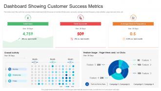
Dashboard showing customer success metrics





Try Before you Buy Download Free Sample Product
 Impress Your
 Audience
 100%
100% Editable
 Save Hours
 of Time


Our Dashboard Showing Customer Success Metrics are topically designed to provide an attractive backdrop to any subject. Use them to look like a presentation pro.
People who downloaded this PowerPoint presentation also viewed the following :
Dashboard showing customer success metrics with all 2 slides:
Use our Dashboard Showing Customer Success Metrics to effectively help you save your valuable time. They are readymade to fit into any presentation structure.
FAQs for Dashboard showing
Focus on churn rate, CLV, and NPS first - those three will tell you the most. Product adoption stuff is huge too, like how often people actually log in and which features they're using. I've seen so many teams ignore this and then act surprised when customers bail. Track expansion revenue and support tickets while you're at it. Oh, and time-to-value for new signups is clutch. Don't go crazy though - stick to maybe 6-8 metrics tops that your team will actually check regularly. Nobody looks at dashboards with 20 different charts.
Okay so basically these dashboards track stuff like how much your clients actually use your product, support ticket volume, engagement scores - all that health data. When someone stops using key features or their satisfaction tanks, you'll see it right away. Game changer is setting up alerts when accounts hit risk levels so you're not scrambling after they've already mentally checked out. Instead of getting blindsided by cancellations, you can jump in early with fixes or extra help. Honestly beats playing defense all the time - way better to catch problems before they snowball.
Honestly, Tableau and Power BI are your best bets if you need something that can handle complex stuff. Google Data Studio is free and way better than you'd expect - I was skeptical at first but ended up using it constantly. If you're already on HubSpot or Salesforce, their built-in dashboards aren't terrible. ChartIO and Looker are solid too but they'll cost you. Here's the thing though - figure out your key metrics first (churn, NPS, expansion revenue, whatever). Then just pick whichever tool plays nicely with your current data sources. Don't overthink it.
Honestly, visualizations are like translating your messy customer data into something that actually makes sense. You know how staring at spreadsheets makes your eyes glaze over? Charts and graphs fix that - they show patterns instantly. Heat maps are seriously underrated for tracking usage trends across different customer groups. I've found dashboards are clutch for spotting your power users and tracking health scores over time. The trick is matching the right chart type to each metric. That way your team can spot red flags early and make quick decisions without drowning in numbers.
Look, customer feedback is everything for your dashboard - it shows you what actually moves the needle instead of what you assume does. Pull survey scores, support tickets, feature requests into widgets that track real problems. Most dashboards I've seen are gorgeous but totally useless, honestly. The feedback helps you figure out which health scores matter and what red flags to watch. Oh, and don't overcomplicate it at first. Just ask your best 10 customers what numbers would help them win, then build those widgets. You'll be way ahead of most teams who just guess.
Honestly, daily updates are your sweet spot here. Real-time is amazing if you can swing it – there's nothing more embarrassing than walking into a client meeting with outdated info. But daily works for most stuff like churn risk and health scores. I'd set up overnight refreshes so everything's fresh when you get in. Weekly updates are technically doable but you'll miss way too much. Actually, check what your IT setup can handle first – no point planning for real-time if your systems can't keep up. Most teams do fine with daily though.
Honestly, the worst part is everyone fighting over which metrics to track. Bob from sales wants his numbers, marketing wants theirs - suddenly you've got a hot mess of a dashboard nobody can read. Data quality is another nightmare since you're pulling from like 5 different systems that don't play nice together. People also get obsessed with making things look pretty instead of actually useful. Start with maybe 3-4 metrics that actually move the needle on revenue or keeping customers around. Build from there. And here's the thing - if you can't do anything about what you're measuring, you're basically just making expensive wall art.
Honestly, start tracking your baseline numbers now - churn rates, upsell revenue, customer lifetime value. That stuff matters most. Once you implement, watch how quickly your team spots at-risk accounts. Are CSMs juggling more accounts without losing their minds? I've seen teams go from drowning in spreadsheets to actually enjoying their jobs again, which is huge. Calculate prevented churn savings plus any revenue bumps, then divide by implementation costs. Oh, and measure how fast issues get resolved - that's usually where you see quick wins. The ROI math becomes pretty obvious once you're not hemorrhaging customers.
So basically B2B is way more complex but smaller scale - you're tracking like 50 high-value accounts instead of thousands of random users. With B2B you're obsessing over contract renewals, how much each account is expanding, and whether the decision-makers are actually engaged. Takes forever to close deals too. B2C is the opposite - pure volume game. You're watching churn across tons of customers, lifetime value, basic engagement stuff. B2B feels like you're a relationship therapist honestly, trying to keep each account healthy. B2C is more about spotting patterns in user behavior. Figure out if your customers buy once or stick around for years - that'll tell you which direction to go.
So customer segmentation is basically chopping up your data in ways that actually make sense - like by company size, industry, or how long they've been with you. Instead of looking at everyone as one giant mess, you can see how different groups behave. Enterprise clients vs small businesses? Totally different animals. I swear you'll find stuff that's completely invisible when you look at everything together. Maybe your month 3 churn is brutal, or big accounts need way more handholding before they'll upgrade. Just start simple with 2-3 segments that match how your team already thinks about customers.
Honestly, you can grab data from tons of places - your CRM like Salesforce, support tickets, billing stuff, product analytics. Most dashboards these days have connectors that make it pretty easy to set up. Survey tools for NPS scores are clutch too. Social media monitoring might be worth it depending on your business. Here's the thing though - start with just your most important customer health metrics first. I've seen people try to connect everything right away and they just drown in all the data. Way better to build it out gradually.
So instead of just dumping a bunch of random metrics on your dashboard, data storytelling actually connects the dots for people. Your churn rate suddenly makes sense when you show WHY it's happening. I always think of it like - would you rather see ingredients scattered on a counter or an actual recipe? Structure it with a clear flow and stakeholders won't have to guess what the numbers mean. They'll get it instantly and can act faster. Oh, and try building your next one around a specific part of the customer journey. Trust me, it makes a huge difference in how people respond to it.
So HubSpot's really good at this - they track customer health scores, how much people actually use their products, and who might bail soon. Healthcare companies watch patient engagement and whether people stick to treatment plans. Retail's all about lifetime value and repeat purchases, which makes sense. Financial services get crazy detailed though - account growth, how deep customers go with services, support tickets. Their dashboards honestly look overwhelming sometimes! But here's the thing: the smart ones only focus on like 3-5 metrics that actually matter for keeping customers around, not every possible data point.
Your dashboard basically tells you which customers are crushing it - those are your goldmine for upsells. Look for accounts hitting their plan limits or using features that scream "upgrade me!" Health scores help you time everything right instead of randomly bugging people (which honestly never works). I'd start by filtering your happiest customers first. You'll spot patterns pretty quick - like which successful accounts match your ideal cross-sell profiles. The engagement data shows when someone's ready vs. when they'll probably ignore your pitch. Super straightforward once you get the hang of it.
Honestly, you'll know it's working when your team stops just putting out fires and starts preventing them. Better retention rates and NPS scores are the obvious wins. But here's what I really look for - people actually using the thing regularly, not just when their boss asks about it. Response times to at-risk accounts get way faster. Your early warning stuff starts catching problems before customers bail (which is kind of the whole point, right?). Track it monthly so you can see if those patterns are actually helping you save accounts. The real test? When your team goes from reactive to proactive without you having to remind them.
-
Editable templates with innovative design and color combination.
-
Professional and unique presentations.
-
The content is very helpful from business point of view.
-
Design layout is very impressive.