


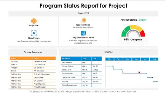
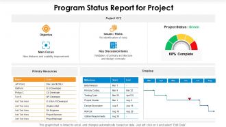
Program status report for project





Try Before you Buy Download Free Sample Product
 Impress Your
 Audience
 100%
100% Editable
 Save Hours
 of Time


Our Program Status Report For Project are topically designed to provide an attractive backdrop to any subject. Use them to look like a presentation pro.
People who downloaded this PowerPoint presentation also viewed the following :
Program status report for project with all 2 slides:
Use our Program Status Report For Project to effectively help you save your valuable time. They are readymade to fit into any presentation structure.
FAQs for Program status
So your status report needs five main things: where you are vs milestones, budget situation, any roadblocks, what's coming up next, and decisions you need from higher-ups. Honestly, I always start with a quick wins section because who doesn't want good news first? Don't be vague - instead of saying "on track," give real numbers or specifics. Bullet points are your friend since executives skim everything anyway. The whole point is someone should read it and immediately know what's happening and if they need to do anything about it.
Weekly works best for most projects - I always send mine out on Fridays since people actually read them before the weekend. If your project's pretty stable or long-term, you could probably get away with bi-weekly. Daily updates? That's just annoying unless everything's on fire or you've got some crazy deadline breathing down your neck. Honestly, consistency matters more than the exact timing. When something big happens or you hit a roadblock, don't wait - shoot out an update right away. Start weekly and see how stakeholders react. You can always dial it back if they're getting sick of hearing from you.
Go with super simple visuals - progress bars, red/yellow/green colors, basic timelines. Charts can be cool, but honestly? Sometimes just showing "65% complete" hits better than some elaborate graph. Your stakeholders should get it within 30 seconds of glancing at your report. Show both the big picture progress and where individual deliverables stand. Keep the same format each week so people aren't hunting around for info. Oh, and always throw in a quick written explanation next to your visuals - you'd be surprised how many people stare at a red bar wondering if that's good or bad.
Okay so three main things - spell out what the risk actually is, how likely it'll happen, and what kind of damage we're talking about. Bullets or tables work way better than big chunks of text because nobody wants to dig through paragraphs. High/medium/low categories are your friend here, executives eat that up. Always include your game plan for handling each one too. The trick is being real about potential problems without making everyone panic. Oh and add timelines - like when you'll know more or have it sorted. Honestly, the format matters almost as much as the content itself.
Track your schedule progress first - like what percentage you've actually finished versus your timeline. Budget burn rate is huge too. Any blockers or risks that could mess things up, definitely keep an eye on those. Team velocity helps you spot problems early, which honestly saves so much headache later. If you're managing multiple projects, resource utilization becomes pretty critical. Quality stuff like defect rates matter depending on what you're building. But here's the thing - consistency beats perfection. Pick maybe 4-5 metrics your stakeholders actually care about and update them regularly. That's way better than tracking everything poorly.
Honestly, collaboration tools are a game changer for status reports. Instead of hunting people down for updates (ugh), you just pull the real data straight from Slack, Asana, or whatever you're using. Task completion rates, blockers, progress - it's all right there. No more outdated info from last Tuesday that's already irrelevant. Your stakeholders can check live dashboards whenever they want instead of waiting for your weekly recap email. I'd definitely connect your project tool to your reporting workflow. You'll actually spend time analyzing what's happening instead of just collecting random updates from everyone.
Honestly, stakeholder feedback makes or breaks your status reports. Nobody wants another document that gets ignored. Ask a few key people what they'd actually change about your current reports - trust me, their answers will shock you. I made this mistake early on, sending super technical updates to executives who literally just wanted the bottom line. Some want more detail on risks, others prefer different metrics entirely. Check in with them regularly about format and content. It's wild how much this simple step improves everything. Short reports work better for busy people anyway.
Look, status reports basically catch scope creep before it destroys your project. You're documenting what's actually happening vs. what you planned, right? So when those "tiny tweaks" start piling up or new requirements randomly appear, you'll notice immediately. Compare each report against your original baseline - that's where the magic happens. I swear, most people just ignore the warning signs until they're drowning. Spot the drift early and you can fix it instead of panicking when you're over budget and way behind schedule.
Weekly and monthly dashboards work best, plus milestone trackers. Traffic light systems are clutch - red/yellow/green status, completion percentages, that stuff. Keep sections for what you finished, what's coming up, blockers, and budget updates. Match it to who's reading it though. Project teams want details, executives want the high-level view. Honestly? Don't go too fancy - I've seen people spend hours making these things look pretty when they could've been actually working. Start simple and tweak it based on what your stakeholders bug you about most.
Okay so basically you gotta speak their language, right? Executives want the big picture stuff - budget, timeline, major roadblocks that'll mess up their day. Skip the tiny details or they'll zone out (learned this one the hard way lol). Your team though? They need the nitty-gritty. What's due when, who's doing what, all that tactical stuff they can actually work with. I usually think of it like execs need to know if we're winning or losing and why. Team members need their marching orders. Start with one solid template then tweak it for each group. Way easier than starting from scratch every time.
Honestly, the worst thing you can do is be vague about progress. Like saying "we're on track" when you're actually behind - that just pisses people off later. I always lead with the big wins and blockers right up top, then get into details. Don't bury important stuff in long paragraphs either. People are busy and just want to scan it quickly. Oh, and here's what drives me crazy - when people only mention problems without any ideas for fixing them. You don't need perfect solutions, but at least throw out some options. Be real about issues though. Sugarcoating helps nobody.
Honestly, status reports work because they put everyone's work out in the open. Nobody can hide behind "working on it" when you're tracking actual commitments and results. The transparency thing is huge - people have to admit when they're stuck instead of making excuses. Also, there's this weird peer pressure that kicks in. Like, nobody wants to be the only person with red status while their teammates are crushing it. I've seen this work so well it's almost unfair to the slackers. Try adding individual commitments to your next report and watch people suddenly care about deadlines.
Watch out for confidentiality stuff when you're writing those reports. Skip any sensitive client details or proprietary info that could bite you if it leaks. NDAs are no joke. If you're in healthcare or finance, there's probably compliance rules you can't ignore either. I've literally watched colleagues get in trouble for putting too much detail in reports that got forwarded around. Keep it factual but vague on the sensitive bits. Short sentences work better anyway. Run anything dicey past legal first - especially if people outside your team will see it.
Just mix the story right in with your numbers instead of separating them out. Like if you're 15% over budget, throw in a quick note about those vendor delays that screwed things up. I do this all the time - honestly makes reports way more readable. Try bullet points that combine both: "Sprint velocity: 23 points (down from 28 because we're onboarding someone new)." Or add a little "Key Insights" box next to your charts. The main thing is keeping those explanations short and tied to actual data points. Don't ramble or you'll lose people.
Dude, project reporting is getting a massive overhaul. Real-time dashboards are replacing those painful weekly PowerPoint decks. AI pulls data automatically from all your tools now, and predictive stuff actually catches problems early (which is honestly amazing). Mobile apps give everyone instant updates too. Manual copying between systems? That nightmare's almost over. Everything's becoming way more visual and interactive since it connects straight to your data sources. I'd start playing around with dashboard tools now - my team's been testing a few and the difference is nuts. That's definitely where this is all going.
-
Unique design & color.
-
Great designs, really helpful.
-
Helpful product design for delivering presentation.
-
Designs have enough space to add content.