


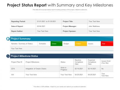
Project status report with summary and key milestones




Try Before you Buy Download Free Sample Product
 Impress Your
 Audience
 100%
100% Editable
 Save Hours
 of Time


This slide shows project status report including summary of the project, milestone status etc.
People who downloaded this PowerPoint presentation also viewed the following :
Project status report with summary and key milestones with all 2 slides:
Use our Project Status Report With Summary And Key Milestones to effectively help you save your valuable time. They are readymade to fit into any presentation structure.

FAQs for Project status report with summary
Oh man, status reports - I hate writing these but they're so necessary! Hit these five things: progress on your milestones, budget stuff (which I always forget until the last minute), any risks or roadblocks, what's coming up next, and decisions you need from the higher-ups. Don't bury the blockers in some dense paragraph - call them out clearly so people actually notice. Budget tracking is honestly the worst part but stakeholders love seeing those numbers. Keep it specific enough that if someone needs to jump in and help, they can figure out what's going on. Short and sweet wins every time.
Honestly, weekly is usually the sweet spot for most projects. But it really comes down to what you're dealing with - if things are moving fast or there's high stakes involved, maybe bump it up to twice a week or even daily when stuff gets crazy. Monthly works too if it's a longer project that's pretty stable. Nobody wants their inbox constantly blown up with updates they don't actually need, you know? I'd say just ask your stakeholders what they prefer upfront - like, what timing actually helps them make decisions? Start weekly and see how it goes. Oh, and whatever you pick, stick with it. People hate inconsistent communication schedules.
Honestly, visuals are everything for project reports. Progress bars and those red/yellow/green status dots are lifesavers - people get it instantly. Budget charts showing actual vs planned spend work great too. I personally love Gantt charts but they can overwhelm non-project people, so maybe start simple. Task completion percentages are solid. Dashboards beat boring text blocks every time. Your goal? Someone should understand your project's health in like 30 seconds max. Try one or two visual elements this week and see what clicks with your team.
Dude, you gotta tailor what you send to each group. Executives just want the big picture - budget updates, major roadblocks, business impact stuff. Keep it short or they won't read it. Your team needs all the detailed task lists and blocker info though. Other departments? They mostly care about how your project messes with their deadlines lol. I learned this the hard way - used to blast everyone with these giant reports until I noticed people glazing over. Now I'll write different sections or totally separate updates. Pro tip: just ask each group what they actually want to know. Saves you time and they're happier.
Honestly, stick to the basics - schedule variance, budget variance, and how much scope you've actually finished. Quality stuff like defect rates matter way more than people think, but everyone ignores them until things blow up. Check if your team's overworked or sitting around doing nothing with resource utilization. Risk indicators are clutch too. Oh, and blockers - those'll kill you if you're not watching. My manager always wants like 15 different charts, but really just pick 4-6 metrics that actually matter. Don't dump a ton of data on stakeholders they won't even look at.
So for status reports, I'd probably go with Asana or Monday.com first - they pull progress data automatically which saves tons of time. Microsoft Project works if you're doing complex scheduling. Honestly though, Excel still does the job for most stuff, or Google Sheets if your team needs to collaborate in real time. PowerBI makes pretty dashboards but might be overkill depending on what you're doing. Oh and Slack can grab updates automatically too if you set it up right. My advice? Just use whatever your team already knows well instead of trying to learn something brand new halfway through a project.
Honestly, just go with a simple red/yellow/green thing - stakeholders love that stuff because they instantly get what's urgent. Don't bury the bad news in corporate nonsense either, that always comes back to bite you. Each risk needs the actual impact spelled out (timeline? budget? deliverables?) plus what you're doing about it. Keep it short but specific enough so people understand why they should care. Oh, and always put who's handling what with realistic dates. Makes it super easy for leadership to figure out where to throw their support and resources. Trust me on this one.
Dude, stories are way better than boring data dumps. Like instead of "Task A: 75% complete," tell people what actually happened - the problem you hit, how Sarah figured out that genius workaround, why you're crushing your deadline now. People remember stories, not bullet points (our brains are weird that way). Your stakeholders will actually pay attention for once. Structure it like beginning, middle, end - same as any decent story. Honestly, it's the difference between a phone book and a Netflix show. Try it on your next report, you'll see what I mean.
Honestly, just hit the three big things: what got done, what's at risk, and what you need from people. Bullet points are your friend here - way easier to scan. One page max because let's be real, nobody's reading past that anyway. Stick to metrics your audience actually cares about, not every tiny thing you tracked. Cut the fluff and get straight to it. If something needs more explaining, just say you'll chat about it later instead of cramming everything in. The whole point is giving people just enough to make decisions without overwhelming them.
Oh man, the worst thing you can do is be super vague or bury the important stuff in paragraphs nobody will read. Start with those red/yellow/green status things - people love that. Be honest about problems too, because stakeholders absolutely lose it when they're blindsided later. I learned that one the hard way. Use bullet points so they can scan quickly, and always end with who's doing what next. Otherwise you're just writing expensive diary entries that go nowhere.
Yeah, definitely keep tabs on what feedback you're getting! I always tell people to look for patterns - like, are they constantly asking for timeline details or better risk breakdowns? Sometimes you'll notice they zone out during technical stuff (guilty as charged on that one lol). Once you spot these trends, you can totally reshape how you write future reports. Maybe cut the jargon or add more visuals. Keep a basic log so you don't forget what works. It's honestly game-changing for making reports people actually want to read.
Oh man, this is such a real thing! So like, Japanese team members might say "no problems here" when actually there's tons of stuff going wrong - they just communicate super indirectly. Germans? Total opposite - they'll straight up tell you everything that's broken lol. Some people think admitting delays makes them look bad personally, others just see it as normal project stuff. Had this exact issue with our Mumbai team actually. You gotta do regular check-ins and make people feel safe being honest about what's really happening, not just telling you what sounds good.
Don't just report what happened - tell people what to do about it. Always include a "Next Steps" section with actual owners and deadlines. When you mention problems, immediately suggest solutions (nobody wants issues dumped on their plate without ideas). I swear by adding a "What I Need from You" section - it gets way faster responses. Be specific about decisions needed, resources you're waiting on, or blockers slowing things down. Short sentences work. Also make it crystal clear what success looks like next time so everyone knows their priorities.
Honestly, status reports are like the secret sauce for keeping people engaged. Regular updates with clear wins and challenges make stakeholders feel included instead of left in the dark. I learned this the hard way on a project last year - terrible communication killed all momentum. Charts and progress bars work way better than boring text walls, trust me. People need those little celebration moments when you hit milestones. It's basic psychology but it works. Don't overthink the format - just make it visual and easy to scan. Bullet points with real achievements keep everyone remembering why they should care about your project.
Put your wins right at the top - seriously, lead with the good stuff. Bullet points work best, and throw in actual dates plus numbers when you can. Like "finished user testing early (March 15)" or "cut processing time by 30%." I always add a quick note about why each win actually matters to the big picture. People need to see the connection, you know? Each bullet should be short but memorable enough that your stakeholders don't immediately forget. Oh, and don't downplay your team's hard work - you guys earned those victories so own them!
-
Graphics are very appealing to eyes.