Project Status Report With Milestones And Tasks Communication Management Bundle

Rating:
80%
Project Status Report With Milestones And Tasks Communication Management Bundle
Slide 1 of 7
Favourites Favourites

Try Before you Buy Download Free Sample Product

Audience Impress Your
Audience
Editable 100%
Editable
Time Save Hours
of Time
The Biggest Sale is ending soon in
0
0
:
0
0
:
0
0
Rating:
80%
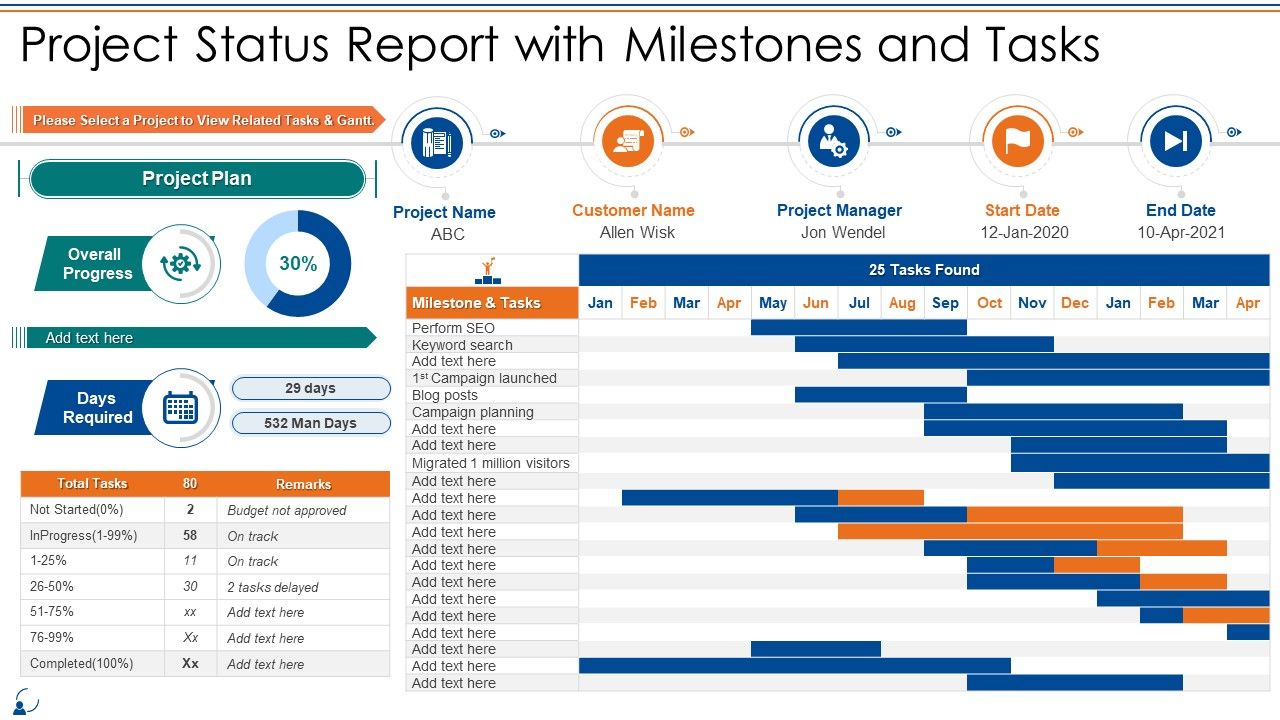
Deliver an outstanding presentation on the topic using this Project Status Report With Milestones And Tasks Communication Management Bundle. Dispense information and present a thorough explanation of Project Status Report With Milestones And Tasks using the slides given. This template can be altered and personalized to fit your needs. It is also available for immediate download. So grab it now.

FAQs for Project Status Report With Milestones And Tasks

So basically you want to cover where you're at - ahead, behind, or cruising along fine. Then hit your wins since last time, any problems blocking you, and what's next on deck. Numbers are clutch here - budget stuff, deadlines, milestones. Honestly, executives eat that data up way more than long explanations. Call out if you need them to decide something or help from other teams. Keep it tight but don't skip the important bits. Once you build a template, you'll thank yourself every week when reporting doesn't take forever.

Look, status reports are honestly your best defense against constant "hey, how's the project going?" interruptions. They give stakeholders the visibility they're craving - progress, roadblocks, what's next - all in one place. Budget stuff too, obviously. Here's the thing though: consistency is everything. Same format every time so people can quickly scan for what matters to them. Way better than scrambling to answer the same questions in random meetings all week. Plus you're controlling the narrative instead of being reactive. Trust me, future you will thank present you for setting this rhythm early.

Budget variance is huge - are you bleeding money or under budget? Schedule stuff too, obviously. Scope completion percentage gives you that solid number everyone wants to see. Quality metrics though? Most people skip this but defect rates will bite you later if you ignore them. Risk status and team velocity matter if you're doing agile sprints. Oh, and milestone completion - stakeholders eat that visual stuff up. Don't go crazy with like 15 different metrics though. Pick maybe 5-7 that actually make sense for what you're building. Resource utilization's good for planning ahead too.

Weekly's usually the sweet spot, but it really comes down to what you're dealing with. High-stakes or crazy fast projects? You might be doing them twice a week or daily when things get intense. More chill, predictable stuff can probably handle every two weeks. The main thing is being consistent - people need to know when they're getting updates. I'd start weekly and see how it goes, then adjust if your team or stakeholders want more or less. Oh, and don't go overboard with reporting or everyone will just start ignoring them. That's honestly worse than not sending any at all.

Dude, visuals completely change the game with project reports. I've watched executives totally skip text-heavy updates but immediately dig into anything with charts or dashboards. Progress bars show where you're at instantly. Timelines highlight what's next without people having to hunt through paragraphs. Color-coded status stuff works amazing too - way better than making people read through walls of text. Even basic charts beat boring data dumps every time. Complex project info becomes digestible in seconds instead of minutes. Honestly, I probably spend too much time picking colors now, but whatever - it actually gets people engaged.

Ugh, this took me forever to figure out but here's what works: Execs just want the big picture - budget, timeline, major issues. Don't bore them with tiny delays. Your team needs all the technical stuff and who's doing what since they're actually building things. Stakeholders? They mostly care about dates and how changes mess with their part of the project. I literally have like 3 different templates now because writing these from scratch every time was killing me. Just map out what each group actually cares about first, then you can reuse the same format.

Ugh, the data collection part is gonna be your biggest headache. Half your team will send outdated info, the other half won't respond at all. Everyone uses different formats too, so you'll spend forever trying to make sense of it all. People get weird about transparency - they want it but also don't want their delays broadcasted to leadership, you know? Set up those annoying automated reminders (sorry not sorry) and make dead simple templates. Honestly, the easier you make it for people to update you, the better your chances of actually getting useful responses back.

Ugh, status reports are the worst! But here's what I've learned - you can actually automate most of that boring stuff. Monday, Asana, or even fancy Excel templates will pull real-time data and auto-generate charts for you. Some even draft those narrative summaries (which honestly saved my sanity). Set up dashboards that refresh themselves so you're not manually updating everything weekly. I started by figuring out what data I was copy-pasting every time - that's your goldmine right there. Once you get templates running, it's pretty much hands-off except for the actual writing part.

Don't be vague about problems - that's the big one. Lead with your worst news upfront because executives literally stop reading after like two sentences. I learned this the hard way lol. Break everything into bullet points instead of paragraph dumps. Skip the technical stuff unless someone specifically needs it. Oh and don't try to sugarcoat delays thinking they'll fix themselves - they won't. Put your critical issues right at the top, then bury the boring details below. Busy people will thank you for not making them hunt through walls of text.

Make a risks section that screams "PAY ATTENTION" - bold colors, red flags, whatever works. Don't bury critical stuff in paragraphs like everyone does. For each risk, spell out the impact, how likely it is, and your plan to fix it. Short but specific descriptions work best. Always throw in deadlines for when you need answers or resources. Honestly, I'd put your worst 3 risks right at the top of the report. Forces people to actually talk about the real problems instead of dancing around them. Works every time.

Honestly, just do the traffic light thing first - red/yellow/green status gives everyone the vibe immediately. Then hit your wins, what's blocking you, and what you actually need from them. Charts beat bullet points every time because let's be real, nobody's reading paragraph slides anyway. I'd structure it: current status, what happened since last time, what's coming up, then the messy stuff that needs decisions. The key is being super specific about your asks - don't just say "we need support." Say "I need Sarah's team for two weeks" or whatever. Always end with clear action items and who owns what. Send a recap email after because half of them weren't paying attention.

Honestly, start keeping a feedback log after each report - just a basic spreadsheet works fine. I track which sections got follow-up questions, what people actually engaged with, and what seemed to fall flat. Sometimes you'll be surprised by what they ignore completely. When prepping the next report, I check that log and adjust accordingly. Maybe I'll focus more on certain metrics or completely ditch sections that aren't landing. It's way better than just throwing reports out there and hoping for the best. The whole point is making them actually useful for your audience instead of just... existing.

Honestly, just use whatever project tool you're already on - the data's sitting right there anyway. Asana and Monday.com are pretty solid for auto-generating reports. Jira works if you're in that ecosystem. Microsoft Project handles complex stuff well, though it's kind of a beast. Excel or Sheets work fine too for basic updates - sometimes simple is better. PowerBI and Tableau look impressive but feel excessive for weekly reports (unless your boss loves shiny dashboards). The real trick? Pick something everyone will actually use. I've seen too many fancy systems gather dust because nobody wanted to learn them.

Honestly, status reports are like having receipts for everyone's work. You can see who's actually getting stuff done and who's been "working on it" for three weeks straight. I've found they're clutch for spotting patterns too - like when someone always hits roadblocks right before deadlines (suspicious much?). The trick is reviewing them together as a team, not just sending them into the void. Over time you'll have real data instead of just guessing who deserves that promotion. Just keep the format consistent or people won't fill them out properly.

So basically, status reports in agile keep your whole team on the same page about sprint progress. They help catch blockers early before they mess up your timeline. Yeah, it feels like busy work sometimes - I get it. But they're super useful for standups and sprint reviews. You can track your team's velocity and spot work patterns that way. Plus you'll have actual data when you need to make calls about scope or resources. Honestly, just focus on three things: what got delivered, what's blocking you, and what's next. Don't overthink it with long explanations.

Ratings and Reviews

80% of 100
Review Form
Write a review
Most Relevant Reviews
  1. 80%

    by Courtney Griffin

    SlideTeam has helped me take my presentation to the next level. Everyone at the office is impressed! I’ll be using their designs for a long-long time.
  2. 80%

    by Cyrus Ellis

    Been using SlideTeam for some time now…can’t imagine why I wasted all that time in front of the screen trying to make the perfect presentation.

2 Item(s)

per page: