Customer satisfaction dashboard market intelligence and strategy development

Rating:
100%
Customer satisfaction dashboard market intelligence and strategy development
Slide 1 of 7
Favourites Favourites

Try Before you Buy Download Free Sample Product

Audience Impress Your
Audience
Editable 100%
Editable
Time Save Hours
of Time
The Biggest Sale is ending soon in
0
0
:
0
0
:
0
0
Rating:
100%
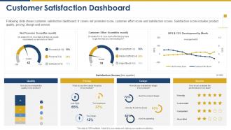
Following slide shows customer satisfaction dashboard. It covers net promoter score, customer effort score and satisfaction scores. Satisfaction score includes product quality, pricing, design and service Present the topic in a bit more detail with this Customer Satisfaction Dashboard Market Intelligence And Strategy Development. Use it as a tool for discussion and navigation on Customer Satisfaction Dashboard. This template is free to edit as deemed fit for your organization. Therefore download it now.

FAQs for Customer satisfaction dashboard market intelligence

Hey! Start with the basics - NPS, CSAT, and Customer Effort Score. Those three will tell you the most. Then add churn rate, first contact resolution, and response time (seriously, slow responses kill everything). Retention rate and lifetime value are huge for the money side of things. Oh, and if you can get sentiment analysis from customer feedback, that's gold. But don't go crazy - stick to like 6-8 metrics tops. I learned this the hard way, but too many numbers just paralyze your team instead of helping them actually fix stuff.

Honestly, real-time analytics completely changes the game for customer satisfaction dashboards. You're not stuck looking at old data anymore - you can actually catch problems while they're happening. Picture having your finger on the pulse of every customer interaction as it unfolds. Super useful for jumping on complaints right away and spotting patterns before they tank your numbers. The best part? You get to be ahead of issues instead of always playing catch-up. Set up some alerts when satisfaction starts dropping and boom - you're preventing customers from bailing rather than just watching it happen after the fact.

Look, customer feedback is literally your roadmap for what to put on that dashboard. Don't just guess at metrics - dig into what people are actually complaining about. Response times keep coming up? Make that a key KPI. You'll spot patterns pretty quickly if you categorize recent feedback first. Those themes show you how to slice your data too - maybe by product line or customer segment, whatever makes sense. Honestly, I've seen too many dashboards tracking vanity metrics that sound impressive but don't move the needle. Let the feedback tell you what drill-downs you actually need instead of building some fancy thing nobody uses.

Dude, visuals are a game changer for customer satisfaction dashboards. Nobody wants to stare at endless spreadsheet rows - charts actually tell a story. Bar graphs and heat maps work great for showing satisfaction trends across different customer groups. Your executives will spot patterns way faster, plus frontline teams can quickly see what's broken. Honestly, I've watched the most boring quarterly meetings turn into actual strategy discussions just by ditching tables for visual dashboards. Color-coded metrics grab attention too. People ask better questions when they can *see* the data instead of hunting through numbers.

Honestly, start with whatever your team already knows - no point learning something new if you don't have to. That said, Tableau and Power BI are pretty much the gold standard if you need serious analytics capabilities. Google Data Studio works great too and won't cost you anything, which is nice. Oh, and if you're mainly dealing with survey stuff, check out Hotjar or Zendesk since they have dashboards already built in. Saves you the headache of setting everything up from scratch. Even basic Excel can work initially - I've seen some surprisingly decent dashboards made that way. You can always upgrade later when things get more complicated.

Honestly, clean data is everything here. Pull from solid survey platforms and stick to the same collection methods everywhere - inconsistency will bite you later. I'd set up automated rules that catch weird outliers or missing responses because presenting bad numbers to your boss is... not fun. Weekly audits are your friend - compare dashboard stuff against the actual source data and write down anything funky you spot. Oh, and train your team properly on data entry! Sounds boring but it matters. Have backup plans ready because something always breaks at the worst possible moment.

Break down your satisfaction data by demographics first - age, location, that stuff. Then look at how people actually use your product and their purchase patterns. Transaction value is huge too because your big spenders probably complain about totally different things than bargain hunters do. Time periods matter more than you'd think - I always find weird seasonal patterns hiding in there. Oh, and don't forget support touchpoints. Start with maybe 2-3 segments that actually matter to your business goals. You'll go insane if you try to slice everything immediately.

So basically, connecting everything turns your dashboard into something way more useful than just static numbers. Hook up your CRM and support tools first - that's where you'll see the biggest difference. Then you can actually understand why scores dropped, like was it because of that buggy release last month? The automated alerts are clutch too. Nothing worse than finding out customers were pissed weeks after it happened. You get the whole story instead of just wondering what went wrong. Start small though - don't try to connect everything at once or you'll go crazy.

Ugh, mixing qualitative and quantitative feedback is such a pain. Numbers tell you what happened, but customer comments explain the why - and honestly, cramming both into one dashboard usually just overwhelms people. Comments need space to actually read, while metrics work best when they're tight and condensed. Then you get stakeholders trying to "weight" some angry complaint against like a 4.2 star rating, which makes zero sense. I'd probably go with progressive disclosure - show the key metrics first, then let people click through to see the actual stories. Way less messy that way.

Honestly? Daily if you can swing it, but weekly at minimum. Customer feelings change fast - like, one bad update and suddenly everyone's pissed. I learned this the hard way lol. Weekly gives you enough data to actually see what's happening without driving yourself nuts checking every little blip. Just pick whatever schedule works and don't keep switching it up or your team won't know when to expect updates. Oh and definitely automate the data pulls if possible. Makes life so much easier.

So sentiment analysis basically takes all those messy customer comments and turns them into actual data you can use. No more reading through hundreds of "your service sucks" reviews manually - it just scores everything as positive, negative, or neutral automatically. Here's the cool part: you'll finally understand *why* your ratings dropped. Like if your score goes from 4.2 to 3.8, the analysis might show it's all about shipping delays, not your actual product. Pretty useful, right? Set up alerts when negative sentiment hits like 30% so you can fix problems before they get worse.

Check your satisfaction scores across different timeframes - daily, weekly, monthly. That'll show you if something's trending downward. The visual charts are honestly the best part since drops jump out immediately. Filter by customer segments or product lines to nail down where problems are starting. Oh, and definitely compare those scores against response times or recent feature releases - you'd be surprised how often they're connected. Set alerts when scores hit your minimum threshold. Trust me, catching issues early beats putting out fires later.

Honestly, skip the PowerPoint death march and just get everyone clicking through the dashboard together in a workshop. Way more effective. Connect each metric to actual customer stories - not just random numbers floating around. I've watched so many teams drown in data because they never figured out the "so what" part, you know? Have different people present what they found in regular check-ins, and always link findings back to what you'll actually DO about it. Oh, and let them mess around with filters and views on their own time. That's where the real learning happens - when they're poking around trying to answer their own questions.

So basically it lets you see in real-time how happy your customers actually are. You can track stuff like NPS scores, how many people stick around, satisfaction ratings - all that good stuff. Makes it super easy to catch problems early instead of scrambling later. Everyone on your team can see how their work affects customer happiness, which honestly creates some healthy pressure. I'd definitely set up alerts when scores tank below certain levels so you're not caught off guard. Oh and leadership loves having actual data to justify spending money on improvements rather than just guessing what needs fixing.

Honestly, less is more with dashboards. Stick to maybe 5-7 metrics that actually matter for decisions - cramming everything in just confuses people. Those generic satisfaction scores are pretty useless without context too. Like, is 4.2 good? Compared to what? You need benchmarks and trends to make sense of it. Oh and this drives me crazy - always show when your data was last updated! I've seen people make terrible decisions because they didn't realize they were looking at week-old numbers. Keep it simple and give context.

Ratings and Reviews

100% of 100
Review Form
Write a review
Most Relevant Reviews
  1. 100%

    by Dewey Stephens

    Editable templates with innovative design and color combination.
  2. 100%

    by Cyril Gibson

    Appreciate the research and its presentable format.

2 Item(s)

per page: