


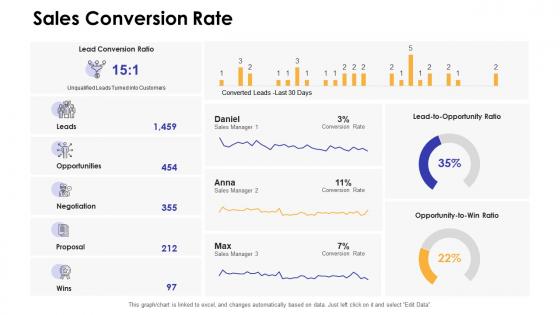
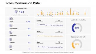
Sales conversion rate dashboards by function




Try Before you Buy Download Free Sample Product
 Impress Your
 Audience
 100%
100% Editable
 Save Hours
 of Time


Our Sales Conversion Rate Dashboards By Function are topically designed to provide an attractive backdrop to any subject. Use them to look like a presentation pro.
People who downloaded this PowerPoint presentation also viewed the following :
Sales conversion rate dashboards by function with all 7 slides:
Use our Sales Conversion Rate Dashboards By Function to effectively help you save your valuable time. They are readymade to fit into any presentation structure.





FAQs for Sales conversion rate
Track your conversion rates at each funnel stage - that's the big one. Lead-to-opportunity, opportunity-to-close, average deal size. Sales cycle length matters too. Win/loss ratios tell you a lot, but honestly lead source performance is where the real insights are hiding. Budget decisions get so much easier when you know what's actually working. Don't skip activity metrics like calls and emails made - shows if your team's putting in the work or just coasting. Pipeline revenue and forecast accuracy are obvious must-haves. Customer acquisition cost too if you can calculate it without going insane. Mix outcome metrics with leading indicators so you can fix problems before they wreck everything.
Dude, charts are a game changer for sales data. I was drowning in spreadsheets until I figured this out. Funnel charts show you exactly where people bail, heat maps reveal your money-maker channels. Bar charts let you compare segments super fast. The trick is matching the right chart to what you're actually trying to figure out - sounds obvious but I definitely picked the wrong ones at first lol. Trend lines track conversion rates over time, which is clutch. You'll stop guessing and start making real decisions based on what's actually happening.
Ugh, the worst thing you can do is cram like 20 different metrics on one screen. I've literally seen dashboards with 15 conversion rates - who needs that many?? Focus on maybe 3-5 things that actually matter for sales. Skip the vanity metrics that just look pretty but don't help anyone make decisions. Double-check your data's updating right too - wrong numbers will tank everyone's trust super fast. Here's what works: ask your team what they need to decide each day, then build around that. Context matters more than flashy numbers. Keep it simple and actionable.
So basically, more sales stages = worse conversion rates on your dashboard. It's like that leaky bucket thing - every stage drops some people. You're tracking leads through qualified, demo, proposal, then closed? Each step kills your numbers a bit more. Your dashboard probably shows either stage-by-stage rates or the full lead-to-close percentage. Here's the thing though - you gotta nail down what "conversion" actually means first. Are we talking demo-to-close or the whole lead-to-close journey? Get everyone on the same page about that definition or you'll just confuse yourself looking at the data.
Yeah, absolutely! Map out your customer journey first - that's the key. B2B SaaS companies obsess over trial-to-paid rates and MRR, but retail folks care more about cart abandonment and seasonal spikes. Healthcare's weird because they need compliance stuff mixed in with conversions. You can swap the funnel stages around, change which KPIs you're tracking, even tweak lead scoring based on what actually makes you money. Honestly, I'd start simple and add complexity as you figure out what moves the needle. Every industry's got its own quirks anyway.
Look, your historical sales data is basically a time machine for figuring out conversion rates. You'll see patterns jump out - seasonal stuff, which lead sources actually convert (not just the ones that look pretty), and when things randomly tank or spike. I love watching dashboards automatically catch when something's off compared to your usual numbers. You need at least a year of decent data though, maybe 18 months if it's messy. Set up some month-over-month trend tracking first. That's where you'll find the gold.
Look, your sales dashboard is pretty much useless without proper data integration. You need everything connected - CRM, marketing tools, website analytics, the whole mess. Otherwise you're just staring at random charts that tell you nothing about why people actually buy from you. I learned this the hard way tbh. The real insight comes when you can trace someone's entire journey from that first click to signing the contract. Map out where all your data lives first, then figure out what's missing. Trust me, you'll be shocked at how many blind spots you have.
Dude, real-time data changes everything. Your dashboard becomes this live command center instead of just looking at old stuff. You'll catch trends right as they happen - maybe your conversion rates tank during lunch or some random lead source suddenly goes crazy. Honestly it's pretty addictive watching those numbers shift around lol. The best part though? You can actually do something about it immediately. Don't wait weeks to figure out what's working. Pivot fast, move budget to the hot channels, fix messaging that sucks. I check mine like every hour now.
Honestly, just track what actually moves the needle - conversion rates, where your leads come from, and how fast deals close. Don't try to squeeze everything onto one screen (trust me, I learned this the hard way). Your sales team will thank you for keeping it clean with good spacing and consistent colors. Put your most critical stuff at the top where people look first. Bar charts beat pie charts every time - way easier to read quickly. Oh, and definitely test it with a few reps before you launch. They'll spot problems you totally missed.
Track your funnel stage by stage in your dashboard - that's where you'll catch the dropoffs. Heat maps are honestly a game changer for spotting patterns quickly. Watch for stages where conversion rates tank or deals just sit there forever. Time-in-stage and deal velocity are your best friends here. Once you find the problem spots, filter by lead source or rep to see what's really going on. Maybe it's just one source that sucks, who knows? Point is, don't just stare at the data - actually fix whatever you find.
Honestly, if you're just getting started I'd check what your current CRM can do first - most have basic dashboards that work fine. Tableau and Power BI are amazing but they're overkill unless you really need the fancy stuff. HubSpot's dashboard is solid for smaller teams, nothing groundbreaking but gets the job done. Google Data Studio is free which is nice, though it feels kinda janky sometimes (maybe that's just me). Oh and if you're already using Salesforce, their reporting is actually pretty good. I always forget about that one. Start simple though - you can always upgrade later when you know exactly what you need.
So basically you want dashboard sections showing conversion rates for each variant side-by-side. Include those statistical significance indicators too - honestly nothing beats seeing clear green confidence intervals when a test is crushing it. Set up automated feeds from your testing platform for real-time updates. The trick is segmenting all your conversion metrics by test groups, not just the specific pages you're testing. That way you'll see how variants affect your whole funnel. Oh and definitely show sample sizes plus test duration so everyone knows when results are actually worth acting on.
Dude, customer segmentation is a total game-changer for your dashboard. You'll see conversion rates that are completely different - like enterprise leads might convert at 15% while SMBs hit 35%. But here's the kicker: enterprises take 90 days longer to close. Each segment drops off at different funnel stages too. It's honestly wild how much clearer everything becomes. Instead of one average that doesn't tell you much, you can actually optimize your campaigns for each group. Way better than trying to make everything work for everyone, you know?
Honestly, mobile access to your conversion data is a game changer. Your sales team can see what's working in real-time - even during client meetings. That instant feedback lets them adjust their pitch on the spot instead of guessing. I've watched reps literally change their approach mid-conversation because they saw conversion numbers drop on certain products. Managers don't have to wait for weekly meetings either. They can jump in right away when someone's struggling. Oh, and definitely set up those push alerts for big milestones - you'd be surprised how easy it is to miss important stuff when you're juggling multiple deals.
Okay so dashboards basically stop the whole sales vs marketing blame game. Both teams can see the exact same numbers - which campaigns are bringing in leads that actually close, lead quality scores, all that stuff. Sales can give feedback right away instead of complaining later. I swear, once everyone's staring at the same data, the arguments just... stop? You'll figure out where leads are getting stuck and can tweak your targeting based on what's working. Oh, and do weekly reviews together or people will just ignore the dashboard. Trust me on that one.
-
Innovative and attractive designs.
-
Visually stunning presentation, love the content.
-
Thanks for all your great templates they have saved me lots of time and accelerate my presentations. Great product, keep them up!
-
Use of icon with content is very relateable, informative and appealing.