


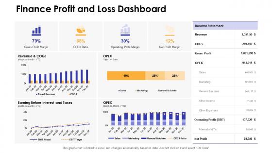
Dashboards by function finance profit and loss dashboard




Try Before you Buy Download Free Sample Product
 Impress Your
 Audience
 100%
100% Editable
 Save Hours
 of Time


Our Dashboards By Function Finance Profit And Loss Dashboard are topically designed to provide an attractive backdrop to any subject. Use them to look like a presentation pro.
People who downloaded this PowerPoint presentation also viewed the following :
Dashboards by function finance profit and loss dashboard with all 7 slides:
Use our Dashboards By Function Finance Profit And Loss Dashboard to effectively help you save your valuable time. They are readymade to fit into any presentation structure.






FAQs for Dashboards by function finance profit
Honestly, just pick the stuff that actually matters for decisions. Revenue trends and profit margins are obvious ones. Cash flow too - that's like your financial pulse check. Budget vs actual is where all the awkward conversations happen, so definitely track that. If you're trying to grow, customer acquisition cost and lifetime value are pretty critical. Oh, and accounts receivable aging because getting paid on time keeps the lights on. Don't go crazy though - maybe 6-8 metrics tops. Your team will tune out if you throw too many numbers at them every week.
Honestly, charts and graphs are game-changers for financial stuff. You'll catch trends and weird outliers that would just blend into spreadsheet noise otherwise. A simple revenue line shows if you're actually growing or tanking. Pie charts are perfect for seeing where your money disappears to each month. Heat maps work great for spotting which areas of your business are crushing it vs. struggling. Just don't get lazy and make everything a bar chart – that drives me crazy. Pick the right visual for what you're trying to show and your data will actually tell a story.
Markets move crazy fast, so you can't be working with yesterday's numbers. Cash flow dips? Major expense hits? You'll miss it completely if you're waiting for end-of-day reports. Your dashboard needs to refresh automatically - honestly, anything else is just asking for trouble. Set up alerts for whatever metrics actually matter to your role. Short sentences help you spot trends and react fast. Without real-time feeds, problems snowball before you even know they exist. It's like trying to drive while looking in the rearview mirror.
So basically, you get to see your actual spending vs what you budgeted in real-time. Super helpful for catching when you're going overboard before it gets ugly. The charts are honestly a lifesaver compared to staring at boring spreadsheets all day. You can click into specific expenses to figure out what's messing up your budget too. I'd definitely set up alerts for when you hit certain spending limits - saves you from obsessively checking your accounts every five minutes like I used to do. Makes spotting trends way easier overall.
Honestly, just go with line charts for tracking stuff over time - revenue, cash flow, whatever. Bar charts are perfect when you're comparing different periods or categories. Gauge charts work great for things like profit margins where you have target ranges. Skip pie charts though, they're way overused and kinda suck for financial data unless you're doing budget breakdowns. Oh, and sparklines are clutch for dashboards when you want quick trends without eating up space. Your execs just want to spot problems fast, not figure out some fancy chart. Start simple with lines and bars, then get fancier only if you really need to.
Honestly, you've gotta think about what each group actually needs to do their jobs. Your C-suite folks want the big picture stuff - revenue trends, profit margins, that level. Don't overwhelm them with every tiny expense line (trust me, they'll hate you for it). Department heads need their budget vs actual numbers so they can actually manage their people. Board members? Keep it clean with quarterly comparisons and key ratios. Finance team obviously needs all the detailed drill-down stuff for reconciliations. Here's what works: ask each group what decisions they're making every day, then build dashboards around that. Way more effective than guessing.
Honestly, Power BI or Tableau are your best bets - they're solid for connecting to financial data and the dashboards look really professional. Excel still works great for basic stuff, especially since everyone already knows it. Google Data Studio is free which is nice, though it can be weird sometimes. Oh, and Qlik Sense is worth checking out if you're doing heavy financial modeling. I'd probably start with Power BI if you're already using Microsoft stuff. Otherwise just try Google Data Studio first since it won't cost you anything.
Honestly, getting a good finance dashboard set up was one of the best moves I made last year. You can see everything at once - cash flow, revenue trends, where your money's actually going. Real-time data means you'll catch issues before they become problems. The forecasting part is pretty cool too; you can play around with different scenarios using your historical numbers. Like, what happens if sales drop 15% or expenses spike? Takes two seconds to model it out. Start with whatever metrics keep you up at night and build from there.
Don't cram everything onto one screen - that's like the
-
Professional and unique presentations.
-
The content is very helpful from business point of view.
-
Understandable and informative presentation.
-
Easily Understandable slides.