


Dashboards by function it project management dashboard




Try Before you Buy Download Free Sample Product
 Impress Your
 Audience
 100%
100% Editable
 Save Hours
 of Time


Our Dashboards By Function It Project Management Dashboard are topically designed to provide an attractive backdrop to any subject. Use them to look like a presentation pro.
People who downloaded this PowerPoint presentation also viewed the following :
Content of this Powerpoint Presentation
An IT project is any project that deals with information systems, computers or IT infrastructure. Software development, mobile app development, hardware installation and web development are all examples of an IT project. But these projects don't just magically come to life rather are a result of planning and coordination of a team that is well managed.
An IT project management is the process of scheduling, planning, executing and monitoring projects. The management process starts by determining the need of the project. This is followed by a planning phase wherein the directors and managers set a budget, create goals and identify potential risks. Then the tasks are delegated, deliverables are created and communication mediums are established. The project then needs to be well tracked and monitored to make sure that everybody is on track.
Now, easily track the management efforts of multiple projects with help of our pre-designed PPT Template on multiple project management dashboard with risks and issues status.
With the help of dashboards, the managers can easily track the progress of the projects at one dedicated place. SlideTeam’s PowerPoint Slide on IT project management dashboard provides a layout for tracking the progress of any project. This pre-designed template is 100% editable and customizable providing you with a head-start.
Let’s explore!
Template: IT Project Management Dashboard
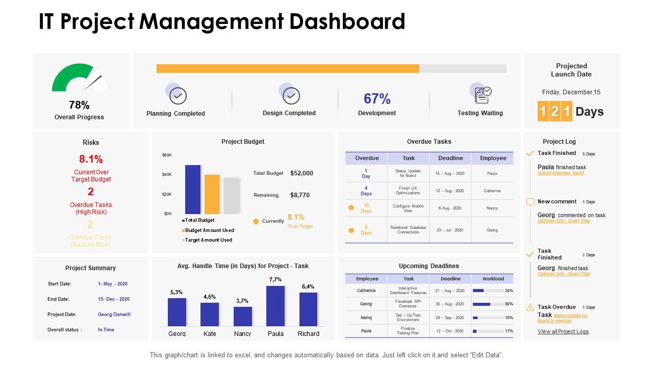
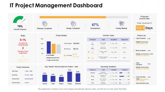
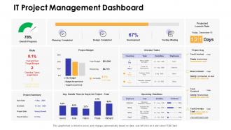
This PowerPoint slide showcases a dashboard for monitoring any IT project. It showcases a meter in the top left corner which highlights the overall progress of the project. This template has dedicated sections for risk percentage, project summary, project launch date with the number of days left for the launch and a log section. It includes graphs and tables to represent project budget, overdue tasks with deadline and employee name, upcoming deadlines and average handle time for each project.
Inspiring Teams, Achieving Goals
Regardless of what project you have in hand, using this dashboard will make your work easier. Its predesigned framework will help you organize tasks and make alterations according to the requirement. A dashboard is a great tool to connect teams and stakeholders making sure that everyone is on the same page and understands the project’s goals.
PS: Also check out our PowerPoint Template design on Project Management with KPIs. These key performance indicators highlight the results of your management efforts. This assists in making informed decisions about the project.
Dashboards by function it project management dashboard with all 7 slides:
Use our Dashboards By Function It Project Management Dashboard to effectively help you save your valuable time. They are readymade to fit into any presentation structure.





FAQs for Dashboards by function it
Definitely start with your timeline and major milestones - that's what everyone looks at first. Budget tracking is obvious but super important, plus how you're spreading resources across the team. Task completion rates too (those red progress bars honestly stress me out lol). Risk flags are clutch for catching problems early. Oh, and definitely track team workload so nobody gets buried. If it's an infrastructure thing, system uptime matters. Keep everything visual - stakeholders hate dense spreadsheets. Start basic then add whatever metrics come up most in your actual meetings.
Dude, real-time data integration is like switching from checking yesterday's weather to having live radar. You'll see sprint progress, budget burns, and who's actually working on what as it happens. No more awkward "lemme get back to you" moments with stakeholders. Honestly, once you start catching bottlenecks before they blow up into full disasters, you won't want to go back. Plus moving team members around becomes way less stressful when you can see the whole picture. Oh, and start with your ticketing system and time tracking first – those are usually where the magic happens.
Honestly, charts and graphs are lifesavers when you're trying to explain tech stuff to non-tech people. Color-coded dashboards beat the hell out of Excel dumps - nobody wants to stare at rows of numbers. You can instantly show what's broken, what's on track, progress bars, all that good stuff. Plus different people need different views, right? Executives want the big picture summary while your actual project team needs the nitty-gritty details. I've seen way too many presentations where people's eyes just glaze over from information overload. Visual stuff just clicks faster.
Budget tracking vs actual spend is huge - don't skip that one. Timeline stuff too, like which milestones you're hitting or missing. I got burned once when a project went 40% over and we didn't catch it for three months, ugh. Track scope creep because clients love adding "just one more thing." Team velocity matters, plus your critical path items so nothing falls through cracks. Oh and risk counts with severity levels - quality metrics too if you're building something. Resource utilization helps spot bottlenecks early. Honestly though? Start simple with the basics, then add whatever your stakeholders actually want to see.
Yeah totally! Just figure out what each project type actually needs. Agile teams want sprint burndowns and velocity charts. Infrastructure folks care about uptime and deployment stuff. Security projects need risk tracking - you get the idea. Honestly the best approach is just asking your stakeholders what stresses them out most. Then build widgets around those specific pain points. Most tools have drag-and-drop anyway, so grab a template and mess with it until it works. Way easier than starting from scratch, trust me.
So predictive analytics basically flips your IT dashboard from showing what already happened to predicting what's coming. It digs through your old project data to spot patterns - like when teams usually hit bottlenecks or which types of features always cause delays. Pretty handy, right? You'll get alerts before budget issues or timeline problems actually hit, instead of scrambling after everything's already gone sideways. I mean, it's not perfect, but at least you can actually fix stuff instead of just watching it burn. Way better than those old dashboards that just told you how screwed you already were.
Honestly, dashboards are lifesavers for catching problems early. You'll see stuff like budget burn rate and timeline slips right away instead of finding out too late. When sprint velocity tanks or critical tasks get delayed, boom - there's your warning. Way better than scrolling through endless spreadsheets every day (ugh). Set up alerts for your biggest concerns so you're not babysitting the thing constantly. The visual layout makes everything super scannable too. Just customize it for whatever risks actually matter to your specific project - don't go crazy tracking everything under the sun.
Start with the stuff that actually matters - budget, timeline, major milestones. Red/yellow/green indicators are your friend since nobody has time to decode spreadsheets. I learned this the hard way after creating a dashboard that looked impressive but told people basically nothing. Group similar info together and don't go crazy with charts everywhere. The best move? Run it by the people who'll actually use it first. They'll spot what's broken or confusing way faster than you will. Simple beats comprehensive every single time.
Oh man, collaborative dashboards are so much better than regular ones. Instead of just staring at static reports, your whole team can actually jump in and contribute stuff. People can comment in real time, assign tasks, and add notes right where the data sits. No more digging through endless email chains trying to figure out what happened last week (seriously, who has time for that?). Remote teams especially love this setup. When someone spots an issue or has an idea, they just flag it directly on the dashboard. Set up notifications for your most important metrics too – saves you from having meetings about every little thing.
Jira's probably your safest bet if you're already using Atlassian stuff - their dashboards are solid for agile metrics. Microsoft Project paired with Power BI is pretty powerful too, especially if your company's already deep in the Office 365 world. Monday.com is way more user-friendly though, which matters if you've got non-technical people on the team. Honestly? I'd just go with whatever plays nicest with your existing setup. Don't overthink it - I've watched too many teams spend weeks perfecting dashboards instead of actually getting work done. Pick something that won't make you rebuild your entire workflow.
Oh man, start with data governance right away - figure out who's responsible for what data and set up validation rules. I made this mistake once and our sprint burndown was totally screwed for weeks, so embarrassing. Automated checks are your friend here. Also, integrate your data sources properly and avoid manual entry at all costs - that's where everything goes wrong. Regular audits help catch issues early, and honestly? Just assign someone to be the data quality person for each project. Train everyone on consistent input standards too, otherwise you'll get garbage data and wonder why your dashboards look weird.
Honestly, the biggest pain points are data silos, people pushing back on changes, and way too many dashboards. I swear I've seen teams build like 15 different ones that just sit there collecting dust. Here's what works though - figure out what decisions your stakeholders actually need to make first, then work backwards from there. Get people involved early so they don't hate whatever you build. Integration comes before the fancy stuff. Three solid metrics will beat thirty confusing ones every time. Start with one dashboard that fixes a real problem, then grow it out. Much better approach than going big right away.
Dude, mobile access is a game changer. You can approve stuff and unblock your team from literally anywhere - I've saved so many projects while stuck in grocery store lines, it's not even funny. Your stakeholders love it too since they don't need to haul out laptops just to check status updates. But here's the thing - make sure your dashboard actually looks decent on phones, not like someone just crushed a desktop version. I'd test it on your phone first. You'll probably find weird button placement or text that's impossible to read right away.
So here's the deal - Agile dashboards are all about what's happening right now. You'll see burndown charts, story points, team velocity, daily blockers. Waterfall ones track those big milestone checkpoints instead. Way more structured and predictable, honestly. With Agile, everything changes constantly so it feels pretty hectic compared to Waterfall's neat linear progression. I mean, some people love that chaos but it's not for everyone. The key is picking dashboard widgets that actually match how your team operates day-to-day. Don't force a square peg into a round hole, you know?
Honestly, monthly feedback surveys work great - just keep them short or people won't bother. Anonymous is better since nobody wants to trash the new system with their name attached. I'd also do quarterly sessions where your team shows you how they're actually using the dashboard vs. how you think they are. Trust me, you'll be surprised! Pay attention to which reports get screenshotted all the time and which widgets nobody touches. That tells you way more than any survey. Oh and make small changes along the way instead of waiting months - people need to see you're listening.
-
Great designs, really helpful.
-
Very well designed and informative templates.