


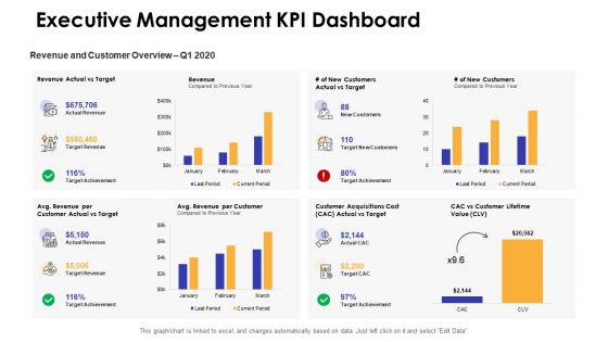
Dashboards by function executive management kpi dashboard




Try Before you Buy Download Free Sample Product
 Impress Your
 Audience
 100%
100% Editable
 Save Hours
 of Time


Our Dashboards By Function Executive Management Kpi Dashboard are topically designed to provide an attractive backdrop to any subject. Use them to look like a presentation pro.
People who downloaded this PowerPoint presentation also viewed the following :
Dashboards by function executive management kpi dashboard with all 2 slides:
Use our Dashboards By Function Executive Management Kpi Dashboard to effectively help you save your valuable time. They are readymade to fit into any presentation structure.
FAQs for Dashboards by function executive
Focus on the metrics that actually matter for your goals - revenue growth, profit margins, customer acquisition cost, cash flow. Those are your bread and butter. Then throw in some operational stuff like customer satisfaction and employee turnover. Honestly, I've watched so many people create these massive dashboards that look fancy but tell you nothing useful. Six to eight KPIs tops. Each one should make you think "okay, what do I need to do about this?" Your dashboard needs to tell you how healthy your business is, not just show off pretty charts that don't help you decide anything.
Okay so basically you're turning boring spreadsheets into something execs can actually understand without getting a headache. Heat maps are perfect for showing where things are performing well or tanking. Trend lines help them spot patterns super fast. Those color-coded dashboards with the green/yellow/red thing? Total game changer - they eat that stuff up. Bar charts work great when you need comparisons, and gauges are solid for tracking targets. The interactive stuff is clutch because they can dig deeper if they want but aren't overwhelmed upfront. Real-time updates keep everything current too.
Honestly, real-time data is what makes your dashboard actually useful instead of just fancy eye candy. You'll catch issues before they blow up and spot trends while they're happening. Making decisions off last week's numbers is like driving while looking in the rearview mirror - not gonna end well. The magic happens when your KPIs update live and you can jump on things immediately. Oh, and definitely set up alerts for your most critical stuff so you don't have to babysit the thing constantly.
So first, figure out your top 5-7 metrics that actually move the needle for your business. A retail company cares about same-store sales and inventory turnover, but if you're running a SaaS business? You'll want monthly recurring revenue and churn rates instead. Completely different priorities. Most dashboard tools are pretty intuitive - you can drag widgets around and swap data sources without much hassle. Honestly, I'd skip the generic templates entirely. They're usually too broad to be useful. Just start with your core metrics and build the layout around those. Way more effective than trying to force your business into someone else's framework.
So the big names are Tableau, Power BI, and Qlik Sense. Power BI's your best bet if you're already using Microsoft stuff - it connects with Excel really smoothly. Tableau makes gorgeous visuals but man, it gets expensive quick (trust me on that one). Google Data Studio is free and works fine for basic stuff. Really comes down to what data you're working with and how much you want to spend. I'd go with Power BI if you've got Microsoft licenses sitting around, or mess around with Google's tool first to see if dashboards are even worth it for you.
Honestly, connecting your executive dashboard to other systems is a game changer. You'll get live data flowing in from your CRM, ERP, financials - all of it. No more manually updating spreadsheets like it's 1995. The best part? Those annoying meetings where everyone argues about whose numbers are correct basically disappear. Everything syncs up automatically, so you're seeing what's actually happening right now instead of last week's outdated reports. Makes spotting trends way easier too. Oh, and definitely set up automated feeds if you can - saves tons of headaches down the road.
Honestly, executives are super impatient - they want revenue numbers and key metrics they can scan in like 30 seconds max. Put your most critical stuff right up front with clean visuals. They absolutely hate when dashboards are cluttered with random widgets everywhere. Your data should tell an actual story, so include trends and comparisons to last quarter or whatever goals you're tracking. Interactive filters can be useful but don't go crazy with them - I learned this the hard way. Most execs just want the insights served up, not to fiddle around with controls. Definitely test it with real executives first and tweak based on their feedback.
Dashboards are great for catching trends and gaps before they bite you. I'd focus on KPIs that actually matter though - too many people get obsessed with flashy numbers that don't move the business forward. Real-time data means you can pivot fast when something's off track. Maybe set up monthly reviews with your team to dig into what the numbers are saying about market changes or where you're bleeding efficiency. The key is turning those insights into actual action items, not just pretty charts. Oh and don't get trapped chasing growth opportunities that look good on paper but aren't realistic.
Oh man, don't cram everything onto one screen - executives will take one look and nope right out. Focus on maybe 5-7 metrics that actually matter for decisions, not just flashy numbers that look cool. I've watched so many beautiful dashboards become digital paperweights because nobody could figure out what they were supposed to do with all that data. Make sure it updates often enough to stay useful. Test with real users first - like, actually sit with them and watch them try to use it. Start with their biggest business questions and work backwards from there. Trust me on this one.
Look, having everyone stare at the same dashboard kills those annoying "marketing says X but sales says Y" arguments. Your teams can actually see how their stuff affects other departments - like when marketing's campaign boosts the sales pipeline or customer service drama hurts retention. Honestly, it's pretty eye-opening once people realize how connected everything is. The silo thing just naturally breaks down because suddenly finance gets why marketing needs that budget increase, you know? Try doing weekly reviews where department heads go through it together. Way better than those pointless status meetings nobody wants to attend anyway.
Dude, be super careful with those executive dashboards. They're packed with your company's most sensitive stuff - financials, strategy data, competitive intel. If that leaks, you're screwed. Most companies are way too casual about who gets access (honestly drives me crazy). Don't just send out sharing links to everyone. Set up proper role-based permissions instead and actually check who has access every now and then. Watermarking helps too if you're paranoid. Only share with people who truly need it - treat this data like it could sink the company, because it could.
Daily works best in my experience. Most execs want those numbers with their coffee, you know? Weekly's fine if things move slow for you, but I'd skip that unless you're tracking bigger picture stuff. Real-time is just showing off honestly - total waste unless everything's on fire. You want the frequency to match how fast decisions get made around there. I'd say start daily and see what happens. If they're not actually checking it that much, dial it back. But yeah, daily's usually the winner.
NPS is probably your best bet - execs love that metric. Also grab CSAT and Customer Effort Score to round things out. Don't fall into the trap of cramming every possible metric in there (I've seen way too many dashboards that look like a NASCAR car with all the data points). Support ticket resolution time matters for ops stuff. First-call resolution rates too. Customer retention shows if you're actually keeping people happy long-term. Maybe add customer lifetime value if your data's clean enough - though that one can be tricky to track. Stick to 5-6 metrics tops or nobody will bother checking it.
Just add some forecast widgets to your existing dashboard - revenue projections, churn predictions, that kind of stuff. Most platforms like Tableau already have forecasting built in, so you don't need to get super technical about it. Your executives will love seeing trend lines instead of just "here's what already happened." Keep the predictions simple though - clear charts with confidence ranges work way better than showing off complex models. Honestly, I'd start with maybe two key forecasts that actually matter for your big decisions. Power BI works great for this too if you're already using it.
Honestly, training is everything here. Your executives need to actually know how to use the thing, otherwise you've just built an expensive digital paperweight. Show them the drill-down features and how to read the visualizations properly. But don't just do the "click here, then click there" stuff - they need to understand what the data actually means for making decisions. I've watched so many leaders get frustrated and just give up when the interface feels too complex. Practice sessions work best, maybe throw some real scenarios at them so they're not learning in a vacuum when crunch time hits.
-
Good research work and creative work done on every template.
-
Very well designed and informative templates.
-
Thanks for all your great templates they have saved me lots of time and accelerate my presentations. Great product, keep them up!