


Dashboards by function human resources employee performance dashboard




Try Before you Buy Download Free Sample Product
 Impress Your
 Audience
 100%
100% Editable
 Save Hours
 of Time


Our Dashboards By Function Human Resources Employee Performance Dashboard are topically designed to provide an attractive backdrop to any subject. Use them to look like a presentation pro.
People who downloaded this PowerPoint presentation also viewed the following :
Content of this Powerpoint Presentation
At the end of the year, when the Human Resource Department (HRD) reflects on its activities, it discovers the range of office aspects where its presence has been felt. From major activities like onboarding and offboarding and conducting office-get-togethers to tallying attendances and generating salary reports, HR personnel will have collected a lot of information to draw insights from. Upon processing this information, the department releases trends, statistics, and a general overview of the diversity, coordination, and engagement levels of employees. However, presenting this information in an easy to understand way that’s also gripping requires the involvement of designers and spreadsheet-experts. With SlideTeam as your aide, you have nothing to worry about.
Introducing this content-rich, Excel-linked, and fully editable PPT Dashboard that allows the HRD to publish analysis of the year in a fresh, engaging and easily understandable manner. Graphs and charts add a visual element to this easy to use dashboard template, which has clutter-free as its USP. Let’s have a closer look at this PPT Template now!
Template 1: Human Resources Employee Performance Dashboard

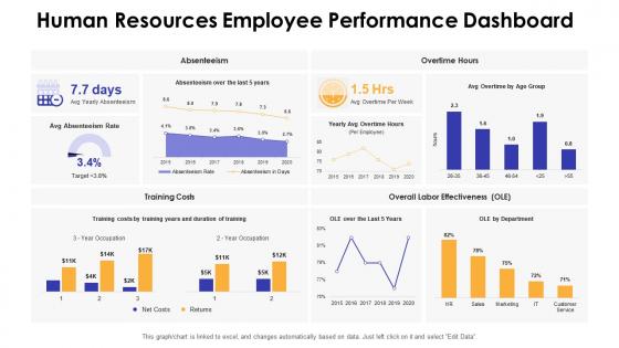
Create a summary of your organizational statistics with this HR Dashboard Template. Report attendance and overtime trends depicted by employees over the year with bar graphs, pie charts, area charts, and line graphs as shown. Demonstrate the training costs incurred during this time. Compare labor effectiveness over the years and department-wise, as shown. Start editing this PPT Dashboard now!
Report employment status with this fully editable KPI Dashboard template now!
Derive insights about company culture, employee engagement, and skill development with this dashboard template. Based on the finding of this PPT Design, you can govern strategies for company growth and employee development.
PS: List the specifics of the onboarding process and make it a breeze for the HRD to track this process with this ready to use PPT Layout.
Dashboards by function human resources employee performance dashboard with all 7 slides:
Use our Dashboards By Function Human Resources Employee Performance Dashboard to effectively help you save your valuable time. They are readymade to fit into any presentation structure.







FAQs for Dashboards by function human resources
Honestly, start with goal completion rates and productivity stuff that actually matters for each role. Quality scores are huge too - way more telling than people think. Throw in some peer feedback ratings because nobody works in a vacuum, right? Track both the hard numbers (sales, project times) and the softer stuff like collaboration. Learning progress is solid gold for keeping people motivated. But seriously, cap it at 5-7 metrics or you'll create this monster dashboard nobody wants to look at. Start basic, then tweak based on what actually moves the needle for your teams.
Honestly, these dashboards are game-changers. You get real-time data on project progress, goals, productivity - all that stuff you usually wait months to see in reviews. Spot problems early instead of finding out your team's been struggling this whole time. Same goes for wins - you can give props when it actually matters. I'd set up alerts for the important stuff so you're not glued to the screen all day (learned that one the hard way). Your people get help right when they need it, not after it's too late to fix anything.
Okay so basically, charts and graphs turn your performance data into something you can actually understand at a glance. Raw spreadsheets? Total nightmare - like trying to find a needle in a haystack. Your brain picks up on patterns way faster when stuff's visualized. You'll spot who's crushing it and who's struggling without squinting at numbers for ages. I always start with bar charts and heat maps since they're super straightforward. Makes those quarterly reviews so much easier when you can just point to the visual and be like "see, here's what happened." Trust me, your team will thank you for not making them decode spreadsheet hieroglyphics.
Honestly? Power BI is probably your best bet if you're already using Microsoft stuff - it's way cheaper than Tableau. Speaking of Tableau, yeah it looks amazing but holy shit the licensing costs add up fast. Looker's pretty solid too but your data team needs to actually know what they're doing. Google Data Studio works fine for basic stuff and it's free, which is nice. Really depends on your budget though. I'd start there and see how technical your team is - no point getting something fancy if nobody knows how to use it. What's your setup like right now?
Honestly, having a dashboard for your goals is a game changer. You can set up your SMART goals right in the system and actually see where you stand without panicking before reviews. Breaking those huge yearly goals into smaller chunks with progress bars? Surprisingly motivating - I'm weirdly competitive with myself about filling those bars. Your manager can peek at your progress too, which cuts down on those weird check-in meetings. Just spend like 5 minutes each week updating your wins. Trust me, it'll make review time so much less stressful when everything's already documented.
Honestly, the worst thing you can do is cram everything onto one screen. Nobody wants to look at 50 different charts - it's just overwhelming. Skip the vanity metrics too, like those impressive-looking numbers that don't actually help anyone decide anything. Daily updates are usually plenty; real-time feels fancy but it's overkill most of the time. Here's what really matters though: talk to the managers first! I can't stress this enough. Ask them what decisions they're struggling with, then build the dashboard around those specific needs. Otherwise you'll end up with something pretty but useless.
Focus on metrics that actually help managers make decisions, not just look impressive. Set clear benchmarks so they know what's good vs bad. Your data should point to specific actions - like "Sarah needs coaching on X skill" instead of vague stuff like "performance declining." Honestly, most dashboards I've seen are just fancy decoration nobody uses! Connect each metric to something concrete: schedule coaching, adjust workloads, recognize good work. Oh, and add notes explaining what the numbers mean with recommended next steps built right in.
Honestly, your existing systems probably have most of what you need already. HR platforms, project management tools, CRM - they're all tracking stuff. 360 feedback surveys work great too. Goal tracking and KPIs from your performance system are obvious ones. Oh, and some places throw in attendance records if that matters to you. The real game-changer though? Automate everything you can. I spent way too many Friday afternoons updating spreadsheets manually before I figured that out. You don't want to be doing that every week - it'll drive you crazy.
Honestly, dashboards work because nobody wants to look bad when their numbers are right there for everyone to see. It's like peer pressure but in a good way - people naturally step up when there's visibility. You'll spot who's crushing it and who needs help pretty quickly. The visual aspect is weirdly motivating too, seeing your progress climb up those charts. Just make sure you're tracking stuff that actually moves the needle, not just random metrics that look impressive. Oh, and do team reviews regularly so it feels collaborative instead of like Big Brother watching. Otherwise people get defensive and the whole thing backfires.
Honestly, less is more with dashboards - cram too much stuff in there and people just get overwhelmed. Color coding and progress bars are your best friends for making data actually readable. Nobody wants to scroll through endless rows of numbers, trust me. Let users filter and dig into what they care about. Oh, and definitely explain what your metrics actually mean - not everyone speaks data fluent. Keep things updated regularly. The real key though? Actually ask people what's useful versus what's just taking up space. You'll be surprised how different their priorities are from what you'd expect.
Monthly works best for most people, though quarterly's fine if you're tracking bigger picture stuff. Sales teams might need it more often since their numbers bounce around daily, but for everyone else? Monthly hits that sweet spot. You'll catch actual trends without getting buried in data that doesn't really matter yet. Just pick whatever schedule works and don't change it - consistency beats perfection here. I learned this the hard way when I kept switching between weekly and monthly updates and nobody knew what was happening. Set a calendar reminder so you're not scrambling last minute.
Don't get caught up in daily fluctuations - look for patterns over weeks instead. One terrible day doesn't mean everything's falling apart. I'd recommend checking multiple metrics together since you can't judge performance from just one number. External stuff matters too, like if someone's training or dealing with crazy project deadlines. The dashboard's honestly pretty confusing at first (took me forever to figure out). But here's the thing - use this data to actually talk with your team members instead of jumping to conclusions. Those conversations are way more valuable than staring at charts all day.
Honestly, gamification works because we're all weirdly competitive deep down. Add badges for hitting targets, leaderboards showing who's crushing it, progress bars, point systems - that stuff. Makes boring data feel less like work and more like... well, a game. Short sentences hit different sometimes. The trick is matching your game elements to what you actually want people to do. So figure out which behaviors matter first, then build the fun stuff around those actions. Oh and don't go overboard - too many bells and whistles just gets annoying.
Honestly, dashboards are goldmines for spotting skill gaps. You'll see patterns super clearly - like when Sarah crushes client calls but her project timelines are always a mess (we've all worked with that person). Look for consistent low scores in specific areas or whole departments struggling with the same stuff. That's literally your training roadmap handed to you on a silver platter. Don't just focus on individual scores though. Check for company-wide trends too. Maybe everyone's weak at the new software or something. Review these regularly and build actual targeted programs instead of those boring generic workshops nobody remembers.
Privacy is huge here - never let employees see each other's individual performance data. Trust me, that creates so much unnecessary workplace drama. You'll also want to check that your metrics aren't accidentally biased against certain groups, because discrimination lawsuits are no joke. Be upfront about how you calculate scores too. People get really suspicious when they can't figure out where their numbers come from. Keep the sensitive stuff limited to managers who actually need it, and maybe use aggregated data when you can. Honestly? Just think about whether you'd want your own performance shared the same way.
-
Out of the box and creative design.