


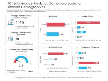
Hr performance analytics dashboard based on different demographics powerpoint template




Try Before you Buy Download Free Sample Product
 Impress Your
 Audience
 100%
100% Editable
 Save Hours
 of Time


Our HR Performance Analytics Dashboard Based On Different Demographics Powerpoint Template are topically designed to provide an attractive backdrop to any subject. Use them to look like a presentation pro.
People who downloaded this PowerPoint presentation also viewed the following :
Hr performance analytics dashboard based on different demographics powerpoint template with all 2 slides:
Use our HR Performance Analytics Dashboard Based On Different Demographics Powerpoint Template to effectively help you save your valuable time. They are readymade to fit into any presentation structure.
FAQs for Hr performance analytics dashboard based on different
Honestly, just stick to the basics that actually matter - turnover rates, time-to-hire, engagement scores, and performance ratings. Those four will cover most of what leadership cares about. Absenteeism and diversity metrics always come up in meetings too, so throw those in. Cost-per-hire is huge if you're watching the budget (and who isn't these days?). Don't go overboard though - like 8-10 max or people's eyes glaze over. Training completion percentages are solid too. Start simple and add more later when people inevitably ask for that one weird metric nobody thought of initially.
Okay so basically, those endless HR spreadsheets? Data viz turns them into something you can actually make sense of. Like instead of staring at rows of turnover numbers, you get clean trend lines showing if retention's getting better or worse. Heat maps will show you which departments are struggling with engagement - way easier than scrolling through data forever. Bar charts make salary gaps super obvious too. The trick is picking the right chart type for whatever you're measuring. Honestly makes such a difference when you're trying to spot patterns quickly. Your team will actually understand what's happening instead of drowning in numbers.
Look, having real-time data means you'll catch problems when they're actually happening - not three weeks later when everyone's already quit. Attendance issues, engagement tanking, turnover going crazy? You see it immediately and can fix it. Executives eat this stuff up too, makes you look super sharp. Your team responds faster to employee problems instead of waiting around for those boring quarterly reports. Oh and tracking your HR programs becomes way easier when you can see results right away. I'd say start with whatever metrics stress you out most, then add more later.
So basically you track stuff like survey scores, turnover rates, and who's actually showing up to company events. The dashboard breaks it down by department and role - honestly, the patterns that pop up are wild. You'll catch seasonal trends you never noticed before. When engagement tanks, you can usually trace it back to something specific like a bad manager hire or crazy deadlines. Oh, and definitely set up alerts when scores drop below a certain point. Last thing you want is your best people quietly job hunting because nobody caught the warning signs early enough.
Honestly, three things will save you major headaches down the road. Set up automated validation rules first - stuff like catching negative hours or weird dates that make no sense. Monthly spot checks are clutch too, just grab a random sample and verify against your source docs. I'd also cross-reference your payroll with HRIS data to catch mismatches. Look, I get that it sounds boring as hell, but cleaning up garbage data later is such a nightmare. Way easier to prevent it upfront. Start with your most important metrics and build rules around those - don't try to fix everything at once or you'll burn out.
Honestly, just match your metrics to what each HR team is actually trying to do. Recruitment? Track time-to-fill, quality of hire, source effectiveness - stuff that shows if you're getting good people quickly. Turnover rates and engagement scores matter most for retention. I made the mistake early on of tracking way too much (total data overload). Pick maybe 3-4 solid metrics per function that people actually care about and can do something with. Don't go crazy trying to measure everything at once. Get those few things right first, then add more later.
So predictive analytics is like having a crystal ball for HR stuff. Instead of scrambling when people quit, you can see it coming weeks ahead. Same with spotting who's promotion-ready or figuring out how many people you'll need to hire next quarter. Honestly, it beats making decisions based on hunches and whatever happened last year. The data shows you what's actually gonna happen next - which employees are flight risks (sometimes before they even realize it), future staffing needs, all that. Just don't go crazy trying to predict everything at once. Pick turnover first, then expand.
Honestly, these dashboards are game-changers for workforce planning. They show you real-time data on turnover patterns and where your talent gaps are hiding. The predictive stuff is actually pretty neat - it'll forecast hiring needs based on retirements, growth, seasonal changes, all that. You can see which departments are bleeding people and track your top performers too. Oh, and the skills inventory data helps with succession planning. My advice? Figure out what's keeping you up at night workforce-wise, then build your dashboard around fixing those specific problems first.
So honestly, employee feedback is like your GPS for HR dashboards – shows you what actually matters vs what you *think* matters. If people keep complaining about workload or feeling stuck career-wise, focus on productivity balance and internal mobility stuff. Their input saves you from tracking pointless metrics that look impressive but don't mean much day-to-day. I've seen too many dashboards that just become pretty charts for executives because they ignored what employees wanted. Survey your team regularly about what workplace insights would help them most, then build around those real problems.
Honestly, the key is figuring out what each person actually needs to see. Executives want the big picture stuff - retention rates, how the talent pipeline looks. HR managers need the nitty-gritty operational data like recruitment funnels and performance review status. Line managers? They just care about their own team's performance and who needs development. Set up role-based permissions so people aren't drowning in irrelevant data. I'd start by literally asking each group what decisions they're making every day, then build dashboards around that. Way more effective than dumping everything on everyone.
Oh man, data inconsistencies are the absolute worst. Your HRIS stores employee IDs one way, performance tools do it completely different - and payroll? Don't even ask about their date formatting nightmare. You'll run into API limits, duplicate people showing up everywhere, sync issues that'll drive you crazy. Legacy systems are honestly just jerks that refuse to cooperate with anything modern. Here's what saved my sanity though - map out every single data source first. Figure out which fields you can actually trust before trying to connect anything. Sounds boring but it'll save you weeks of headaches later.
Look, HR spreadsheets are basically death by data. Nobody cares about raw numbers, but tell a story? Game changer. Start big picture - how's your workforce doing overall? Then zoom into the juicy stuff like why people are quitting or who's actually crushing it. Don't dump everything at once though, that's overwhelming. I swear executives check out the second they see rows of data, but show them a clean before/after story and they're suddenly paying attention. The key is always answering "okay, so now what?" End with actual next steps they can take.
Hey! So for mobile HR dashboards, responsive design is obviously crucial - gotta work on phones properly. Make navigation touch-friendly and add offline access since people are always moving between locations. Don't cram everything on one screen though. Use simple charts and data cards instead. Push notifications for urgent stuff are a game-changer. I'd focus on maybe 5-7 metrics that managers actually look at daily (not the random ones nobody cares about). Drilling down shouldn't require endless scrolling either. Test it on real phones first - seriously, can't stress this enough!
Honestly, start with something simple like progress bars for goal completion - people are weirdly obsessed with filling those things up. Leaderboards work great too, especially for training completion or peer feedback scores. You know how LinkedIn shows that profile completion percentage? Same concept. Team challenges can get competitive in a good way. Just make sure whatever you pick actually connects to real business stuff, not random points that don't mean anything. I'd probably test one thing first - maybe a progress tracker for annual reviews - and see if people actually use it before going overboard with badges and everything else.
Check your metrics every quarter, especially when business stuff shifts or you get new priorities. Monthly data checks are a lifesaver - seriously, presenting broken dashboard numbers is embarrassing as hell. Pick metrics that actually help people make decisions, not just ones that look fancy. I'd survey users twice a year to see what they're ignoring. Keep your main KPIs steady but stay flexible with everything else. Honestly? Start small this quarter. Grab 2-3 metrics that aren't pulling their weight and either fix them or ditch them completely.
-
Much better than the original! Thanks for the quick turnaround.
-
Unique design & color.
-
Thanks for all your great templates they have saved me lots of time and accelerate my presentations. Great product, keep them up!
-
Out of the box and creative design.
-
Innovative and attractive designs.
-
Awesome presentation, really professional and easy to edit.
-
Great designs, really helpful.