

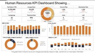
Human resources kpi dashboard showing employment status turnover rate






Try Before you Buy Download Free Sample Product
 Impress Your
 Audience
 100%
100% Editable
 Save Hours
 of Time


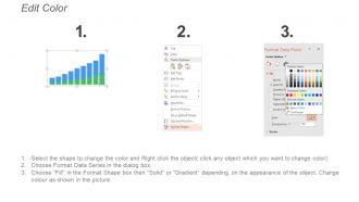
If you are a Human Resource manager in a company, you need to check out our new Human Resources Kpi Dashboard Showing Employment Status Turnover Rate PPT. The business template will help you know about all the changes in the human capital of the firm. This is a three stage process and the names of all the three stages are human resource, human capital and Hrm. This PowerPoint presentation tells you about all the ups and downs in the employee status. Your audience is going to love the attractive design of the diagrammatic presentation as it is very impressive. Our PowerPoint template will also help you know the employee turnover ratio of the organisation. The human capital of a firm is the main component and asset of the company so it is mandatory to keep a track of the human capital as well. You can also make excel linked charts in the presentation. Get them aroused with our Human Resources Kpi Dashboard Showing Employment Status Turnover Rate. They will activate their every cell.
People who downloaded this PowerPoint presentation also viewed the following :
Human resources kpi dashboard showing employment status turnover rate with all 6 slides:
Our Human Resources Kpi Dashboard Showing Employment Status Turnover Rate get behind the glass and concrete. They expose the essential excellence.
FAQs for Human resources kpi dashboard showing employment
Definitely start with turnover rate and time-to-fill - those are your bread and butter metrics. Employee satisfaction scores too, obviously. I'd throw in absenteeism rates and training completion stuff. Oh, and diversity metrics are kind of a big deal now for the C-suite crowd. Cost-per-hire and engagement scores round it out nicely. You want coverage across recruiting, keeping people, and general workforce stuff. Honestly though? Start small with like 6-8 KPIs max or you'll go crazy trying to track everything. You can always pile on more once you've got the basics humming along.
Honestly, HR dashboards are game-changers because you get real-time data instead of guessing what's happening with your team. Turnover spikes? Engagement dropping? You'll catch those trends before they blow up into major headaches. Everything's visual and in one spot, which beats the hell out of digging through endless spreadsheets (seriously, who has time for that anymore?). The connections between metrics become super obvious when you can see them all together. My advice? Pick 3-5 metrics that actually matter for your biggest problems and start there.
Honestly, dashboards are a game-changer for HR stuff. Instead of staring at endless spreadsheets (ugh), you can actually see what's happening. Like if people are suddenly quitting from one team, or your hiring process is stuck somewhere weird. Charts and graphs make everything click way faster than rows of numbers ever will. When you need to show your boss something, it's so much easier too - they get it immediately. Oh, and don't go crazy at first. Pick maybe 5 metrics that actually matter to your company, then add more later. Trust me on this one.
Hook your dashboard straight into HRIS and payroll - don't mess around with manual spreadsheets because that's where everything goes wrong. Automated quality checks are your friend here. Have someone review the numbers monthly, and honestly? Most companies skip this part then wonder why their data's garbage. Quarterly reviews work well for ditching metrics that don't matter anymore. I learned this the hard way when we kept tracking stuff that was totally irrelevant after a reorg. New business goals mean you'll need different KPIs, so stay flexible with what you're actually measuring.
So for HR dashboards, Power BI and Tableau are your best bet if you don't mind learning something new - they're crazy powerful once you get the hang of it. BambooHR has decent built-in stuff if you want something that just works right away. Google Data Studio is actually pretty solid too and it's free, which is nice. Oh, and Workday's analytics are good but expensive as hell. Main thing is whatever you pick needs to play nice with your current HR system. I'd honestly start with something simple first - you can always upgrade later when you figure out what you actually need.
Monthly updates work for most HR stuff. Real-time metrics like headcount? Yeah, those need weekly or daily refreshes if you can swing it. Engagement and turnover rates do better monthly since they need time to actually mean something. I've watched teams completely burn themselves out doing weekly updates on everything - total waste of energy. Quarterly makes sense for the bigger picture stuff like training ROI. Honestly though, just start monthly and see how often your leadership actually checks the dashboard. No point updating data nobody's looking at. You'll figure out what needs more frequent attention pretty quickly.
Honestly, HR dashboards are a game changer for tracking engagement stuff. Instead of drowning in spreadsheets monthly, you'll see satisfaction scores and turnover rates in real-time. Spotting struggling teams becomes way easier. I'd definitely set up alerts when scores dip below your thresholds - beats waiting for quarterly reviews when it's already too late. The visual trends are clutch for measuring if your initiatives actually worked. Like, you can compare before/after data and see what moved the needle. Also helps justify budget requests to leadership, which is always fun.
Look at your cost-per-hire first - add up everything you spend (job posts, recruiter hours, interviews) and divide by total hires. Then compare that to what you're actually getting back. Track how new people perform in their first 90 days, whether they stick around for 6-12 months, and how fast they get up to speed. Revenue per employee is super useful too, though honestly it gets weird when you're comparing like sales reps to accountants. I'd also survey managers about hire quality - they'll tell you straight up if someone's working out. Pull these numbers monthly and you'll spot which job boards or agencies are worth it pretty quick.
Hey! So turnover rates are super telling - they show whether people actually want to stick around or if they're running for the hills. Don't just look at company-wide numbers though, that's pretty useless honestly. Break it down by department and role so you can see the real patterns. Also track voluntary vs involuntary separately since someone quitting is way different than getting fired. Set up some kind of alert when numbers get weird so you can figure out what's going wrong before half your team bails.
Start with turnover prediction - that's honestly where you'll see the biggest wins. Pull historical data like tenure, performance scores, engagement surveys to spot who might bail. Leadership eats this stuff up because retention is expensive. From there you can branch into hiring bottlenecks, headcount planning, performance trends. The cool thing is most BI tools (Tableau, Power BI) have ML features built in now, so it's not as scary as it sounds. Oh and definitely pick one use case first. Prove it works, then expand. Way easier than trying to boil the ocean.
Honestly, it's all about knowing your crowd. Executives just want the big picture stuff - how it affects the bottom line, you know? Department heads care more about what's happening with their actual teams. Don't dump spreadsheets on people (seriously, no one reads those). Visual stuff works way better - charts, graphs, whatever makes the story clear. I'd set up regular meetings to walk through trends instead of just sending static reports. Here's the thing though - always connect the dots between your data and real business impact. Like, if engagement scores dropped, what does that actually mean for productivity? Come with solutions too, not just "hey, here's a problem."
Look for the story behind the numbers - that's what actually matters. Are turnover rates going up? Time-to-hire getting better? Employee satisfaction tanking? Most dashboards use colors to flag problems (red = bad news, obviously). Honestly, don't stress about being a data expert. Half the "analytics people" are just figuring it out as they go too. Focus on trends over time instead of freaking out about one weird month. The real question is always "okay, so what do we actually DO about this?" That's when your dashboard stops being just pretty charts and starts helping you make better HR calls.
Start with representation breakdowns - demographics across departments and leadership levels. Employee engagement scores by group will show you what's really happening. Retention data is huge too, especially exit interviews sorted by demographics. That tells you if people actually want to stay or if they're just getting hired and bouncing. Pay equity analysis is solid gold but honestly such a pain if your data's messy. Promotion rates by group matter too. Pick maybe 3-4 metrics that match your biggest goals first, then build from there once you've got those running smoothly.
Honestly, HR dashboards are game-changers. Having turnover rates, time-to-hire, and satisfaction scores right there means you catch issues before they explode. No more scrambling when everyone decides to quit at once - trust me, we've all lived that nightmare! Budget meetings become way less painful too. Instead of begging for money, you're showing actual data that proves why retention programs matter. Oh, and don't go crazy with metrics at first. Pick 3-5 that really move the needle for your company and expand later.
Honestly, the worst thing you can do is cram everything onto one screen - it ends up looking like a hot mess. Focus on maybe 5-7 metrics that actually matter to your business goals, not just flashy stuff like headcount that sounds impressive but tells you nothing useful. Think about who's gonna see this too. Your CEO doesn't need the same details as HR does. I always ask "okay, but what does this number actually mean?" for each metric I add. Oh, and definitely prioritize things like retention and performance data - that's where the real insights are hiding.
-
Very unique and reliable designs.
-
Colors used are bright and distinctive.