


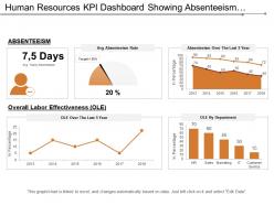
Human resources kpi dashboard showing absenteeism overall labor effectiveness
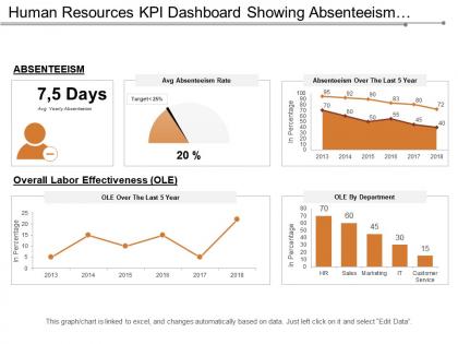




Try Before you Buy Download Free Sample Product
 Impress Your
 Audience
 100%
100% Editable
 Save Hours
 of Time


It is common to be enthralled by our Human Resources Kpi Dashboard Showing Absenteeism Overall Labor Effectiveness. They have that effect on a lot of people.
People who downloaded this PowerPoint presentation also viewed the following :
Human resources kpi dashboard showing absenteeism overall labor effectiveness with all 6 slides:
Give greater leverage to your thoughts. Use our Human Resources Kpi Dashboard Showing Absenteeism Overall Labor Effectiveness as the fulcrum.


FAQs for Human resources kpi dashboard showing absenteeism
Start with your basic absenteeism rate - just divide total absent days by scheduled workdays. Pretty straightforward. Then look at how often people actually call out versus how long they're gone when they do. The Bradford Factor thing is honestly genius even though it sounds corporate-y. It catches people who take lots of random sick days since that screws up scheduling way more than someone being out for surgery or whatever. Break it down by department and seasons too. You'll probably see patterns you didn't expect. Don't lump planned and unplanned absences together - they're completely different animals. Cost tracking helps but start simple and add layers once you know what actually matters to your boss.
Honestly, those absence dashboards are game-changers. You'll spot patterns that would be impossible to catch otherwise - like absences always spiking around flu season or certain Fridays (we've all been there). Break it down by department and you might find some teams are way worse than others. The visual aspect really hits different when you see all the data laid out. Set up monthly reports so trends don't sneak up on you. Also track specific demographics and roles - sometimes there's weird correlations you'd never expect. Way better than trying to make sense of random spreadsheets.
Track the obvious stuff first - sick leave, family emergencies, mental health days. Transportation problems happen more than you'd think. Also watch for that vacation spillover thing where people mysteriously get "sick" right before their time off (we've all seen it). Workplace drama and stress cause tons of absences too. Don't forget seasonal patterns - flu season absolutely wrecks attendance, and parents disappear during back-to-school madness. Break these into separate categories so you can actually see what's driving the problem instead of just generic absence numbers.
You'll catch absenteeism stuff way faster with real-time analytics instead of waiting for those monthly reports nobody reads anyway. Set up alerts when absence rates get wonky - that's the game changer. No more staring at dashboards all day. Sudden spikes? You'll know immediately. Teams having issues? Same thing. It's actually pretty cool how you can jump on problems before they snowball. I'd definitely push for automated notifications that ping you when patterns look off. That way you're not just reporting on what already happened, you're actually fixing things while there's still time.
Start with a line chart - that's your go-to for spotting trends and those annoying seasonal patterns. Heat maps are perfect for seeing which days hit hardest (Mondays are the worst, obviously). Bar charts help you compare different teams or locations. Don't forget KPI cards with the big numbers like overall absence rates. Oh, and maybe average days per person too. Keep it clean so managers aren't drowning in charts when they're just trying to figure out where the problems are. Simple dashboards actually get used.
You basically need industry benchmarks to know if your absence rates are actually bad or not. Like is 4.2% good? Terrible? No clue without comparing it to similar companies. Manufacturing always runs higher than office jobs - makes sense with all the physical stuff and safety risks. Different industries have totally different "normal" ranges too. Honestly, I've seen people freak out over numbers that were perfectly average for their sector. Pull benchmarks from companies your size in your specific industry when you're looking at the data. Otherwise you might be stressing about the wrong thing entirely.
So when people call out sick, it totally messes with your team's productivity - you can actually see this happening in real time on the dashboard. Work gets delayed or dumped on whoever's left, which creates these annoying bottlenecks. The data shows productivity always drops during high-absence periods, plus overtime costs go through the roof. Honestly, the patterns are pretty obvious once you start looking. Short-staffed teams just can't keep up the same pace. You'll want to catch these trends early though, so you can figure out what's causing all the absences before your whole operation takes a hit.
So basically you'd connect your absence data to machine learning tools that spot patterns and predict what's coming. Tableau and Power BI already have this stuff built in - literally just click to enable it. Feed it good data like seasonal trends, employee info, workload, flu seasons, whatever. Then your dashboard shows forecasted absence rates for like 30-90 days ahead. Honestly, I'd start super simple with basic forecasting first. Once you're comfortable with how accurate those predictions are, throw in more variables. The confidence intervals are pretty helpful too - gives you a range instead of just one number.
Go with monthly - trust me on this one. Weekly gets messy with random sick days and people taking long weekends. You'll spot actual trends like flu season hits or when certain departments are struggling. Annual data? Useless for making real decisions. Keep weekly views around though, they're perfect for digging deeper when something looks off in your monthly numbers. Set monthly as your default view. Oh, and quarterly rolling averages help smooth out the bumps so you can see what's actually happening long-term.
Don't just track days missed - that's boring and tells you nothing useful. Figure out what HR actually cares about first. Retention issues? See how absence patterns match up with people who quit. Employee engagement problems? Compare absence trends with survey data. Honestly, most dashboards I see are pretty useless because they exist in a vacuum. Connect your absence stuff to real business metrics like recruitment costs or productivity numbers. Maybe even wellness program ROI if you're running those. Pick your top 2-3 HR priorities, then build KPIs around those instead of random metrics that don't matter.
So first thing - look for your biggest problem department and dig into what's going wrong there. High absences usually mean bad managers or crazy workloads. Seasonal stuff is pretty telling too, like if everyone's calling out sick in January, maybe you need better wellness programs. The employee-level data is gold though - you can spot people struggling before they totally burn out. I'd honestly just pick whatever looks worst on your dashboard and start investigating there first. Oh and check industry benchmarks so you're not freaking out over normal rates.
Honestly, just pull your engagement survey data and absence rates for the same timeframes - seeing them together is wild. Break it down by department or team to catch patterns. Low engagement almost always means more sick days, trust me. Don't get caught up in daily numbers though, look at rolling averages since this stuff builds slowly. Set up alerts when engagement tanks so you can jump on problems early. Way easier than dealing with attendance issues later. The correlation will probably surprise you once you actually see the numbers lined up.
Honestly? Just go with Power BI or Tableau for your absenteeism dashboard. Power BI's probably your best bet - not too expensive but handles all the complex absence tracking you'll need. Google Data Studio works too if money's really tight. They all connect to your HR system pretty easily and pull attendance data automatically. I've watched companies waste months building custom solutions that turn into total headaches later. My old boss did this and we spent more time fixing bugs than analyzing data. Start with their templates, then tweak things once you figure out what your managers actually care about tracking.
Oh man, the data mess is real. HR systems, timekeeping apps, manual spreadsheets - nothing syncs properly and it's honestly infuriating. Plus people code their time off wrong constantly. Is it sick leave? Personal? FMLA? Who knows! Remote work made everything worse too since managers aren't seeing who's actually out. Half the time absences don't even get logged until weeks later. I'd start by figuring out where your data collection is completely broken first - then worry about the pretty dashboard later.
So first thing - ask each department what absence stuff they actually want to track. Manufacturing probably cares about safety-related absences, sales teams need to watch peak season patterns, that kind of thing. Most dashboard tools let you set up different views for different people. HR gets the full picture, but managers only see their own team's data (honestly saves everyone from drowning in irrelevant info). Don't forget to adjust timeframes since some departments have weird seasonal trends. Oh and definitely use those department filters - makes everything way more useful than just one giant overwhelming dashboard.
-
Easily Understandable slides.
-
Illustrative design with editable content. Exceptional value for money. Highly pleased with the product.