

KPI Dashboard For HR Integration Tool Focused On Leave Management




Try Before you Buy Download Free Sample Product
 Impress Your
 Audience
 100%
100% Editable
 Save Hours
 of Time


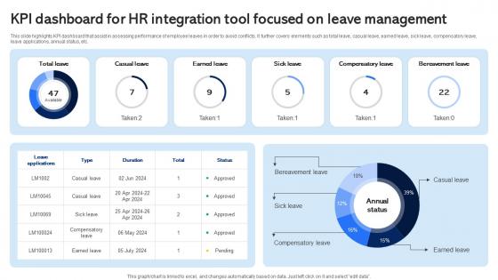
This slide highlights KPI dashboard that assist in assessing performance of employee leaves in order to avoid conflicts. It further covers elements such as total leave, casual leave, earned leave, sick leave, compensatory leave, leave applications, annual status, etc.
People who downloaded this PowerPoint presentation also viewed the following :
KPI Dashboard For HR Integration Tool Focused On Leave Management with all 10 slides:
Use our KPI Dashboard For HR Integration Tool Focused On Leave Management to effectively help you save your valuable time. They are readymade to fit into any presentation structure.









FAQs for KPI Dashboard For HR Integration Tool Focused
Essential components of an effective KPI dashboard include clear metric visualization, real-time data integration, customizable filters, trend analysis capabilities, and actionable alerts. These elements work together by streamlining performance monitoring, enabling quick decision-making, and providing stakeholders with comprehensive insights, with many organizations finding that well-designed dashboards significantly enhance operational efficiency and strategic alignment.
Organizations can tailor KPI dashboards by identifying relevant metrics that directly measure strategic objectives, customizing visualization layouts for stakeholder needs, and integrating data sources across departments like sales, finance, and operations. Through configurable widgets and role-based access controls, companies streamline decision-making processes, enhance performance visibility, and ultimately deliver actionable insights that drive competitive advantage.
Best practices for visualizing data in KPI dashboards include using clear hierarchical layouts, selecting appropriate chart types for each metric, maintaining consistent color schemes, implementing real-time data updates, and ensuring mobile responsiveness. These design principles enhance decision-making by reducing cognitive load, highlighting critical trends, and enabling quick performance assessments, with many organizations finding that well-designed dashboards significantly improve operational efficiency and strategic alignment.
KPI dashboards should be updated based on business needs and data velocity, with real-time updates for operational metrics, daily updates for sales and customer data, and weekly or monthly updates for strategic performance indicators. The frequency depends on decision-making cycles and data availability, with many organizations finding that automated, dynamic dashboards deliver greater accuracy and responsiveness than static reporting methods.
Audience engagement plays a critical role in KPI dashboard design by determining data visualization methods, interface complexity, interactive features, and information hierarchy that resonate with specific user groups. Through user-centric design approaches, organizations enhance decision-making speed, improve data adoption rates, and increase operational efficiency, with many finding that engaged stakeholders ultimately deliver better business outcomes and strategic alignment.
KPIs can be prioritized through strategic placement, visual hierarchy, and stakeholder alignment, focusing on metrics that directly drive business outcomes and decision-making speed. By positioning critical performance indicators prominently, using size and color coding strategically, and grouping related metrics logically, organizations streamline executive review processes, enhance operational visibility, and ultimately deliver faster strategic responses with measurable competitive advantage.
Common pitfalls include overloading dashboards with excessive metrics, selecting vanity metrics over actionable KPIs, poor data visualization choices, lack of real-time updates, and misaligned stakeholder expectations. These issues undermine decision-making effectiveness by creating confusion, reducing focus on strategic objectives, and delivering misleading insights, with many organizations finding that streamlined, purpose-driven dashboards significantly enhance operational clarity and performance tracking.
Real-time data integration enhances KPI dashboard functionality by providing instant visibility into performance metrics, enabling immediate decision-making, and eliminating delays from manual data entry or batch processing. Through continuous data streams, organizations can monitor critical operations, detect anomalies quickly, and respond to changing conditions proactively, ultimately delivering competitive advantage and improved operational efficiency.
**INPUT**: What tools and software are recommended for building KPI dashboards? **OUTPUT**: Recommended KPI dashboard tools include Tableau, Power BI, Google Data Studio, Klipfolio, and Sisense, each offering robust visualization and real-time analytics capabilities. These platforms streamline data integration, automate reporting processes, and enhance decision-making through intuitive interfaces, with many organizations finding that cloud-based solutions deliver greater scalability and faster implementation. **Word count: 54 words**
User feedback improves KPI dashboard effectiveness by identifying missing metrics, clarifying confusing visualizations, and revealing workflow integration gaps. Through regular feedback sessions, organizations streamline dashboard navigation, enhance data relevance, and customize views for different user roles, with many companies finding that user-driven improvements increase dashboard adoption rates and ultimately deliver more actionable business insights.
KPIs serve as direct indicators of business health, measuring progress toward strategic objectives through financial metrics, operational efficiency, customer satisfaction, and growth targets. These measurements enable organizations to identify performance gaps, optimize resource allocation, and make data-driven decisions that ultimately drive revenue growth, cost reduction, and competitive advantage in increasingly complex markets.
KPI dashboards enhance cross-departmental collaboration by providing shared visibility into performance metrics, aligning goals across teams, and facilitating data-driven discussions during meetings. These platforms streamline communication between departments like sales, marketing, and operations, enabling teams to identify interdependencies, coordinate strategies more effectively, and ultimately deliver improved organizational outcomes and accountability.
Customer satisfaction and loyalty KPIs include Net Promoter Score (NPS), Customer Satisfaction Score (CSAT), Customer Effort Score (CES), retention rates, and repeat purchase frequency. These metrics enable organizations to streamline customer experiences by identifying pain points, enhancing service delivery, and optimizing touchpoints, with many retail and financial services companies finding that strategic KPI tracking ultimately delivers improved loyalty and competitive advantage.
Historical data in KPI dashboards enables predictive analysis by identifying trends, seasonal patterns, and performance correlations that forecast future outcomes. Through machine learning algorithms and statistical modeling, organizations can anticipate customer behavior, demand fluctuations, and operational bottlenecks, ultimately delivering proactive decision-making capabilities and competitive advantage in strategic planning.
Financial KPI dashboards should include revenue growth, profit margins, cash flow, accounts receivable turnover, and debt-to-equity ratios. These metrics enable executives to streamline resource allocation, enhance operational efficiency, and accelerate strategic decisions, with many organizations finding that comprehensive financial visibility ultimately delivers competitive advantage and improved stakeholder confidence.
-
“I really like the convenient operation and professionalism I saw on the SlideTeam website. I want to express my regards and appreciation to the team.”
-
Their designing team is so expert in making tailored templates. They craft the exact thing I have in my mind…..really happy.