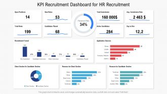
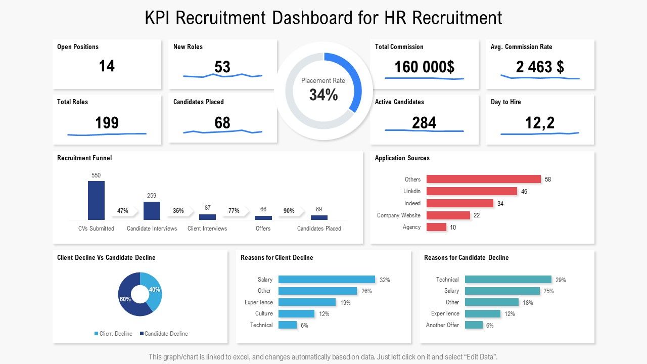
Kpi recruitment dashboard for hr recruitment
Try Before you Buy Download Free Sample Product
Audience
Editable
of Time
Our KPI Recruitment Dashboard For HR Recruitment are topically designed to provide an attractive backdrop to any subject. Use them to look like a presentation pro.
People who downloaded this PowerPoint presentation also viewed the following :
Kpi recruitment dashboard for hr recruitment with all 2 slides:
Use our KPI Recruitment Dashboard For HR Recruitment to effectively help you save your valuable time. They are readymade to fit into any presentation structure.
FAQs for Kpi recruitment dashboard
So I'd focus on four main ones: time-to-fill, cost-per-hire, quality of hire, and source effectiveness. Time-to-fill shows how fast you're closing positions. Cost-per-hire keeps your budget in check. Quality of hire is harder to nail down but honestly the most important - look at performance reviews and whether people stick around after 90 days and a year. Source effectiveness tells you which job boards or referral programs are actually worth your money. Oh, and maybe throw in offer acceptance rate too if you're getting a lot of rejections. Start with those and you'll have a solid picture of what's working.
Honestly, recruitment dashboards are pretty clutch. You get this bird's-eye view of your whole hiring pipeline instead of drowning in random spreadsheets. See exactly where candidates get stuck - maybe they're waiting forever after interviews or whatever. Plus you can finally figure out which job boards actually work vs the ones that just waste your budget (looking at you, expensive premium sites). Track your biggest headaches first - like time-to-hire or application drop-off rates. Don't go overboard initially. Once you've got those dialed in, you can add more metrics.
Honestly, data viz is a game-changer for recruitment metrics. Instead of staring at endless spreadsheet rows, you get clean charts that actually tell a story. Bar graphs showing time-to-hire trends? Way better than raw numbers. Heat maps highlighting where candidates drop off? Chef's kiss. Your stakeholders will thank you too - nobody wants to decode 50 rows of hiring data when a simple dashboard does the heavy lifting. I'd start basic with bar charts and work up from there. Makes spotting bottlenecks so much easier, and you'll look like you know what you're doing in meetings.
Okay so for recruitment dashboards - Tableau and Power BI are your best bet if you want the fancy analytics stuff and can hook into your ATS. Google Data Studio's free which is nice, especially if you're already using Google for everything. Excel might sound basic but honestly? A good Excel dashboard can be pretty solid when you're starting out. BambooHR and Workday have their own reporting built in too, which could save you some headaches. Oh and definitely figure out what metrics you actually need first - I made that mistake once and built way too much stuff I never used. Then just go with whatever connects easiest to your current system.
Honestly, real-time analytics changed everything for me. Instead of waiting weeks to figure out what bombed, you're catching problems while you can actually fix them. Like if Indeed isn't bringing in decent candidates or people are dropping off after phone screens - you'll know immediately. Way better than the old spray-and-pray method we all used to do (guilty as charged). Set up alerts for your main metrics so you're not obsessively refreshing dashboards every hour. Trust me, you'll spot bottlenecks and timing issues before they wreck your whole hiring process.
Track your source-to-hire ratios first - that's the big one. Also look at time-to-fill and cost breakdowns by source. Honestly, most people skip the progression rates but they're super telling - like how many LinkedIn candidates actually make it past round two vs. referrals? Diversity sourcing is critical too, so see where your underrepresented talent is coming from. Oh, and don't sleep on application-to-interview conversion rates. Start with these basics and you'll spot patterns pretty quickly. You can always get fancy with the data later once you've got the foundation down.
So time-to-hire is basically counting days from posting a job to when someone accepts your offer. Add up all those days across your hires and get the average - pretty straightforward math. Why care? Well, slow hiring kills you in multiple ways. Good candidates get snatched up by faster companies, empty seats tank your team's productivity, and recruitment costs just keep piling up. I'd check this metric weekly honestly. Compare your numbers to industry benchmarks too. When your average starts climbing, that's your cue to figure out where things are getting stuck in your process.
Set up metrics at different stages of your funnel - that's where the magic happens. Which job boards actually bring good hires? Track that. Interview-to-offer ratios matter too. Honestly, hiring manager satisfaction scores are gold because they'll tell you fast if your screening sucks. Also watch offer acceptance rates and 90-day retention by source. The real trick is seeing which candidates actually succeed in the role, not just who nails the interview. Time-to-productivity is huge for this. Start with maybe 3-4 metrics though - don't go crazy with data right away.
Track demographics at each stage - applications, interviews, hires. Gender and ethnicity breakdowns are good starting points, though honestly you can go overboard with categories pretty fast. Most dashboard tools make percentage charts super easy to set up. The real insight comes from comparing your pipeline diversity to actual hire rates. That's where you'll see if you're losing diverse candidates somewhere in the process. I'd definitely set up alerts when numbers drop below your targets - way easier to fix issues early than scramble later. Start simple, then build from there.
Pull your last 12-18 months of data first - time-to-fill, cost-per-hire, offer acceptance rates. That's your real baseline, not some fancy industry report. Set quarterly targets that actually make sense, like cutting time-to-fill by 5-10% each quarter. Here's the thing though - you gotta break it down by role type. Hiring a senior engineer isn't the same as hiring someone for customer service, obviously. Your historical data beats industry benchmarks every time since it reflects your actual company. Start there and work up gradually. Trust me, realistic goals won't make your team want to quit.
So picture this - your whole team finally sees the exact same info at the same time. No more "wait, where is that candidate again?" confusion. Everyone knows who's doing what next, which roles are actually moving, and where things are getting stuck. Honestly, it cuts down on so much back-and-forth nonsense. Your meetings get way better too since you're not spending half the time just figuring out what's even happening. Oh, and make sure people actually use it daily - otherwise you're back to square one with everyone working off different info.
Start with big, bold numbers for your main metrics - that's what catches the eye first. Group similar KPIs together so it actually makes sense. Stick with green for good stuff, red for problems, you know the drill. Don't cram everything onto one screen though, it'll look like a hot mess. Charts can be cool but honestly? Sometimes just showing the number with some context beats a fancy graph. Put your critical stuff like time-to-hire right up front. Oh, and definitely test it with your team - I've seen dashboards that seemed brilliant until actual users got confused within seconds.
So cost-per-hire basically shows you where your money's actually going. Like if executive recruiters are costing you $5k per hire but employee referrals are only $500, that's a no-brainer about where to double down. Track it monthly and you'll start seeing which channels are just burning cash. I was shocked when I first ran these numbers - some "premium" sources were complete money pits. You can gradually move budget from the expensive duds to whatever's working. Just compare across different roles since a senior dev hire obviously costs more than entry-level. The patterns become pretty obvious once you're watching the data.
Drop-off rates basically tell you where candidates are bailing on your process. Maybe your phone screens drag on forever, or there's some awkward two-week gap between rounds that kills the vibe. People dropping after salary talks? Yeah, you're probably lowballing them. I've noticed some recruiters just have this magic touch - their candidates stick around way more than others. The trick is checking these numbers weekly instead of waiting until you've lost half your candidate pool. Oh, and if one specific interview stage consistently tanks people, that's your red flag right there.
Honestly? Monthly check-ins work way better than quarterly for recruitment stuff - hiring moves too fast otherwise. I'd set a calendar reminder or you'll totally forget (learned that the hard way). Your KPIs need to actually match what's happening now. Like if you're suddenly all about remote hires or diversity goals, those old metrics are useless. Watch out for ones that are either impossible to hit or way too easy - both are red flags. Don't get attached to KPIs just because they've been around forever. Business changes, so your dashboards should too.
-
Helpful product design for delivering presentation.