

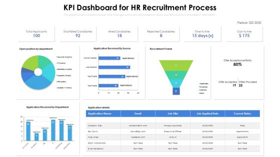
Kpi dashboard for hr recruitment process





Try Before you Buy Download Free Sample Product
 Impress Your
 Audience
 100%
100% Editable
 Save Hours
 of Time


Our KPI Dashboard For HR Recruitment Process are topically designed to provide an attractive backdrop to any subject. Use them to look like a presentation pro.
People who downloaded this PowerPoint presentation also viewed the following :
Kpi dashboard for hr recruitment process with all 2 slides:
Use our KPI Dashboard For HR Recruitment Process to effectively help you save your valuable time. They are readymade to fit into any presentation structure.

FAQs for Kpi dashboard for
Stick to like 5-7 KPIs tops - revenue stuff, how you're getting and keeping customers, operational efficiency, cash flow. More than that and people just ignore your dashboard completely (learned this the hard way). Mix leading indicators with lagging ones so you're not just looking backwards all the time. Each metric needs actual targets and gets updated often enough to matter for decisions. Really depends on your industry obviously, but here's what I always tell people: what 3 numbers would you check every morning to know if you're crushing it or not? Start there and build out.
Smart color coding and clean layouts make KPI dashboards so much easier to read. Use the same colors for similar stuff, and make your most important metrics bigger or stick them where people look first. Trust me, cluttered dashboards are the worst - nobody has time to hunt for numbers. Group related things together with plenty of white space between sections. Short sentences help too. The whole point is spotting trends quickly without squinting at your screen. Oh, and definitely test it with someone else first - if they can't find the key info in like 10 seconds, you'll need to rework it.
Don't cram everything onto one screen - I learned this the hard way! Pick 5-7 metrics that actually matter, not just ones that look pretty in meetings. Honestly, vanity metrics are the worst because they're impressive but useless for decisions. Give your important KPIs visual weight so they pop. Also, automate that data refresh unless you enjoy clicking buttons all day. Here's the thing: every metric should make someone go "okay, now I need to do X." If people stare at your dashboard confused, you've overcomplicated it. Start simple, then add more later.
Daily updates work for most dashboards, but it depends what you're tracking. Fast stuff like web traffic or sales? Yeah, you'll want hourly or real-time. Strategic metrics like customer satisfaction can wait for weekly updates though. I've watched teams go crazy trying to make everything real-time when honestly, daily would've been fine. Total overkill. Match your refresh rate to how fast you actually need to respond to changes. Start daily and see how your team uses it - you can always tweak from there.
Honestly, just connect each KPI straight to your actual business goals first. Can't make that connection? Toss it. I've watched so many teams get obsessed with metrics that look impressive but don't really matter. You want the stuff that predicts what's coming, not just reports on what already went down. Seriously though - stick to maybe 5-7 KPIs tops or people's eyes will glaze over. Here's my test: if this number changes tomorrow, would we actually do something different? No? Then why track it. Keep it dead simple.
Honestly, just think about what each person actually needs to make decisions. Executives want the big picture stuff - revenue, customer satisfaction, whether strategic goals are hitting. They don't need to dig into details. Middle managers? Give them departmental metrics they can actually control. Frontline supervisors need real-time data about their specific teams. I always start by asking what decisions people make every day, then build dashboards around that. It's kinda like - you wouldn't give a CEO the same view as someone managing a production line, right?
Honestly, start with Looker Studio since it's free and pretty straightforward. Tableau and Power BI are amazing but they'll make your head spin at first - save those for later. Google Sheets actually works great for basic stuff too, which sounds dumb but I've seen some impressive dashboards built that way. Excel's gotten way better recently with all their new chart options. Klipfolio's another decent middle-ground option if you don't mind paying a bit. My suggestion? Play around with Looker Studio first, figure out what you actually need, then upgrade to the fancy stuff once you know your metrics inside and out.
Honestly, start with automated validation rules - they'll save your ass later. I do monthly audits where I compare dashboard numbers back to the original sources, plus checksums catch weird errors. Definitely limit who can mess with the data inputs because too many people editing = chaos. Oh and set alerts for anything outside normal ranges. The documentation thing is boring but super helpful - anyone should be able to trace where your numbers came from. Build this stuff in from the beginning though, don't try adding it after things break.
Honestly, you can't build a useful KPI dashboard without constantly asking users what they think. I learned this the hard way - spent weeks on visualizations nobody even looked at! Quick surveys work great, or just grab people for 15-minute chats. They'll tell you which metrics are pointless, what's confusing, and how they actually use the data day-to-day. Sometimes they mention workflow stuff you'd never consider. Set up quarterly check-ins so your dashboard doesn't become one of those tools everyone ignores.
Your KPI dashboard needs to tell a story, not just dump numbers everywhere. Start with the setup - market conditions, whatever context matters. Then show what you actually did about it - launched campaigns, rolled out features, etc. End with the results - revenue bumps, conversions, all that good stuff. It's basically like explaining your quarter to someone at happy hour. You wouldn't randomly throw out metrics, you'd connect what caused what. Add little notes when big things happened and group similar stuff together. Way more interesting than a random pile of charts, trust me.
Mix quantitative stuff with behavioral metrics that actually make sense for each role. Goals completed, deadlines met, quality scores - the usual suspects. But don't go crazy with numbers or everyone just zones out. Engagement stuff matters too: training completion, peer feedback, attendance patterns. Growth metrics like skill development and internal mobility are solid indicators. Honestly, role-specific dashboards beat generic ones every time. Start with maybe 4-6 core metrics per employee type, then tweak based on what actually sparks meaningful conversations with your managers. That's where the real insights happen.
Honestly, KPI dashboards are game-changers for breaking down those annoying department walls. Marketing suddenly sees how their leads actually convert for sales. Operations can watch their improvements boost customer happiness scores in real-time. It's wild how much better teams work together when they're not playing completely different games, you know? You'll spot problems way faster this way. Plus cross-team meetings become way less awkward when you've got actual data to talk about instead of just guessing. Oh, and definitely do regular dashboard check-ins with multiple teams - keeps everyone engaged and not just ignoring the thing after week one.
Honestly, having your KPI dashboard on mobile is a game changer. You can catch problems during your morning coffee instead of waiting to get to the office. I'm always checking mine when I'm stuck in traffic anyway - might as well be productive, right? The best part is responding to alerts instantly rather than discovering issues hours later. Quick decision-making becomes way easier. Set up push notifications for your key metrics though, trust me on this one. Being tied to your desk just to see performance data feels so 2015.
Add forecasting widgets to your dashboard - they pull from your historical KPI data to show future trends. Tools like Tableau and Power BI make this pretty straightforward now (thank god, because it used to be a nightmare). Focus on KPIs where you've got solid historical data first. Sales revenue, customer churn, inventory - that kind of stuff works great. Display the predictions right next to your current numbers so you can catch problems early. I'd start with maybe two critical KPIs, see how it goes, then add more once you're convinced it's actually helping.
You can catch problems before they blow up into disasters when you're watching your data live. Bottlenecks? You'll see them coming. Which processes are slow? Right there on screen. I honestly think the best part is everyone stays on the same page - no more confusion about which numbers we're looking at. Trends pop up that help you pivot quickly instead of wondering what went wrong last Tuesday. Set alerts for the stuff that matters most so you don't have to babysit the dashboard all day. Way better than finding out about issues after they've already cost you time and headaches.
-
Very unique, user-friendly presentation interface.
-
Design layout is very impressive.