


Staff Turnover Key Performance Indicators Dashboard Snapshot


Try Before you Buy Download Free Sample Product
 Impress Your
 Audience
Editable
of Time


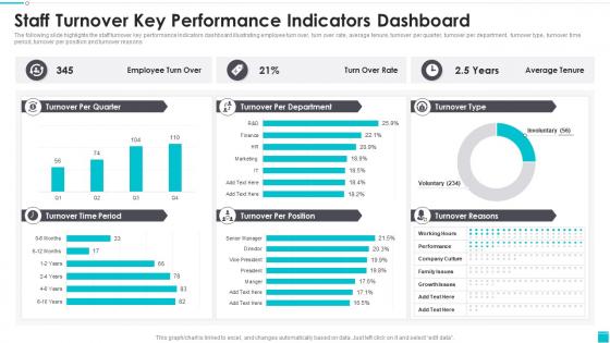
The following slide highlights the staff turnover key performance Indicators dashboard illustrating employee turn over, turn over rate, average tenure, turnover per quarter, turnover per department, turnover type, turnover time period, turnover per position and turnover reasons
People who downloaded this PowerPoint presentation also viewed the following :
Staff Turnover Key Performance Indicators Dashboard Snapshot with all 7 slides:
Use our Staff Turnover Key Performance Indicators Dashboard Snapshot to effectively help you save your valuable time. They are readymade to fit into any presentation structure.


FAQs for Staff Turnover Key Performance
Definitely track your turnover rate, but slice it up by department and voluntary vs involuntary - that's where the real insights are. Time-to-fill for positions is huge too. Exit interview scores can tell you a lot, though honestly half the time people won't be totally honest anyway. Retention rates by manager? Super revealing. Some managers just hemorrhage people. Cost-per-hire and employee satisfaction help you catch problems early. I'd also look at headcount changes over time so you're not missing the bigger trends. Start with these basics and build from there based on what weird patterns pop up.
Honestly, looking at charts beats scrolling through endless spreadsheet rows any day. You'll catch patterns immediately - maybe HR is losing people left and right, or there's some weird summer exodus happening. Heat maps are clutch for pinpointing which managers or departments have the worst retention. Plus you can quickly compare turnover across different teams or time periods without going cross-eyed. The biggest win though? Leadership actually pays attention when you show them a clean visual instead of dumping raw numbers on them. Makes getting approval for retention fixes way easier.
Look, compensation and bad managers are your biggest culprits - those two alone probably drive like 60% of exits. Career advancement issues and work-life balance problems round out the top four. Oh, and remote flexibility is massive now. People bounce fast if onboarding sucks too. Here's what I'd do: create exit interview buckets for each cause, then watch which ones jump month to month. Maybe I'm overthinking it, but tracking the patterns lets you actually tackle root issues instead of just hemorrhaging talent. Culture mismatches and unclear job roles matter too, especially for newer hires who bail within six months.
So you'll want to add department and role filters to your dashboard - most BI tools have dropdown menus for this stuff. Create separate calculated fields for each department's turnover percentage. Heat maps are honestly the best way to visualize this because problem spots jump out immediately. I'd start with your biggest departments first, then dig into specific roles within those teams. Side-by-side comparisons work great too. Role-based analysis will show you if certain positions always have higher churn - that's usually where the real insights are hiding.
You'll need at least 12-18 months of data to see real patterns. Go with quarterly breakdowns - they're way better than monthly because monthly is just too all over the place. I made that mistake once and freaked out over what turned out to be nothing lol. Annual reviews miss stuff that happens mid-year though. Set up rolling 12-month averages on your dashboard. That'll help you catch actual trends instead of random spikes. Plus you can fix problems before they blow up into bigger headaches.
Dude, exit surveys are honestly your best friend for figuring out turnover issues. They tell you WHY people are actually leaving - not just the numbers. Track the patterns you're seeing: bad managers, no growth, crappy pay, whatever keeps coming up. Then you can build KPIs around those problem areas. I'd set up alerts too so when complaints about specific stuff start spiking, you catch it early. Oh and don't forget to check satisfaction scores regularly - they're like your early warning system before people actually quit. Seriously though, skipping exit surveys is just leaving money on the table.
Start with the departments bleeding people the fastest - that's your low-hanging fruit. Check if there's a pattern, like everyone bailing after 6 months or during crazy busy periods. Specific managers might be the problem too. Once you spot the trends, hit them with targeted fixes: better onboarding, pay bumps for risky roles, manager training. The dashboard probably shows what everyone already knew but leadership ignored (classic). Use those hard numbers to pitch focused retention programs instead of some boring company-wide thing that helps nobody.
Honestly, date range filters are your best friend here. Set up custom ranges around whatever events you're tracking, then compare turnover rates before/during/after. The drill-down stuff is clutch - you can break it down by department, role, demographics, whatever. I'm obsessed with the trend visualization because it literally shows you everything at a glance. No guessing needed. You'll want to overlay external factors too - market shifts, layoffs, new leadership, all that mess. Look for weird spikes first. Those usually tell the whole story.
Honestly, turnover rates are all over the place depending on your industry. Tech and hospitality usually hit 20-30% per year. Healthcare sits around 15-25%. Manufacturing's typically lower at 10-15%. Retail though? That's rough - often over 50% because of all the seasonal hiring and entry-level churn. Don't compare against general averages - that's pretty useless. A 20% rate could be amazing for restaurants but awful for an accounting firm. I'd grab current data from SHRM or BLS for your specific industry, then set your alerts to trigger when you're running 5-10% above that benchmark. Way more actionable that way.
Monthly updates work best, trust me on this. Weekly is way too much - turnover patterns don't change that fast, and your HR team will hate you for the constant data pulls. Plus it's just busywork at that point. Monthly gives you enough info to catch trends and seasonal stuff without driving everyone crazy. Oh, but if you're doing some big restructuring or hiring like crazy, maybe switch to every two weeks for a bit. And seriously, set up automated feeds if you can - makes it so much easier than manually pulling numbers every single time.
Look at your past turnover data and break it down by seasons, departments, stuff like that. I've found even basic trend lines work pretty well if you've got 2-3 years of decent data. Don't just look at company-wide numbers though - that's way too broad. Figure out what's actually driving people to leave historically. Maybe it's certain managers, pay issues, or people hitting their 18-month mark and bouncing. Then track those specific things going forward. Moving averages help too, but honestly you don't need to get super fancy with the math to spot useful patterns.
Honestly, engaged employees are way less likely to bail - like 87% less likely. I'd start with quick pulse surveys about job satisfaction and how people feel about their managers. Track those scores next to your turnover numbers because they basically mirror each other. Participation in company stuff matters too, plus internal promotions and what people say in exit interviews. The trick is doing this monthly or quarterly so you catch problems early. I mean, nobody wants to scramble after half your team already decided to leave, right?
So first thing - figure out your biggest 3-5 turnover headaches, then build everything around those. Most platforms let you drag and drop KPI widgets around, which is honestly pretty satisfying. You can filter by departments, locations, whatever makes sense for your setup. Timeframes are adjustable too - some teams love weekly snapshots, others prefer quarterly deep dives. Custom benchmarks work great if you've got industry standards to compare against. I've seen companies track the weirdest metrics like "regrettable vs non-regrettable" turnover, but hey, if it helps. Set up automated alerts so leadership doesn't have to hunt for problems.
Look, turnover dashboards are pretty limited tbh. They show you the "what" but totally miss the "why." Sure, you'll spot trends - maybe Q4 always sucks or marketing keeps bleeding people. But that's it. The data won't tell you if people are fleeing bad managers or just getting poached by competitors. It's like knowing someone has a fever without understanding what's making them sick. You really need exit interviews and those team pulse surveys to fill in the gaps. Otherwise you're just staring at numbers that don't actually help you fix anything.
Honestly, start by getting everyone on the same page about what you're actually measuring. Like, do contractors count as staff? What's the difference between someone quitting vs getting fired? HR data is usually a hot mess. Cross-check everything with payroll - you'll catch so many weird discrepancies that way. Train your managers to document stuff properly and create standard exit processes. I learned this the hard way, but solid data rules upfront save you from looking stupid in front of leadership later. Oh, and audit your sources regularly because things drift over time.
-
The website is jam-packed with fantastic and creative templates for a variety of business concepts. They are easy to use and customize.
-
I am a big fan of their newsletters because that is how I found my perfect requirement at the time of urgency. Thank God, I kept opening those.