


Employee turnover dashboard for your hr department powerpoint template




Try Before you Buy Download Free Sample Product
 Impress Your
 Audience
 100%
100% Editable
 Save Hours
 of Time


Our Employee Turnover Dashboard For Your HR Department Powerpoint Template are topically designed to provide an attractive backdrop to any subject. Use them to look like a presentation pro.
People who downloaded this PowerPoint presentation also viewed the following :
Content of this Powerpoint Presentation
Description:
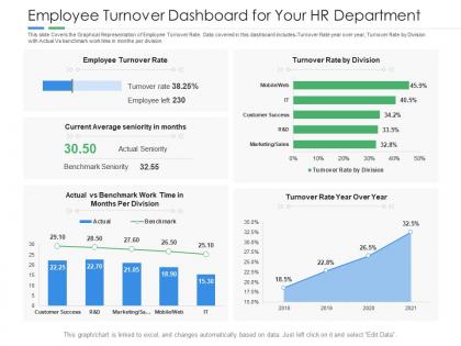
The image is a PowerPoint slide titled "Employee Turnover Dashboard for Your HR Department," depicting various metrics relevant to HR management. The slide is segmented into four sections, each providing different data visualizations:
1. Employee Turnover Rate:
A horizontal bar chart showing a high turnover rate of 38.25%, with a total of 230 employees having left.
2. Turnover Rate by Division:
A bar graph compares the turnover rates across different divisions such as Mobile/Web, IT, Customer Success, R&D, and Marketing/Sales, with Mobile/Web showing the highest turnover rate.
3. Current Average Seniority in Months:
A comparison between the actual average seniority of 30.50 months and a benchmark seniority of 32.55 months.
4. Actual vs Benchmark Work Time in Months Per Division:
A line chart with markers showing the actual versus benchmark work time across divisions.
5. Turnover Rate Year Over Year:
A line graph displaying an increasing trend in turnover rate from 2018 to 2021, reaching 32.5% in the last year.
Use Cases:
This HR dashboard slide can be utilized across various industries for monitoring and discussing employee retention strategies:
1. Technology:
Use: Tracking turnover trends to improve retention.
Presenter: HR Analytics Manager.
Audience: HR team, Department Heads.
2. Healthcare:
Use: Analyzing staff turnover to ensure consistent patient care.
Presenter: HR Director.
Audience: Hospital Administrators, Department Managers.
3. Finance:
Use: Assessing the impact of turnover on operational efficiency.
Presenter: Chief Financial Officer.
Audience: Finance team, HR specialists.
4. Retail:
Use: Understanding turnover to manage staffing across stores.
Presenter: Retail HR Manager.
Audience: Store Managers, Regional Directors.
5. Education:
Use: Reviewing faculty and staff turnover for institutional planning.
Presenter: Dean of Faculty.
Audience: Educational Administrators, HR team.
6. Manufacturing:
Use: Addressing turnover to ensure production line stability.
Presenter: Plant HR Coordinator.
Audience: Production Managers, Team Leaders.
7. Hospitality:
Use: Examining turnover rates to maintain service quality.
Presenter: Chief of Staff.
Audience: Hotel Managers, Service Staff.
Employee turnover dashboard for your hr department powerpoint template with all 2 slides:
Use our Employee Turnover Dashboard For Your HR Department Powerpoint Template to effectively help you save your valuable time. They are readymade to fit into any presentation structure.
FAQs for Employee turnover dashboard for your hr
Start with your overall turnover rate and split between voluntary vs involuntary exits. Department breakdowns are huge - you'll spot problem areas fast. I'd throw in time-to-fill for open roles and definitely track how long people stay before bailing. Exit interview themes help too, though honestly half the time people won't tell you the real reason anyway. Cost per hire matters since replacing folks gets pricey. Manager-specific retention rates are gold - bad bosses stick out like crazy when you see the data. Build these basics first, then add fancier predictive stuff later once everything's working smoothly.
Honestly, charts and graphs are game-changers for spotting turnover issues. Spreadsheets? They're just rows of numbers that'll put you to sleep. But when you can see seasonal spikes on a line chart or use heat maps to pinpoint which teams are hemorrhaging people - that's when it clicks. Bar charts help you compare departments side by side too. I swear it's like suddenly being able to see what's actually happening instead of just guessing. Oh, and definitely set up those automated dashboards so you're not playing catch-up months later wondering why half your marketing team quit.
Your HRIS is gonna be your main data source - that's where all the employee records and hire/termination dates live. Payroll systems are super helpful too, especially when your HRIS data is a mess (which honestly happens way more than it should). Exit interviews and performance management stuff will give you the why behind the numbers, not just the what. Oh, and survey platforms are clutch for catching turnover risks before people actually leave. The biggest thing though? Make sure your headcounts match across systems. I've seen so many dashboards crash and burn because of conflicting data. Just start with whatever systems you can actually access and grow from there.
So instead of just seeing "Sarah from Marketing quit last month," you'd get heads-up alerts like "3 people in Engineering might bail soon based on their engagement scores." Way better than always playing catch-up, honestly. The algorithms catch weird patterns we'd probably miss - like people skipping training or seeming less collaborative. Then you can actually do something about it before they're already out the door. Maybe have those retention conversations or tweak some policies. It's pretty wild how it shifts everything from reactive to proactive mode.
So basically, benchmarking shows you how your turnover stacks up against other companies or even your own departments. Without it, you're just guessing - like, is 15% good or awful? Depends totally on your industry. The visual comparisons are actually pretty helpful for spotting when you're way off. Plus you can see if you're getting better or worse over time compared to those benchmarks. Oh, and it's great for getting budget approval - nothing like solid data to back up why you need money for retention stuff. Way better than just saying "trust me, we need this."
Use the filters to dig into different segments and find patterns - check turnover by department, tenure, manager, hire date to see where issues are clustering. Honestly, integrating exit interview data is huge because it shows you the "why" behind the numbers. Cross-reference those high turnover spots with engagement scores, promotion rates, and comp data for the full picture. I'd start with your riskiest departments first, then trace back through their employee lifecycle stuff to figure out exactly where things fall apart. Works way better than just staring at overall turnover rates.
Put your key stuff right at the top - turnover rates, department breakdowns, whatever matters most. Don't make people hunt for it. I made this mistake once and created what basically looked like a data vomit situation lol. Color coding helps but keep it simple - red bad, green good. Your filters shouldn't confuse anyone, and definitely include time comparisons so people can actually see what's trending. Short sentences work better than cramming everything together. Test it with real users first though - they'll spot the weird stuff you got used to looking at.
Honestly, I'd go with monthly updates. Weekly feels like way too much - you'll just stress yourself out over normal fluctuations. Quarterly though? That's too slow, you'll miss important trends. Monthly hits that sweet spot where you can actually see patterns without drowning in data noise. I mean, people quit randomly all the time, but the real trends show up over weeks, not days. If things get weird - like layoffs or you're hiring like crazy - maybe switch to every two weeks temporarily. Just be consistent with whatever you pick so you can actually compare months meaningfully.
Honestly, less is more here. Start with maybe 5-7 solid metrics and call it a day - voluntary vs involuntary turnover, department splits, tenure stuff. Clean data is huge too (learned that the hard way). Skip the flashy vanity metrics that executives love but don't actually help anyone. The real gold mine? Breaking it down by manager or team. That's where you'll find the patterns that matter. I'd get stakeholders using the basics first before you go crazy adding more dashboards they'll never look at.
Honestly, the tenure breakdown is where you'll find the juiciest insights - like whether people are bailing during their first few months vs. after they've settled in. Break your data down by department, job level, manager, location, maybe even where you hired them from. I usually do chunks like 0-6 months, 6-18 months, that kind of thing. You can get fancy and cross-segment too - turnover by department AND how long they'd been there. Start with whatever's keeping you up at night, then add layers. The whole point is spotting which groups have weirdly high rates so you can actually fix something.
Honestly, your dashboard is gold for figuring out where to actually focus your retention stuff. Check which departments are bleeding people and when - like, everyone always quits around 6 months or 2 years, it's wild. Exit interview patterns tell you tons too. Best part? You can actually see if what you're doing works instead of just hoping. Say engineering keeps losing people at 18 months - maybe they need better career growth or pay bumps. I'd just pick your worst problem area first and build one solid program around that instead of trying to fix everything at once.
Bar charts with trend lines are your best bet here - execs eat that stuff up when they can see the dollar impact right away. Break it down by department using stacked bars, then add a running total line for cumulative costs. Heat maps are perfect for spotting which departments are hemorrhaging money the worst. Don't forget indirect costs like lost productivity alongside the obvious recruiting/training expenses. Monthly views work well, but honestly? Quarter breakdowns give you way better insight for analysis. Oh, and definitely highlight those big total cost numbers - leadership loves seeing what turnover actually costs them.
Honestly, just grab your engagement data straight from whatever platform you're using - Glint, Culture Amp, whatever. Then match it up with turnover numbers by department or quarter. I'd set up a dashboard showing both metrics together because the patterns are usually pretty obvious once you see them visually. Like engagement tanks in Q2, then boom - people start bailing in Q3. Most of these tools have decent APIs so you can automate the whole thing instead of doing manual exports every month (trust me, that gets old fast). Oh, and definitely set alerts when scores drop below your baseline - way easier to fix things before people actually quit.
I'd go with Power BI if you're already using Microsoft stuff - connects super easily to Excel and most HR systems. Tableau's solid but gets expensive fast, which is annoying. For something cheaper, Google Data Studio actually works pretty well for basic turnover stuff. Python with Plotly/Dash is cool if you want to get fancy, but honestly that might be overkill depending on your team. The main thing is making sure it can automatically pull from your HRIS so you're not manually updating spreadsheets forever. Start with basic exit rates and see what people actually use.
Stop just throwing numbers at people - they'll glaze over instantly. Break your turnover report into actual stories: "Here's What's Happening" for trends, then dig into the real reasons why people are bailing. I always add little notes explaining weird spikes or calling out which departments are in trouble. Show them the dollar impact too, because executives love that stuff. Oh, and don't forget to translate everything into "here's exactly what we need to do next" - otherwise you'll get blank stares and crickets in the meeting.
-
Great quality product.
-
Very unique, user-friendly presentation interface.
-
Excellent template with unique design.
-
Much better than the original! Thanks for the quick turnaround.
-
The content is very helpful from business point of view.