

Multiple project management dashboard with risks and issues status




Try Before you Buy Download Free Sample Product
 Impress Your
 Audience
 100%
100% Editable
 Save Hours
 of Time


Our Multiple Project Management Dashboard With Risks And Issues Status are topically designed to provide an attractive backdrop to any subject. Use them to look like a presentation pro.
People who downloaded this PowerPoint presentation also viewed the following :
Content of this Powerpoint Presentation
Description:
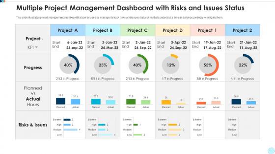
The image displays a Multiple Project Management Dashboard with a focus on tracking the status of various projects along with associated risks and issues.
1. Start and End Dates:
Each project column lists the start and end dates, providing a timeframe for the project's duration.
2. Progress:
A progress bar or gauge for each project indicates the percentage completed. For instance, Project A is 40% complete, while Project 1 is 55% complete.
3. Planned vs. Actual Hours:
Bar graphs compare the planned hours against the actual hours spent on the projects, giving insights into time management and efficiency. For example, Project A planned for 30.5 hours but actually spent 25.1 hours.
4. Risks & Issues:
A color-coded tally of risks and issues, categorized by severity (Extreme, High, Medium, Low), allows project managers to quickly assess the risk profile of each project.
Use Cases:
Project management dashboards are invaluable across sectors for overseeing multiple initiatives, ensuring they stay aligned with goals, timelines, and budgets.
1. Software Development:
Use: Tracking multiple software project developments.
Presenter: Lead Software Developer.
Audience: Development Team, Stakeholders.
2. Construction:
Use: Monitoring various construction project phases.
Presenter: Construction Project Manager.
Audience: Contractors, Investors, Clients.
3. Healthcare:
Use: Overseeing multiple healthcare systems implementations.
Presenter: Healthcare Systems Manager.
Audience: Hospital Administration, IT Staff.
4. Education:
Use: Managing educational program rollouts and updates.
Presenter: Academic Projects Coordinator.
Audience: Educational Leadership, Faculty.
5. Marketing:
Use: Tracking multiple marketing campaigns and launches.
Presenter: Marketing Director.
Audience: Marketing Team, Sales Division.
6. Manufacturing:
Use: Overseeing production line upgrades and new installations.
Presenter: Plant Manager.
Audience: Engineers, Production Teams.
7. Government:
Use: Managing community development projects.
Presenter: Public Works Administrator.
Audience: Government Officials, Public Stakeholders.
Multiple project management dashboard with risks and issues status with all 10 slides:
Use our Multiple Project Management Dashboard With Risks And Issues Status to effectively help you save your valuable time. They are readymade to fit into any presentation structure.








FAQs for Multiple project management dashboard with risks
Honestly, start with the obvious stuff - timeline, budget tracking, and where your resources are going. Risk status is huge too. I'd also throw in team workload because burnout kills projects faster than anything else. Charts beat paragraphs every time, trust me. Color coding makes everything way easier to scan quickly. Track completion percentages for your big deliverables and flag any blockers that need fixing ASAP. Here's the thing though - pay attention to what people actually ask about in your meetings. Those questions should become dashboard items. No point tracking metrics nobody cares about.
Honestly, project dashboards are game changers - no more awkward "uh, where are we on that?" conversations in meetings. Your whole team can see who's doing what and when stuff's due. Real-time updates mean everyone's looking at the same info, which cuts down on so much miscommunication. You'll spot problems before they blow up too. Way better than those endless email threads we all hate. Oh, and set up notifications for big milestones so people actually know what's happening without you having to bug them constantly.
Honestly, Monday.com and Asana are your best bets if you want something that just works without much setup. Power BI's amazing for data viz but probably way too much unless you're dealing with tons of complex reporting. Trello's solid for basic stuff - their Butler automation is actually pretty slick. Notion's everywhere now and super flexible, though I find it can get messy fast if you're not organized. Oh, and if you're already deep in Microsoft land, definitely go Power BI since it'll sync with everything seamlessly. Just pick whatever won't make your current workflow a nightmare.
Honestly, data visualization is a game changer for project management. You know how you're always drowning in spreadsheets trying to figure out if everything's on track? Charts and dashboards cut through that noise instantly. Burndown charts show you exactly where bottlenecks are happening. Timeline views make it obvious when resources are getting stretched too thin. Plus stakeholders actually understand what you're showing them instead of glazing over at another Excel dump. I started with simple stuff and it completely changed how I spot problems early. Way better than guessing based on gut feelings when deadlines are looming.
You really need real-time data for your dashboard to work properly. Spotting issues as they happen beats finding out about problems weeks later when it's too late to fix anything. Live updates let you manage proactively instead of constantly putting out fires. Trust me, discovering your team hit a roadblock three days ago while you thought everything was fine is the absolute worst. Without current data, you're basically flying blind. Set up automated feeds so you don't waste time manually updating everything - honestly, who has time for that?
Dashboards are lifesavers for catching risks early. They track stuff like budget overruns, timeline slips, resource crunches - basically anything that could blow up your project. Set up alerts when things hit certain thresholds so you're not scrambling at the last minute. I swear, the visual aspect alone helps you spot weird patterns you'd totally miss in spreadsheets. You can even track your fixes right alongside the actual risks. Oh, and don't go crazy at first - pick your top 3-5 risk indicators and start there. Way less overwhelming.
Honestly, the worst thing you can do is cram everything onto one screen. People just shut down when there's too much going on. Skip the vanity metrics that look cool but don't actually help anyone make decisions - I see this all the time and it drives me crazy. Don't bury the important stuff either. Budget alerts and overdue tasks need to be right there where you can't miss them. Oh, and make sure your data actually updates regularly! Focus on maybe 3-5 metrics that really matter for decisions. Keep those front and center.
Yeah, most dashboards are pretty customizable actually. Look for "customize view" or those little gear icons - you can usually drag widgets around and set up filters by date, project, team, whatever. Some are way more flexible than others though, which is annoying. I'd start by poking around in the settings menus first. You can typically save different view setups too. Like I have one clean executive view for the big picture stuff, then another messy detailed one for daily work. Oh and the drag-and-drop thing works for most charts and metrics if you want to rearrange everything.
Pick KPIs that actually matter to your stakeholders and project goals. Don't get caught up in vanity metrics that look pretty but won't help you make real decisions. I learned this the hard way on my last project - we tracked everything and it was just overwhelming noise. Keep it tight, maybe 5-7 tops. Ask yourself what numbers would make you lose sleep if they tanked. Those are your must-haves. Your exec team cares about different stuff than your daily ops people, so factor that in. Start small and see what clicks before piling on more metrics.
Connecting Trello or Jira to your dashboard is honestly such a lifesaver. All your task updates and sprint stuff shows up in one place instead of having to jump between like 6 different tabs - which, let's be real, makes you feel insane after a while. You'll catch problems way faster when everything's right there. Plus making decisions becomes so much easier when you're not piecing together info from random places. Oh, and definitely start with just one integration first. Don't go crazy trying to connect everything at once.
Ask your team what numbers they actually look at every day, then put those up front. Simple as that. Don't try cramming 47 charts on one screen - it's just visual chaos and nobody has time for that. Make the critical stuff pop immediately when they open it. Clear labels, colors that make sense, you know the drill. Here's the thing though - test it with real people constantly. If someone's squinting or going "huh?" then you've missed the mark. Oh, and don't get attached to your first design. You'll probably need to tweak it based on feedback anyway.
Honestly, API connections are your best bet here - they'll pull data straight from Jira, Asana, whatever you're using. I'd set up hourly refreshes for your active stuff and daily for everything else. Real-time webhooks are cool but can be crazy overwhelming if you've got a lot going on. Tableau and Power BI have connectors built right in, which is nice. Oh, and Zapier's clutch for connecting tools that don't normally talk to each other - saved me so many headaches. Just start with your most important metrics and build out from there.
Honestly, the best way to tell if it's working is looking at your project completion rates and deadline performance. Are people actually using the thing? Check login stats - nobody logging in means it sucks. I'd also track whether you're getting fewer random "hey what's the status on X" messages since people can just check themselves now. Decision-making speed is huge too. The monthly review thing is smart - compare before/after metrics. Oh and team communication should feel smoother, though that one's harder to measure with numbers.
So high-level dashboards are for the big picture stuff - budget health, major milestones, overall project status. Executives love these. Detailed ones get into the weeds with individual tasks, resources, timelines. I'm always drowning in the detailed view honestly, probably check it too much. Use high-level for stakeholder meetings and big decisions. The detailed dashboards? That's where you actually manage daily work and catch problems early. Really depends on who you're talking to and what they need to decide on.
Honestly, dashboards are a game changer for project retrospectives. Instead of sitting around trying to remember what happened three months ago, you've got all the real data right there. Timeline visuals make delays super obvious - way better than someone going "I think we were late on that deliverable?" You can actually see which risks hit you and compare your estimates to reality. Oh, and checking similar projects side-by-side helps catch those annoying patterns that keep tripping you up. I'd totally set up a standard template that auto-pulls the key stuff, then you can spend time analyzing instead of digging through spreadsheets.
-
Professional and unique presentations.
-
Excellent design and quick turnaround.