


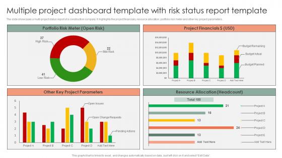
Multiple Project Dashboard Template With Risk Status Report Template




Try Before you Buy Download Free Sample Product
 Impress Your
 Audience
 100%
100% Editable
 Save Hours
 of Time


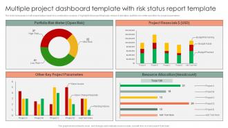
The slide showcases a multi-project status report of a construction company. It highlights the project financials, resource allocation, portfolio risk meter and other key project parameters.
People who downloaded this PowerPoint presentation also viewed the following :
Multiple Project Dashboard Template With Risk Status Report Template with all 7 slides:
Use our Multiple Project Dashboard Template With Risk Status Report Template to effectively help you save your valuable time. They are readymade to fit into any presentation structure.





FAQs for Multiple Project Dashboard Template With Risk
You'll want to start with timeline/milestones, budget tracking, and resource allocation - those are your bread and butter. Task status updates too, obviously. But here's the thing that saved my butt on like three different projects: add a risk indicator. That's usually where everything falls apart first. Make sure you're getting real-time data feeds so you're not looking at last week's disasters. Visual stuff works best - charts, progress bars, color coding. You want to spot problems without squinting at spreadsheets. Keep it simple at first though. You can always add more bells and whistles once your team actually starts using it.
So visualization tools basically take all your chaotic project data and turn it into charts and graphs that actually make sense. Way better than staring at endless spreadsheets (seriously, my eyes glaze over). Gantt charts show your timeline, progress bars track completion, dashboards give you the big picture - you'll spot problems like resource bottlenecks super fast. Stakeholders love visual updates too since they can grasp everything instantly. Honestly, I'm a sucker for a good dashboard. Just pick whatever format fits your project best and start simple with timeline, budget, and task percentages.
Track the big three first: timeline, budget burn, and resource allocation. Task completion rates matter too, plus any blockers that could derail things. I swear, most dashboards are just metric vomit - they show everything but tell you nothing! Scope creep deserves its own spot because that stuff sneaks up on you. Anyone should be able to look at your dashboard and instantly know if you're in trouble or not. Green, yellow, red - keep it simple. Start there, then add whatever your stakeholders keep bugging you about in meetings.
Honestly, stakeholder feedback controls pretty much everything about your dashboard - what metrics matter, how stuff gets laid out, all of it. Executives want those bird's-eye view summaries while project teams are digging into task details. I made this gorgeous dashboard once that literally nobody touched because I didn't ask what they actually needed first. Big mistake. You've got to interview people upfront about their workflows and what's driving them crazy. Then watch how they're using it and keep tweaking. My advice? Start super simple, get their reactions, then build from there until it's actually useful.
Honestly, dashboards are like having a command center for your whole project. Everyone can see what's happening without you constantly asking "hey, where are we on that thing?" Real-time updates show who's doing what and when stuff is due. No more awkward meetings where people realize they've been working on the same task - been there, it sucks. The visual tracking keeps everyone focused on what actually matters. You can drop comments right on tasks too. Oh, and definitely turn on notifications so people get alerts when something needs their attention, otherwise they'll just ignore it.
So your KPIs are gonna drive the whole dashboard setup, honestly. Put your most important ones right up front where you can't miss them. Then arrange everything else around those key metrics so it flows logically. I always think of it like organizing a kitchen - frequently used stuff goes in the easy spots, you know? Pick your top 3-5 KPIs first. Build the rest around those core numbers. That way your dashboard actually tells a coherent story about how your project's doing instead of just being a random mess of charts.
Set up different dashboard views for each phase - trust me, it makes a huge difference. Planning phase? Focus on timelines, resources, and milestones. When you're executing (honestly the make-or-break moment), you want real-time progress bars and budget tracking front and center. For closing, switch to deliverable status and sign-offs. Hide the irrelevant stuff so your team isn't overwhelmed. Most platforms let you filter or create separate layouts. Quick switching between views keeps everyone focused on what actually matters right now instead of getting lost in data they don't need.
Don't cram everything onto one screen - that's the biggest mistake I see. People think more data = better, but it just creates a mess. Skip the vanity metrics that look cool but don't help anyone decide anything. Load times matter too, nobody's waiting around for slow charts. Here's what actually works: pick 3-5 metrics that directly impact your project's success. Test it with real users early - and I mean the people using it daily, not just stakeholders. You can always add more later based on their feedback. Keep it simple first.
APIs and data connectors are gonna be your best friend here. Tableau and Power BI can hook into pretty much anything - project management tools, databases, spreadsheets, you name it. Set up automated pipelines so stuff updates by itself because trust me, doing it manually is soul-crushing. You might need to massage the data a bit to get everything playing nice together, but that's pretty normal. Oh, and don't try to connect everything at once. Pick your top 3-4 sources first, get those working smoothly, then add more later.
Honestly, real-time data is a game changer for dashboards. You're seeing what's happening right now instead of making calls off last week's numbers - which I swear happens more than anyone admits. Problems get caught early when you can actually fix them. Budget going crazy? You'll know immediately, not three weeks later when it's already a disaster. Your team stays on the same page since everyone's looking at current info. Plus stakeholders can check project status themselves without constantly hitting you up for updates, which is honestly such a relief.
Honestly, just make it stupid simple to find the important stuff. Project status and deadlines should smack you in the face the second you open it - no hunting around required. I've used so many "pretty" dashboards that were basically useless because finding anything took forever. Stick with consistent colors and don't cram everything together. White space is your friend here. Also, definitely get some actual PMs to test it out before you launch. They'll spot problems you'd never notice. Oh, and resist the urge to get fancy right away - start basic and only add bells and whistles if people actually need them.
Honestly, just start with what metrics you actually need to track first. Microsoft Project and Asana both have decent built-in dashboards that'll handle most stuff. Monday.com is ridiculously easy to use - like, almost too pretty if that makes sense? For heavy data stuff, Tableau and Power BI are your best bet. You could also go the DIY route with Grafana if you're feeling technical, or even just stick with Excel/Google Sheets. Don't overthink it though. Pick whatever displays your data clearly without making you want to pull your hair out every time you use it.
Honestly, mobile accessibility can make or break your dashboard. People are constantly checking stuff on their phones - I mean, who's actually sitting at their desk all day anymore? Your team will just ignore the dashboard if it sucks on mobile. Then you get those annoying delays when someone doesn't see a blocker alert, or worse, people feel totally out of the loop on project updates. What works best is designing for mobile first. Make buttons big enough to actually tap without zooming in. Keep the views simple so you can quickly update tasks and check key metrics. Trust me, it's worth the extra effort upfront.
Yeah, customization is huge because different industries need totally different stuff. Like, construction dashboards track material costs and weather delays, but software teams care about sprint velocity and bugs. Makes no sense to use the same thing for both. Honestly, I've watched so many teams get these fancy generic dashboards that just collect dust because they don't match how people actually work day-to-day. The real trick is showing metrics that help your team make actual decisions - not just charts that look cool in meetings but don't tell you anything useful.
Dashboards are lifesavers for catching problems before they blow up. You get real-time data on budgets, timelines, resource issues - all that stuff that usually bites you later. Set alerts when numbers go wonky. Trust me, this has literally saved my projects so many times. The visual aspect is huge too - patterns just jump out at you way better than buried in some Excel nightmare. You can actually track how well your fixes are working right there on screen. Oh, and do weekly reviews with your team. Sounds boring but it's worth it to catch things early.
-
“Slides are formally built and the color theme is also very exciting. This went perfectly with my needs and saved a good amount of time.”
-
Excellent design and quick turnaround.