


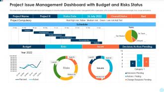
Project issue management dashboard with budget and risks status





Try Before you Buy Download Free Sample Product
 Impress Your
 Audience
 100%
100% Editable
 Save Hours
 of Time


Our Project Issue Management Dashboard With Budget And Risks Status are topically designed to provide an attractive backdrop to any subject. Use them to look like a presentation pro.
People who downloaded this PowerPoint presentation also viewed the following :
Project issue management dashboard with budget and risks status with all 10 slides:
Use our Project Issue Management Dashboard With Budget And Risks Status to effectively help you save your valuable time. They are readymade to fit into any presentation structure.








FAQs for Project issue management dashboard with budget
Definitely start with timeline stuff and budget tracking - that's your foundation. Task status and team workload are huge too. I can't tell you how many times I've watched projects crash because someone was drowning and nobody noticed. Resource allocation is probably where most people mess up tbh. Risk indicators should be front and center, plus keep those stakeholder communication logs visible. The whole point is getting a quick health check without digging through tons of data. Charts and color coding are your friends here - makes problems jump out at you immediately. Build these basics first, then tweak based on whatever your team actually struggles with most.
Dude, visualization stuff is a game changer for dashboards. Color-coded indicators and progress bars beat scrolling through spreadsheets any day - you'll spot problems instantly instead of hunting through rows of numbers. Gantt charts are clutch for catching timeline issues before they blow up. Burndown charts? They show if your team's actually moving or just spinning wheels. Oh, and stick with consistent colors and labels that make sense. I learned this the hard way during crunch time last month. Trust me, when you're stressed and need answers fast, clear visuals save your sanity.
Look, you really only need four things on there: timeline/milestones, budget vs what you're actually spending, team workload, and risk stuff. Most dashboards I've seen are just packed with useless metrics that make you feel busy but don't actually help. Timeline tells you if you're hitting deadlines. Budget tracking saves you from those awful "wait, we spent HOW much?" moments. Team workload shows bottlenecks before they explode. Risk indicators keep you ahead of problems. Honestly, if you can't look at it for five seconds and know whether things are fine or you need to jump in, there's too much junk cluttering it up.
So everyone's looking at the same dashboard but hunting for totally different stuff. Executives just want the big picture - budget, timeline, major red flags. Meanwhile project managers are buried in task dependencies and figuring out where things are getting stuck. Team members? They mostly care about their own deadlines (which honestly makes sense). Clients focus on milestone updates and when they're getting their deliverables. The trick is building something that works for all these different needs without drowning people in info they don't actually care about. It's like having multiple views of the same story.
Don't cram everything onto one screen - that's the fastest way to confuse everyone. Vanity metrics are tempting but honestly pretty worthless if they're not driving actual decisions. Your PM and executives need completely different info, so think about who's actually using this thing. Generic templates are basically useless too. I learned this the hard way at my last job - we built this beautiful dashboard that nobody touched because it wasn't tailored to how we worked. Focus on maybe 3-5 metrics your team genuinely uses to make calls, then build from there.
Dude, it's a game changer - no more staring at dashboards showing last week's info while everything's already shifted. Task updates, budget changes, resource moves all sync instantly. You'll spot problems way before they blow up into disasters. Your whole team sees the same current data instead of working off different versions (which honestly happens more than anyone admits). Stakeholders stop bugging you for updates since everything's already there. I'd start with whatever data sources are most critical - maybe your project tracker and budget tool? Then just add more connections as you go.
Honestly, if your team can't figure out how to use the dashboard, you might as well not have one. I've watched people completely ignore beautifully designed dashboards because they were too confusing to navigate. Make the interface dead simple - like, your least tech-savvy person should be able to jump in and immediately get what's happening with projects. Focus on clear visual hierarchy and intuitive navigation. The data needs to match how your team actually thinks and works (not how you think they should work). Short version: if it needs training, you've already lost half your users.
So your dashboard basically gives you a heads up before stuff hits the fan. Set alerts for budget burns and timeline slips - it's like your project's smoke detector. Those visual charts? They'll show you patterns fast. Maybe Sarah's always swamped or Phase 2 consistently blows the budget (happens more than you'd think). Schedule weekly check-ins where you actually review these numbers with your team. Don't just glance at them - dig into the what-if scenarios. Trust me, catching problems early beats scrambling later.
Okay so for custom dashboards, Power BI and Tableau are solid if you want all the fancy visualizations. But honestly? Tableau can be a pain - super powerful but kinda overwhelming at first. Monday.com's also decent for this stuff. If your team's not super technical, just go with Asana or Trello. Way simpler and their dashboard options are pretty good. Oh, and if you're more hands-on, Notion actually works great for building custom stuff - I know it sounds weird but trust me on this one. Google Data Studio too. Just trial like 2-3 options first though. See what doesn't make everyone want to cry.
Honestly, dashboards are game-changers for team coordination. No more hunting through email threads to figure out if Mike actually finished that report - you just glance at the board. Everyone sees the same info at the same time, which is clutch for remote teams especially. You'll catch problems before they explode and can actually celebrate wins when they happen (we're terrible at that). The tricky part? People have to actually update the thing regularly or it just becomes another forgotten bookmark. Trust me, I've seen too many beautiful dashboards turn into graveyards because nobody maintained them.
Update it weekly, or daily if things move fast on your project. Honestly, automate the data feeds or you'll hate yourself later - manual updates are the worst. Ditch the vanity metrics that look cool but don't actually help anyone make decisions. Let people know your update schedule so they're not staring at old numbers. I'd set a monthly reminder to clean house and remove widgets nobody clicks on. Otherwise you end up with dashboard bloat and half the stuff becomes useless. Focus on what actually matters for decisions.
Dude, mobile compatibility is absolutely critical. Your team isn't glued to their desks all day - they're grabbing coffee, commuting, working from home. Without mobile access, people just skip the updates entirely. I've seen this happen so many times. Quick status changes happen on phones, not computers. You'll end up with outdated info and teammates who feel out of the loop. Test it yourself first though - some "mobile-friendly" dashboards are still a nightmare to actually use. Worth the extra effort to get it right.
Start with who can access what - that's your biggest risk right there. Make sure your dashboard platform encrypts everything properly and check where the data actually lives. Some tools automatically sync to random external servers which is... not great if you've got picky clients. I'd set up regular reviews to boot people who've moved off projects. Strong authentication is non-negotiable obviously. Oh and honestly? I've watched teams accidentally leak client stuff because they got sloppy with permissions. Just treat it like your own financial data and you'll be fine.
Your users are the real MVPs here – they're in your dashboard every day catching stuff you'd totally miss. They'll call out confusing navigation and tell you what features are actually missing (not just nice-to-haves). Plus they're brutal about pointing out metrics that look impressive but are basically useless. I learned this the hard way once. Set up feedback sessions or just throw in a suggestion box. The key is watching for patterns in what people say, then actually doing something about it. Short feedback loops beat perfect dashboards every time.
So dashboards are actually perfect for this! Set up automated alerts when your metrics go outside the required ranges. I used to waste so much time checking spreadsheets manually - never again. You can track quality benchmarks, safety stuff, documentation status, all that compliance headache in one spot. The visual alerts are clutch for catching problems before audits happen. Plus generating reports for your boss takes like two seconds instead of hours. Just figure out which standards actually matter for your project first, then configure the widgets to monitor those in real-time. Game changer honestly.
-
Informative design.
-
Excellent products for quick understanding.
-
Excellent work done on template design and graphics.
-
Professional and unique presentations.