


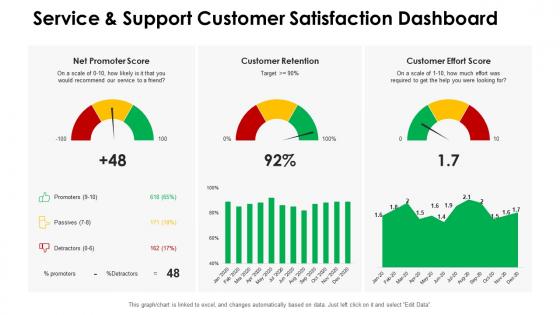
Dashboards by function service and support customer satisfaction dashboard




Try Before you Buy Download Free Sample Product
 Impress Your
 Audience
 100%
100% Editable
 Save Hours
 of Time


Our Dashboards By Function Service And Support Customer Satisfaction Dashboard are topically designed to provide an attractive backdrop to any subject. Use them to look like a presentation pro.
People who downloaded this PowerPoint presentation also viewed the following :
Dashboards by function service and support customer satisfaction dashboard with all 7 slides:
Use our Dashboards By Function Service And Support Customer Satisfaction Dashboard to effectively help you save your valuable time. They are readymade to fit into any presentation structure.





FAQs for Dashboards by function service and support
Start with the classics - NPS, CSAT, and customer effort score. Those are your bread and butter. Churn rate's huge too, obviously. Track your support ticket volumes and how fast you're resolving stuff. Customer lifetime value gives you the bigger picture of what people are actually worth. Oh, and if you're doing SaaS, definitely watch product adoption rates - that's where you see if customers are really using what they're paying for or just letting it collect dust. Don't sleep on the qualitative feedback either. Sometimes a angry email tells you more than a spreadsheet. Start there and build out based on what your team can actually do something about.
For feedback viz, I'd go with sentiment trend lines and NPS breakdowns by customer segment - super helpful for spotting patterns. Heat maps work great too, especially for showing which features are causing headaches. Skip word clouds though, they look nice but won't help you make real decisions. Bar charts showing complaint categories are way more actionable. Oh, and definitely set up alerts when satisfaction drops below certain levels. Include actual customer quotes with your data - numbers alone don't tell the whole story. The goal is making problems obvious before they blow up.
Honestly, surveys are what make your dashboard worth anything. They give you the actual data - NPS scores, satisfaction ratings, all that stuff that turns into real trends you can track. Without them you're just staring at empty charts looking like an idiot. Run them regularly though, because gaps in your data make everything look sketchy and unreliable. The cool part is catching problems early before they blow up (your manager will love you for that). I learned this the hard way when I had months of missing survey data and couldn't explain why our metrics suddenly dropped.
Honestly, I'd go with weekly updates minimum - daily if you can manage it. Really depends on how many surveys you're getting and whether you need to catch problems fast. I've watched teams get screwed by doing monthly updates because they totally missed angry customers who could've been handled way earlier. Daily updates are pretty much a must if you're in a high-touch business or launching something new. Real-time sounds fancy but it's usually overkill since customer satisfaction doesn't really flip that quickly. My advice? Start weekly and bump it up if you keep finding out about issues too late.
Tableau and Power BI are your best bets for customer satisfaction dashboards. Power BI's honestly pretty great if you're using Microsoft stuff already - everything just works together without headaches. Looker's solid too but pricier. Google Data Studio works fine for basic needs and won't cost you anything, though it feels kinda clunky sometimes. Whatever you go with needs to connect to your survey tools like Zendesk or Salesforce easily. Oh, and definitely try the free trials first! Your team might hate Tableau's interface but love Power BI, or vice versa.
So basically you need to connect your feedback tools to whatever dashboard you're using. Tableau and Power BI are pretty good at pulling straight from Zendesk, Salesforce, that kind of stuff. I'd set up auto-refreshes every 15-30 minutes - real-time sounds cool but it'll just slow everything down and honestly gets annoying. For urgent stuff, webhooks work great for instant pings. Oh, and don't try to connect everything at once. Get one source working smoothly first, then add the rest. Way less headache that way.
Honestly, the biggest mistake is cramming every metric you can think of onto one screen - total overload. Pick maybe 3-5 that actually matter for decisions, not just stuff that looks impressive. I've watched so many teams build these gorgeous dashboards that end up as expensive wallpaper because nobody knows what to do with all the data lol. Show trends over time instead of random snapshots. Context helps too - throw in some benchmarks so people know if their numbers are decent or trash. But really, start by figuring out what decisions your team needs to make first.
Honestly, dashboards are game-changers for spotting customer patterns. You'll catch things like satisfaction dropping right before renewals, or support tickets exploding after updates. Way better than staring at endless spreadsheets - the visual timeline makes everything obvious. Pick maybe 3-4 key metrics to track weekly. NPS scores, complaint types, usage data across different customer groups. Just make sure you're using consistent timeframes so you're not comparing random periods. Once you get in the rhythm of checking weekly, the cycles become super clear. It's wild how predictable customer behavior actually is.
Dude, segmentation totally changes the game with satisfaction scores. Don't just stare at that overall average - it's basically useless. Break it down by customer type, product, location, whatever makes sense. You'll find crazy stuff hiding in there. Maybe your big enterprise clients are happy as clams while small businesses are having a nightmare experience. Or your app sucks but the website's fine. Without digging into segments, you're gonna waste time fixing stuff that isn't even broken. I'd start simple though - customer size or main product lines usually reveal the most obvious issues first.
Dude, trust me on this - historical data is what turns your dashboard from eye candy into something actually worth building. You'll want at least 12-18 months if you can swing it. That's when you start seeing the good stuff: seasonal dips, what happens after product launches, which changes actually worked vs. which ones flopped. Short bursts are pretty useless honestly. But once you've got that timeline? You can finally spot real trends and compare quarters. It's like the difference between a photo and watching a movie - suddenly everything clicks and you know what to fix next.
Honestly, these dashboards are game-changers because they make customer problems impossible to hide from. Once executives see CSAT scores tanking in real-time, they actually start caring about fixing the underlying issues instead of just damage control. Teams begin watching their own metrics proactively rather than waiting for angry customers to complain. The behavior shift happens fast when everyone's staring at the same numbers - it's wild how priorities change overnight. One thing though: focus on trends over time, not just current snapshots. Otherwise you won't know if your fixes are actually working or if you're just spinning your wheels.
Honestly, start tracking your baseline metrics now - customer lifetime value, retention rates, churn costs. Once you launch the dashboard, compare those numbers to see the actual impact. Most companies don't realize how much money they save just from fewer support tickets (seriously, that alone can pay for everything). Also measure stuff like Net Promoter Scores and how fast your team resolves issues - those tie directly to revenue. The math isn't complicated. Just add up what you're making from keeping customers longer, plus what you're saving on support costs, then subtract what the dashboard cost you. You'll probably be surprised by the results.
Honestly, just make it visual - simple charts work way better than walls of text. I'd go with that classic green/yellow/red color scheme since everyone gets it immediately. Lead with the big numbers they actually care about first. Ditch all the fancy terminology too. Like, instead of saying "Net Promoter Score methodology" just say "customers who'd recommend us." Way clearer. Keep tons of white space on your dashboards - cluttered ones are the worst. Show trends over time rather than random snapshots, and definitely explain what you're doing about the data. Nobody wants to just stare at problems without solutions, you know? Always end with concrete next steps.
Honestly, dashboards are pretty clutch for this. They let everyone see the same customer data at once - no more silos. Sales can check support ticket patterns, marketing tracks satisfaction scores, product teams spot adoption problems. All in one spot. Once teams actually see how their stuff affects the whole customer experience, they start working together instead of just handling their own mess. Though you'll probably need to do weekly check-ins with stakeholders to keep people on track. Way better than everyone guessing what's happening in other departments.
Stick with clean color coding - green/yellow/red is perfect. Trend lines show direction over time, which is clutch. Make your percentages and star ratings big enough to actually read (seriously, tiny fonts kill presentations). I'm obsessed with well-designed gauges for satisfaction scores - they just look so clean. Use consistent icons throughout. Avoid 3D charts though, they're honestly distracting. Same goes for fancy animations. Put your most critical metrics front and center so they grab attention first. Oh, and make sure everything's readable when you're presenting to stakeholders across the room.
-
Best Representation of topics, really appreciable.
-
Thanks for all your great templates they have saved me lots of time and accelerate my presentations. Great product, keep them up!
-
Excellent design and quick turnaround.
-
Out of the box and creative design.