


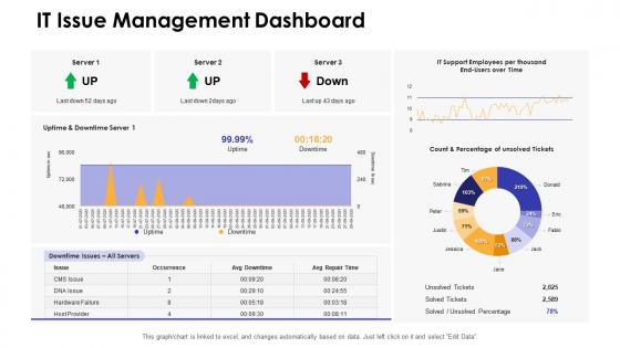
It issue management dashboard dashboards snapshot by function




Try Before you Buy Download Free Sample Product
 Impress Your
 Audience
 100%
100% Editable
 Save Hours
 of Time


Our It Issue Management Dashboard Dashboards By Function are topically designed to provide an attractive backdrop to any subject. Use them to look like a presentation pro.
People who downloaded this PowerPoint presentation also viewed the following :
It issue management dashboard dashboards snapshot by function with all 7 slides:
Use our It Issue Management Dashboard Dashboards By Function to effectively help you save your valuable time. They are readymade to fit into any presentation structure.






FAQs for It issue management dashboard dashboards
Track your ticket volume and trends first - that's your baseline. MTTR and first-call resolution rates are huge too. Don't forget escalation patterns and SLA compliance percentages. Backlog aging is annoying but super important - nobody wants old tickets just sitting there forever. I always include severity breakdowns because critical issues have a way of sneaking up on you. Team workload distribution helps prevent people from burning out (learned that one the hard way). Customer satisfaction scores are gold if you're collecting them. Start simple with these and add more later once everything's working.
Dude, visualization tools are a game-changer for spotting IT issues. Raw data in spreadsheets? Total nightmare to parse through. But throw it into charts and heat maps and suddenly patterns jump out at you - system crashes at 2pm every Tuesday, seasonal spikes, whatever. Line graphs show volume changes over time. Dashboards let you dig into what's actually causing problems. I swear it's like night and day compared to staring at rows of numbers. Oh, and set up those automated reports so you're not scrambling when something breaks.
Dude, this stuff makes or breaks your whole project. I've watched so many beautiful dashboards just sit there unused because nobody asked what people actually needed. Your execs want the big picture - SLA numbers, trend stuff. Meanwhile your tech folks need all the nitty-gritty incident details. Here's what works: interview your main users first. Find out what's bugging them daily and how they make decisions. Then build in chunks and keep checking back with them. Don't guess what they want - that's how you waste months building something nobody opens. Oh, and usage patterns will surprise you every time, so stay flexible.
Okay so first thing - color code everything. Red for critical, yellow for medium, green for low priority. Trust me, when your boss is panicking about outages, you'll thank me later. Put the critical stuff at the top obviously, and throw in P1/P2/P3 labels too since not everyone sees colors the same way. Here's what really helps though - add timers showing how long each incident's been sitting there. Nothing motivates people like seeing that P1 has been open for 3 hours. Oh and set up alerts for when you're about to miss SLAs, because nobody wants to explain that mess.
Grafana's my go-to honestly - it's free and handles real-time monitoring like a champ. Tableau and Power BI are solid too if you want something more polished. Already using ServiceNow or Jira? Their dashboards aren't terrible, might save you some headache. Splunk and New Relic are crazy powerful but they'll cost you - only worth it if you're dealing with really complex stuff. Oh, and don't overthink it. Pick something that plays nice with whatever you're already running. Your team will hate you if they have to learn some completely new system from scratch. I'd just trial 2-3 options and go with whatever feels right.
Dude, real-time data integration is a game changer for catching IT problems right when they happen. Your dashboard pulls live feeds from all your monitoring tools and ticket systems, so you're not waiting around for angry user emails (been there, not fun). Jump on critical issues before they blow up into those 3am emergency calls nobody wants. You can watch resolution progress happen live and shift people around as needed. Oh, and definitely set up automated alerts for the big stuff - trust me, you don't want to miss those. It's basically like having eyes everywhere without actually being everywhere.
Look, biggest thing is don't jam every metric onto one screen - you'll just confuse everyone. Nobody knows what to look at first. Skip the vanity stuff that looks cool but doesn't actually help you fix problems faster. Your data needs to update often enough to be useful, obviously. Oh and definitely test it with real users first because I've seen so many dashboards that made perfect sense to the creator but were total gibberish to everyone else. Stick to maybe 3-5 KPIs that actually matter for solving issues quickly. Save everything else for those deep-dive reports nobody reads anyway.
Honestly, it's all about giving people what they actually need to do their jobs. IT folks want the technical stuff - resolution times, error rates, system performance metrics. That's their bread and butter for fixing problems. But executives? They couldn't care less about server CPU usage (learned that the hard way once). Show them the big picture instead - service availability, costs, how IT issues affect customers. Short bursts work better for ops teams who need quick decisions. Executives prefer trend analysis over longer periods. Match the detail level to how each group thinks and you're golden.
honestly start with validation rules at data entry - catches garbage before it spreads. learned this when our "resolved" tickets were absolutely not resolved lol. set up alerts for weird spikes or missing feeds too. someone should manually spot-check records weekly (boring but necessary). also make sure each data source has an owner. when stuff breaks, you need someone to actually fix it instead of everyone just shrugging. the automated validation thing? do that first - it'll save you so much headache later.
Pull your dashboard data from the past 6-12 months and look for patterns. Which problems always pop up at the same times? What kills your uptime the most? Honestly, you'd be surprised how much seasonal stuff affects IT systems - it's wild. Focus on your top 3 recurring issues first since that's where you'll see real results. The trends will help you figure out when to do maintenance, how to staff better, and what SLAs actually make sense. Oh, and track resolution times too - that data's gold for planning ahead and catching things before they blow up.
Look for trend analysis charts and incident clustering first - seriously, these will save you so much time spotting patterns. Heat maps are great too, they show you frequency by category or component at a glance. The drill-down stuff is where it gets really useful though - click from high-level trends straight into the actual incident details. Most dashboards have root cause tagging and keyword analysis that'll surface common themes across tickets. Oh, and definitely set up filters for your critical systems first. Then use those time-series views to catch when issues are spiking.
So you can set up ML to look at your old incident data and spot patterns before stuff hits the fan. Feed it server metrics, complaint volumes, seasonal trends - that kind of thing. Honestly, once you get enough data in there, the predictions are scary accurate. Your dashboard shows risk scores and tells you what to do before problems blow up. ServiceNow and Splunk already have this built in, which is nice because setting it up from scratch would be a nightmare. Just start with whatever incidents happen most often at your company.
Templates are honestly a lifesaver - they get you running in days instead of weeks. All the important metrics and layouts are already figured out, plus you get docs and community support which is clutch. Sure, custom builds give you more control, but who has time for that? Most teams I know started with templates anyway. Here's what I'd do: pick a solid template that hits your main needs, then tweak widgets later as things change. Way cheaper than starting from zero, and you can always customize the hell out of it once you know what you actually want.
Set up role-based access first - executives see the big picture metrics, security teams get all the detailed breach info. Most places screw this up by giving everyone access to everything, which is nuts. You'll want data masking for sensitive stuff like IPs and credentials on your dashboards. Start by sorting issues into sensitivity levels, then build permissions around that. Oh and definitely log who's looking at what - auditors eat that up during reviews. Different views for different roles is key here.
Dude, you should see what good dashboards actually do. Netflix cut their incident response by 40% with real-time monitoring - they catch problems before customers even know something's wrong. Spotify's teams? 60% faster at fixing issues because their dashboards show how all their services connect. That's honestly pretty wild when you think about it. Airbnb dropped downtime by 35% just by giving everyone visibility into system health. The trick is getting the right info in front of people when they need it. I'd start with whatever's causing you the biggest headaches right now and build around those specific numbers first.
-
Designs have enough space to add content.
-
Unique design & color.