



 0 Comment
 Customer Reviews

Imagine being responsible for an entire IT department while dealing with all different data sources, numerous reports, and systems that don't talk to each other. You are continually chasing performance metrics from one system, and tracking project deliverables in another numerous spreadsheets. Sounds like a pathway straight to burnout? Welcome an IT dashboard—A centralized place to measure everything with real-time accuracy. It enables decision makers to see trends, troubleshoot potential issues, and enhance overall operational efficiency.
Refer to our blog on Top 10 Information Dashboard Templates to meet one or more goals; combined and displayed on a single screen.
Unfortunately, while IT dashboards offer many advantages, many organizations, large and small, are way behind. This results in wasteless response times, teams spending valuable time building reports. Ultimately, the picture is only blurry.
That is why SlideTeam's "Top 10 IT Dashboard Templates with Samples and Examples" is an instant classic. Whether you are tracking IT governance, system monitoring, network performance, cloud service tracking, and so much more, these templates cover it all. Also check out the cloud service tracking, IT operational, system monitoring, project statuses and more.
Our frameworks help to identify the right tools, think about what to track, and present your functional components in a clear, interactive, and decision facilitating manner.
And the best part? Fully editable options levels, content-ready options, user-friendly options, and downloadable in PNG or JPG. No coding. No fuss. Just edit and use.
Get ahead to simplify your reporting and dazzle your stakeholders? Read our blog to get an in-depth look at the templates—and learn how each one supports crystal-clear communication of real-time insights with confidence.
Get an insight to our blog on Top 10 Testing Dashboard Templates for efficient testing methodologies, creating a new form of communication in the field.
Template 1: Business Performance Dashboards Snapshot With New Customers and Gross Profit
This PPT Slide provides the highest-level, real-time snapshot of your business performance metrics. It focuses on metrics such as revenue, new customer acquisition, and gross margin for a quick overview of the state of the business. It offers visual representations of customer satisfaction, monthly sales trends, and product-wise sales distribution. It allows you to compare performance month over month easily and see where the most profit is coming from (brand vs. category).

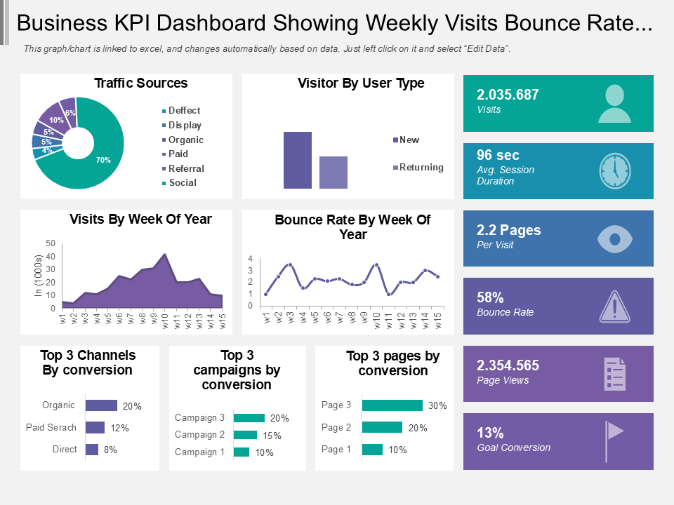
Template 2: Business KPI Dashboard Snapshot Showing Weekly Visits Bounce Rate and Traffic Source
This presentation slide is the business KPI dashboard snapshot showing weekly visits, bounce rate and traffic source. It monitors statistics such as weekly visits, bounce rate fluctuation, and making it easy for you to understand how users are interacting with your website. It covers best campaigns, converting pages, and traffic channels as well. This KPI tracking facilitates rapid, insight based, decisions related to digital strategies.
Template 3: Global Cyber Security or Critical Risk Dashboard
This presentation theme covers overall critical risk for your organization. It provides crucial information like complete growth status, problem areas and ongoing vulnerability management. By structuring insights into easily digestible, visual formats, it clarifies what is typically many layers of complexity in the cybersecurity world. This cybersecurity metrics dashboard simplifies the communication of security progress and priorities, whether at executive briefings or internal reviews.

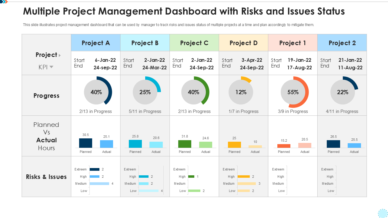
Template 4: Multiple Project Management Dashboard with Risks and Issues Status
This PPT Theme is meant for managers to keep track of time of multiple projects at a time in one single view. It consists of project status across multiple timelines such as project progress, actual performance, status of risks and issues. It compares the start and end dates, as well as spots where bottlenecks are located. This project status dashboard helps while managing simultaneous projects without missing risk triggers.
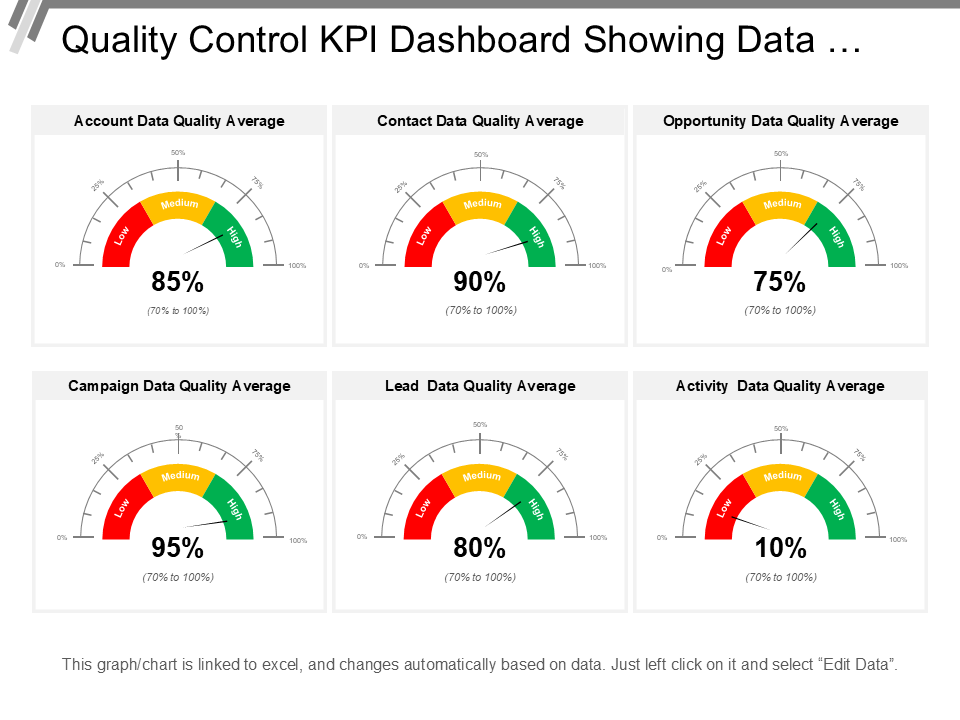
Template 5: Quality Control KPI Dashboard Snapshot Showing Data Quality
This PowerPoint Template gives a systematic perspective on how your data assets are faring across different touchpoints. It displays key metrics like average account data quality, lead data accuracy, and campaign data health. This slide enables you to track the sore spots beforehand by monitoring contact, opportunity and activity data in real time. Its alignment with quality assurance and control practices helps to support wider quality objectives.
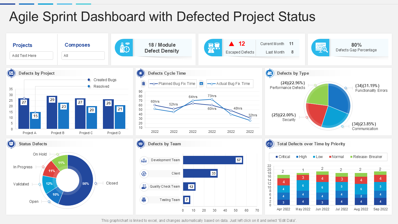
Template 6: Agile Sprint Dashboard Snapshot with Defected Project Status
This PPT Template emphasizes significant statistics such as defects per team, type, and project to enable teams to tackle issues without delay. Cycle time, time by priority and status updates provide the agile team the necessary context to increase their efficiency of sprints. It helps in better planning, quicker defect response, and robust sprint retrospectives. It works great for scrum meetings, project reviews, or real-time reporting.
Template 7: Project Portfolio With Roadmap and Health Card Dashboards PPT Template
This PPT Theme covers a structured view of a project ecosystem in the organization. It covers project financing, resource solicitations and portfolio risks into one seamless visualization. The delivery roadmap communicates milestones and timelines, while the health card provides at-a-glance visibility into the status of individual initiatives and overall network performance. It facilitates improved judgment, prioritization, and portfolio risk management by combining those things.

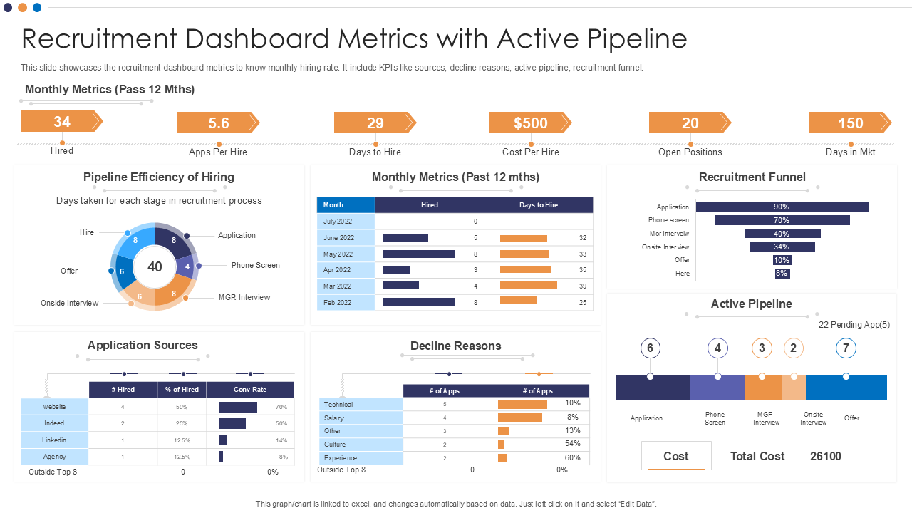
Template 8: Recruitment Dashboard Metrics with Active Pipeline PPT Template
This PowerPoint Template offers a robust overview of how you’re doing when it comes to hiring, along with your recruitment pipeline. It includes important resource utilization metrics like the monthly hiring rate, sources of application, and pipeline conversion. It uses metrics on why candidates are dropping off in the recruitment funnel which help HR teams know exactly where and why candidates are dropping off.
Template 9: Cyber Security Dashboard Powerpoint PPT Template Bundles
This presentation theme covers IT operations covering account identity and access controls, global cybersecurity measures, and IT security analytics. A section for disaster recovery plan was added as a measure to help with proactive risk management and strategy for business continuity. This dashboard is perfect for turning senior IT leaders, project managers and security analysts to tell higher-ups about protections and threats at an enterprise-level scale.
[product_image id=794396]
Template 10: Data Lake It Centralized Repository Data Lake Reporting Dashboard Snapshot PPT Template
This PowerPoint Template provides a strong visual overview of your data visualization. These metrics can chart out key performance indicators such as total number of users, lake size and data quality levels in a single screen view for teams. It covers efficiency and gaps in data and gives an idea of ingested terms, duplicates, and trusted zone size. Get it now for a quick view of systems and availability to users.

Own Your IT Narrative : Get Started Now!
As we know, the digital landscape is evolving at breakneck pace, and IT professionals have never been under more pressure to monitor systems, proactively solve or triage problems, and deliver performance insight in terms that those responsible for the business can understand. And that is exactly where IT dashboard templates can be really helpful.
The IT Dashboard templates shared above are just more than designing marvels. From tracking uptime from critical infrastructure to tracking cybersecurity threats, service level agreements to managing help desk operation to overseeing incident management—these templates help you to be ahead of the curve.
Our templates are based on real-world IT use cases across industries: from CIO needing executive level and business insights to system administrator monitoring backend metrics.
So, don’t wait! Get Our templates & turn your data to decisions.
Don't miss our blog on Top 10 Daily Dashboard Templates to track activities and measure their efficacy on variable parameters.
IT Dashboard FAQs
1. What types of metrics should be included in an effective IT dashboard?
IT dashboards must contain both live and historical metrics relevant to organizational objectives. Common metrics include:
- Uptime and availability of the system
- Performance of servers and networks
- Response Time for Incident and Ticket
- Security alerts and compliance statuses
- Trends in application performance and utilization
- IT budget vs. actual spend
- User satisfaction and feedback on support
IT teams uses these metrics to monitor the health of the infrastructure, identify problems, and quantify the performance of the services.
2. How can an IT dashboard improve decision-making for IT managers?
Here is how IT dashboard improves decision making:
- Swift identification and resolution of issues or system failures
- Data to Rank Resource and Projects
- Monitor IT KPIs and business objectives progress
- Identifying areas of inefficiency, and improvements could help the process.
- Budgeting & staffing decisions made easier
It provides decision-makers with the combination of crucial information in one place and that correctly makes decisions faster.
3. What tools are commonly used to create and maintain an IT dashboard?
IT teams would use different set of tools for dashboard creation and management. For example:
- Power BI — used for interactive data visualization and reporting
- Tableau – Advanced Analytics and User-Friendly Dashboards
- Grafana — A prevalent time-series data monitoring and system performance tool
- Datadog — integrates with cloud infrastructure for metrics and logs monitoring
- Splunk – Security, Monitoring, and Operational Intelligence
- Kibana (with ELK stack) – for analytics processing and log visualization in real-time
The decision is based on an organization and their pre-setup systems and needs or wants for customization.