


Business Kpi Dashboard Snapshot Showing Weekly Visits Bounce Rate And Traffic Source





Try Before you Buy Download Free Sample Product
 Impress Your
 Audience
 100%
100% Editable
 Save Hours
 of Time


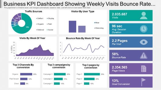
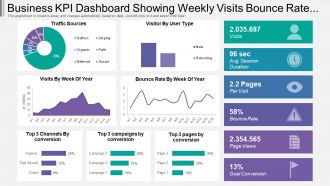
Browse through our Business KPI Dashboard PowerPoint template design. This presentation slide shows the dashboard that assists you to share the complex business data into a meaningful way. Every organization set some parameters to achieve their goals and this PPT design enables you to check the numbers at regular intervals so that you can achieve them. You may also use PowerPoint diagram to present the current update of metrics and KPIs. Sharing the information in the right manner is vital not only for the development purpose but also to understand where the improvement is required. Our presentation slide allows you to analyze your trade in a professional manner to your audience that can be your stakeholders, business partners, team members or even your clients. People working in the operations departments are required to create the presentation and show the numbers to the management team, you can show the information with this business KPI dashboard PPT design that shows aspects such as traffic sources, visitor by user type, visitor by week of year, bounce rate by week of year etc. It shows every activity performed on the website. Download to show the key performance indicators related to your business. Presentations are a big part of business. Make your presentations perfect with these high quality Business Kpi Dashboard Showing Weekly Visits Bounce Rate And Traffic Source.
People who downloaded this PowerPoint presentation also viewed the following :
Business Kpi Dashboard Snapshot Showing Weekly Visits Bounce Rate And Traffic Source with all 6 slides:
Chisel away with our Business Kpi Dashboard Snapshot Showing Weekly Visits Bounce Rate And Traffic Source. Give your thoughts the perfect shape.


FAQs for Business Kpi Dashboard Snapshot Showing Weekly Visits Bounce Rate
Figure out what decisions you actually need to make first - that's your starting point. Then grab 5-7 metrics that matter most (seriously, resist adding more or it'll look like mission control). You'll want real-time data feeding into clean charts and graphs. Trend arrows are clutch so people know if things are going up or down. Oh, and different teams should see different views - sales doesn't need to see IT metrics, you know? Build in some way for users to click deeper when something looks weird. Benchmarks help too, otherwise numbers just float in space meaninglessly.
First, figure out what actually matters for your business - like what really drives revenue or growth. Pick maybe 5-8 metrics that tie directly to those goals. I've seen way too many dashboards that are just overwhelming noise (seriously, some look like NASA mission control). Your team should be able to influence these numbers, and when something changes, people need to actually DO something about it. That's the whole point, right? Each metric should make you think "okay, this matters because..." Oh, and definitely test it with a few people first. You'll catch stuff that doesn't make sense before everyone sees it.
Honestly, visuals make all the difference for KPI dashboards. Nobody wants to stare at endless spreadsheet rows trying to figure out what's happening. Charts let you spot trends instantly - what's trending up, crashing down, whatever. Your executives will thank you too since they definitely prefer pretty graphs over boring data tables. Bar charts work great for comparisons, line graphs show trends over time, and those gauge things are perfect for single metrics. Oh, and start with your most important KPIs first - don't try to visualize everything at once. Test different formats until something clicks.
Look, it really depends on how fast your data changes and when your team actually checks the thing. Most operational stuff like sales or web traffic? Daily updates work great. Strategic metrics like customer satisfaction can probably wait for weekly or monthly refreshes. Honestly, I've watched people obsess over hourly updates when nobody even opens the dashboard that often - total waste. Match your refresh rate to when decisions actually get made. Start daily and see how it goes. If your team isn't checking it constantly, don't refresh constantly either. Just creates unnecessary noise.
Tableau and Power BI are the big names but they're kinda complex to learn. Google Data Studio's free and works great if you're already using Google stuff. Excel can work too - not gonna lie, I've built some pretty decent ones there, though real-time updates are a pain. Klipfolio and Geckoboard are way more user-friendly if you don't want the headache. Here's what I'd do: figure out where your data's coming from first. Pick whatever connects to that easily, then you can worry about making it look pretty later. Way less frustrating that way.
Start with rock-solid data governance and automated checks - seriously, this stuff will save your ass. Flag anomalies with quality rules, assign clear owners for each data source, and audit regularly. Too many dashboards turn into fancy guesswork because nobody's watching the inputs! Pull from single sources of truth, not a bunch of conflicting systems. Oh, and track data lineage so you can trace numbers back to where they came from. The goal? Catch errors before they hit your dashboard, not after someone's like "wait, why did sales jump 300%?"
Dude, don't cram everything onto one screen - it's just visual chaos. Skip the vanity metrics too. Like, who cares about follower counts when engagement is what actually matters? I've seen so many dashboards that look "impressive" but tell you nothing useful. Keep it to maybe 5-7 key things that tie to real business goals. Oh, and be consistent with colors - red should always mean trouble. Start simple since half the team probably won't even use it at first anyway, then add more once people are hooked.
Honestly, KPI dashboards are game-changers because you get all your important business numbers in one place instead of hunting through a million spreadsheets. Problems jump out at you way faster. Your whole team sees the same data, which stops those awkward moments when someone thinks sales are crushing it but they're actually terrible. I learned this the hard way at my last job - we were flying blind for months! Pick maybe 5-7 metrics that actually move the needle for your business. Don't go crazy and throw everything on there.
Honestly, NPS is probably your best bet to start with - shows how likely people are to actually recommend you to others. CSAT gives you quick feedback on specific stuff, and Customer Effort Score tells you if you're making things too complicated (which customers hate). Churn rate matters too since it shows the real impact. Support ticket resolution time is pretty solid for tracking operations. Oh, and first-contact resolution - that one's huge. Customer lifetime value is worth watching but maybe not day one priority? I'd honestly just focus on NPS and CSAT first, then build from there once you get the hang of it.
Honestly, just ask each team what 3-5 numbers they actually look at every day - that's your starting point. Sales will want pipeline stuff and conversion rates. Marketing's all about leads and how their campaigns are doing. Finance obviously cares about revenue and costs, you know the drill. Don't try to shove everyone into the same dashboard because it'll suck for everybody. Most tools let you set up different views for different roles anyway. I learned this the hard way at my last job - nobody used our "universal" dashboard because it was useless to everyone.
Dude, mobile accessibility is a game changer for KPI dashboards. Your team can check metrics during their commute or between meetings instead of being chained to their desks. Decision-making gets so much faster when managers spot issues right away. I've actually seen dashboard usage jump 60% just from mobile optimization - pretty crazy. You'll want charts that don't look terrible on small screens though. Oh, and prioritize your most critical KPIs for mobile since screen real estate is limited. Honestly beats waiting hours to discover problems.
So you'll want to hook up your dashboard to live data through APIs or database connections. Most BI tools like Tableau or Power BI can auto-refresh every few minutes - though honestly, "real-time" is usually marketing BS unless you're day trading or something. Figure out which metrics actually need constant updates vs. daily refreshes first. That'll save you a headache later. Then just set up data pipelines that refresh often enough for what you need. Google Data Studio works too if you're on a budget.
Honestly, benchmarks are what make your KPI dashboard actually useful instead of just pretty numbers. Like, a 15% conversion rate sounds decent until you realize your industry average is 25% - then you know you're in trouble. I always compare against three things: what competitors are doing, our own past performance, and industry standards. Makes it way easier to figure out if we should be popping champagne or scrambling to fix something. The trick is focusing on benchmarks that tie to real business outcomes, not just metrics that make you look busy in meetings.
Your KPI dashboard doesn't have to be boring spreadsheet hell. Turn those numbers into actual stories people care about. Like instead of "sales dropped 15%," try "We crushed Q3 early, then that August product delay screwed everything up and we're still feeling it." Show the cause and effect - connect the dots between what happened and why. Honestly, think of yourself as a detective walking people through the case. When you give context like this, people actually remember the insights AND know what they need to fix.
Tell the story behind your numbers first - what's actually happening? I always say "here's what this means for us" before showing any charts because honestly, people just zone out otherwise. Pick your biggest insights or changes since last meeting, then back those up with the data. Keep it visual but don't go crazy - maybe 3-5 key metrics max. Colors and clear trends help, but too many KPIs will lose everyone. The trick is wrapping up each section by tying it back to what you're all trying to accomplish and what comes next.
-
Very well designed and informative templates.
-
Best Representation of topics, really appreciable.
-
Absolutely perfect