


Business Performance Dashboards Snapshot With New Customers And Gross Profit





Try Before you Buy Download Free Sample Product
 Impress Your
 Audience
 100%
100% Editable
 Save Hours
 of Time


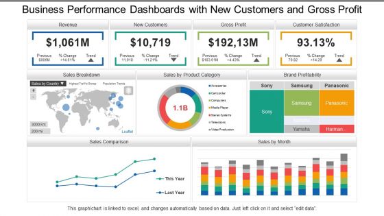
Plan with us and enlighten folks on prejudice through our, business performance dashboards snapshot with new customers and gross profit. The stages are shown here in the PPT design, filled with charts and graphs, bar and rating graphs, maps and text to reflect on your business performance. Validate your plans and explain the techniques on how these goals can be achieved, and the time frame that these goals need to be accomplished. Use the text areas to organize your data according to the plan. Here at SlideTeam, we are continuously endeavoring on better ideas for creating better results and accompanying a step to step with the market and rivals, our PPT slide reflects the same. Chalk out your future course of action with our Business Performance Dashboards With New Customers And Gross Profit. Elaborate on how you intend to go about it.
People who downloaded this PowerPoint presentation also viewed the following :
Content of this Powerpoint Presentation
Description:
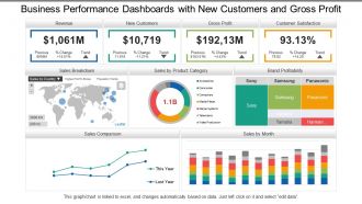
The provided image is a comprehensive business performance dashboard on a PowerPoint slide. It showcases key financial metrics such as Revenue, New Customers, Gross Profit, and Customer Satisfaction, all crucial for assessing a company's performance. The dashboard includes a map for sales distribution, a pie chart for sales by product category, a treemap for brand profitability, and a line graph for sales comparison over time. This visual representation of data is designed to offer a clear, at-a-glance understanding of the business's health, highlighting areas of growth and those needing attention.
Use Cases:
This performance dashboard is versatile and can be effectively used across various industries for tracking and presenting essential business metrics.
1. Retail:
Use: Monitoring sales performance and customer acquisition trends
Presenter: Business Analyst
Audience: Executives, Store Managers
2. E-commerce:
Use: Analyzing product category sales and brand performance online
Presenter: E-commerce Manager
Audience: Marketing Team, Sales Department
3. Manufacturing:
Use: Evaluating production efficiency and profitability by brand
Presenter: Plant Manager
Audience: Production Supervisors, Finance Team
4. Telecommunications:
Use: Assessing customer satisfaction and profit trends
Presenter: Chief Operating Officer
Audience: Customer Service Managers, Stakeholders
5. Healthcare:
Use: Tracking patient acquisition and revenue from services
Presenter: Healthcare Administrator
Audience: Department Chiefs, Financial Officers
6. Financial Services:
Use: Displaying customer growth and profitability of financial products
Presenter: Market Analyst
Audience: Investment Team, Account Managers
7. Automotive:
Use: Comparing sales trends and satisfaction across different car brands
Presenter: Sales Director
Audience: Dealership Owners, Marketing Team
Business Performance Dashboards Snapshot With New Customers And Gross Profit with all 6 slides:
Brainstorm with the best with our Business Performance Dashboards Snapshot With New Customers And Gross Profit. You will get their exclusive attention.
FAQs for Business Performance Dashboards Snapshot With New Customers
Honestly, start simple - pick 5-7 metrics that actually move the needle for your business. Real-time data is clutch because who wants to make decisions off stale numbers? Your visualizations should be dead simple to read. I can't tell you how many dashboards I've seen that look like a data explosion happened. When something looks weird, you'll want to drill down fast. Oh, and arrange everything so it tells a story - trends and problems should jump out at you. My old boss used to say "if it takes more than 30 seconds to understand, it's garbage." Maybe harsh but pretty accurate.
Start with clean data and put validation rules everywhere in your pipeline. Automated quality checks are a lifesaver - they'll catch weird stuff, missing values, all that before it hits your dashboard. Way easier than debugging later when everything's already broken. Cross-check your dashboard numbers against the actual source systems regularly too. Oh, and make someone own each data source - can't have accountability floating around nowhere. Build the verification right into your workflow from day one instead of crossing your fingers and hoping it works.
Look, visualization makes or breaks a dashboard honestly. Raw numbers are basically useless - your brain can't process them quickly. But a line chart? You'll spot trends immediately instead of staring at boring tables forever. Good visuals help you figure out what's urgent and reduce mental overload. Plus stakeholders won't fall asleep looking at charts (spreadsheets are brutal). The trick is matching the right chart to what you're trying to show. Ask yourself what decision you need to make first, then pick something that makes the answer super obvious.
Honestly, it totally depends on what you're tracking. Most operational stuff works fine with daily updates - gives you fresh info without driving everyone crazy. Financial dashboards? Maybe weekly or monthly is plenty. But customer service metrics need to be real-time or hourly because, let's be real, angry customers aren't gonna wait around. I'd say start with whatever feels right for how your team actually works. You can always tweak it later based on how often people are actually checking the thing and whether they need newer data to make calls.
Don't cram everything onto one screen - that's the
No Reviews