


Project Management Weekly Status Report Dashboard





Try Before you Buy Download Free Sample Product
 Impress Your
 Audience
 100%
100% Editable
 Save Hours
 of Time


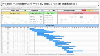
This slide represents a dashboard representing the weekly status report of an IT project prepared by the project management team. It includes details related to ongoing activities, top issues, breakdown chart, project plana and timeline and outstanding issues of the project.
People who downloaded this PowerPoint presentation also viewed the following :
Project Management Weekly Status Report Dashboard with all 7 slides:
Use our Project Management Weekly Status Report Dashboard to effectively help you save your valuable time. They are readymade to fit into any presentation structure.





FAQs for Project Management Weekly
Honestly, start with the basics - timeline, budget tracking, and task completion percentages. Resource allocation is huge too. I'd also throw in team workload visibility because bottlenecks suck when they blindside you. Upcoming deadlines are obvious but still essential. Those red/yellow/green health indicators work great for quick status checks. Oh, and definitely include whatever KPIs your stakeholders actually care about - not just vanity metrics. Risk tracking helps you catch problems early. The key thing though? Don't overcomplicate it. Focus on what your team checks daily, then build from there.
Dude, visuals are a game changer for dashboards. Color coding saves everyone's sanity - red for urgent stuff, green for good to go. Progress bars show milestones without making people do math in their heads. Charts let you spot trends super quick too. Nobody's got time to dig through walls of text when they're panicking about deadlines, right? Icons help people find things fast. I swear, sometimes the best dashboards remind me of video game interfaces - everything just clicks. The whole point is making the important stuff jump out so your team can actually make decisions instead of squinting at spreadsheets all day.
Budget variance and timeline progress are your bread and butter - stakeholders live for that stuff. Scope changes too, obviously. Resource utilization is huge because that's where things usually fall apart (learned that the hard way). Risk status keeps everyone from panicking when issues pop up. Quality metrics are good but don't overcomplicate it - just track defect rates or how clean your milestones look. Honestly, more than 6-7 metrics and people's eyes glaze over. Set up alerts for the red flags so you're not scrambling before meetings.
So real-time data integration basically means your dashboard shows what's happening right now instead of last week's numbers. Game changer, honestly. You'll catch problems before they blow up and can move people around when needed. No more digging through five different systems when your boss asks for updates (been there, it sucks). I'd start with time tracking and budget tools - they give you the most immediate payoff. Once you see project budgets updating live as hours get logged, you won't want to go back to manual spreadsheets.
Monday.com and Asana are pretty solid if you want something straightforward with dashboards already built in. Tableau's powerful but honestly kind of intense unless you're drowning in data from everywhere. I've had good luck with Notion and Airtable - you can basically build whatever you want. Already using Jira or Trello? Just grab their dashboard add-ons, way easier than starting over. Oh, and Power BI's decent too if you're into Microsoft stuff. Definitely try the free versions first though - no point paying for something that doesn't fit your team's vibe.
Honestly, dashboard customization is huge for keeping teams sane. Your marketing people want to see campaign deadlines and budget stuff right away, while developers need sprint updates and bug tracking. No more digging through random metrics that don't matter to you! You can set different permissions too - maybe junior folks get a cleaner view while managers see everything. I'd start simple though, just ask each team what 3-5 things they actually check every day and build around that. Way better than having everyone stare at the same generic dashboard.
Dude, feedback is everything. Without it your dashboard just becomes expensive digital wallpaper that nobody actually uses. I'd set up monthly check-ins with your team - or honestly, just throw some quick rating buttons right into the interface so people can complain in real time lol. What you really need to figure out is which features actually help vs which ones just demo well to executives. Half the dashboards I've used were clearly built by people who've never managed a project in their lives. Users will tell you what metrics they actually care about, which buttons are confusing as hell, and what's missing that could save them serious time each week.
Honestly, get a dashboard that shows who's doing what in real-time - super crucial when people are scattered everywhere. Comment threads on tasks are a lifesaver because then you don't need those annoying "quick sync" calls every five minutes. Show everyone's time zones too, or you'll be messaging someone at 3am their time like an idiot. Mobile-friendly is key since remote people check stuff on their phones constantly. Hook it up to Slack or whatever you use. Automated notifications help, but don't go crazy with them or people will just ignore everything.
Honestly, most people just dump way too much stuff on one screen. Pick like 3-5 metrics that actually help your team make decisions - not vanity stuff like "total hours logged" that sounds impressive but tells you nothing useful. Skip the pie charts just because they're pretty (I see this all the time). Focus on what matters: project status, deadlines, who's doing what. Test it with actual users first - trust me on this one. You can always add more bells and whistles later, but start simple. People need to get comfortable with the basics before you throw complexity at them.
Dude, you need to see what's happening with your project in real-time - budget, timeline, resources, all that stuff in one spot. When your boss starts grilling you (and they will), you'll actually have answers instead of scrambling around like an idiot. The visual stuff helps you catch problems early before they blow up. Honestly, I wish I'd started using one sooner - would've saved me so many headaches! You can share updates with everyone without doing those awful manual reports. Just pick 3-5 metrics that actually matter for your project and start there.
So agile dashboards are all about what's happening right now - burndown charts, story points, team velocity that updates daily. Traditional ones? They're stuck tracking your original timeline and budget from months ago. Agile stuff changes every sprint during standups. Traditional dashboards might get refreshed weekly if you're lucky. Honestly, most people forget what that initial project plan even said anyway. One shows real-time progress, the other shows how far you've drifted from some executive's dream timeline. Just pick whatever actually matches how your team works - not what looks good in meetings.
Dashboards are way easier to scan when you use color coding - like red for urgent stuff, yellow for warnings, green for good. Your brain reads colors faster than text, so people spot problems instantly. I always think of it like organizing your desk where the important things are right in front of you. Visual hierarchy does the same thing. Put key info in bigger fonts up top, less critical details smaller below. Honestly, traffic light colors work for almost everything. Just pick 3-4 colors and use them consistently across all your project stuff.
Honestly, you've gotta nail down your KPIs first or you're just gonna waste time. They're like your guide for what data actually matters - without them, you'll build something that looks cool but doesn't help anyone decide anything. I've seen this happen so many times. Pick 3-5 metrics that tie directly to what success means for your team. Don't go overboard with fancy stuff. Just focus on what moves the needle for your specific goals, then design everything around those core numbers.
Honestly, it's a game changer for keeping everyone in the loop. No more "hey what's happening with that project" messages every five minutes. Everyone can just check the dashboard to see task progress, deadlines, who's doing what. Way better than those weekly status meetings that drag on forever (you know the ones). You can comment directly on stuff and tag people when you need them. The notifications are clutch too - you'll actually catch problems before they blow up. My team used to spend half our time just figuring out where things stood. Now that info's always right there.
So basically you'd feed your AI all that historical project stuff - completion rates, how fast teams actually work, budget burn, whatever. Then it starts spotting patterns and can warn you about delays or resource crunches before they happen. Honestly feels like cheating sometimes lol. I'd start with timeline predictions first, that's where you'll see the biggest wins. Resource planning and risk scores come after. Oh and check Monday or Asana - they've got some decent AI baked in already so you might not need anything fancy to start.
-
Easily Understandable slides.
-
Their products can save your time, effort and money. What else you need. All in one package for presentation needs!