


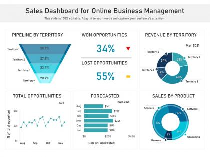
Sales dashboard for online business management




Try Before you Buy Download Free Sample Product
 Impress Your
 Audience
 100%
100% Editable
 Save Hours
 of Time


Our Sales Dashboard For Online Business Management are topically designed to provide an attractive backdrop to any subject. Use them to look like a presentation pro.
People who downloaded this PowerPoint presentation also viewed the following :
Sales dashboard for online business management with all 2 slides:
Use our Sales Dashboard For Online Business Management to effectively help you save your valuable time. They are readymade to fit into any presentation structure.
FAQs for Sales dashboard for
Track your lead gen numbers and conversion rates at each funnel stage - that's where you'll spot the bottlenecks. Revenue stuff is obvious but necessary: monthly numbers, average deal size, how fast deals actually close. Pipeline value tells you what's coming. Activity metrics like calls and meetings are useful, though they can feel pretty micromanage-y honestly. Don't go crazy with dashboards - pick maybe 8-10 metrics that actually help you make decisions. Individual rep performance against quota is clutch too. The fancy metrics look nice but won't help if nobody acts on them.
Honestly, sales dashboards are such a lifesaver for getting everyone on the same page. No more digging through random spreadsheets or playing the "whose numbers are right" game. Your team can actually see pipeline progress and bottlenecks as they happen. Monday meetings become way less painful - nobody's scrambling to find data anymore. You'll spot trends faster and can jump in when someone's struggling before things get messy. Plus celebrating wins in real-time just hits different, you know? Just don't let it become another tool people ignore.
Honestly, good charts make all the difference. Your sales dashboard goes from being this overwhelming mess of numbers to something you can actually read in like 2 seconds. Spotting trends becomes easy when you've got clean visuals instead of endless spreadsheet rows. Nobody wants to sit there decoding raw data when there's deals to close, right? Your team will make way faster calls because they can see what's working and what isn't immediately. Stick with simple stuff - pipeline health, conversion rates, the basics. Maybe throw in some color coding if you're feeling fancy. Trust me, you'll wonder why you waited so long.
Honestly, daily updates are your sweet spot for most sales teams. Real-time is even better if your system can swing it - sales data moves fast and you need current info to make decent decisions. Weekly? Way too slow unless you're selling enterprise software or something with super long cycles. Quick deals or big teams definitely need that real-time refresh. I'd say start with daily and see how often people actually look at the thing. If your team's checking it constantly, bump it up to real-time. Match whatever speed your sales environment runs at.
Put your biggest metrics up top - revenue, pipeline, win rates, that stuff. Charts beat tables every time, trust me. Don't try shoving everything on one screen though (I've seen so many cluttered disasters). Your team needs easy filters for dates, regions, whatever. Colors should match across the board. Here's the thing - if it takes more than 10 seconds to get the main point, you've gone too far. Mock up a couple versions first and run them by your actual sales people before you commit. They'll spot issues you totally missed.
Honestly, just figure out what each team actually obsesses over. Inside sales? They're glued to lead volume and conversion rates. Field teams want territory numbers and pipeline stuff. Here's what works - ask what metrics they check first thing Monday morning. That's usually your goldmine right there. Shadow a few people for like a day and see what they're constantly asking about, then build around those headaches. Some love daily breakdowns, others prefer weekly trends (which makes sense). Oh, and don't overthink the layout - just put their most-wanted data front and center. Works every time.
Honestly, Tableau and Power BI are your best bets - they handle real-time data like champs. Looker's solid too if you don't mind spending more. Already using Google stuff? Data Studio is free and gets the job done (though the interface can be kinda clunky). Your CRM might have built-in options worth checking out first. Salesforce dashboards are decent, and I actually really like HubSpot's reporting tools. Here's what I'd do: grab free trials of 2-3 platforms and build the same simple dashboard in each. You'll know pretty quick which one feels right for how you work.
So there's a few ways to do this - APIs, native connectors, or something like Zapier. Most CRMs (Salesforce, HubSpot, Pipedrive) already have dashboards built in. But honestly? The dedicated dashboard tools blow them out of the water for customization. Your integration basically pulls live data from the CRM - deals, contacts, all that stuff - and shows it visually without you having to manually update anything. I'd start with whatever your CRM offers first, just to see if it's enough. Then if you need fancier analytics, check out Tableau or Power BI. Way more control over how everything looks.
Don't cram everything onto one screen - learned that the hard way. Pick 5-6 metrics that actually matter instead of vanity stuff like "total leads" when your conversions suck. Get your sales team involved early since they'll hate you if the dashboard is useless. Fresh data is crucial too. Stale numbers kill credibility fast. Oh, and honestly? Most people overthink this - start basic with what drives real decisions, then add more later. Nobody wants to stare at 20 charts trying to figure out what's important.
Look, predictive analytics basically turns your sales dashboard into a fortune teller instead of a history book. You'll actually see which deals might close and catch accounts before they bail on you. Way better than just staring at last quarter's numbers, right? The algorithms dig through your old data to predict what's coming next. Honestly, it's pretty wild how accurate it gets. Start small though – maybe add some lead scoring or revenue forecasting widgets to whatever dashboard you're already using. Then you can make moves before problems hit.
Track your pipeline velocity and conversion rates first - those tell you everything. Lead source quality is huge too, way more important than people think for where to spend money. Watch your Q progress daily because catching momentum shifts early saves your ass. Rep performance data helps you coach before deals die. Honestly? Skip the vanity stuff and focus on what moves this month's numbers. Set alerts when anything drops 15% below normal. Revenue trends week-over-week will show you problems coming. It's all about speed - the faster you see issues, the faster you fix them.
Honestly, sales dashboards are lifesavers - they take all your messy data and make it visual so you can actually see what's happening. Way better than drowning in spreadsheets (been there, done that). You'll start noticing patterns like Q4 always crushing it or certain products gaining steam. Once you get the hang of reading these trends, forecasting becomes pretty straightforward. Oh, and definitely set up alerts for weird changes - saved my butt more than once when things shifted unexpectedly. Makes adjusting forecasts way less stressful.
Your sales team's constantly on the move - client meetings, travel, working from random coffee shops. They need dashboard access wherever they are. Picture this: you're sitting across from a potential client and can't pull up their recent activity or your current pipeline stats. That's just awkward, honestly. Real-time data on mobile keeps you sharp during those crucial moments. Whether you're in an Uber between calls or stuck at the airport, you've got to stay connected to your metrics. Just make sure the thing actually loads fast on phones and isn't a nightmare to navigate with your thumb.
Honestly, just ask people what's broken - surveys, quick interviews, whatever works. Your top performers will straight up tell you what metrics they're missing or which features slow them down. I always look at dashboard sections that get completely ignored, that's like a neon sign something's wrong. Test stuff with a small group first before rolling changes out to everyone. Usage analytics help too, but nothing beats asking your best salespeople "what's the one thing you'd fix tomorrow?" They'll have opinions, trust me.
Honestly, dashboards work because nobody wants to look bad when their numbers are up there for everyone to see. Your team will actually start making those calls instead of just claiming they did. It's like having a public scoreboard - sounds awful but competitive people love it. The trick is tracking daily activities, not just final sales numbers. Otherwise people just focus on outcomes they can't control. Make sure your reps can check where they stand each day without digging through a bunch of screens. Real-time visibility changes behavior fast.
-
Attractive design and informative presentation.
-
Nice and innovative design.
-
Use of different colors is good. It's simple and attractive.
-
Great quality product.
-
Topic best represented with attractive design.
-
Content of slide is easy to understand and edit.
-
Informative presentations that are easily editable.