


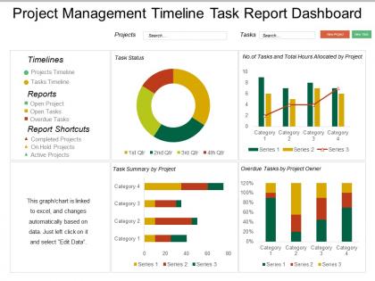
Project management timeline task report dashboard snapshot




Try Before you Buy Download Free Sample Product
 Impress Your
 Audience
 100%
100% Editable
 Save Hours
 of Time


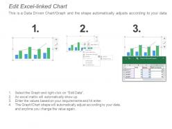
No project plan or charter is complete without a project management timeline. So therefore, we have come up with our project management timeline task report dashboard PowerPoint slide to help you out with your business needs. You can use this project management timeline dashboard PPT slideshow to outline the deliverables you plan to produce by the end of a project. Our project management timeline task report dashboard PowerPoint visual provides a simple visual overview of our projects from start to finish and lead to increased work efficiency among teams. Editable bar charts and donut charts along with text boxes have been used to craft this professional project management timeline PPT slide. It is very important for project managers to develop skills to build an accurate timeline. Further this project management timeline Presentation design will describe what phases are already in the past, what is in the progress now and what is supposed to be finished in future. Cut across the divide with our Project Management Timeline Task Report Dashboard. The gentry will appreciate your even handedness.
People who downloaded this PowerPoint presentation also viewed the following :
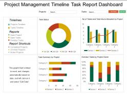
Project management timeline task report dashboard snapshot with all 6 slides:
Control critical functions with our Project Management Timeline Task Report Dashboard Snapshot. Ensure that errors don't happen.

FAQs for Project management timeline task
Three main things to track: how you're doing on schedule milestones, whether you're over/under budget, and if your team's actually busy or sitting around. Risk indicators matter too - I learned that the hard way on my last project. Those traffic light status updates (red/yellow/green) are honestly clutch for exec meetings since nobody wants to read paragraphs. Dependency tracking is huge because that's where everything falls apart usually. Put your most critical stuff at the top of your dashboard. Real-time updates are nice but don't stress if that's complicated to set up initially.
Honestly, timeline dashboards are pretty clutch for team communication. No more constant "hey what's the update on that thing?" messages blowing up your Slack. Everyone can just check the dashboard to see who's working on what, when stuff's due, and where things might get backed up. Plus stakeholders stop bugging you for status reports - just send them the link. Though I will say, it only works if people actually update their tasks regularly. Otherwise you're back to square one with an outdated mess that nobody trusts.
So static dashboards are basically like taking a screenshot - they show your project data from one moment and stay that way until you update them manually. Dynamic ones pull live data automatically, so they're always current when tasks finish or deadlines move around. Honestly? Static feels pretty old school now unless you need it for compliance stuff or whatever. I mean, why look at outdated info when you could see what's actually happening right now? Dynamic's definitely the way to go for daily project tracking. You'll always know the real status instead of guessing if things changed since your last update.
Honestly, visuals are a game-changer for timeline dashboards. Color-coded progress bars show you instantly where things stand. Your team won't have to waste time digging through boring spreadsheets - thank god for that. Gantt charts and milestone markers make delays super obvious. Icons help differentiate task types, and dependency indicators actually make sense when they're visual. I'd stick with consistent colors and keep the layout clean though. Status symbols are clutch for quick updates. Trust me, your stakeholders will love being able to understand project status without squinting at tiny text.
Hey! So for timeline dashboards, I'd probably go with Smartsheet or Microsoft Project first - they've got all the project management stuff baked in already. Asana and Monday.com are way easier to use though, honestly I find them less overwhelming. You could always just build something in Excel or Google Sheets if you're feeling ambitious, but that's gonna be more work obviously. Tableau and Power BI are total overkill unless you're dealing with huge amounts of data. Oh and definitely try the free trials first - I made the mistake of buying software before testing it once and regretted it. Start with Smartsheet or Asana, see what feels right.
Weekly updates are the bare minimum, but honestly? Daily is way better when you're in crunch mode or hitting big milestones. I totally screwed this up once - only updated mine every two weeks and completely missed a major bottleneck. Now I just do it first thing Monday or right before I log off each day. Fresh data makes stakeholders way more likely to actually trust what you're showing them. Plus you'll spot problems while they're still fixable instead of when everything's on fire. Oh, and definitely set a calendar reminder because it's so easy to forget!
Dude, get stakeholder feedback early or you're gonna regret it. Find out what metrics they actually care about and how they want to see the data. I made this gorgeous dashboard once that execs totally ignored because I buried the budget stuff they needed front and center - such a waste of time. Ask them about granularity too, some people want daily breakdowns while others just need monthly. Their input helps you figure out what to build first. Oh and don't wait until you're done to show them - do quick check-ins during development so you're not building the wrong thing.
So I'd definitely use color coding - red for high risk stuff, yellow for medium, green for safe tasks. Most project management tools let you create custom risk fields that'll show up right on your Gantt charts. Conditional formatting is honestly a game changer because it automatically highlights when things get sketchy. Oh, and add warning icons next to any dicey milestones. That visual stuff really helps during stakeholder meetings. You might want to throw in a risk register panel too, so people can see the timeline AND the actual risk details side by side. Makes it way easier to spot what could go sideways before it actually does.
Red diamonds work great for hard deadlines, gold stars for milestones - your brain processes those shapes instantly. Bold colors on critical path stuff so it jumps out. I always throw in buffer time indicators too (stakeholders love seeing wiggle room). Dependency lines between tasks are huge - you'll spot bottlenecks way faster. Keep milestone names descriptive but short, like "Beta Testing Complete" not "Milestone 3" which tells you nothing. Make everything clickable for details without turning your main view into a mess. Honestly, the visual hierarchy makes or breaks these things.
Dude, timeline dashboards are honestly game-changers. You can see when everyone's swamped vs. free, which helps you catch conflicts early instead of dealing with chaos later. Color-code your team members first - makes scanning for availability so much easier. When priorities shift (and they always do), just drag tasks around or move people. I swear it saves my sanity during those crazy planning weeks when every stakeholder thinks their project is urgent. Plus you'll spot who's overloaded before they burn out.
Honestly, Gantt charts are probably your best option here - they show everything at once: dependencies, how long stuff takes, progress updates. Kanban boards are solid too if you care more about workflow than exact deadlines. Timeline charts work for the big picture milestones, but they get cluttered fast with details (learned that the hard way). What I've been doing lately is mixing a Gantt with a basic milestone timeline. Stakeholders get the full story without their eyes glazing over. Just pick something that lets you update progress quickly and flag delays as they happen. Trust me, you'll need that real-time visibility when things inevitably go sideways.
Honestly, less is more with dashboards. Put the urgent stuff right at the top - overdue tasks, deadlines coming up, project health status. I can't tell you how many times I've seen teams build these monster dashboards that nobody actually uses because they're overwhelming. Color coding works great for quick status checks. Your team should be able to glance at it and know what's going on in like 30 seconds max. Oh, and definitely test it with real users - they'll tell you if something's confusing way faster than you'll figure it out yourself.
Don't cram everything onto one screen - that's the fastest way to make people's eyes glaze over. Focus on the big milestones, not every little task. Make it interactive too, because static timelines are basically useless when things inevitably change. Your team needs to actually update progress and move dates around easily. Oh, and definitely test it with real users first - I learned this the hard way when I thought my "brilliant" layout made zero sense to anyone else. Dependencies between tasks matter way more than you think. Start basic, then build up based on what people actually tell you they need.
Track your completion rates, milestone delays, and resource usage over time - that's your foundation. Those velocity trend charts work like magic, especially when stakeholders see red lines dropping (nobody ignores that). Build dashboards with burndown charts and variance tracking to spot patterns. Here's the thing - you need solid baseline metrics from day one or your forecasting will suck. I'd start basic with completion percentages, then get fancier once you've got enough data points. Oh, and earned value analysis is clutch for predicting where things are headed.
Mobile dashboards are seriously a lifesaver for project teams. Your people can approve stuff during meetings, check status updates on the train, handle urgent tasks without running back to their computer. But here's the thing - if it doesn't work well on phones, you're screwed. Make sure everything scales down properly and the touch controls actually work. I've seen too many dashboards where you can't read the charts or you keep hitting wrong buttons by accident. Test it on real phones first, not just those fancy design previews. Trust me on this one.
No Reviews