KPI Dashboard To Track Loan Management System

Rating:
90%
KPI Dashboard To Track Loan Management System KPI Dashboard To Track Loan Management System
Slide 1 of 7

or

Favourites Favourites

Try Before you Buy Download Free Sample Product

Audience Impress Your
Audience
Editable 100%
Editable
Time Save Hours
of Time
The Biggest Sale is ending soon in
0
0
:
0
0
:
0
0
Rating:
90%
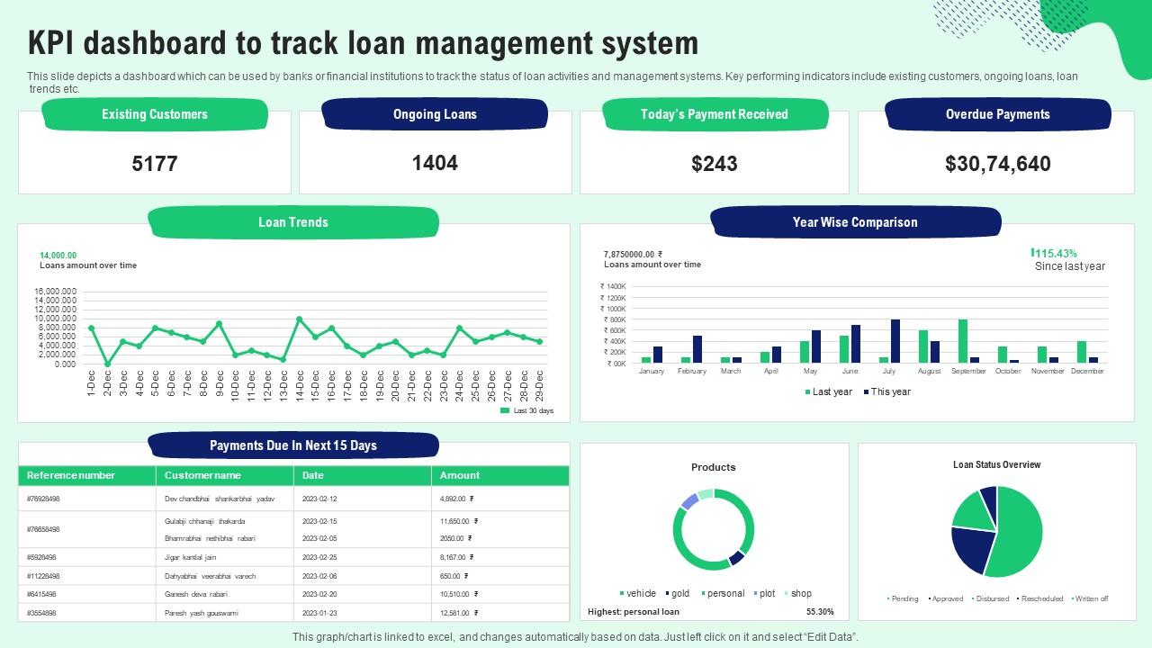
This slide depicts a dashboard which can be used by banks or financial institutions to track the status of loan activities and management systems. Key performing indicators include existing customers, ongoing loans, loan trends etc. Introducing our KPI Dashboard To Track Loan Management System set of slides. The topics discussed in these slides are Existing Customers, Ongoing Loans, Payment Received. This is an immediately available PowerPoint presentation that can be conveniently customized. Download it and convince your audience.

People who downloaded this PowerPoint presentation also viewed the following :

FAQs for KPI Dashboard To Track

Pick 4-6 metrics that actually matter to your business - seriously, don't try to track everything or you'll go crazy. Revenue and profit margins are obvious ones. Then look at stuff like conversion rates or what it costs to get new customers. Whatever's big in your industry too. Honestly, half the metrics people obsess over are just ego boosters that don't change anything real. Each one needs a target and deadline so you can tell if you're winning or losing. Start with your most critical ones first. You can always add more later once you get the hang of it.

So you'll want different dashboard views for each department - sales needs their revenue and pipeline stuff right up front, HR cares about retention and hiring numbers, operations lives for efficiency metrics (they're obsessed, I swear). Don't make everyone stare at the same cluttered mess of data. Set up role-based access so people only see what actually matters to their job. Maybe give each department their own tabs? Let the department heads pick their top 5-7 metrics to highlight. Trust me, less is more here.

Honestly, good visuals are what separate useful dashboards from total data dumps. Pick the right charts and your team can spot problems instantly instead of squinting at spreadsheets for hours. Line charts work great for trends, gauges for hitting targets, heat maps when you're comparing stuff. The trick is figuring out what story each metric needs to tell first. Then match your visuals to that story. Nobody wants to decode rows of numbers when they could just glance at a chart and know if things are going well or not. Makes decision-making way faster too.

Honestly, just match it to when your data actually changes and when you'll act on it. Daily updates work for operational stuff, weekly for tactical metrics, monthly for the big strategic numbers. Real-time sounds cool but it's usually pointless - unless you're watching something mission-critical like server crashes or holiday sales spikes. Most teams should start weekly and see how it goes. Why refresh every hour if you only check performance once a week anyway? That's just data for data's sake. Figure out when your team actually looks at the dashboard, then set your refresh schedule around that rhythm.

Honestly, less is more with dashboards. Your most important KPIs should go top-left since that's where people look first. Stick with obvious color choices - red = bad, green = good, etc. Group similar stuff together but don't cram everything onto one screen (learned that the hard way). Quick load times are non-negotiable. Nobody waits around for slow data. Skip the confusing abbreviations - just write it out clearly. Always show your time periods too. Test with real users before you launch. They'll spot the weird stuff you totally missed.

Honestly, automated data integration is a game-changer if you're tired of that copy-paste hell. Your dashboard just pulls from everything automatically - CRM, analytics, databases, you name it. Real-time updates mean stakeholders actually trust what they're looking at since it's always current. No more human errors from manual entry either, which is huge. You'll spend way less time gathering data and way more time figuring out what it actually means. I set mine up like 6 months ago and haven't looked back. The setup takes some work upfront but then it basically runs itself.

Tableau and Power BI are solid choices if you need heavy analytics. Google Data Studio's free and actually pretty decent - can't beat that price. Excel works but gets messy fast with complex stuff. For real-time dashboards, check out Grafana or Klipfolio. Honestly, Looker's great too but might be overkill depending on what you're doing. Start by figuring out what data sources you'll connect to first. That alone will cut your options in half and you won't get stuck scrolling through endless comparisons online.

Lead with the story, not the spreadsheet. Like "sales dropped 15% but here's what's actually happening." Then get into specifics. Charts help but honestly, throw in too many and people check out completely. Match your message to who's listening - execs just want bottom line impact, team leads need the nitty gritty operational stuff. The real trick? Always connect what your KPIs are showing to what needs to happen next. Don't leave people hanging. Wrap up with concrete next steps or you'll get that dreaded "thanks, we'll circle back" response.

Honestly, the worst thing you can do is cram everything onto one screen - it just becomes chaos. Don't chase vanity metrics either, executives hate that stuff and can smell BS from a mile away. Your KPIs need to actually match what the business cares about, not just look pretty. Also make sure the data refreshes regularly because nobody uses stale dashboards. Clean design matters too or people won't even bother opening it. Oh, and definitely test it with actual users first - I learned that one the hard way when my "brilliant" layout confused literally everyone.

So basically everyone can see what actually moves the needle instead of just doing random busy work. It's like having a scoreboard - honestly pretty motivating when you know if you're winning. Your team stops working in silos and starts focusing on stuff that leadership actually cares about. The key is making sure people check it weekly and talk about how their projects tie into those numbers. Otherwise it just becomes another dashboard collecting dust (we've all seen that happen). When everyone's tracking the same metrics, your daily work naturally aligns with company goals. Game changer for most teams.

So basically predictive analytics turns your dashboard into something way more useful than just looking at old data. You'll get forecasts and trend projections that show what's coming next. It can warn you when metrics are about to hit trouble spots and help you spot patterns before they blow up into real problems. Honestly, it's a game-changer for staying ahead of things instead of always playing catch-up. Plus you can run "what if" scenarios to test different decisions. I'd start simple - just add trend lines to your main metrics first, then work up to fancier forecasting once you trust the predictions.

Look, small businesses should stick to maybe 5-7 KPIs tops - stuff like cash flow, customer acquisition costs, basic revenue tracking. Keep it dead simple so you can actually check it on your phone without getting overwhelmed. Big companies? They can go nuts with 15+ metrics, multiple layers, department-specific views because they've got actual analysts to make sense of it all (must be nice, right?). Different people need different data anyway. Honestly though, start basic no matter what size you are. Way easier to add complexity later than to strip it back when everyone's confused.

Clean data sources are your starting point, obviously. Set up automated checks that catch errors before they mess up your dashboard. Skip manual exports if you can - someone always forgets to update that random Excel file when you need it most. Data quality alerts help too, they'll flag weird spikes or missing stuff. Document how you calculate things so everyone knows what your KPIs actually mean. Oh, and assign someone to own this mess - like actually own it, not just pretend to care. They'll spot problems fast and fix them.

So it really comes down to your industry, you know? Retail needs conversion rates, average order value, inventory turnover - the usual suspects. For healthcare, you'll want patient satisfaction, readmission rates, staff utilization. Manufacturing is all about OEE, defect rates, production throughput. Now SaaS is where it gets interesting - monthly recurring revenue, churn rate, customer acquisition cost. Those three will basically tell you if you're winning or dying a slow death. Don't go crazy though. Pick like 5-7 metrics that actually matter for making decisions instead of turning your dashboard into some overwhelming mess nobody wants to look at.

Honestly, just compare what you spend (software, setup, training costs) against the time you get back. Your team will save hours weekly on reporting and catch problems way faster. I'd multiply those saved hours by everyone's hourly rate, then look at it annually - the numbers add up quick. Plus you'll probably see revenue bumps from spotting trends earlier. The real win though? Way fewer "so what's our status" meetings that go nowhere. Oh, and definitely track your current baseline metrics before you roll anything out, otherwise you can't prove jack later on.

Ratings and Reviews

90% of 100
Review Form
Write a review
Most Relevant Reviews
  1. 80%

    by Thomas Garcia

    The best collection of PPT templates!! Totally worth the money. 
  2. 100%

    by Darryl Gordon

    The team is highly dedicated and professional. They deliver their work on time and with perfection.

2 Item(s)

per page: