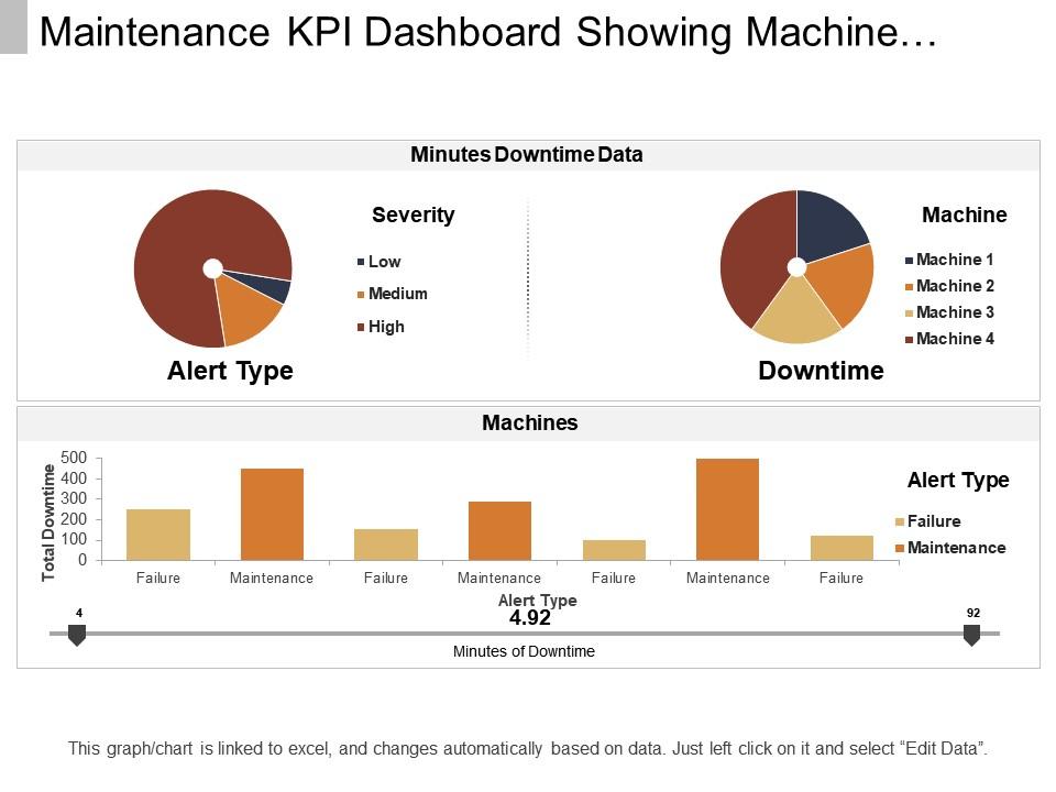
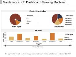
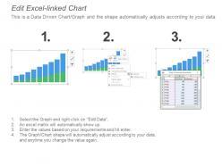
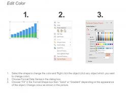
Maintenance kpi dashboard showing machine downtime and alert type
Try Before you Buy Download Free Sample Product
Audience
Editable
of Time
Explain how following instructions benefits all with our Maintenance Kpi Dashboard Showing Machine Downtime And Alert Type. It will instil a desire for discipline.
People who downloaded this PowerPoint presentation also viewed the following :
Maintenance kpi dashboard showing machine downtime and alert type with all 6 slides:
Build your campaign with our Maintenance Kpi Dashboard Showing Machine Downtime And Alert Type. They allow you to canvas effectively.
FAQs for Maintenance kpi dashboard showing machine downtime
Stick with five main KPIs - trust me on this one. OEE is your best friend since it shows the whole picture (availability, performance, quality rolled into one). MTBF and MTTR tell you how reliable your equipment is and how fast you're fixing stuff. Also track maintenance costs as a percentage of asset value, plus your planned vs unplanned maintenance ratio. I worked somewhere that had this crazy dashboard with like 15 different metrics and nobody could make sense of it. These five give you everything you actually need to know. Set up alerts when they hit your limits and you're golden.
So basically, these dashboards show you what's really going on with your equipment instead of just guessing. You'll catch patterns early - like that one machine that keeps acting up or where you're bleeding cash on emergency fixes. Honestly, once you start using the data it's pretty addictive. Makes it way easier to plan preventive maintenance and actually back up your budget requests with real numbers instead of just saying "trust me, we need this." Oh, and don't try tracking everything at once - pick maybe 3-5 metrics to start or you'll go crazy.
Honestly, Power BI is probably your best bet for maintenance dashboards. Connects to most CMMS systems without being a total nightmare to set up. Tableau's powerful but way too complicated unless you love spending weekends learning software. Grafana's solid too, especially if you're more technical. Google Data Studio works if budget's tight - not amazing but gets the job done. I'd just grab Power BI's free trial first though. See how it feels with your current setup before committing to anything fancy. Your team will thank you for picking something that doesn't make them want to throw their laptop out the window.
Daily updates are the minimum, but honestly? Real-time is where you want to be if your system can swing it. Old data won't help when equipment's down and you need to act fast. Hourly refreshes usually hit that sweet spot - accurate enough without killing your system performance. Equipment status and work order stuff definitely work better with live feeds. Your team has to actually trust what they're seeing on screen, you know? Oh, and set up auto-refresh so nobody's stuck updating spreadsheets manually all day. That's just painful.
Honestly, data visualization is what saves you from drowning in spreadsheets when you're trying to track maintenance stuff. Charts and graphs let you spot problems fast - way better than staring at rows of numbers when equipment's acting up. I always tell people to use color coding too, makes it super obvious what needs attention. Your team will actually look at dashboards if they're visual, plus management loves seeing pretty charts during meetings (weird but true). Keep it focused though - pick maybe 3-5 metrics that actually matter for your operation. You can always add more later once people get used to checking it regularly.
Grab 6-12 months of your maintenance records first - work orders, failure logs, all that stuff. You'll need it to figure out your baseline MTTR, MTBF, and downtime ratios. Honestly, medians work better than averages here since one catastrophic breakdown can totally mess up your numbers. Watch for seasonal trends too. Some equipment just acts up in winter or whatever. Once you've got solid baselines, set targets maybe 10-15% better than where you currently sit. Don't go crazy ambitious or you'll just frustrate everyone. Been there!
Oh man, the worst thing you can do is cram like 15 different metrics on one screen - nobody knows where to look first. Teams love picking those feel-good vanity metrics that don't actually help you make decisions. Make sure everyone's on the same page about what each number means too, because I've seen departments argue over the same KPI for weeks. Keep your data updated or you'll end up with this depressing museum of old numbers. Honestly? Start with maybe 3-5 metrics that actually matter for what you're trying to fix.
Start with figuring out what your company actually cares about, then pick maintenance KPIs that match. Cost cutting? Track maintenance cost per asset or your preventive vs reactive ratios. Most manufacturers should honestly focus on uptime though - that's where the real money is. Monitor MTBF, MTTR, and OEE for that stuff. Here's the thing: your dashboard needs to tell a story that executives get, not just metrics your maintenance team understands. I've seen too many dashboards that look impressive but don't connect to business goals. Set targets that actually matter to the bigger picture.
Okay so first track your MTBF and MTTR - those are your bread and butter metrics. Availability percentage too, obviously. That tells you how much uptime you're actually getting. Failure rate trends are huge, plus your planned vs unplanned downtime ratios. If those ratios look terrible, your preventive maintenance probably isn't working. Equipment age and maintenance costs per unit help you figure out when it's time to just replace the thing instead of throwing more money at repairs. Honestly, OEE is pretty useful too but don't get overwhelmed trying to track everything at once.
Honestly, user feedback is what separates dashboards people actually use from expensive digital wallpaper. Ask your team which metrics help them do their jobs better and what's currently driving them nuts. Monthly check-ins work great, or just throw a comment box somewhere. I'd start with your power users - they'll tell you exactly what's broken. The thing is, most dashboards get built without talking to anyone who'll actually use them daily. Pretty charts don't mean much if they're showing the wrong stuff or confusing everyone.
Honestly, just pick the KPIs your team checks every single day - resist cramming everything in there. Simple charts work best, and that green/yellow/red color system is clutch because everyone gets it instantly. Group similar stuff together so it flows logically. Skip the technical labels too - nobody wants to decode what "conversion funnel optimization rate" means at 9am. Ask your team what's confusing them regularly. I learned this the hard way, but test changes with like 2-3 people first. Saves you from that awkward "hey can we go back to the old version" conversation later.
Focus on future predictions instead of just looking backward. Track remaining useful life, failure probability scores, and when equipment needs maintenance next. Show uncertainty clearly - confidence intervals or color codes work well so people know how reliable your predictions are. Way too many dashboards make forecasts look like guaranteed facts, which is a disaster waiting to happen. Add alerts when equipment hits maintenance thresholds. Your team won't trust the system unless you're tracking how accurate past predictions were. Start with whatever equipment costs the most when it breaks.
Downtime metrics show you exactly where you're bleeding production time. Track planned vs unplanned downtime first - that's your starting point. MTBF is honestly underrated, most people sleep on it but it's gold for spotting equipment patterns. Which machines keep breaking? Why? Once you have that data, you can actually plan maintenance instead of just scrambling when stuff breaks. I'd focus on your worst 3 downtime causes first - trying to fix everything at once never works. You'll see results pretty quick once you stop playing whack-a-mole with equipment failures.
Having that dashboard on phones is honestly such a smart move. Your techs can check work orders and equipment status right from wherever they are - no more running back to the office computer. When everyone's seeing the same live data, decisions just happen faster. Plus you can update stuff immediately and flag problems before they get worse. Way better than playing phone tag all day. I'd probably start small though, maybe just get them used to mobile alerts for the really critical stuff first. Once they see how much easier it makes their job, they'll be all over it.
Tell a story with your data instead of shoving everything onto one screen. Your most important stuff - like equipment effectiveness and unplanned downtime - should jump out first. Then add the supporting details underneath. Color coding is your friend (red for problems, green for good). I know it's tempting to squeeze in another chart but honestly? Don't. People want to quickly see equipment health and maintenance trends, not solve a puzzle. Make it interactive for drilling down, and always show targets or comparisons so they have context. Otherwise you're just showing pretty numbers.
-
Excellent design and quick turnaround.
-
Unique research projects to present in meeting.