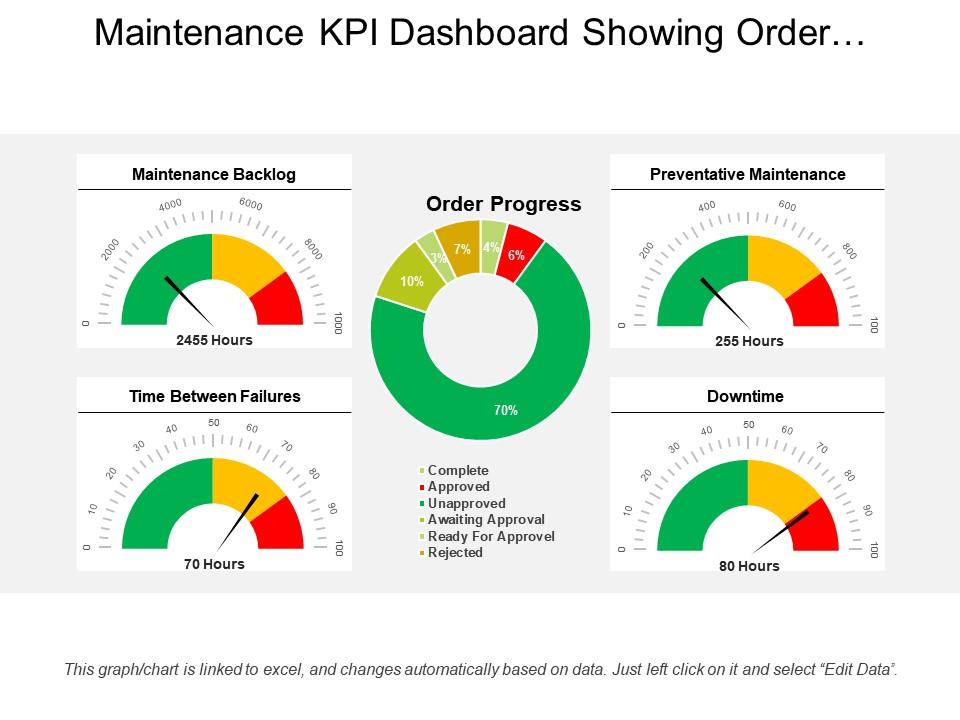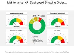
Maintenance kpi dashboard showing order progress and backlog

Rating:
100%
Slide 1 of 6
Favourites Favourites

Try Before you Buy Download Free Sample Product

Audience Impress Your
Audience
Editable 100%
Editable
Time Save Hours
of Time
The Biggest Sale is ending soon in
0
0
:
0
0
:
0
0
Rating:
100%
Presenting our maintenance KPI dashboard showing order progress and backlog. This PPT slide offers you plenty of space to put in titles and sub titles. High resolution-based presentation layout, does not change the image even after resizing. This presentation icon is data driven and template can be downloaded via excel file to incorporate data. Quick downloading speed and simple editing options in color text and fonts.PPT icons can easily be changed into JPEG and PDF applications.

FAQs for Maintenance kpi dashboard showing order

Track your equipment uptime first - that's the big one. Maintenance costs matter too, both planned and surprise repairs that'll kill your budget. Work order completion rates and backlog size give you a good picture of how swamped your team is. Don't forget safety metrics either. Real-time data is crucial though - stale numbers are basically useless. Charts with color coding help you spot problems fast. MTTR and MTBF are solid if you're into reliability tracking. Honestly, start simple with these basics, then pile on whatever metrics your boss actually looks at during meetings.

Look, you've gotta focus on what actually breaks in your world. Manufacturing? Track OEE and downtime costs - that's your bread and butter. Healthcare places obsess over equipment uptime and compliance stuff. Food processing is completely different - they're all about sanitation schedules and temp monitoring (honestly makes sense when you think about it). Map out your biggest headaches first - like what keeps you up at night - then build KPIs around those specific problems. Don't just copy some generic template. Pick your top 3-5 pain points and work backwards from there. Way more effective than trying to track everything under the sun.

Honestly, go with Power BI or Tableau for maintenance KPIs. Both pull data from most CMMS systems pretty smoothly. Power BI's probably your best starting point - free trial and it plays nice with Microsoft stuff you're already using. Google Data Studio is solid too if you're trying to keep costs down. Excel works but gets messy quick with complex data, trust me on that one. Oh, and don't overthink the visuals - I've watched people spend hours on fancy charts when a basic bar graph tells the story just fine. Start simple, you can always jazz it up later.

Monthly reviews are the bare minimum, but weekly's way better if you can manage it. Maintenance data moves fast - stuff breaks, priorities change constantly. Quarterly's fine for actually updating which KPIs you track or changing targets. But those monthly (or weekly) sessions? That's where you catch problems early and spot trends before they bite you. Oh, and definitely put it on your calendar as a recurring meeting. I learned this the hard way - these reviews always get bumped when you're swamped, then suddenly you're three months behind and wondering why everything feels chaotic.

MTBF and MTTR are your starting points - they show what's breaking and how fast you're fixing it. OEE is honestly my favorite because it wraps availability, performance, and quality all together. Track your planned vs unplanned downtime ratio too, that'll tell you if you're actually being proactive or just playing catch-up constantly. First Pass Yield matters for quality stuff. Oh, and Equipment Availability is pretty basic but still useful. If you're just starting out though? Stick with MTBF and MTTR first - you'll get immediate insights without drowning in data.

Pull everything from your CMMS, IoT sensors, and condition monitoring into something like Power BI or Tableau. Track the big ones - remaining useful life, failure probability, anomaly alerts. Color-coding by urgency is clutch because nobody's got time to dig through spreadsheets when stuff's breaking. Real-time updates are ideal, but daily works too. Set up alerts for critical thresholds so you're not babysitting the dashboard all day. Oh, and start with your most expensive equipment first. Once people see it actually preventing downtime, expanding to other assets becomes way easier.

Time-series charts are your best bet for tracking MTTR and uptime trends - you'll spot patterns instantly. Heat maps? Perfect for showing which equipment keeps failing. I'd throw in some gauge charts to see how you're hitting targets, plus basic bar charts for comparing different teams or assets. Pie charts are pretty much useless here unless you're breaking down what's causing downtime (and even then, meh). Keep it simple with maybe 5-7 visuals max. Each chart should answer something your maintenance crew actually cares about, not just look pretty on the wall.

Figure out your team's main goals first - cutting downtime? Saving money? Better equipment reliability? Then pick maybe 3-5 KPIs that actually measure those things. Don't fall into that trap where you're tracking everything but learning nothing (I've seen so many teams do this). Start with what data you can realistically collect, then match your KPIs to your specific equipment and what your team can handle. Honestly, just begin simple - MTTR or planned vs unplanned maintenance work great. You can always add more complex stuff later once everyone's comfortable with using the dashboard regularly.

Look, your dashboard's only gonna be as reliable as the data going into it. Garbage in, garbage out, you know? I've watched whole teams screw themselves over because they thought their numbers were improving, but really their techs were just getting sloppy with data entry. Missing failure codes, wonky timestamps, incomplete work orders - all that stuff makes your KPIs basically useless. You can't spot real trends when half your data's wrong. First thing I'd do? Audit where your data's coming from and get your technicians on the same page about how they're logging everything. Otherwise you're just guessing.

Dude, these dashboards are game-changers. You'll actually see what's happening with your equipment in real-time instead of just guessing. Downtime patterns become obvious before they wreck your budget - same with parts costs spiraling out of control. The visual stuff makes it way easier to show your boss why you need more money for repairs (trust me on this one). I'd start small though, maybe 3-4 metrics that hit your worst headaches. Once you get hooked on the data - and you will - you can add more. Way better than flying blind all the time.

Data silos are gonna be your worst nightmare - nothing talks to each other. Your CMMS and ERP live in separate worlds, which is honestly ridiculous in 2024. Technicians record stuff however they feel like it too. Some use hours, others minutes. Manual entry means tons of gaps and mistakes. Old equipment? Forget getting real-time data without expensive sensor upgrades. Oh, and good luck getting departments to agree on what "downtime" even means. Manufacturing counts it one way, maintenance another. My advice? Fix your data collection first. Dashboards look pretty but they're useless with garbage data.

Honestly, the math isn't too complicated once you get your baseline numbers down. Start tracking stuff like downtime hours, repair costs, and how often equipment breaks unexpectedly. Then compare that against what you're spending on preventive maintenance. MTBF improvements and equipment availability are your best friends here - they directly protect revenue. I'd set up a simple dashboard that shows cost avoidance vs maintenance spend. That gives you a clean ROI percentage for the bosses. Track maintenance cost per unit too, that one always gets their attention. Once you have a few months of data, the trends become pretty obvious.

Get them clicking through the dashboard while you walk them through real stuff they'll actually deal with. Pick 3-4 KPIs that matter for their jobs - seriously, don't dump everything on them at once. I've watched so many teams crash and burn trying to teach the whole system day one. Make quick reference sheets showing what good numbers look like vs when they should worry. Follow up in a couple weeks because trust me, questions will come up. Oh, and always connect each metric back to their day-to-day work or they won't care.

Look, your KPIs need to actually connect to what the big bosses care about. Like if they're obsessed with revenue targets, show how your uptime numbers feed into that. Cost per repair should tie back to budget stuff they track quarterly. Honestly, I've watched so many maintenance teams get ignored because their metrics just float around meaninglessly. OEE tied to production goals? That gets attention. Preventive maintenance rates linked to quality targets? Now you're speaking their language. The dashboard becomes your proof that maintenance isn't just burning money - it's actually driving results. Start with whatever your executives track, then work backwards from there.

Honestly, just talk to people first - don't build anything yet. Surveys work, but I've found workshops way better since people bounce ideas off each other. One-on-ones are solid too. Ask what's actually bugging them day-to-day and what decisions they're trying to make. Then figure out how they get their data now (probably Excel hell, let's be real). Build some quick user personas from what you learn. Start super simple with a basic prototype and let them tear it apart. Way easier than rebuilding everything later because nobody wanted half the features you thought were brilliant.

Ratings and Reviews

100% of 100
Review Form
Write a review
Most Relevant Reviews
  1. 100%

    by Ahmed Haleem

    V good
  2. 100%

    by Clayton Sanders

    Great designs, Easily Editable.
  3. 100%

    by Cleveland Foster

    Awesome use of colors and designs in product templates.

3 Item(s)

per page: