


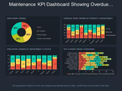
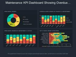
Maintenance kpi dashboard showing overdue work orders by priority and department




Try Before you Buy Download Free Sample Product
 Impress Your
 Audience
 100%
100% Editable
 Save Hours
 of Time


All the professionals know that powerful presentations are not about bullet points and unnecessary transitions and animations. If you are having problems creating awesome slides just make use of our Maintenance Kpi Dashboard Showing Overdue Work Orders By Priority And Department.
People who downloaded this PowerPoint presentation also viewed the following :
Maintenance kpi dashboard showing overdue work orders by priority and department with all 6 slides:
Enable folks to address the complexities with our Maintenance Kpi Dashboard Showing Overdue Work Orders By Priority And Department. Identify intricate aspects.


FAQs for Maintenance kpi dashboard showing overdue work orders by
Start with OEE - it shows how well your equipment's actually performing. MTBF tracks reliability, MTTR measures how fast you fix breakdowns. The planned vs unplanned maintenance ratio is huge though, most teams are shocked when they see those numbers. Work order completion rates matter too, plus maintenance costs as a percentage of asset value. That's six solid metrics right there. Honestly, I'd pick 2-3 that match your biggest headaches first rather than trying to track everything at once. You'll get way better results that way.
So here's the thing - predictive maintenance KPIs are game-changers for OEE. You'll catch issues before they wreck your day by tracking stuff like vibration trends and temperature patterns. Instead of dealing with surprise breakdowns, you can actually plan your maintenance windows. Your availability stays solid, plus you avoid those quality headaches from worn-out parts. The reliability boost alone makes a huge difference for throughput. Honestly, I'd start small - pick maybe 2-3 KPIs that match your biggest problem areas. Once you get ahead of the failures instead of chasing them, your OEE numbers will thank you.
Look, maintenance KPIs are basically your heads-up before stuff breaks down. Track mean time between failures, planned vs unplanned maintenance ratios, equipment availability - you know, the usual suspects. It's like a health monitor that actually does its job. The cool part? You can flip from that panicked "oh shit, it's broken" mode to actually planning when things need attention. Honestly, I'd just pick 3-4 metrics and stick with them consistently. You'll start seeing patterns pretty quick, and then you can schedule maintenance during normal downtime instead of when everything's on fire.
Pull together 12-18 months of your old data first - that's your real baseline. Industry benchmarks are nice (trade associations have them) but honestly your own numbers tell the actual story. Pick 3-5 solid metrics - MTTR, MTBF, planned vs unplanned maintenance ratios work well. Don't go crazy with targets that'll crush morale. Make them challenging but reachable. Check in quarterly and tweak as needed. Oh, and don't overthink it at the start - you can always refine later once you see what's actually happening.
Honestly, start with a decent CMMS - Fiix and UpKeep are solid choices, or Maintenance Connection if you need something beefier. Power BI works too if you're already pulling data from other systems (and your budget's hurting). But here's the thing - doesn't matter how fancy your dashboard looks if your team won't actually use it. I've seen so many places blow money on tools that just sit there collecting digital dust. Pick 3-4 KPIs that actually move the needle for you first. Then find whatever platform makes entering data feel least painful. Trust me, user adoption beats features every single time.
Dude, training your maintenance crew is literally a game-changer for all those KPIs you're tracking. Downtime drops. Repairs happen faster. People actually spot problems before they become disasters during routine checks. I know it sounds boring, but proper training means techs aren't fumbling around trying to figure stuff out - they just fix it. Plus they follow safety rules better, which saves you from expensive accidents. Your mean time to repair will tank in a good way. Oh, and start logging training hours next to your maintenance numbers. The connection is pretty wild once you see it mapped out.
Track your team's Mean Time to Repair and First-Time Fix Rate - those two tell you everything about efficiency and skill level. Schedule Compliance is solid too, but honestly gets messy when you're constantly putting out fires. Don't skip Safety incidents per technician though. I've seen too many places obsess over speed while ignoring near-misses. These four give you the real picture without getting buried in spreadsheets. Start there and you'll know who's crushing it and who needs help.
Here's what worked for me - figure out what your company actually gives a damn about first. Cost cuts? Uptime? Safety? Then pick maybe 4-6 metrics that tie directly to those priorities. Like if downtime kills your business, track MTTR and planned vs unplanned maintenance ratios. Don't get caught up measuring every little thing (learned that the hard way). The real trick is showing leadership how your maintenance numbers connect to their bottom line. You've got to be able to tell a clear story with your data, otherwise you're just throwing numbers at them.
Dude, you're basically throwing money into a black hole without KPIs. Can't tell if you're burning cash on emergency fixes or wasting time on stuff that doesn't need it yet. It's like - and I learned this the hard way - trying to manage anything without actual numbers to guide you. Crisis mode becomes your default, which kills budgets every time. When your boss inevitably asks why costs are so high, you'll just shrug because there's no data to show what's actually happening. Even tracking basic stuff like downtime hours helps tons. Start with 3-4 simple metrics and you'll finally see where your money's going.
Set up some visual dashboards that people can actually read at a glance. Color coding works great - green for good stuff, red for "hey we need to fix this." Track things like equipment uptime and work order completion rates. Honestly, digital displays are perfect for break rooms, but printed charts work too if that's more your vibe. Just don't go overboard - stick to maybe 4-5 key metrics so people don't get overwhelmed. Update them regularly though, because stale data is basically useless. This way everyone knows what's happening and can catch issues early instead of playing catch-up later.
So MTBF is basically how long your equipment runs before it craps out on you. Take your total operating hours and divide by number of failures - boom, there's your number. Higher MTBF = more reliable stuff, which is obviously better. I always tell people to watch the trends over time instead of just looking at one measurement though. It's great for figuring out maintenance schedules and when to budget for replacements. You can also compare similar equipment to see what's giving you the most headaches. Honestly makes asset management way less of a guessing game.
Here's the thing - you can't fix what you're not tracking. Pick 3-5 KPIs that actually matter for your setup and check them monthly. MTTR, uptime, cost per work order - stuff like that shows you where you're bleeding time or money. Honestly, the reactive vs planned maintenance ratio is probably my favorite because it tells you if you're just putting out fires all day. When you spot trends, that's when you make moves. Like if your downtime keeps spiking on Fridays (weird example but whatever), you'll know to dig deeper. The data basically points you toward what needs fixing first instead of just guessing.
Honestly, start with the big three: OEE, MTBF, and MTTR. Those will tell you most of what you need to know about how your equipment's actually performing. After that, I'd add your planned vs unplanned maintenance ratio - that one's a real eye-opener when you see the numbers. Also track maintenance costs as a percentage of what it'd cost to replace the thing, plus asset availability. Oh, and compliance rates for scheduled maintenance. Super boring but you'll kick yourself if you skip it. My advice? Pick maybe 2-3 to start. Once you get good at collecting data consistently, then pile on more metrics.
Honestly, you've gotta match your KPI reports to what each group actually cares about. Operations wants downtime and availability stuff. Finance? They're all about cost per work order and spend ratios. For executives, keep it super high-level with those red/yellow/green dashboards - trust me, they don't want Excel overload. Charts work way better than boring tables. Always explain what the numbers mean for the business and why variances happened. Don't just email reports and hope people read them - schedule actual review meetings. Oh, and definitely add a "here's our action plan" section whenever metrics are trending badly. Shows you're not just reporting problems but fixing them too.
Honestly, you gotta stop staring at those red numbers and actually figure out what's causing them. Dig into your data - is it busted equipment, not enough people, or just crappy planning? Most teams I've worked with get stuck in analysis paralysis here. Get preventive maintenance going if you don't have it already. Your spare parts inventory probably sucks too, so fix that. Make sure techs actually know what they're doing. Oh, and don't try fixing everything at once - that's a recipe for disaster. Just pick your worst KPI and hammer away at that first.
-
Great quality product.
-
Illustrative design with editable content. Exceptional value for money. Highly pleased with the product.