


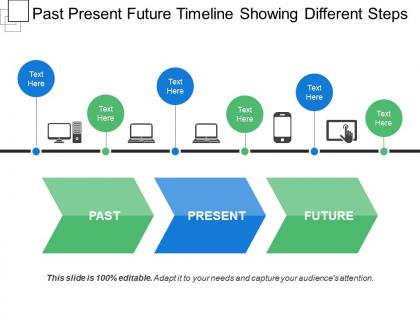
Past present future timeline showing different steps




Try Before you Buy Download Free Sample Product
 Impress Your
 Audience
 100%
100% Editable
 Save Hours
 of Time


Have a go with our Past Present Future Timeline Showing Different Steps. You are certain to accomplish.
People who downloaded this PowerPoint presentation also viewed the following :
Past present future timeline showing different steps with all 5 slides:
Cut down consumption with our Past Present Future Timeline Showing Different Steps. You will come up with excellent alternatives.
FAQs for Past present future timeline
Start with your dates - when you're kicking off and wrapping up. Then map out the big milestones with realistic deadlines (trust me, overly optimistic timelines bite you later). Don't forget dependencies - that's where everything usually goes sideways. Assign clear owners to each piece so there's no confusion about who's doing what. Build in some buffer time because delays always happen. Color coding helps people follow along during those long meetings. Oh, and keep it clean enough that your stakeholders can actually understand what they're looking at without squinting.
Okay so visual design is huge for timelines - it basically guides where your eye goes. I always use the same colors for related stuff and make important events bigger so they pop. White space is your friend too, otherwise everything looks messy. You wouldn't believe how many timelines I've seen that are just... chaos. Like someone sneezed dates onto a page lol. But if you align things nicely and create a clear hierarchy with your fonts, people can actually follow along. Simple linear layout works best. Then you can get fancy later if you want.
Figure out your time scale first - hours, days, years? That's your starting point. Plot the big events as anchors, then fill in details around them. I usually work backwards from key deadlines since it's way easier to spot what depends on what. Keep your date formats consistent (and time zones if that matters). Check that your cause-and-effect stuff actually makes sense - honestly, this is where most people mess up. Your timeline should tell a story that flows logically. If something feels chronologically weird, trust that instinct. Oh, and definitely cross-check dates with multiple sources before you call it done. Can't tell you how many times I've caught errors that way.
Timelines are perfect for this! Plot your key deliverables and deadlines chronologically so everyone can see what's happening when. Use different colors or icons to make major milestones pop - honestly, the visual aspect makes such a difference. Dependencies become super obvious too, which helps catch potential bottlenecks early. Just make sure the whole team can actually access it, whether that's your PM tool or even a physical board (old school but it works). The trick is keeping it updated. Nobody likes stale timelines that don't reflect reality.
**Lucidchart** or **Visio** are your best bet for professional stuff - tons of customization options. **Canva** and **Venngage** work great if you want something that looks good right out of the box. PowerPoint actually isn't terrible for this either, weirdly enough. I've seen some decent ones made there. **Airtable's** timeline view is clutch when your data keeps changing since it updates itself. Honestly? Just start with whatever you already know how to use. You can always switch later if you need fancier features, but you won't waste time figuring out a whole new interface.
So it really depends on what you're working with. Construction has to plan around weather and permits - plus everything builds on the step before it, so they pad timelines like crazy. Tech teams do those short sprint things where they can change direction fast. Healthcare? Those compliance deadlines are set in stone, no wiggle room whatsoever. Retail is wild - they're prepping for Christmas in July because of buying cycles. Manufacturing has to sync with their supply chains. Honestly, the trick is figuring out what absolutely can't move in your industry first, then you build everything else around those fixed pieces.
Honestly, color schemes make such a difference for timelines! I use different colors for themes, time periods, or priority levels - makes everything way easier to follow. Trust me, I once made this insane rainbow timeline that was completely unreadable. Total disaster. Keep it simple though - 3-4 colors tops. Make sure there's good contrast so people can actually read it, and throw in a legend so viewers know what's what. Your audience will actually be able to follow along instead of getting lost in visual chaos.
Honestly, timelines are amazing for showing kids how events actually connect. Students can see cause-and-effect relationships way clearer when everything's laid out chronologically. Works great for wars, social movements, basically any sequence of events. Skip the boring pre-made ones though - have your kids build them in groups instead. Way more engaging that way. You could even have them debate which events matter most (gets heated sometimes but in a good way). They're also perfect for prepping students before you dive into really complex topics. Trust me, they'll remember so much more when they create it themselves.
Ugh, the worst thing you can do is cram everything onto one timeline - nobody wants to squint at tiny text trying to figure out what's happening. Also make sure your dates are actually readable! I've seen so many where the timeline is just a bunch of random events with zero context about why they matter. That's pretty useless honestly. Keep your colors simple, space things out evenly, and definitely include clear start/end points. Oh and test it on someone first - if they're confused after 30 seconds, you need to cut stuff out.
Just drag and drop videos, images, and audio right into PowerPoint or whatever timeline tool you're using. Photos are perfect for showing key moments. Short video clips really bring stuff to life - but seriously, keep them under 30 seconds or people will check out. Audio clips like old speeches or period music add a nice touch too. Oh, and definitely test everything beforehand! I learned this the hard way when my video wouldn't play during a presentation. Always have backup static images ready because tech loves to fail at the worst possible moment.
Honestly, I'd plan for way more time than you think you need - like if it should take 6 months, budget 7-8 months total. That extra 10-20% buffer has saved me so many times. Weekly milestones work great for the first month, then switch to every two weeks after that. Daily tracking drives everyone crazy and monthly is basically useless. Oh, and definitely work backwards from your deadline - sounds weird but it's the only way to spot when expectations are completely unrealistic. Don't forget testing time and all those stakeholder review cycles that somehow always take longer than planned.
Honestly, clickable hotspots are a game changer for timelines - way better than boring static ones. Add some hover effects and throw in videos or audio clips where it makes sense. Interactive scrolling is pretty sweet too, like letting people drag through different eras or jump between events. Some of the best ones I've seen can zoom in and out of time scales, which is oddly satisfying? Oh, and filtering options are clutch so users can focus on specific themes. Don't overthink it though - start with simple click-to-reveal details first, then add the fancy stuff later.
Dude, turn that boring timeline into an actual story people give a shit about. Like instead of "Project started January 2024," try "We kicked this thing off right after the holidays when everyone was still half-dead from family drama." Stories just stick better than bullet points - that's basic brain science right there. Walk them through the journey. What was the main challenge? How did each phase get you closer to solving it? Honestly, I've seen so many good projects tank because they presented timelines like grocery lists. Your brain wants narrative, so give it one.
Try adding clickable scenario branches or those "what-if" sliders - people love exploring different outcomes themselves. Color gradients work great too, where darker shades show likely trends and lighter ones are more speculative. A "living timeline" that auto-updates is pretty slick if you can pull it off. Honestly, icons and visual metaphors beat wall-of-text every time. The branching thing is my favorite though - shows how one trend could split into totally different possibilities. Oh, and start with your solid predictions as the main timeline, then branch out the experimental stuff from there.
Honestly, audience feedback is a game-changer for timelines. Show people your rough draft early and just watch their faces - when they look confused or start asking questions, that's pure gold right there. Notice what parts they skim past versus what makes them actually lean in. If someone's squinting at your dates or going "wait, what happened between this and that?" then you know you need better spacing or more context. Maybe break things into clearer chunks. I learned this the hard way on a project last year. The trick is tweaking based on their real reactions, not what you assume they want.
-
Wonderful templates design to use in business meetings.
-
Appreciate the research and its presentable format.