


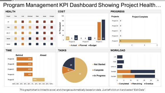
Program management kpi dashboard showing project health and progress





Try Before you Buy Download Free Sample Product
 Impress Your
 Audience
 100%
100% Editable
 Save Hours
 of Time


Discourage jibes with our Program Management Kpi Dashboard Showing Project Health And Progress. Insist on folks being fair in their assessment.
People who downloaded this PowerPoint presentation also viewed the following :
Program management kpi dashboard showing project health and progress with all 6 slides:
Bring the haughty down to earth with our Program Management Kpi Dashboard Showing Project Health And Progress. Give them a dose of hard facts.
FAQs for Program management kpi dashboard showing project
Schedule variance, budget variance, and scope creep percentage are your big three - catch most problems early with those. Resource utilization matters too, plus stakeholder satisfaction scores if you can get people to actually fill them out (good luck with that). Risk mitigation status is critical but honestly, half the team forgets to update it until we're already in crisis mode. Don't sleep on quality metrics and milestone completion rates either. Those seven will give you solid program visibility without overwhelming everyone with endless charts and graphs.
Honestly, KPI dashboards are pretty clutch for this stuff. You get everything in one spot instead of hunting through a million spreadsheets (which is the worst). Instantly see what's working, what's broken, and where things are getting stuck. I've found you catch problems way earlier this way - like you'll notice patterns that totally fly under the radar when you're just looking at individual programs. My advice? Pick your most important metrics first and get those up on screen. Don't overthink it initially. You can always make it fancier down the road once you see what actually matters.
Power BI's probably your safest bet - integrates well with most PM tools and updates in real time. Tableau looks amazing but honestly might be too much unless you're doing crazy complex stuff. Don't sleep on Excel though! I've seen people build surprisingly solid dashboards with just pivot tables and charts. The real trick is picking something your team will actually maintain. I learned this the hard way when we built this gorgeous Tableau setup that nobody touched after week two. Start with whatever feels comfortable, then move up if you need fancier features later.
I'd say monthly reviews are a solid starting point, but it really comes down to how fast things are moving. Weekly makes way more sense if you're dealing with something super time-sensitive or complex. You'll want to update the actual data weekly or bi-weekly though - nobody wants to look at stale numbers. Don't just plug in new figures and call it done. Actually dig into what the trends are showing you about how things are going. Oh, and every quarter or so, ask yourself if you're even tracking the right stuff. That's honestly where most people mess up.
Honestly, the hardest part is not going overboard with tracking everything - that just creates a mess of data nobody cares about. I'd pick maybe 5-7 KPIs max that actually tell you what's happening. Mix some predictive stuff (like how well you're using resources) with results-based metrics (budget variance, etc). Your stakeholders will definitely try pushing their favorite random metrics on you, but don't cave unless they're actually useful. Start with what success looks like for your program, then figure out which numbers best show if you're heading there. Way easier than drowning in spreadsheets later.
Start with mapping your KPIs straight back to whatever your org's big goals are - like literally make a table showing the connections. Super simple but it'll save you later. Review this stuff with stakeholders regularly because honestly, priorities change way more often than anyone wants to admit. Your dashboard needs to tell the actual story of how your program moves the needle, not just track whatever's easiest to measure. Focus on outcomes that leadership genuinely cares about. Oh, and don't get caught up measuring vanity metrics - been there, learned that the hard way. The whole point is showing real impact, not just pretty numbers.
Keep it stupid simple - traffic lights (red/yellow/green), progress bars, basic line charts. Don't get tempted by those awful 3D pie charts that look "cool" but tell you nothing. Your boss needs to get it in 10 seconds max. Stick to one screen if you can, use the same colors consistently, and always show target vs what actually happened. Oh and group similar stuff together so it makes sense. Honestly? Start with just your top 5 most critical metrics first, then build from there.
Start by actually talking to people - surveys, quick interviews, whatever works. Different groups care about totally different stuff (executives vs project managers vs customers), so map that out first. Honestly, I've seen way too many gorgeous dashboards that just collect dust because nobody bothered asking what people actually needed. Figure out what decisions they're making and what data helps them decide faster. Then pick your KPIs based on how many people will use them and how often. Don't go crazy - start with maybe 3-5 metrics everyone can agree on, build from there.
Honestly, you've gotta nail down data ownership right from the start - like who's responsible for what metrics and how often they get updated. Set up some automated checks that catch weird numbers or missing data before it screws up your dashboard. I learned this the hard way when someone fat-fingered entries for a month straight and nobody noticed! Have your team do quarterly spot-checks too, tracing numbers back to where they came from. Oh, and make it stupidly easy for people to flag issues when they see something's off. Trust me on this one.
Real-time data makes all the difference between a dashboard that actually helps versus one that just looks nice on the wall. You'll catch problems while they're happening instead of finding out weeks later when there's nothing you can do about it. Budget going over? Critical deadline slipping? You want that info today, not next month when everything's already gone sideways. The quicker you spot issues, the faster you can fix them and get things back on track. Oh, and definitely set up automated feeds if you can - manually updating spreadsheets every week is honestly just painful.
Get everyone together for hands-on training sessions with real dashboard data. Walk through each KPI and explain what good numbers vs. bad numbers actually look like. More importantly - show them what to DO about it. Real examples from your own stuff work way better than made-up scenarios, trust me. Make some simple cheat sheets they can stick by their computers. The whole point is helping them understand WHY each metric matters, not just reading the numbers. Oh, and definitely do check-ins the first month because people always have random questions.
Honestly, most people just throw way too much stuff on one screen - it becomes this overwhelming mess. Stick to like 5-7 metrics tops. Also, make sure your KPIs actually connect to what the business cares about, not just random numbers that sound cool. Executives hate that vanity metric BS and can spot it instantly. Oh, and your data needs to refresh often enough to actually matter for decisions. Don't forget context either - targets, benchmarks, whatever helps people understand if the numbers are good or bad. Best approach? Ask stakeholders what decisions they're trying to make first, then build from there.
Honestly, most PMs totally sleep on this but your historical KPI data is gold for predicting what's coming. Start with your biggest pain points - delivery times, budget overruns, resource crunches. You'll start seeing patterns pretty quick, like "oh we always get slammed in Q4" or whatever. Build a simple dashboard that compares your current projects to similar past ones. Red flags pop up way earlier that way. You need decent data though - at least 6 months, ideally a year. Don't try to track everything at once. Pick your top 3 KPIs and focus there first.
Honestly, a good KPI dashboard completely changes how you make decisions. No more guessing or waiting weeks for updates - you'll see problems before they blow up. Real-time data means you can actually steer instead of just reacting to fires. The trick though? Focus on metrics that help you decide stuff, not just numbers that make you look busy. I learned this the hard way when I first started tracking everything under the sun. Once you nail down what actually matters, it's seriously addictive having all that insight right there.
Just ask each level what decisions they're making every day, then build around that. Executives want the big picture - overall health, budget stuff, major milestones. Traffic lights work great for them. Middle management needs the operational view: who's doing what, timeline issues, team metrics. Project managers are honestly obsessed with detailed charts and granular data (but that's their job, right?). Most tools have role permissions built in, so you can filter views pretty easily. The trick is matching the dashboard to actual daily decisions instead of just dumping all the data on everyone.
-
Designs have enough space to add content.
-
Much better than the original! Thanks for the quick turnaround.