

Data Science Powerpoint Presentation Slides





Try Before you Buy Download Free Sample Product
 Impress Your
 Audience
 100%
100% Editable
 Save Hours
 of Time


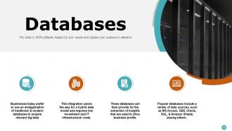
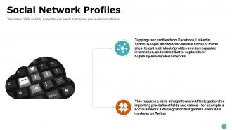
Analyze and understand actual phenomena with data by using this Data Science Powerpoint Presentation Slides. Utilize this big data PPT visual to showcase the interactive social media platforms like Google, Facebook, Twitter, Youtube, etc. Take the assistance of this structured data PowerPoint graphics to explain the cloud storage which provides business with real-time information and on-demand insights. Also, present the web services that constitute big data that is widespread and easily accessible. Showcase interrelated computing devices that have the ability to transfer data over the network without requiring a human to computer interactions with the help of this data mining PPT slides. Mention some databases like oracle, SQL, Amazon, etc that are used to drive business profits by taking the assistance of this machine learning PowerPoint templates. You can also mention data warehouse applications such as Teradata, IBM Netezza, etc that are used for data analysis. Download this information science PPT presentation to understand the data processing methods.
People who downloaded this PowerPoint presentation also viewed the following :
Content of this Powerpoint Presentation
Data science blends statistical analysis, machine learning, and vast datasets to unlock unprecedented insights and opportunities in modern business. This multifaceted discipline enables organizations to harness (customer/campaign/project) data to transform it into actionable intelligence. These data-driven insights navigate decision-making, predict market trends, and personalize customer experiences.
Data science can help businesses optimize operations to innovate quickly and gain a competitive edge. Extracting and analyzing data and communicating complex findings in a digestible format is part of data science. It is a complicated concept to understand and handle. This is where our data science presentation templates can help.
Click here to view our Top 10 Data Science Templates for Better Decision-Making!
Data Science Templates
SlideTeam's pre-designed data science templates are expertly designed to impart a comprehensive understanding of data science. With their 100% customizable nature, these PowerPoint Layouts provide users with the desired flexibility to create and edit a simple, easy-to-follow data science presentation from scratch.
The slides break down complex data science into smaller, easy-to-understand components like big data sources, technologies, repositories, etc. This deck provides a structured approach to presenting intricacies like big data analytics, cloud storage advantages, IoT connectivity, etc.
Are you ready to embrace the power of data science? Discover our Top 10 Data Science Framework Templates with Examples and Samples today!
Use these content-ready slides to create a well-structured presentation on data science with a minimum investment of resources and time.
Template 1: Media
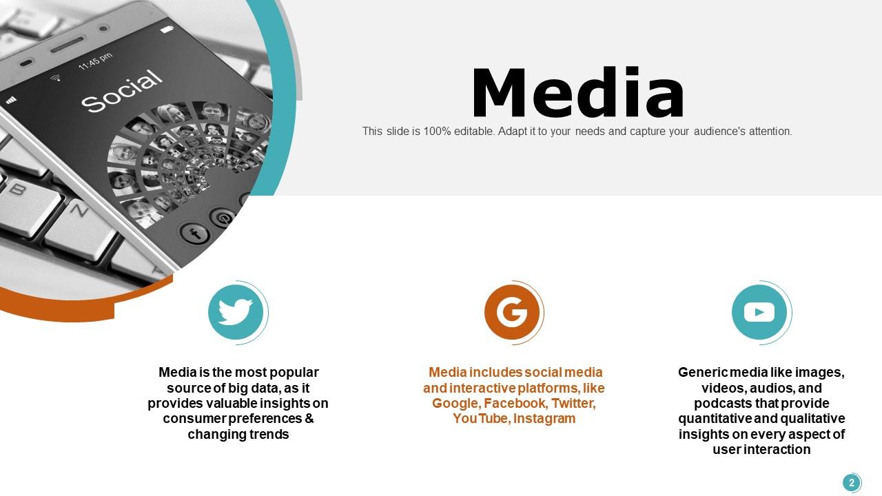
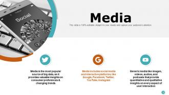
This slide underscores the significance of Media as a rich repository for big data within the realm of Data Science. The PPT Template highlights the Media's role in capturing and reflecting consumer preferences and trends, including social media and interactive media platforms such as Google, Facebook, Twitter, YouTube, and Instagram. It also mentions generic media types like images, videos, and podcasts used for big data collection. Use this template to share analytical, quantitative, and qualitative user interaction insights to comprehend and predict user behavior.
Template 2: Cloud
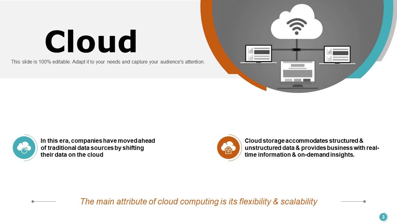
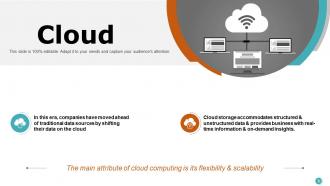
The presentation layout highlights the role of cloud technology in Data Science. It helps to store, process, and analyze big data. This helps to provide real-time business insights and on-demand analytics. The template helps to focus on the attributes of cloud computing, such as its flexibility and scalability, which are essential in managing data-driven applications' vast and variable demands. Use it to facilitate a seamless, scalable, and efficient data infrastructure in a data science presentation.
Template 3: Web
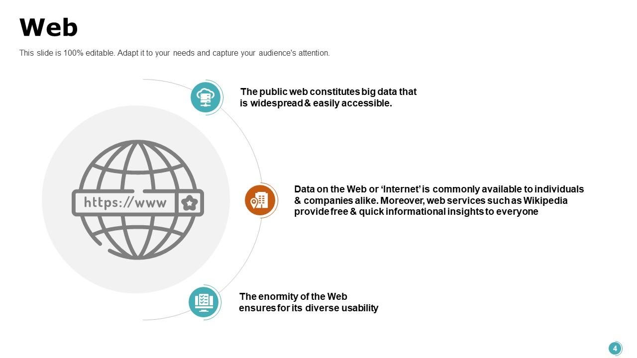
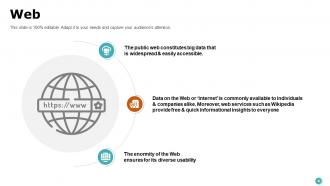
The Web is a vast, accessible source of big data that is crucial for gathering real-time insights and trends. This template highlights the Web's capacity to house expansive datasets and flexibility for different applications. The slide underscores the Web's vastness and accessibility by providing a schematic representation of its infrastructure. It highlights the wealth of information that can be harnessed for analysis, from structured data to user-generated content. This slide will help data professionals and educators in data Science presentations demonstrate the integral role of web-based data in driving analytical decisions and strategies.
Template 4: Internet of Things
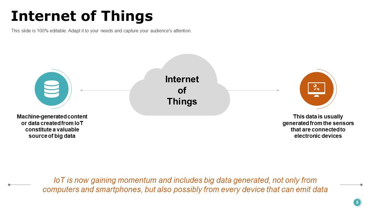
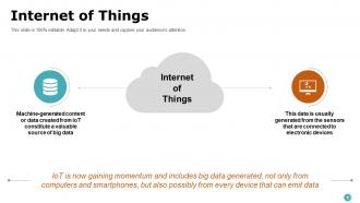
The Internet of Things (IoT) generates vast quantities of machine-created data and contributes a significant stream of big data from an array of connected devices. The presentation slide outlines the IoT landscape and shows how sensors integrated into electronics yield a continuous flow of information with real-time analytics and insights. This template highlights the breadth and depth of data IoT offers and its potential for predictive analytics, trend analysis, and enhanced decision-making. It can be a critical resource for data scientists and analysts illustrating the expansive data networks created by IoT and their impact on modern data-driven strategies in data science presentations.
Template 5: Social Influencers
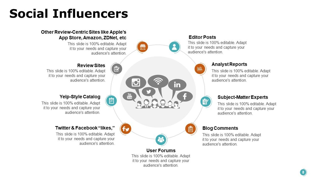
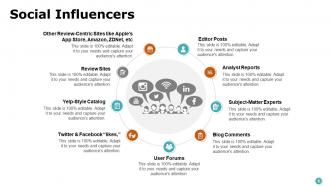
Social influencers in Data Science play a crucial role in interpreting and disseminating complex data insights to a broader audience, often influencing public opinion and decision-making processes. This slide centers around the multifaceted nature of social influencers, encompassing review-centric sites like Apple's App Store and Amazon, editor posts, analyst reports, and user forums. It highlights the network of diverse platforms that shape public discourse, like Yelp-style reviews, Twitter and Facebook interactions, blog comments, etc. This template illustrates the extensive impact of social influencers on big data analysis, especially regarding consumer sentiment and trend analysis. It will help data scientists, marketers, and business strategists understand and share social insights for informed decision-making.
Template 6: Activity Generated Data
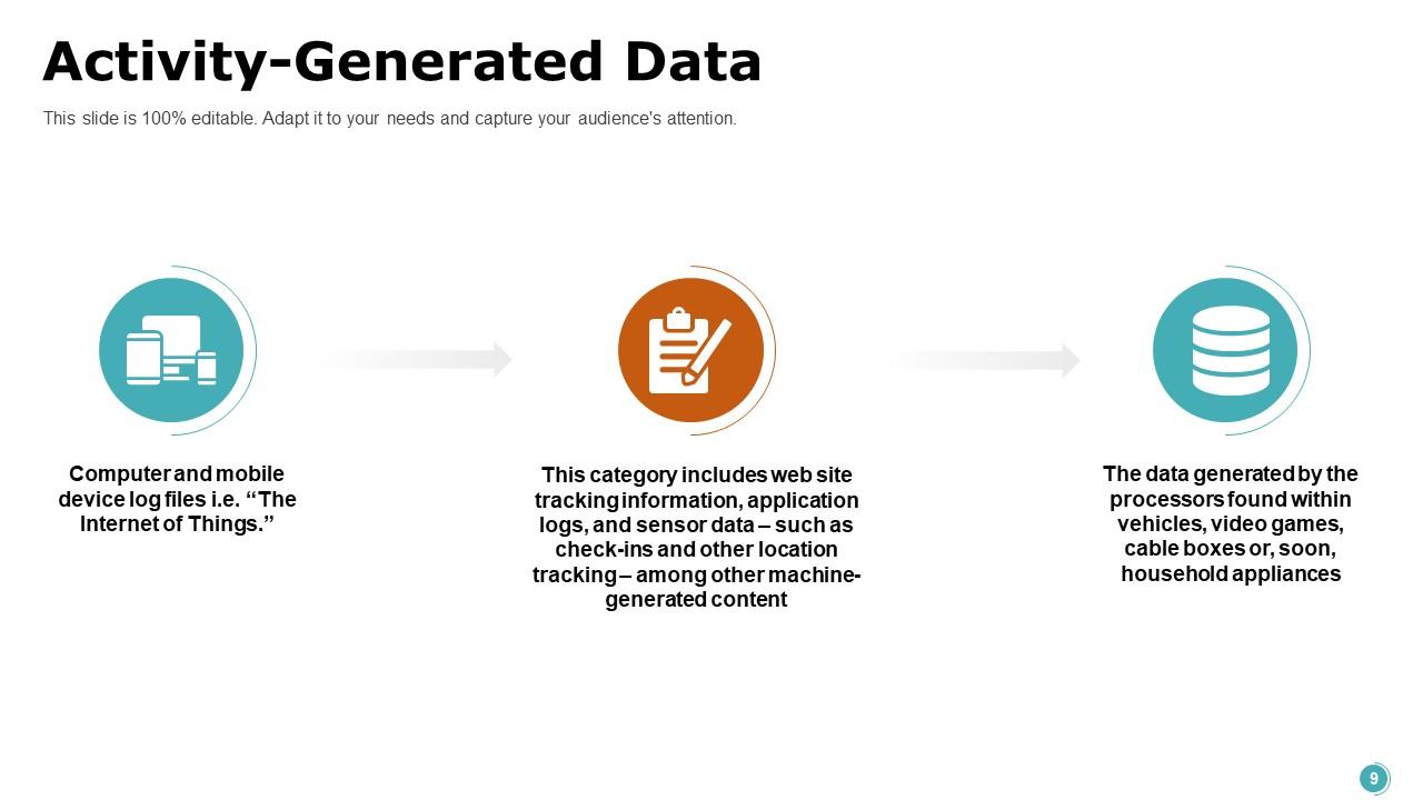
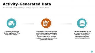
In Data Science, activity-generated data is crucial for understanding user behavior, preferences, and patterns. This presentation layout illustrates the multifaceted nature of activity-generated data generated from computer and mobile device logs, web interaction trails, sensor data, and information processors in everyday technology. It portrays how these data points converge into a substantial digital footprint, underpinning analytical models and algorithms. Use this slide to refine predictive models and enhance decision-making processes.
Template 7: Data Warehouse Appliances
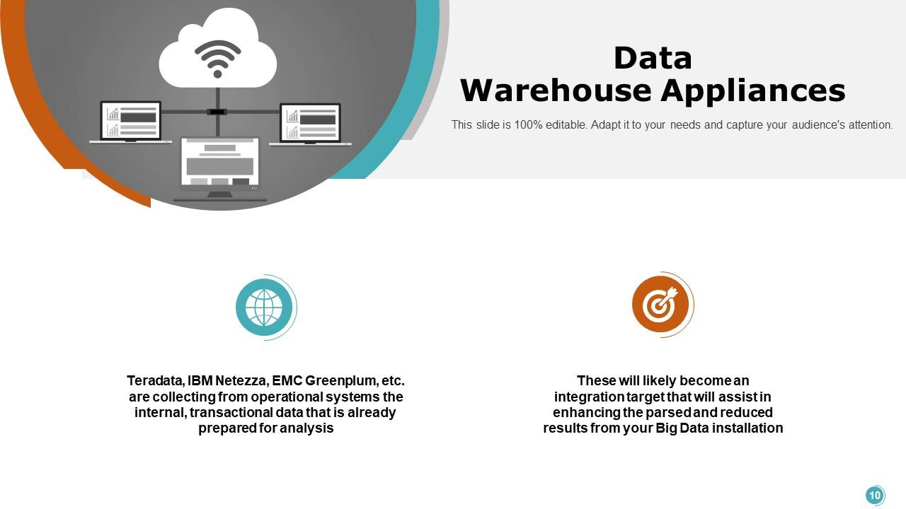
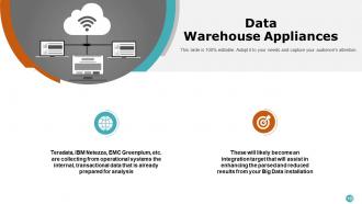
Data Warehouse Appliances streamline complex data analytics. These tools allow for the efficient processing and analysis of vast datasets by aggregating transactional data that is ready for analysis. This PPT Slide presents an overview of top-tier Data Warehouse Appliances like Teradata, IBM Netezza, and EMC Greenplum, which excel at collecting operational system data. The design suggests these appliances can enhance and expedite outcomes from Big Data implementations. It will set the stage for how these data warehouses can significantly optimize and reduce the processing time in a Big Data ecosystem, leading to quicker, more informed decision-making.
Template 8: Big Data Sources
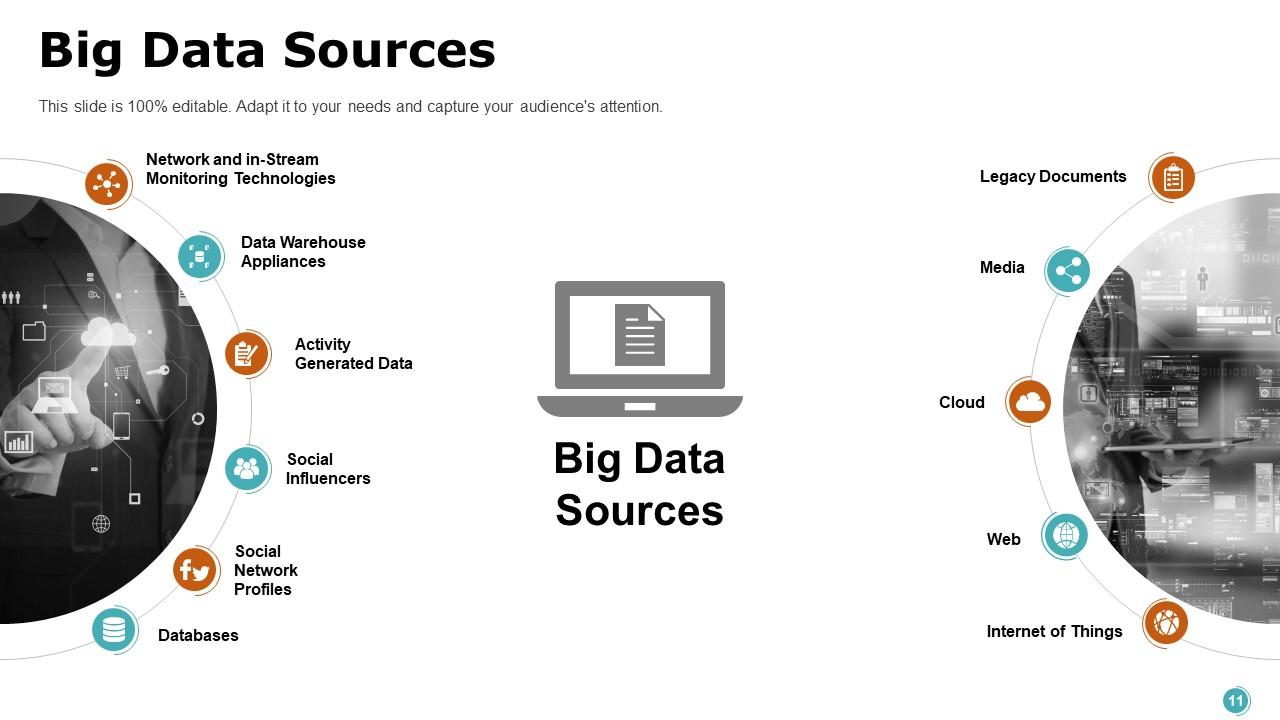
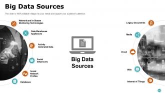
Big data sources are the lifeblood of Data Science, providing the raw material from which valuable insights and strategies are derived. This PowerPoint Layout offers a comprehensive map of the varied sources that fuel Big Data analytics, including Network and In-Stream Monitoring Technologies, Data Warehouse Appliances, Activity Generated Data, Social Network Profiles, and more contemporary sources like the Internet of Things. Each element represents a data stream that, when harnessed, can yield crucial information for business intelligence. Use it to illustrate the ecosystem of Big Data and the importance of integrating diverse data streams to construct a holistic analytical framework.
Template 9: Network and In-stream Monitoring Technologies
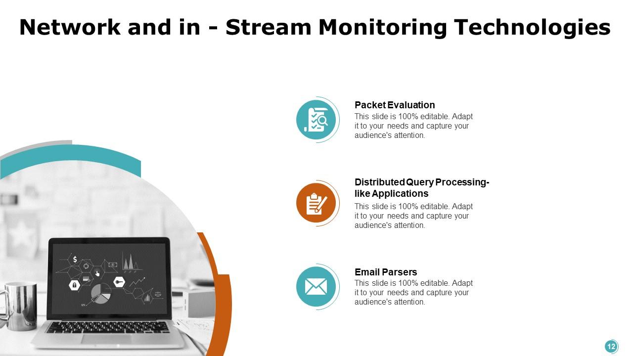
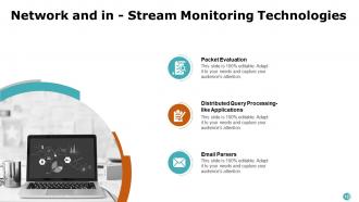
Network and In-Stream Monitoring Technologies ensure real-time data integrity and security in data science. This PPT Design gets into the nuances of these technologies and highlights key components, such as Packet Evaluation, Distributed Query Processing for Application-like Applications, and Email Parsers. These elements are essential tools in the monitoring process, enabling the analysis and management of data traffic. It also helps in the optimization of data queries across networks and the structuring of unstructured data from communications. The presentation slide will help showcase how monitoring technologies underpin the stability and efficiency of data analysis platforms.
Template 10: Legacy Documents
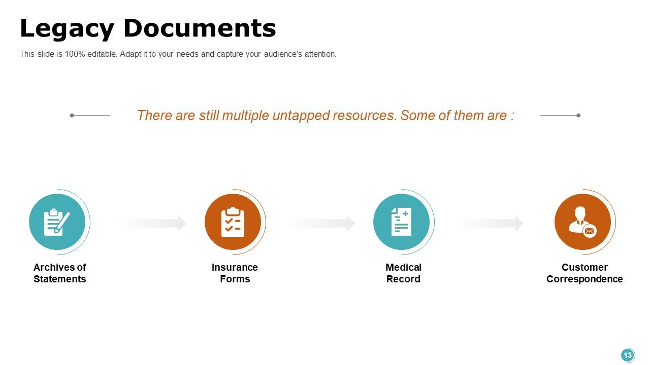
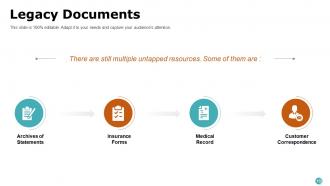
Legacy documents are repositories of historical data and are vital for comprehensive analysis. This slide highlights the significance of these documents and identifies key types: Archives of Statements, Insurance Forms, Medical Records, and Customer Correspondence. Each represents a segment of data that, when leveraged, can provide insights into past trends and patterns essential for informed decision-making. This template emphasizes the need to incorporate legacy data for a robust analytical framework and as a bridge between past information and future predictions.
Our Contribution!
Data science presents challenges, from managing voluminous data sets to interpreting complex analytical results. SlideTeam's Data science presentation templates help share the nuances and components of this intricate concept in an easy-to-grasp format. By leveraging these templates, one can distill the complexity of components like data analytics, cloud, Web, legacy documents, etc., into strategic narratives. These digestible stories will resonate with stakeholders, streamline the communication flow, and facilitate data-driven decisions.
PS. Data science dashboards enable companies to transform raw data into strategic initiatives by revealing trends, patterns, and insights. Click here to read more.
Data Science Powerpoint Presentation Slides with all 20 slides:
Use our Data Science Powerpoint Presentation Slides to effectively help you save your valuable time. They are readymade to fit into any presentation structure.

FAQs for Data Science
Programming skills are obviously key - Python or R, plus SQL for database stuff. Statistics and ML frameworks too. But honestly? Communication matters way more than people think. I've seen so many brilliant analysts whose work just sits there because they can't explain what they found to the business folks. Being curious helps a lot - like actually questioning the data before jumping into analysis. Domain knowledge is super useful depending on your field. Oh, and problem-solving instincts are huge. I'd focus on whatever feels like your biggest gap right now.
Dude, you'll literally spend most of your time on data cleaning - like 80% probably. But it's so worth it. Missing values, weird outliers, inconsistent formats... fix all that stuff first. Otherwise your model learns from messy data and performs terribly. I learned this the hard way on my first project actually. Clean data means your algorithm can spot real patterns instead of getting confused by junk. Skip the preprocessing and your accuracy will tank. Trust me, garbage in definitely equals garbage out. Take the time upfront and your results will be way better.
Honestly, ML is just one piece of the data science puzzle - but it's a pretty cool piece. Data science covers everything from scrubbing messy datasets to making charts that don't suck, plus the whole business side of things. Machine learning kicks in when you want algorithms that actually learn patterns and predict stuff - like what customers might buy next or sorting through images. I'd say start with general data science basics first since you'll need that foundation anyway. Then you can get into the ML rabbit hole later. Think of it like... data science is the whole toolbox, ML is your power drill.
Your brain's wired to spot visual patterns way faster than scanning endless rows of data. Trust me, I've wasted hours staring at spreadsheets missing obvious trends that would've jumped out in a simple chart. Plus stakeholders don't want to decode your analysis – they want the story at a glance. Charts also catch data quality issues you'd totally miss otherwise (learned that one the hard way). Start basic though: scatter plots, histograms, box plots. Complex dashboards can wait until you've nailed the fundamentals.
Ugh, ethics stuff can feel overwhelming but it's actually pretty crucial. First off, make sure your data was collected properly - did people actually agree to this? Bias is the big one though. Your models will basically learn whatever garbage is in your training data, so if that's biased, congrats, you've built a discrimination machine. Document everything about your methods and be upfront about what your model can't do. Stakeholders love making huge decisions off our work without understanding the limitations. Oh, and audit regularly for fairness - I learned that one the hard way.
Honestly, just start with what problem you're solving - classification, regression, whatever. Your data size matters too. Got something small and need to explain it later? Linear models are perfect. Random Forest is clutch when your data's a mess (I swear I use it way too much lol). Neural networks are overkill unless you have tons of data and complex stuff going on. They eat up resources like crazy though. Timeline's huge too - some stakeholders want explanations, others just want results. My advice? Begin with logistic regression or decision trees, see how they perform, then get fancy if you need to.
So big data is what makes data science actually useful now. You're dealing with terabytes of stuff - customer clicks, sensor readings, social feeds, whatever. The cool part? Patterns emerge that you'd never spot in smaller datasets. Your models get way more accurate when they're trained on millions of points instead of just thousands. Honestly, it's wild how much better predictions get. Now we can build things like recommendation systems and fraud detection that actually work because they need tons of diverse data to function properly. Before big data, most of this was just theoretical.
So collaborative filtering is all about using user behavior to predict what people will like. Think of it like this - if you and I both loved the same 10 movies, and I also loved an 11th one, you'd probably dig it too. It's basically crowdsourced recommendations at scale. The beauty is it finds weird connections that other methods miss - like how people who love horror movies also weirdly love romantic comedies (random example but you get it). I'd start with user-user or item-item similarity matrices and see what clicks for your data.
Dude, the classic mistake is diving into models before you actually know your data. Missing values and weird outliers will totally screw you over. Oh, and just because two things correlate doesn't mean one causes the other - honestly can't believe how often people mess this up. Your model needs testing on fresh data it's never seen, otherwise you're just overfitting. Selection bias is another big one where your sample doesn't match the real world you're studying. Basically start every project exploring the hell out of your data first and question everything.
Match your metrics to what actually matters for your problem. Accuracy's pretty much garbage when you've got imbalanced data - learned that the hard way. Go with precision/recall/F1 for classification stuff, RMSE/MAE for regression. Cross-validation is your friend, especially with small datasets. Test on data your model's never seen before, not just your regular test set. Here's the thing though - figure out what costs more: false positives or false negatives? That'll tell you which metric to obsess over. Your stakeholders don't care about perfect accuracy if the model tanks in production.
So feature engineering is basically where you can totally screw up or nail your model. You're taking messy raw data and turning it into stuff that actually makes sense - like mixing variables together, grouping numbers into buckets, pulling apart date fields. Honestly doesn't matter if you use some crazy algorithm if your features suck. Domain knowledge is huge here because you gotta understand what connections might be hiding in your data. Oh and definitely spend time exploring first - then build features that match whatever business problem you're solving.
Dude, stop throwing charts at people and expecting them to care! You need to tell an actual story with your data. Start with the problem, walk them through what you discovered, then hit them with why it matters. It's like the difference between watching a good documentary vs. staring at Excel all day - same info but one actually keeps people awake. I always structure mine like: here's the mess we're in → here's what I dug up → holy crap look what I found → now here's what we're gonna do about it. Way more effective than data vomit.
MLOps and AutoML are absolutely blowing up right now - companies finally realized they need to actually deploy stuff, not just build cool demos. Obviously generative AI is everywhere (seriously, ChatGPT changed everything overnight), but honestly? The real money's in responsible AI and explainable ML. Real-time analytics is getting huge too since everyone wants instant everything these days. Edge computing's right there with it. Oh, and data engineering - still can't find enough good people who know how to build pipelines that don't break every week. My take? Just pick one thing you're actually interested in and go deep. Chasing every new framework will drive you crazy.
Honestly, you can't go wrong with either one. Python's your best bet for machine learning stuff and building actual production systems - pandas makes data cleaning way less painful. R is where it's at for statistics though, and ggplot2 creates seriously beautiful visualizations. Most data science teams I know end up using both anyway. Start with whatever your current team already knows, then learn the other one later when you hit something it does better. Oh, and R's statistical libraries are genuinely amazing if you're doing heavy analysis work.
Honestly, cloud platforms are like having a supercomputer you can rent by the hour. Your laptop's gonna cry trying to train big models, but with AWS or Google Cloud you just spin up whatever you need. The pay-as-you-go thing is clutch - no more babysitting servers or buying expensive hardware that'll be outdated next year. You can experiment with different setups without breaking the bank. Team collaboration becomes way easier too. I'd start with Google Colab since it's free, then maybe try AWS SageMaker once you get the hang of it. Game changer for real.
-
Content of slide is easy to understand and edit.
-
Nice and innovative design.
-
Easily Understandable slides.
-
Excellent design and quick turnaround.