


Determine Team Performance Tracking Dashboard Managing Staff Productivity




Try Before you Buy Download Free Sample Product
 Impress Your
 Audience
 100%
100% Editable
 Save Hours
 of Time


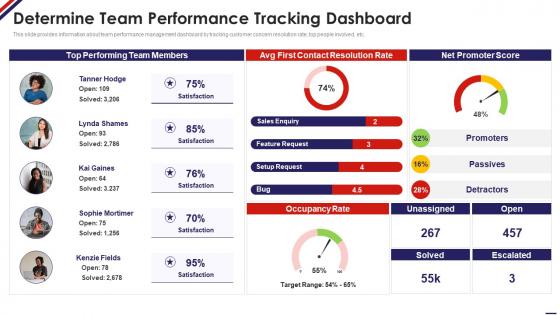
This slide provides information about team performance management dashboard by tracking customer concern resolution rate, top people involved, etc.
People who downloaded this PowerPoint presentation also viewed the following :
Determine Team Performance Tracking Dashboard Managing Staff Productivity with all 7 slides:
Use our Determine Team Performance Tracking Dashboard Managing Staff Productivity to effectively help you save your valuable time. They are readymade to fit into any presentation structure.





FAQs for Determine Team Performance Tracking Dashboard
Honestly, pick metrics that actually matter to what your team's trying to accomplish. Task completion rates and project velocity are solid starting points. Quality stuff is huge too - defect rates, customer satisfaction, how much rework you're doing. Team health metrics like utilization rates help, and employee satisfaction if you can track it without making it weird. Revenue impact is the holy grail if you can connect it to your work (not always easy though). Keep it under 7 KPIs max. People's eyes glaze over with too many numbers.
Look, dashboards are honestly a game changer because you can see what's broken before it gets worse. No more hunting through random spreadsheets when you need answers fast. Everything's right there in real-time, so you're making calls based on actual data instead of just guessing. The trick is picking 3-5 metrics that really matter to your goals - resist the urge to track literally everything (I learned this the hard way). Once your whole team can see the same numbers, spotting bottlenecks and productivity issues becomes so much easier.
Bar charts are your best bet for comparing individual contributions. Line graphs work great for tracking trends over time. Heat maps? Perfect for spotting patterns across different metrics. Seriously though, avoid cramming everything into pie charts - I see this mistake constantly and it's painful. KPI cards are clutch for highlighting key numbers at a glance. Progress bars make goal tracking super visual. Keep it clean and focus on what your team actually needs. Start with maybe 3-4 core metrics, then add more if needed. Less is definitely more here.
Weekly updates are your sweet spot, but daily is gold if you can pull it off. Consistency matters more than anything - your team has to know the data's fresh and useful. I've watched so many dashboards turn into fancy decorations because nobody trusted the old info! Sprint progress and customer satisfaction? Weekly works great. Sales numbers or support tickets though - those need daily refreshes. Oh, and whatever schedule you pick, actually stick to it. Your team will notice if you don't. Just be realistic about what you can handle long-term.
Honestly, just ask your team what numbers they'd panic without - that's your starting point. Dev teams usually want sprint velocity, bug counts, code review times. Sales cares about pipeline stuff and quota progress. Marketing's all about campaign ROI and lead gen. Time frames matter too - some people need daily updates, others are fine with weekly or monthly. I'd probably start simple and add more later. The whole point is making something they'll actually use, not cramming every possible metric onto one screen.
Start with clean data and set up checks that catch problems before they reach your dashboard. Skip manual entry whenever you can - people always screw that up somehow. Connect straight to your source systems instead. Do regular audits where you randomly check records against the originals. Define your metrics the same way across teams so you're all measuring identical things. Oh, and actually document what everything means somewhere people can find it. Otherwise your team won't trust the numbers they're seeing.
Honestly, getting feedback from your team is what makes or breaks a dashboard. Ask them which metrics they actually use vs what's just sitting there looking pretty - I've seen way too many "impressive" dashboards that collect dust. Find out what's confusing people and what clicks. My go-to questions are stuff like "What decisions did this help with last week?" and "What's missing that'd save you time?" Then actually change things based on what they tell you. Sometimes tiny tweaks make all the difference in whether people will bother using it or not.
Honestly, dashboards are game-changers for remote teams. Everyone can check progress whenever instead of sitting through those painful status calls - which, let's be real, nobody enjoys. Real-time updates mean you'll spot problems early and see who needs help without playing detective. The transparency thing is huge too. When everyone can see what's happening, there's less paranoia about whether people are actually working. Nobody wants their stuff showing up red for the whole team to see, so it keeps people motivated. Just make sure it updates automatically or you'll end up spending forever keeping it current.
Depends what you're working with budget-wise, but Tableau and Power BI are solid if your company already pays for them. Google Data Studio is free and handles most team stuff pretty well. Monday.com or Asana work great if you're doing project tracking - their dashboards are already built in, which is nice. But honestly? I've seen teams do amazing things with just Google Sheets dashboards. People always want the fanciest tool when sometimes simple works better. My advice: start with whatever you can access right now, see how it goes. You can always level up later if you need something more complex.
So most of these dashboards hook up through APIs or they've got built-in connections to stuff like Jira, Asana, Trello. Usually there's an integration section in settings where you authenticate and it syncs automatically. Some are honestly a pain to set up - learned that the hard way with one that took me like two hours. The decent ones pull real-time updates though, so you'll see task completion and sprint progress without typing anything manually. I'd check what integrations they support first before committing. Don't switch your whole workflow just to make a dashboard work - that's backwards.
Don't cram everything onto one screen - it's just confusing. Focus on 3-5 metrics that actually matter, not vanity stuff that looks cool but doesn't help decisions. I worked with this team once that tracked hours constantly while their output was garbage... completely missed the point. Different people need different views too - managers care about totally different things than the people doing the work. Oh, and make sure your data updates often enough to be useful. You can always add more metrics later once you figure out what's working.
Honestly, just throw some text boxes right next to your charts for team feedback and comments. Pull stuff from surveys or retrospectives - even those simple emoji mood ratings work surprisingly well. Quote highlights from team members are gold too. Short health summaries keep things scannable since people zone out if there's too much text. I'd say maybe 30% of your dashboard should be this qualitative stuff? Otherwise everyone just stares at the pretty graphs and misses the actual story. Quick team check-ins are perfect for this kind of thing.
Make it part of your weekly routine - get everyone together to look at the numbers and celebrate the good stuff. Teams totally ignore these things if they just sit there unused, trust me. Set up some friendly competition around hitting certain milestones. The big thing is showing people how their actual work connects to what's on the dashboard. Let them edit it too - gives them ownership. Ask which metrics they actually care about instead of just deciding for them. Honestly, it needs to feel like their tool, not something you're forcing on them.
Honestly, dashboards without benchmarks are pretty useless - you're just looking at random numbers. Like, is 85% conversion actually good? Who knows! You need those reference points to figure out if you're crushing it or totally bombing. Industry standards, your old data, what competitors are doing - that stuff shows you reality. Goals give everyone something to actually work toward instead of just... existing. The real game-changer is when you can instantly see whether you're hitting targets or not. Those red/green indicators? Total lifesaver for quick performance checks.
Honestly, mobile access is a game-changer for dashboards. Your sales team is constantly running around meeting clients, managers are stuck in meetings all day, and everyone's working from random places now. Without mobile access, people just won't check the data when they need it most. I've seen teams miss huge opportunities because someone couldn't pull up metrics while they were out of the office. Quick loading times matter too - nobody's waiting 30 seconds for charts to load on their phone. When your dashboard works smoothly on mobile, people actually use it. Otherwise it just sits there collecting digital dust.
-
Qualitative and comprehensive slides.
-
Thank you SlideTeam for such an excellent service.