Multiple Project Status Dashboard Snapshot With Key Performance Indicators

Rating:
90%
Multiple Project Status Dashboard Snapshot With Key Performance Indicators
Slide 1 of 6
Favourites Favourites

Try Before you Buy Download Free Sample Product

Audience Impress Your
Audience
Editable 100%
Editable
Time Save Hours
of Time
The Biggest Sale is ending soon in
0
0
:
0
0
:
0
0
Rating:
90%
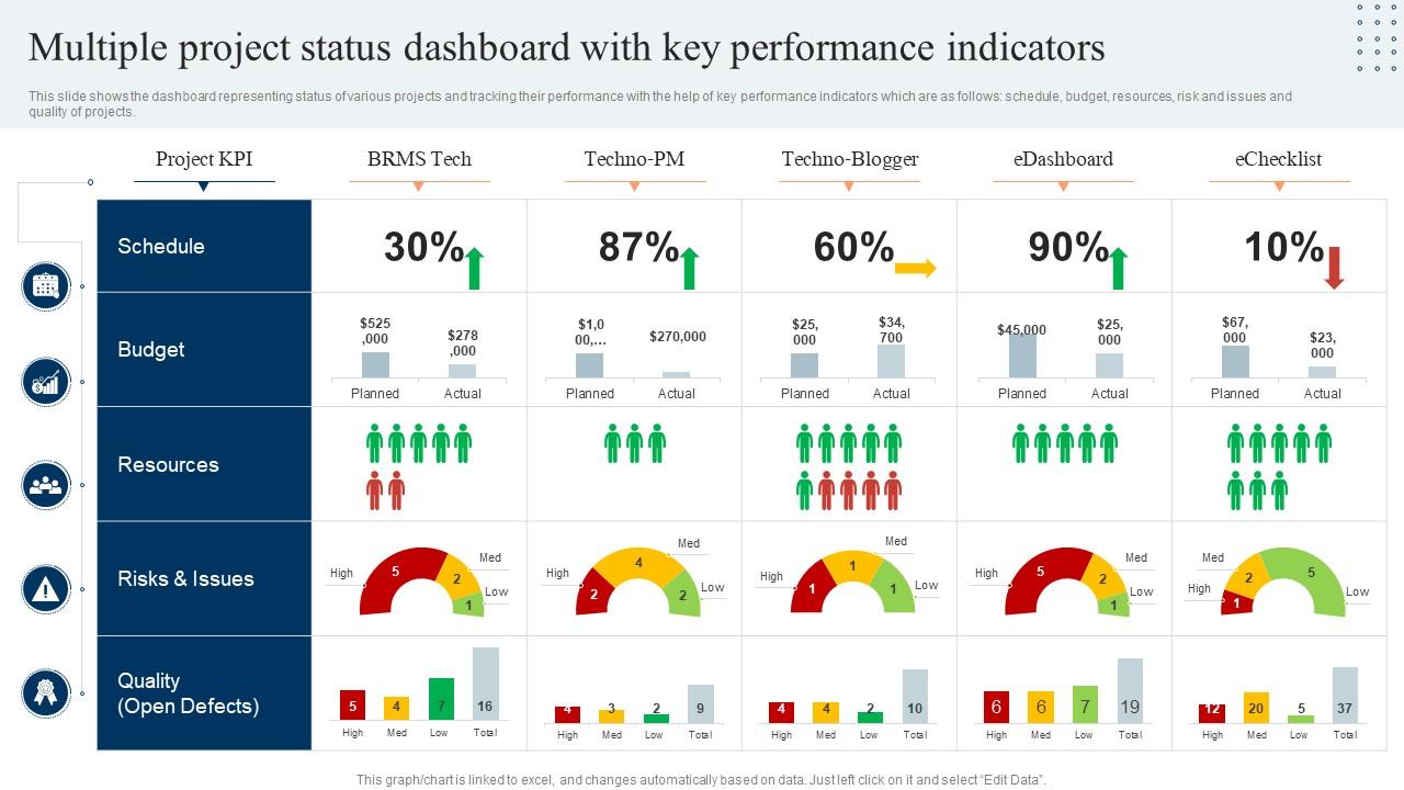
This slide shows the dashboard representing status of various projects and tracking their performance with the help of key performance indicators which are as follows schedule, budget, resources, risk and issues and quality of projects. Introducing our Multiple Project Status Dashboard Snapshot With Key Performance Indicators set of slides. The topics discussed in these slides are Budget, Schedule, Resources. This is an immediately available PowerPoint presentation that can be conveniently customized. Download it and convince your audience.

People who downloaded this PowerPoint presentation also viewed the following :

FAQs for Multiple Project Status Dashboard Snapshot With

Start with timeline stuff - which milestones you hit vs missed. Budget burn rate matters too, obviously. Resource allocation is huge but everyone forgets about it until it's too late. Honestly, risk indicators save my butt more than anything else. Quality metrics like defect rates are non-negotiable. Make everything visual - charts, color coding, whatever works. Nobody wants to dig through endless spreadsheets when they're stressed about deadlines. Keep it simple at first, then add whatever your stakeholders won't stop asking about in meetings. They'll tell you what they actually care about pretty quickly.

Honestly, dashboards are game-changers for keeping everyone in the loop. Your team can see who's doing what and where things are getting stuck without those annoying status meetings every week. Real-time updates mean no more digging through old email chains trying to figure out what's actually happening. Moving those progress bars feels surprisingly good too - weird but true. Just make sure you're tracking stuff that actually matters to your project, not random metrics that look impressive but don't help anyone. Everyone stays aligned when they're all looking at the same current info.

Honestly, Tableau and Power BI are your best bet if you want serious visualization power. Monday.com and Asana both have decent dashboard features built in - if you're already using either one, just stick with it rather than adding another tool to the mix. Grafana's solid for custom stuff. Google Data Studio works too, especially if you're living in Google Workspace anyway. I'd probably start with whatever plays nice with your current setup first, then see if you actually need something fancier later. No point overcomplicating things from day one.

Honestly, charts and graphs are game-changers because your brain just eats up visual stuff way faster than text. Like, you'll spot problems or wins in seconds instead of staring at spreadsheet rows forever. When you're in meetings, stakeholders get the project status immediately - no explaining needed. Line graphs are perfect for showing trends over time, while bar charts make progress comparisons super clear. Oh, and don't fall into the pie chart trap for everything (I see this mistake constantly). Pick your most critical metrics first, then match the chart type to what story your data's actually telling.

Honestly, real-time data is what separates useful dashboards from fancy wallpaper. You'll catch problems while they're still fixable instead of discovering disasters after the fact. Flying blind with day-old numbers? Hard pass, especially when you're already stressed about deadlines. Automated feeds are your best friend here - nobody wants to be that person still copying and pasting from Excel in 2024 (been there, it sucks). Just make sure your refresh rate actually matches your project's pace. Some things need hourly updates, others can wait till morning.

Honestly, people just use stuff more when they can make it their own. Think about it - if you can move widgets around and pick which metrics show up, suddenly it's *your* dashboard instead of some boring template. You'll actually want to check it because the important stuff is right there. It's kind of like... you know how you ignore rental cars but know every button in your own car? Same deal. Oh, and if you're building this - start simple. Let people hide widgets first, then add the fancy customization later.

Don't cram everything onto one screen - that's probably the worst thing you can do. People love adding charts just because they have the data, but honestly? Half of it's useless for actual decisions. Put your most important metrics up front where people can actually find them. Confusing visualizations are another killer - if someone needs a manual to read your dashboard, you've already lost. Oh, and test it with real users! I can't tell you how many beautiful dashboards sit unused because nobody thought about who'd actually be clicking around in there daily. Start with what decisions they need to make first.

Honestly, dashboards are game-changers for catching problems early. Instead of drowning in spreadsheets (ugh), you get this visual snapshot that makes red flags obvious - budget issues, delays, resource crunches. The patterns jump out at you way faster than scrolling through endless rows of data. Plus you can set alerts for the metrics that matter most, so you're not constantly refreshing tabs like some kind of maniac. What's really cool is how you start spotting trends that help you predict future headaches. Then you can actually do something about them before they blow up your project timeline.

Honestly, dashboards work so well because people love seeing their progress visually. Those completion bars climbing up? Pure motivation. Your team gets that dopamine hit watching milestones get checked off in real-time. It creates this momentum that keeps everyone hooked - kinda like a video game progress tracker, if you think about it. People also get competitive when they see metrics improving week to week. The transparency is huge too. Everyone finally understands how their work fits into the bigger picture. I'd definitely show both team wins and individual contributions on yours for maximum impact.

Start with your main goal at the top, then work down to the KPIs that actually feed into it. Picture a pyramid - your biggest metric is the peak, everything else supports it. Honestly, we've all made the mistake of cramming flashy numbers that don't mean anything. Pick 3-5 metrics that genuinely matter for your objective. Color code them so people can see how they connect. I always sketch this out on paper first (sounds old school but it works) before jumping into whatever dashboard tool you're using. Makes the whole thing way clearer.

Static ones are just frozen pictures of your data - like taking a screenshot. You'll have to manually update them every time something changes, which gets annoying fast. Dynamic dashboards pull fresh info automatically from whatever system you're using. Way better for busy projects since they show real-time updates when people log hours or finish tasks. I honestly can't imagine going back to static ones now - feels like using a flip phone or something. If your tools can handle dynamic, definitely go that route.

Mobile accessibility is such a game changer for project dashboards. Your team can actually check progress and update stuff from anywhere instead of being stuck at their computers all day. I'm obsessed with checking our dashboard on my phone now - way more convenient than I expected! Response times get so much faster when issues come up, plus people can collaborate during weird times like their commute or lunch breaks. Remote folks especially love staying in the loop with real-time updates. Oh, and definitely turn on push notifications for big milestones or you'll miss important stuff.

Here's the thing - build for your most confused user but don't forget the power users need their advanced stuff too. Executives want big picture trends, PMs need nitty-gritty task info, devs want technical updates. Totally different worlds! I'd do role-based views or really good filters. Oh, and watch who sees what - not everyone needs budget access, obviously. The number of dashboards I've watched crash and burn because they tried pleasing everyone at once is honestly ridiculous. Test with real people from each group first. Trust me, you'll thank yourself later when you're not fixing a million complaints.

So most dashboard tools connect through APIs or webhooks with stuff like Jira, Asana, Slack, Microsoft Project. Real-time syncing is pretty standard now. Honestly, some integrations work way better than others - I've definitely had headaches with a few. The trick is getting your data fields mapped right during setup, otherwise things get messy fast. Oh, and check what tools your team actually uses first before picking a dashboard. No point having amazing Trello integration if everyone's on Asana, you know? Pre-built connectors make life way easier.

Honestly, a good dashboard can bump your completion rates up by like 15-25%. Your team gets to see everything at once - progress, where stuff's getting stuck, deadlines. It's basically GPS for projects (who wants to wander around confused?). You'll catch problems way earlier before they mess up your timeline. Plus people actually know what to work on next instead of guessing. Oh, and don't go crazy with metrics - just pick 3-5 that actually matter. I learned that the hard way on my last project.

Ratings and Reviews

90% of 100
Review Form
Write a review
Most Relevant Reviews
  1. 80%

    by Devon Ferguson

    SlideTeam is my one-stop solution for all the presentation needs. Their templates have beautiful designs that are worth every penny!
  2. 100%

    by Courtney Griffin

    Their designing team is so expert in making tailored templates. They craft the exact thing I have in my mind…..really happy.

2 Item(s)

per page: