


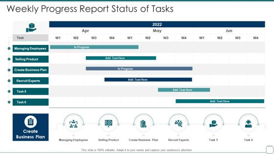
Weekly progress report status of tasks




Try Before you Buy Download Free Sample Product
 Impress Your
 Audience
 100%
100% Editable
 Save Hours
 of Time


Our Weekly Progress Report Status Of Tasks are topically designed to provide an attractive backdrop to any subject. Use them to look like a presentation pro.
People who downloaded this PowerPoint presentation also viewed the following :
Weekly progress report status of tasks with all 6 slides:
Use our Weekly Progress Report Status Of Tasks to effectively help you save your valuable time. They are readymade to fit into any presentation structure.





FAQs for Weekly progress report
Honestly, I'd focus on clear objectives first - what you're trying to hit and how you're tracking against it. Throw in your big wins and any roadblocks you're dealing with. Next steps with actual dates are huge (I'm terrible at this but everyone needs those timelines). Start with a quick summary, then get into the meat with charts or graphs - walls of text kill people. Don't hide the scary stuff either, just put it out there. Oh and definitely end with what you actually need from them, whether that's budget or just a decision. Leave room for questions because there will be some.
Dude, charts and graphs are total game-changers for progress reports. Nobody wants to read through walls of text and numbers – I made that mistake once and watched people literally check their phones mid-presentation. Bar charts work great for comparing stuff, line graphs show how things change over time. Timelines are clutch too because stakeholders can instantly see where you're at without doing mental math with dates. Oh, and infographics for the big milestones? Chef's kiss. Trust me, you'll spend way less time fielding confused questions afterward.
Start with your biggest wins right at the top - nobody wants to dig through paragraphs to find the good stuff. Break everything into bullet points so people can actually scan it quickly. Numbers are your best friend here; saying "30% increase" hits way harder than "significant improvement" (which honestly sounds like corporate BS). Each finding should connect back to whatever goals you set at the beginning - otherwise it just looks like random bragging. Oh, and if something bombed? Just own it. Explain what went wrong and how you're gonna fix it. People respect honesty way more than trying to spin failures into "learning opportunities."
Honestly, most people go with weekly or bi-weekly depending on how crazy things are. If your project's moving fast or stuff keeps changing, weekly keeps everyone sane. Bi-weekly works great for those longer, steadier projects where nothing's on fire every day. I've worked with teams that tried monthly updates but - ugh, that's way too long unless you're only dealing with C-suite folks who just want the highlights. Oh, and definitely ask your stakeholders what they prefer upfront. Then stick to whatever you pick. Consistency matters more than you'd think.
Honestly, the worst thing you can do is dump everything into giant paragraphs - people just won't read it. Be specific about what you actually got done instead of staying super vague. Oh, and don't try to sugarcoat everything! If something's behind schedule, just say so upfront and explain how you'll fix it. I see people turn every tiny task into this huge accomplishment, which gets old fast. Bullet points are your friend here. Skip the corporate buzzwords too - they make you sound robotic. Most importantly, connect your updates back to the deadlines and goals everyone's tracking.
You've gotta tailor it to who you're talking to. Executives want the quick hits - metrics, budget stuff, any major problems they need to handle. They're swamped and just want the headlines. Your team though? Go deeper into the technical weeds and daily grind since they're actually in the trenches doing this stuff. I swear, people send identical updates to everyone then act shocked when nobody cares. Quick test - ask yourself what they'll actually DO with whatever you're telling them. That'll guide how much detail to include.
You'll want to track timeline progress (% complete vs planned), budget burn, and milestone hits for sure. Risk status and resource utilization are solid too - stakeholders always ask about those anyway. Quality stuff matters if you're dealing with defects or acceptance rates. Definitely keep scope changes visible since they explain why timelines shift. The thing is, it really depends what your stakeholders actually care about and your project type. Could be totally different for software vs construction, you know? Stick to 5-7 metrics max though - any more and people's eyes glaze over.
Right after you share the good stuff, jump straight into what went wrong - don't save it for the end. People actually respect you more when you're honest instead of trying to make everything sound perfect. Frame it like "here's what we figured out" rather than just complaining about problems. Give specific examples too. Like "X set us back two weeks, so now we're focusing on Y to catch up." Your stakeholders want to see you're handling the mess, not pretending it doesn't exist. Oh, and always have a solution ready when you bring up any issue.
Honestly, you'll save yourself so much headache if you just stick to one format. Your stakeholders won't have to hunt around for budget info or timeline stuff - they'll know exactly where everything is. I learned this the hard way after switching templates like three times in one project (don't do that). Short sentences work great sometimes. But you also want some variety so it doesn't sound robotic when people actually read these things. Create a solid template that hits all the metrics people actually want to see, then don't mess with it. Trust me, your team will get used to the structure way faster, and you won't be starting from scratch every week.
Look, progress reports are basically your safety net for not looking like an idiot later. They show what you said you'd do versus what actually happened - no BS, just facts. When you write stuff down regularly, people can see where you're at without bugging you constantly. It keeps you honest too, which... yeah, we all need that sometimes. The best part? Problems come up early instead of blindsiding everyone at the end. Just make a simple template and stick to it. Even quick weekly bullet points beat those giant monthly updates nobody reads anyway.
Honestly, Canva's probably your best bet if you want something that looks good without much effort. Adobe Creative Suite is amazing but might be overkill unless you're already familiar with it. Don't sleep on PowerPoint though - I've seen some really impressive reports made with just good templates and consistent colors. Tableau and Power BI are clutch for data-heavy stuff. Oh, and if your team needs to collaborate, Notion's pretty sweet since everyone can edit in real-time. My advice? Start with whatever you already know and nail the basics first. Clean layout beats fancy software every time.
Oh dude, just tell it like a story! Start with "So here's what we were dealing with..." instead of those awful bullet points everyone hates. Walk them through what you tried, what totally didn't work, then the wins. I swear, when you frame the messy parts as plot twists, people actually read the whole thing. Throw in specific details about roadblocks too. Try: challenge → attempts → lessons → next steps. It's way better than those zombie reports nobody opens. Your boss will probably think you got way more interesting overnight lol.
You want people to see you're thinking ahead, not just dumping what happened last week. When you add next steps and timelines, your report becomes actually useful for making decisions instead of just... existing. Plus everyone stays on the same page about priorities, which honestly saves so much headache later. Make sure you're clear about who's doing what and when - vague assignments are where projects go to die. The whole thing shifts from being a boring status update to something that actually guides where the team's headed next.
Just cut straight to what you need help with - your decisions and roadblocks. People don't want a novel about every little thing you did (honestly, who has time?). Start with where you're at, then jump into the specific problems you're hitting. After that, lay out your options. Skip the boring play-by-play stuff. Instead, zero in on where you're actually stuck or need someone else's brain on it. Wrap up each part with real questions like "Should I go with X or Y?" The more specific you get with what you're asking for, the less you'll get those useless "looks good!" responses that don't help anyone.
Honestly, keep it stupid simple for progress reports. Bar charts are your best friend for showing actual vs planned stuff. Line charts work well when you need to show trends over time. Yeah, Gantt charts are totally overdone, but stakeholders eat that timeline visualization up for some reason. Dashboard layouts with progress bars and key metrics? Perfect - people can see if you're winning or losing in like 2 seconds. Don't get fancy with pie charts or weird scatter plots. Nobody has time for that. Your boss just wants to know "are we screwed or not?" Keep it straightforward.
-
Use of icon with content is very relateable, informative and appealing.
-
Great designs, Easily Editable.