


Trend analysis report powerpoint shapes




Try Before you Buy Download Free Sample Product
 Impress Your
 Audience
 100%
100% Editable
 Save Hours
 of Time


Compare your business progress with this readily available Trend Analysis Report PowerPoint Shapes template. Showcase the changes in business trends over time with this trend analysis PowerPoint graph. Use this line chart PPT graph to make a presentation that is comprehensive for your audience and is capable of presenting complex data in a simplified format. Increase the productivity by working on the stress areas. Work towards the better functioning of your organization. This way you can concisely convey as much information as possible through this statistical forecasting PPT slide. The graph trend analysis template will help you analyze the targets achieved and the ones you still need to accomplish. Make an impactful presentation using this professionally designed PowerPoint presentation slide. Download the template now and evaluate the financial status of your company with the help of this line PPT graph.
People who downloaded this PowerPoint presentation also viewed the following :
Content of this Powerpoint Presentation
Description:
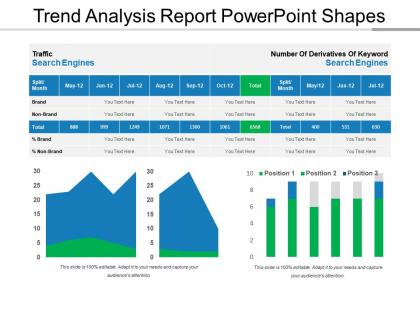
The PowerPoint slide presents a "Trend Analysis Report" focusing on search engine traffic data and keyword performance. The slide is divided into two main sections with accompanying graphs:
Traffic Search Engines:
Displays monthly traffic data split into Brand and Non-Brand categories with a total count.
The left side shows a table with columns for each month from May to October, with the ability to add text or data for Brand and Non-Brand traffic, alongside totals and percentages.
Number Of Derivatives Of Keyword Search Engines:
On the right, there is a similar table for keyword search data, again with monthly columns, showing the total counts.
Below the tables are two graphs: a stacked area graph visualizing the Brand vs. Non-Brand traffic, and a bar graph showing keyword positions over time.
Each section provides editable text boxes for customization and includes specific data points, such as '888' for total traffic in May, '999' for June, etc., suggesting a pattern or trend in the data.
Use Cases:
Industries where this slide could be effectively used:
1. Financial Services:
Use: Analyzing market trends, investment performance, or financial projections.
Presenter: Financial Analyst or Investment Manager.
Audience: Investors, Financial Institutions, Business Leaders.
2. Marketing and Advertising:
Use: Presenting consumer behavior insights, advertising campaign performance, or market research findings.
Presenter: Marketing Manager or Data Analyst.
Audience: Marketing Teams, Advertising Agencies, Brand Managers.
3. Technology and Software Development:
Use: Tracking software usage metrics, user engagement trends, or product development analytics.
Presenter: Product Manager or Data Scientist.
Audience: Software Developers, Product Teams, IT Professionals.
4. Healthcare and Pharmaceuticals:
Use: Analyzing patient health data, clinical trial outcomes, or pharmaceutical market trends.
Presenter: Healthcare Analyst or Pharmaceutical Researcher.
Audience: Healthcare Providers, Pharmaceutical Companies, Regulatory Agencies.
5. Retail and E-commerce:
Use: Monitoring sales trends, customer purchasing behavior, or inventory management analytics.
Presenter: Retail Analyst or E-commerce Manager.
Audience: Retailers, Online Merchants, Supply Chain Managers.
6. Consulting and Advisory Services:
Use: Providing strategic insights, industry trend analysis, or market research reports to clients.
Presenter: Business Consultant or Strategy Advisor.
Audience: Corporate Executives, Decision-makers, Business Owners.
7. Education and Training:
Use: Teaching data analysis techniques, statistical methods, or research report presentation skills.
Presenter: Educator or Trainer.
Audience: Students, Professionals seeking skill enhancement, Academic Institutions.
Trend analysis report powerpoint shapes with all 5 slides:
Our Trend Analysis Report Powerpoint Shapes are forever eager to give. They are definitely good at heart.


FAQs for Trend analysis
Okay so for your trend report, you'll need good charts first - make the data actually visual so people get it right away. Context is huge too, like what's causing these trends? Compare it to last year or whatever timeframe makes sense. The "so what" part is honestly the most important - spell out what this means for the business because half these executives won't connect the dots themselves. End with real recommendations they can act on. Oh and seriously, keep your slide formatting consistent or it looks messy and people focus on that instead of your analysis.
Dude, shapes are seriously a game changer for trend analysis presentations. Use arrows to show where things are heading, circles to call out the big insights, and geometric shapes to break up sections. I made this mistake for years - just dumping charts everywhere without thinking about flow. Now I use consistent colors and shapes as anchors throughout the whole deck. Breaks up that wall-of-text look nobody wants to read. Your audience will actually follow along instead of zoning out. Trust me, it makes even the most boring data feel way more digestible and polished.
So for trend stuff, line charts are definitely your go-to since they show changes over time really clearly. Bar charts work too if you're comparing different categories. Honestly, skip pie charts completely - they're useless for showing trends. Combo charts are pretty solid when you need multiple metrics on one slide, though they can get messy if you're not careful. Oh, and don't forget clear labels and titles because nobody wants to spend five minutes figuring out what they're looking at. Keep it straightforward and you'll be fine.
Oh totally, colors mess with people's heads way more than you'd think. Green = good/growing, red = bad/declining - super basic but it works. Blue makes everything look trustworthy and stable. I swear I've watched people get completely thrown off when someone used red for positive data... like why would you do that? Warm colors give off this energetic vibe while cool ones feel more chill. Just pick a system and stick with it throughout your whole presentation. That way people can glance at a chart and instantly get what's happening without squinting at tiny labels.
Arrows are your best friend here - up for growth, down for decline, curved for anything cyclical. Stick with green for good stuff, red for bad. I swear, simple shapes beat fancy graphics every time. Nobody wants to decode your artistic masterpiece when they're trying to understand quarterly results! Make sure everything's proportional to what you're actually showing. Oh, and label everything clearly - your audience shouldn't have to play guessing games with random zigzags. Trust me, I've sat through way too many presentations where I had no clue what the presenter was getting at.
Honestly, animations can totally transform how people absorb your trend data. Instead of hitting them with everything upfront, reveal insights bit by bit - like using fade-ins for quarterly comparisons or showing how metrics evolved over time. I definitely overdo it sometimes (whoops), but done right, animations help people actually follow your story. Motion paths work great for directional trends too. The trick is making sure each animation has a purpose - don't just add sparkly effects because they look cool. Start simple with one animation per slide, then add more if needed.
Shapes are like your secret weapon for making trends actually visible. I throw arrows on charts to show direction, circles around the crazy outliers, rectangles to box important time periods. Contrasting colors make everything way more obvious too. But here's the thing - don't go overboard highlighting every single point or people's eyes will glaze over. Pick maybe 2-3 key insights max and guide people straight to those. Trust me, they'll actually retain what matters instead of drowning in data overload. Less is definitely more with this stuff.
Honestly, stick to icons that actually match your data - arrows for growth stuff, industry symbols to split up market segments. Don't go crazy with different styles or you'll end up with slides that look like someone threw up emojis everywhere. They work great for replacing text, especially when executives are just skimming through. Each icon should have a real job - either explaining a data point or helping people follow your logic. Oh, and start small with maybe 2-3 types. You can always add more later once you've got the basics down.
For trend reports, I'd go with templates 90% of the time. Pre-formatted charts and callouts already look professional, plus your team won't mess up the formatting when they update stuff. Custom shapes give you more creative freedom and better brand matching, but they're honestly such a time sink. Templates keep everything looking consistent when you're working with other people too - which is huge. Only bother with custom when templates really can't do what you need. I learned this the hard way after spending way too long on custom designs that didn't even look that different.
Okay so basically each shape tells your brain something different. Arrows = movement/direction, circles work for highlighting outcomes, rectangles are perfect for raw data. Triangles? They scream "change" - like trends going up or down. I learned this the hard way after making terrible slides for years lol. Diamonds grab attention for your big insights. Lines connect stuff and show relationships between points. But here's the thing - you've gotta stay consistent. If circles mean "good results" in slide 2, don't randomly switch to squares later. People will get confused trying to decode your random shape choices.
Start with PowerPoint's Designer feature - it's actually gotten pretty decent lately. If you need more, Lucidchart and SmartArt Pro are solid for fancier visualizations. Icons8 has great chart templates that don't look like garbage (unlike most defaults). Think-Cell is incredible but costs money - though if your company will pay for it, totally worth it. I'd probably try Designer first since it's free, then see if you need something beefier. Oh, and Icons8's stuff genuinely looks professional without much effort.
So basically, when you keep using the same shapes and colors throughout your report, people can actually focus on your data instead of getting confused by random design choices. I learned this the hard way after making some truly chaotic presentations lol. Your audience won't have to decode different visual styles on every slide - they'll just see the trends you're showing them. Think about it like this: if everything looks cohesive, comparisons between charts become way clearer. Just pick 2-3 shapes at the beginning and use those same ones for all your charts and callouts. Trust me, it makes a huge difference.
Try red triangles for threats and green arrows for opportunities - they pop right away. Callout boxes with thick borders work really well too. Size your shapes based on impact level, so the biggest risks get huge warning symbols. Group similar stuff together in sections. Oh, and always put your most critical items first with the brightest colors. People notice those immediately. I usually go a bit overboard with the bold shapes, but honestly? It's better than having important risks get missed because they blend into boring bullet points.
Honestly? Stop trying to use every single shape and arrow PowerPoint has - I see this all the time and it's messy as hell. Pick like 2-3 shape types max and stick with them. Don't mix arrow styles for the same type of data, that's just confusing. Each shape needs a real reason to exist, not just decoration. I learned this the hard way after bombing a presentation once. Less crowded slides = happier audience. Your shapes should actually help tell the story, not distract from it. Trust me on this one.
Definitely swap out those colors for your brand palette first - the default ones always look so generic. Update fonts too, and make sure borders/fills match your company guidelines. Honestly, I'd create a master template with everything pre-formatted so your team doesn't have to reinvent the wheel each time. Chart styles should stay consistent with your other materials. Spacing matters more than people think - keeps everything looking polished. Icons and graphics need to feel like they belong to your brand too, not some random stock template.
-
Much better than the original! Thanks for the quick turnaround.
-
Great experience, I would definitely use your services further.