


Strategy house diagram powerpoint layout





Try Before you Buy Download Free Sample Product
 Impress Your
 Audience
 100%
100% Editable
 Save Hours
 of Time


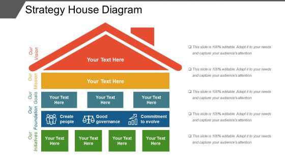
Choose our strategy house diagram PowerPoint layout PPT template for your business presentations and make useful strategies. Our slide design has been crafted using a graphic of house with information diagram which has beautiful colors and can be customized as per your business requirements as this design is fully editable. This Presentation slideshow can be helpful for all your marketing and business-related presentations and this will command the attention of your audience. It is important for a business to make strategies, identify and select a target market so that they can direct marketing efforts towards the target customer. This enables the business to use its marketing resources more efficiently, resulting in more cost and time efficient marketing efforts. By incorporating this PPT graphic into your presentation, you can collect more precise data about customer needs and behaviors and then analyze that information over time to refine market strategies effectively. Also, developing effective business strategies is important for establishing a new business or expanding your existing business. So, download the amazing slide now. Convince folks to exist n harmony with our Strategy House Diagram Powerpoint Layout. Get them to cherish the idea of friendship.
People who downloaded this PowerPoint presentation also viewed the following :
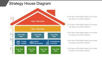
Strategy house diagram powerpoint layout with all 5 slides:
Analyse each constituent clause with our Strategy House Diagram Powerpoint Layout. It helps dissect the judgement.

FAQs for Strategy house
So there's three parts to a strategy house - foundation, pillars, and roof. Foundation is what you're actually good at and what resources you have (be brutally honest here). Pillars are your 3-5 main strategic moves. Roof is your big vision and goals. It's literally like building a house - each level has to support the one above it. Start with the foundation first because honestly, most people skip that part and wonder why their strategy falls apart. The pillars won't work if they're not built on what you can actually do well.
A strategy house diagram basically takes your messy strategy and turns it into something that actually makes sense visually. Foundation at the bottom with your enablers, pillars in the middle for key initiatives, vision at the top. Simple as that. What I love about it is how quickly people "get it" - no more death by PowerPoint slides full of text. You'll spot problems way faster too when everything's laid out like this. Honestly, even a crappy whiteboard sketch beats another 20-page document that nobody reads. Worth trying at your next planning session.
So the roof part shows how your different goals either help or mess with each other. You'll see little + or - symbols that basically tell you if one goal supports another or creates conflict. Most people totally skip this section, which is dumb because it's where you catch problems early. Like if you want to cut costs but also boost quality - that's gonna create tension, right? The roof makes that super obvious. I'd honestly spend way more time on this than most people do because those connections between goals will determine how smoothly everything actually works when you try to execute.
Match your detail to who's in the room. Executives? Keep it high-level - just the big strategic stuff and outcomes. Team meetings? Go deeper into tactics and numbers. Your foundation should be way more detailed than the top sections since it's holding everything up. Like, literally think of building a house here. Start broad, then only add detail where people actually need to make decisions or do something. Oh and here's the test - if people are squinting at your diagram or their eyes are glazing over, you've gone too deep into the weeds.
Honestly, the biggest thing is making sure there's a clear visual hierarchy - foundation at bottom, pillars in middle, goals on top. Don't go crazy with colors, but use them to separate each section so it's not just a blob of text. White space matters way more than people think. I'd add some arrows or lines connecting related stuff. Oh, and please stick to simple fonts - nothing fancy that makes people work to read it. Bullet points beat long paragraphs every time. If someone stares at it for more than 30 seconds looking confused, you've overcomplicated things.
Yeah, totally works for both! Corporate level stuff gets messy with all the different business units, so your foundation would cover portfolio decisions and how you're splitting resources. The pillars might be diversification moves or finding synergies - honestly depends what you're prioritizing. Business-level strategy is cleaner though. Focus shifts to beating competitors, so you'd build pillars around cost leadership or whatever makes you different. What's nice is the visual format doesn't change much between the two. Just swap out the content layers based on whether you're thinking big picture corporate or drilling down into one business. Pretty straightforward once you get the hang of it.
Honestly, it's like having a shared map everyone can look at instead of wandering around lost. When your team's arguing about priorities, you just point to the diagram and go "okay, does this actually fit our foundation?" No more of those painful meetings where everyone's talking about completely different things. The visual part is huge - makes all that abstract strategy stuff way more concrete. I mean, beats the hell out of endless PowerPoints that put everyone to sleep. Next time people start going in circles, pull it up and anchor the whole conversation to what's actually on there.
Honestly, the biggest trap is being way too vague with your foundation - you need actual measurable pillars that tie to your vision. People cram tons of text everywhere which totally kills the visual point. I'm guilty of this too, but mixing tactics with strategy in that middle layer is huge mistake. Focus on "what" not "how" there. Oh and definitely don't build this thing alone - grab input from key people early or you'll regret it later. Most critical though? Actually use it. So many teams build these beautiful strategy maps then never look at them again. Review quarterly or it becomes expensive wall art.
Map what stakeholders tell you straight into your strategy house levels - their concerns should shape your foundation and pillars. Run workshops with different groups so they can tell you what actually matters to them. This gets messy fast because everyone wants different things, but honestly that conflict is super useful info. Take their feedback to check if your themes make sense and catch anything you missed. Oh, and make sure each major group can point to something in the final diagram and say "yeah, that's what we said" - even if it's not exactly their original ask. Trust me, that buy-in is worth the extra work.
Honestly, those diagrams are game-changers for keeping meetings on track. Everyone's looking at the same visual - your foundation stuff like values and capabilities at the bottom, strategic themes as pillars, then your vision up top. No more of those painful sessions where people just ramble endlessly (we've all been there, right?). When you build it as a team, gaps become super obvious. Same with misalignments - they just jump out at you. The whole thing forces systematic thinking without feeling rigid. You should definitely try it next time you're planning strategy. Works way better than I expected when I first heard about it.
I'd say at least once a year, but quarterly makes way more sense if you're in something that moves fast. Don't just wait for your calendar reminder though - big market changes or competitive stuff should make you pull it out sooner. Honestly, I've watched teams use the same strategy house for like three years and then act confused when nothing's working right. The whole thing only helps if it actually matches what's happening in your world. Just block out time every quarter to look at it. Treat it seriously - you know how these things get pushed off otherwise.
Honestly, the biggest thing is you get everything in one visual - vision, goals, initiatives all connected. No more digging through those massive strategy documents that nobody actually reads (seriously, when's the last time you opened a 50-page PDF?). With the house layout, spotting gaps or overlaps becomes way simpler. Your team gets it faster too. I'd actually try mapping your current strategy into a house - bet you'll catch some stuff you missed. Way better than scrolling through endless text trying to figure out how everything fits together.
For interactive strategy houses, I'd go with Miro first - it's great for team stuff. Lucidchart works too, or honestly even PowerPoint if that's what everyone already knows. You can add clickable sections, pop-ups with extra details, links between different parts of the house. Hover effects are pretty slick for revealing context without cluttering everything up. Way better than making people sit through another boring slide deck, you know? I always tell people to start basic with just some clickable areas. See what your team actually clicks on before going crazy with features.
Know your audience before you even start sketching this thing out. Executives? Keep it high-level with clear value props and big strategic pillars. For operational teams, you'll need way more tactical stuff they can actually run with. Honestly, I've watched so many people create these gorgeous strategy houses that nobody understands or uses because they didn't think about who'd be looking at it. The language needs to match too - don't use insider jargon with external stakeholders. Short version: figure out what your specific group needs to get and do differently, then build around that.
Honestly, these diagrams are game-changers for getting everyone on the same page. You basically map out how each team's daily work connects to your big company goals - so marketing isn't accidentally working against what sales is doing. Think of it like a roadmap that shows every department how their stuff matters to the overall strategy. No more "wait, what are we even doing this for?" confusion. I'd definitely run a workshop with your department heads to build one together. The conversations you'll have just figuring it out are probably half the value right there. Plus everyone feels more bought-in when they helped create it.
-
The Designed Graphic are very professional and classic.
-
Very unique and reliable designs.