

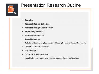
Presentation research outline powerpoint topics




Try Before you Buy Download Free Sample Product
 Impress Your
 Audience
 100%
100% Editable
 Save Hours
 of Time


Provide a roadmap to a more successful business pitch using this Presentation Research Outline PowerPoint template. It is a general plan that summarizes whatever you want to say to your audience. Present the main and supporting ideas for a particular subject. This readymade PPT slide will help you to develop a logical structure, making it easier for you to translate your ideas into words. It includes all the critical elements of your presentation. Create a comprehensive business plan without missing a detail through this professionally designed PPT slide. Provide an overview of the topics covered in the presentation. Organize the ideas into a logical order using this presentation outline template. Organize your thoughts and ideas into main points and display it with this presentation outline template.
People who downloaded this PowerPoint presentation also viewed the following :
Presentation research outline powerpoint topics with all 5 slides:
Pierce through the cloud with our Presentation Research Outline Powerpoint Topics. Derive all the data that you need.

FAQs for Presentation research
Okay so you need three main things: a solid thesis that states your argument, supporting evidence broken into 2-4 points, and good flow between sections. Honestly, I always screw up the flow when I'm rushed lol. Get specific with your data and examples for each point. Write transition phrases so you don't blank out mid-speech - trust me on this one. Time estimates for each section are clutch too. Here's something weird but it works: start by writing your conclusion first. Sounds backwards but it keeps you focused on what actually matters to your audience instead of rambling.
Honestly, visuals are a game-changer for presentations. People can spot patterns in charts way faster than if you just ramble through numbers. Images also save you from those awful text-heavy slides - you know, the ones that make everyone's eyes glaze over. Different people learn differently too, so graphs help the visual learners in your audience actually get it. Just keep things simple and make sure each visual actually supports your point. Don't randomly throw in clipart just because there's empty space (I learned that the hard way). Pick stuff that highlights your key findings.
Figure out who you're talking to first. Tech people? Hit them with all the data and skip the basics. Executives just want the bottom line impact - honestly, they'll tune out if you get too detailed. I switch up my tone depending on the crowd too... way more casual with my own team versus external people. Oh, and frame everything around their actual problems instead of just dumping info on them. That's huge. One thing I learned the hard way - always bring backup slides with extra detail. Someone will definitely ask a question that needs it.
Honestly, your outline is what makes or breaks the whole thing. I've watched so many smart people bomb because they just threw facts everywhere without any structure. Super frustrating to watch! Pick chronological, problem-solution, or cause-effect - whatever fits your topic best. Map out your main points first, then arrange them so they flow naturally. Each idea should build on the last one. Your audience needs to follow you from A to B without getting confused halfway through. Oh, and don't underestimate how much good organization helps with your own confidence too.
Here's the thing - nobody wants to sit through a boring data dump. Stories make people actually give a damn about your research. We're hardwired for narratives, right? Been that way since we were little kids begging for "just one more story" at bedtime. You can either build your whole presentation like a story (problem, struggle, solution) or just sprinkle in real examples throughout. I'd start with a scenario that shows why anyone should care about your research in the first place. Makes the whole thing feel less academic and more... I dunno, human? Complex stuff becomes way more memorable when there's emotion behind it.
Start with your 2-3 biggest findings that actually move the needle for your audience. Put those right up front in your outline. Honestly, skip all the methodology stuff - people just want to know what you discovered, not how you got there. Structure each bullet point with the impact first, then throw in your supporting data underneath. Your outline should basically read like news headlines. If someone only glanced at those main bullets, they'd still walk away with your key message. Most important stuff goes first, then you can get into the weeds later if needed. This way you won't end up just dumping a bunch of data on people during the actual presentation.
Stick to peer-reviewed journals and government databases - Google Scholar's great for this. Check publication dates unless you're doing historical stuff. I always cross-check facts across multiple sources because even legit places can be biased, which is annoying but true. Make sure authors actually have credentials. Avoid anything that sounds too sensational or clickbait-y. Universities and established orgs are usually solid bets. Oh, and seriously save all your source links as you go! I learned this the hard way when I had to dig through my entire browser history at 2am trying to find citations.
Don't just slap trends onto your research at the end - that looks so obvious. Pick 2-3 innovations that actually relate to what you found, not whatever's trending on social media this week. Use them as your "so what" moment to show why your work matters right now. Each trend should back up your main point or show gaps you're filling. Honestly, I've seen too many papers where the trends feel totally random. Make them prove why your research is needed going forward. The whole thing should feel connected, not like you remembered trends last minute.
Stick to one main idea per slide - use your outline headings as titles. Bullet points are your friend here, not huge paragraphs. Six lines max or people zone out completely. Make the important stuff big and bold so it actually stands out. Honestly, throw in charts or images whenever you can because nobody wants to read walls of text. Pick fonts and colors that match throughout (makes you look like you know what you're doing). Your ending should hit those key points from your outline again. Oh, and start with your best slides first - build everything else around those.
Practice each section out loud - yeah I know it feels weird talking to yourself but just do it. Time everything so you know if you're on track. Record yourself if you can, then listen for where you say "um" a million times or rush through parts. Your outline's gonna change as you go - that's normal. Mark up anything that sounds clunky or drags on too long. Honestly, the difference between reading off notes awkwardly vs actually knowing your stuff is just repetition. You'll hit that sweet spot where you can just talk naturally about your topic.
Honestly, just start with whatever you already have - PowerPoint or Google Slides work fine for visual stuff. If you're more of a text person, Notion is pretty solid, or even just Word works. I've been meaning to try those mind mapping tools like MindMeister but keep forgetting lol. Scapple's good for messier brainstorming when your thoughts are all over the place. Miro boards are clutch if you're working with other people since everyone can jump in at once. Don't overthink it though - figure out what feels natural first, then you can get fancy with specialized tools later.
Honestly, time your practice runs beforehand - saved my butt so many times. I usually jot down little time checkpoints in my notes like "10 min: start methodology section" so I don't completely lose track. Oh, and definitely build in some wiggle room between sections! I once had to speed-run my entire conclusion in like 30 seconds and it was mortifying. Watch your audience's faces too. If they're looking lost, slow down even if you have to skip some stuff later. Better to nail the important parts than rush through everything like you're reading the dictionary.
Honestly, the biggest thing is not stuffing too much into your outline. I see people do this all the time and they end up racing through slides while everyone zones out. Pick like 3-4 main points max. Don't make everything seem equally important - it's not. Oh, and think about how you're getting from section to section. Random jumps between topics feel awkward. I learned this the hard way during a terrible presentation last year where I basically gave people whiplash. Here's what actually works: start each part by explaining why your audience should care, then dive into specifics. Don't save your big "here's why this matters" moment for the very end.
Yeah, you definitely need a call to action! Otherwise you're just dumping info on people and walking away. Your audience sits there for 20 minutes listening to all your methodology and findings, then... nothing? That's awkward. The CTA should flow right from your main results. Give them something concrete - "let's test this approach" or "here's what we should investigate next." I've seen too many presentations that just fizzle out with "so... questions?" Don't do that. You've got their attention, so tell them what to do with it.
Four things to check: does your outline flow logically, are the main points clear, is your timing realistic, and will it actually matter to your audience? Each section should connect smoothly to the next. Your key messages need solid backing - no weak points. Timing always screws me over, so be honest about how long each part will take. And honestly? If it doesn't serve your specific audience, cut it. Your outline should tell a story they'll care about. Run it by someone first - if they're lost, you're in trouble.
-
Topic best represented with attractive design.
-
Unique and attractive product design.