

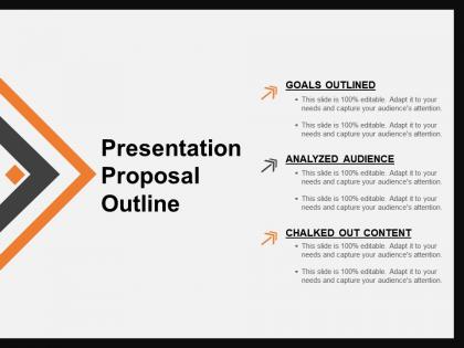
Presentation proposal outline powerpoint slides design




Try Before you Buy Download Free Sample Product
 Impress Your
 Audience
 100%
100% Editable
 Save Hours
 of Time


Outline the issues, goals, and framework of the organization using this Presentation Proposal Outline PowerPoint Slides template for improving the business processes. Using this slide, you’ll be able to break down the process into manageable steps and assign items for each department. Define the project goals, budget, and implementation plans. This template will provide your viewers with information on every area of the business or the project. This will assist you in analyzing the opportunities and threats associated with the project. It helps you to summarize whatever you want to say to the prospective customers, clients, or investors. Organize your ideas into a logical order and lay a clear path. Get this readily available template to provide an overview of the topics to be discussed in the presentation. This presentation outline slide will aid you in organizing your thoughts and ideas into main points, providing a clear understanding of the concept.
People who downloaded this PowerPoint presentation also viewed the following :
Presentation proposal outline powerpoint slides design with all 5 slides:
Force folks to pay heed with our Presentation Proposal Outline Powerpoint Slides Design. They are excellent attention getters.

FAQs for Presentation proposal outline
Okay so the main things: visual hierarchy is huge, keep everything consistent, and there's this 6x6 rule - max 6 bullet points, 6 words each. Make sure your text pops against the background with good contrast. Here's what most people mess up though - way too much text. Give your slides room to breathe with white space. Stick to maybe 2-3 fonts and keep colors simple but purposeful. Oh, and this is crucial: if you're just reading off your slides word for word, you've already lost people. Your slides should back up what you're saying, not do the talking for you. They're like visual notes, not a script.
Dude, colors literally mess with people's brains when they're looking at your slides. Red and orange? Total attention grabbers but they make everyone feel rushed. Blues and greens are way more chill - people actually trust you more with those colors. I watched this guy bomb a financial presentation once because everything was screaming red... like, read the room! For stuff with lots of details, stick to cooler colors since they won't fry people's eyeballs. Yellow and pink presentations just look unprofessional honestly. Pick colors that match the vibe you're going for, not whatever's trendy.
Dude, typography is honestly huge for presentations. Bad fonts will kill your whole vibe - people get distracted trying to read your slides instead of listening to you. You want high contrast so the back row isn't squinting, and please don't use more than 2-3 font families or it looks like a ransom note. Good typography creates a hierarchy that guides people's eyes where you want them to go. Size matters too - go bigger than you think you need. Oh, and never Comic Sans in professional settings. Trust me on that one, I've seen the cringe firsthand.
Stick to the 6x6 thing - 6 bullet points, 6 words max each. Let your visuals carry the weight instead of cramming text everywhere. I used to be terrible at this and could literally watch people's eyes glaze over lol. Good images and charts beat random stock photos every time. Your slides should work like billboards - someone catches the main idea in seconds. Save text for the really important stuff and fill in details when you're actually talking. Oh, and high-quality visuals that actually relate to what you're saying make such a difference.
Skip the generic handshake photos - we're all so tired of those. Pick images that actually connect to what you're saying, not just whatever looks "professional." One good visual per slide beats cramming in three mediocre ones. Quality matters too; blurry pics make you look amateur. Don't let your text fight with the image for attention. Give everything room to breathe with white space. Here's my test: if you have to explain what the image shows, ditch it. The right visual should instantly click with your message. Oh, and avoid the temptation to fill every corner - empty space actually helps people focus.
Honestly? Less is more with animations. I made this mistake once - had my whole team looking seasick during a quarterly meeting because I went overboard with spinning charts. Yikes. Fade-ins work great, maybe some gentle slides. Skip the bouncy stuff unless you want people rolling their eyes. Time everything around 0.5-1 seconds and only animate what you're actually talking about. Otherwise it's just visual noise competing with your words. Run through it beforehand. Ask yourself if each animation actually helps or if you're just showing off. Your slides should guide attention, not turn into some carnival act.
So basically stick to the same color palette and fonts across everything - that's like 80% of it right there. Your logo should go in the same spot every time too. I'd make a quick style guide first so you're not second-guessing yourself on every slide. Keep your layout structure consistent, same margins, similar icons or graphics. Oh and your photos should have the same vibe or filter - nothing worse than random stock photos that don't match. Honestly spacing matters more than people think. Just don't be that person whose deck looks like a collage!
Know your audience first - that's literally everything. Boardroom executives? Keep it super clean with your company colors and zero clutter. They'll check out instantly if your slides are messy. Schools and training sessions are different though - you can throw in more graphics and fun layouts since people actually want to learn. Creative presentations are where you get to have fun with weird fonts and bold designs. Boring slides would actually work against you there. I always think about whether I'm talking to suits or artists before I even open PowerPoint. Sounds obvious but you'd be surprised how many people skip this step.
Ugh, don't be that person who puts entire paragraphs on slides and then reads them word-for-word. Instant audience death. Tiny fonts are awful too - nobody's squinting to read your 8-point text from the back row. I sat through this one presentation where the guy spent like 5 minutes on a simple chart but then blew through the actually important stuff in 30 seconds. Pacing matters! Those generic stock photos look ridiculous btw. Skip the handshake-in-a-conference-room nonsense. Keep slides visual, practice beforehand, and you'll be fine.
Think about what story you're trying to tell first - that's honestly the most important part. Bar charts work great when you're comparing stuff, line graphs are perfect for showing changes over time. Pie charts? Meh, they're kinda overrated if you ask me. Don't go crazy with colors - stick to a consistent palette and actually label things so people aren't guessing. Here's the thing though: resist cramming everything into one chart. It'll just confuse people. Pick the visual that matches your data type and what your audience needs to see. What's that one key takeaway you want them to remember?
Definitely go with PowerPoint, Keynote, or Google Slides first - that's what most clients actually use anyway. Canva Pro is amazing for design though, way easier than trying to make PowerPoint look decent. Figma's gotten really popular too, especially if you're working with a team since everyone can jump in and edit. Oh, and there's Pitch or Beautiful.ai if you want something more modern looking. Adobe stuff like InDesign works great but it's probably overkill unless you're already using it. Honestly? Just design in whatever you're fastest with, then convert it to whatever format they need.
Oh man, cultural stuff can make or break your designs! Colors are tricky - red screams "danger" here but it's lucky in China. Reading patterns flip too (some cultures go right-to-left). White space? Super clean to us, but looks wasteful elsewhere. I made this mistake once and... yeah, not great. Testing with local people saves you so much headache. Even little things like how they scan a page can be totally different. Just do your homework on the audience first - it's way easier than fixing a design that doesn't land right.
Templates are seriously a game-changer when you're scrambling to put something together last minute. They keep everything looking polished and consistent across your whole presentation. Here's what I always do: find one that's pretty close to what you want, then just swap the colors for your brand ones and replace those generic stock photos with something that actually makes sense. Oh, and definitely change the fonts if the default ones look weird. The trick is tweaking what's already there instead of rebuilding the whole thing - trust me, I learned that the hard way. You'll save yourself hours.
Okay so three big things to hit: visual, audio, and motor stuff. High contrast colors are clutch - run your slides through a contrast checker first, takes like 2 minutes. Bump your fonts to at least 24pt and write actual alt text for images. If you've got videos, add captions or transcripts. Honestly, keeping language simple helps everyone, not just people with disabilities. Clear headings, logical flow, all that basic stuff. Oh and make clickable things big enough - don't rely on those annoying hover effects that half the time don't work anyway. The contrast checker thing is probably your biggest bang for buck if you're just starting out.
Here's what works: treat your presentation like telling a story. Start with a problem your audience actually deals with, then build up the tension around what happens if they don't fix it. Your solution becomes the big reveal at the end. Real customer stories hit way harder than just throwing data at people - I swear, nothing kills a room faster than endless spreadsheet slides. Match your visuals to the mood too. Darker slides for the problem stuff, then brighten things up when you get to solutions. Honestly, it's like basic movie structure but for boring work stuff.
-
Commendable slides with attractive designs. Extremely pleased with the fact that they are easy to modify. Great work!
-
Wonderful templates design to use in business meetings.