

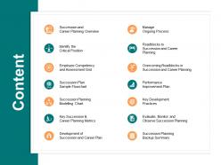
Content ppt powerpoint presentation ideas graphics design





Try Before you Buy Download Free Sample Product
 Impress Your
 Audience
 100%
100% Editable
 Save Hours
 of Time


Handle disgruntled folk with our Content Ppt Powerpoint Presentation Ideas Graphics Design. Give them cause to forget their ire.
People who downloaded this PowerPoint presentation also viewed the following :
Content ppt powerpoint presentation ideas graphics design with all 5 slides:
Let our Content Ppt Powerpoint Presentation Ideas Graphics Design be a haven for your thoughts. They will exist in enviable comfort.
FAQs for Content ppt powerpoint presentation
Okay so basically: one idea per slide, don't cram everything on there. Use fonts people can actually see from the back (Comic Sans is still a no though lol). Keep your colors consistent throughout. Most people make slides way too text-heavy. Your slides should back up what you're saying, not BE your entire speech. White space is your friend. Only put key points up there, not paragraphs. And those random clipart graphics? Skip 'em unless they actually help explain something. Start with figuring out what you want to say first, then make it look decent.
Okay so color psychology is actually huge for presentations - different colors trigger different emotions. Blue makes people feel calm and trusting. Red grabs attention but screams urgency. Green feels balanced and growth-y. I bombed a presentation once using all gray slides... learned that lesson fast! Yellow and orange are energizing but honestly they can be overwhelming if you go overboard. Pick maybe 2-3 colors that match whatever vibe you're going for and just stick with them. Way more cohesive that way.
Honestly, less is more with slides. White space is your friend, and stick to one main point per slide. Make sure your colors have good contrast - people in the back row shouldn't have to squint. And please, no fancy fonts that look like wedding invitations. I'd say max 6-7 lines of text because your slides should back up what you're saying, not be a teleprompter. The important stuff needs to be bigger and bolder. There's this 6x6 thing - six bullet points, six words each. Works pretty well.
Look, typography can make or break your whole presentation. People literally can't focus when they're squinting at weird fonts. Sans-serif like Helvetica is your friend - super clean and readable even from way back. I learned this the hard way watching someone use some curly font that looked like wedding invitations lol. Keep your font sizes simple, maybe 2-3 max so there's clear hierarchy. Make sure there's good contrast with whatever background you're using. Oh, and definitely do a test run from across the room first. Trust me on that one.
Dude, whitespace is a game changer for presentations. Seriously, it's like giving your slides room to actually breathe instead of suffocating them with text. I used to be guilty of cramming everything onto one slide - terrible idea. Your audience won't know where to look first. Space things out strategically. It guides people's eyes to what actually matters and creates that visual hierarchy you need. Think of whitespace like pauses when you're talking. Clean slides = focused audience instead of overwhelmed people checking their phones. Trust me on this one.
Here's my take: visuals should back up your story, not fight it. Good photos hit people emotionally, while clean charts make confusing data actually make sense. I can't tell you how many presentations I've sat through where they crammed tiny, blurry images everywhere - total mess. One solid visual per slide works way better. Also make sure everything's big enough that people in the back can actually see it (learned that one the hard way). Before adding anything, just ask yourself "will this genuinely help my audience get it?" Sometimes less really is more.
Honestly, templates are a lifesaver. They give you that professional look without spending hours figuring out colors and fonts that don't clash. No more blank slide anxiety! Most are designed by actual pros, so they look way better than anything I'd throw together myself. You can still tweak them for your brand too. I've probably saved like 10 hours this month alone just having good ones ready to go. Find 3-4 solid templates for different occasions and bookmark them. Trust me on this one.
Honestly, animations can save your presentation or totally tank it. Use them to guide where people look and reveal info at just the right time - super helpful for longer talks. But don't go crazy with them! I've seen too many people with text bouncing in from every direction like it's 2003. That stuff just screams unprofessional. Simple, consistent animations work way better. They should support what you're saying, not distract from it. Keep it clean and your audience will actually focus on your message instead of wondering why your bullet points are doing backflips.
Make a template first - brand colors, fonts, logo spot. That's your base for everything. I'd stick to 2-3 fonts max because honestly, getting too fancy just looks messy. Same color palette throughout, logo always in the same place. Create a little style guide for icons and how you do charts too. The whole point is deciding once, then copying that format forever. Actually save the template and use it every time - I know it sounds obvious but you'll be so glad you did this when you're rushing on deadline later.
Honestly, figure out your presentation style first - that's what should drive everything else. Storytelling stuff needs way more visuals and emotional flow, less bullet point madness. Data presentations? Clean charts, tons of white space so people can actually read your numbers. I swear I've sat through so many presentations where someone dumps spreadsheet screenshots everywhere trying to tell some grand story. It's brutal. Short sentences work better for impact. Longer ones help when you're walking through complex ideas. Just match your visual setup to how you want people's brains to process it, you know?
Ugh, the worst thing people do is cram way too much text on every slide. Seriously drives me crazy! Also those tiny fonts nobody can read past the first row. Pick colors that don't make people's eyes bleed - I've seen some truly awful neon combinations. One main point per slide, readable fonts, simple colors. Those cheesy stock photos of people pointing at laptops? Just don't. Same with crazy transitions that bounce around everywhere. My test is always: can someone in the back actually read this? If not, make it bigger.
Dude, just swap out those boring bullet point slides with infographics - way better for showing processes or data comparisons. Drop them wherever people need to grasp stuff fast, like when you're explaining key concepts. I swear, nothing kills a presentation faster than text-heavy slides that make everyone's eyes glaze over. Keep your graphics clean and match your color scheme. Oh, and don't stuff everything into one visual - that's just as bad as the wall-of-text problem. Build them so they reveal piece by piece during transitions rather than dumping it all at once.
Honestly, you can't go wrong with the big three: PowerPoint, Canva, or Figma. PowerPoint's still what most companies use, and literally everyone knows it already. But if you want something that doesn't scream "corporate meeting from 2010," Canva's your best bet - their templates actually look modern and put-together. Figma's trickier to learn but super flexible once you get the hang of it. Oh, and Google Slides is decent too if you're working with other people. I'd probably start with Canva though - makes you look way more professional without having to be a design expert.
Honestly, just watch people's faces while you're presenting - sounds basic but so many people miss the obvious confused looks. Quick polls work great too, or send a survey after. The real gold is noticing which slides get the most questions - that's your red flag right there. For next time, I'd restructure those messy sections and throw in more visuals where people seemed lost. Oh, and definitely cut stuff that just didn't hit. Don't just ask "any feedback?" though - that gets you nowhere. Ask specific things like "what part made zero sense?" You'll actually get useful answers that way.
Honestly, half the presentations I've sat through fail because you can't read anything past row three. Go big with your fonts - 24pt minimum. High contrast colors are your friend, and please skip those curly decorative fonts no matter how tempting. They look cute but nobody can actually read them. Oh, and bullet points with lots of white space will save your audience's sanity. Add alt text to images and captions for videos. The phone test works great - hold your slide at arm's length on your phone. Can't read it? Your audience definitely can't either.
No Reviews