


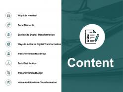
Content ppt powerpoint presentation file clipart images





Try Before you Buy Download Free Sample Product
 Impress Your
 Audience
 100%
100% Editable
 Save Hours
 of Time


Avoid being deceived with our Content Ppt Powerpoint Presentation File Clipart Images. They will expose any half truths.
People who downloaded this PowerPoint presentation also viewed the following :
Content ppt powerpoint presentation file clipart images with all 5 slides:
Display your enthusiasm for the endeavor with our Content Ppt Powerpoint Presentation File Clipart Images. Clearly demonstrate your interest.
FAQs for Content ppt powerpoint presentation
Honestly, start with a solid template then make it yours. You want clean design with lots of white space - looks way more professional. Bold headlines are your friend, and please use readable fonts (Comic Sans will make people judge you lol). Stick to 2-3 colors max so it doesn't look like a rainbow exploded. Every slide should actually move your story forward, not just fill space. Add transition slides between big sections so people don't get lost. The visuals should back up what you're saying, not just be decoration. Most important thing? Hook them right at the start and keep that logical flow going throughout.
Oh totally! Colors mess with people's heads way more than you'd think. Red and orange get everyone hyped up and urgent, but blue/green are super chill and trustworthy. I made this huge mistake once using bright red backgrounds - people literally seemed stressed out lol. Different cultures see colors differently too, which is annoying but worth knowing. Green means "go" here but might mean something totally different elsewhere. Honestly just pick 2-3 colors that match whatever vibe you're going for. Short sentences work. Don't overthink it too much though.
Okay so typography can totally make or break your presentation. Go with clean fonts like Arial or Calibri - they're boring but they work. Make your text at least 24pt, bigger for titles. I learned this the hard way when my prof couldn't read my slides from like 10 feet away, super awkward. Don't cram everything together either. Give your text some space to breathe with decent line spacing. Quick test: if someone sitting in the back row would struggle to read it, your font's too small or messy.
Honestly, your visuals should actually help explain stuff, not just look pretty. Charts make boring data way easier to digest. Screenshots are perfect for walking people through steps. Complex ideas? Break them down with infographics. I cringe when people just throw random stock photos everywhere - like why? Your visuals need to either explain something better than text or help readers scan faster. They're teammates with your writing, not decorations. Here's what works: find your most confusing paragraphs first. Then ask what visual would actually clear things up.
Put your main point right up front - don't make people hunt for it. Break up those text walls with headings and bullets because honestly, giant paragraphs on slides are the worst. Stick to one idea per slide, and try that 6x6 thing - six bullets, six words max each. Your story should flow logically from problem to solution. White space is your friend here, cramped slides look amateur. Oh, and this might sound obvious but end each section with what people should actually DO with the info. Otherwise you'll get blank stares when you ask for questions.
Honestly, multimedia is a game-changer for engagement. People process visuals like 60,000 times faster than text - which makes total sense when you think about it. Videos and infographics just make everything easier to digest, especially since we're all basically goldfish now attention-wise. Interactive stuff like polls keeps people actually scrolling instead of bouncing immediately. The trick isn't just slapping random stock photos everywhere though. Look at your wordiest sections first. Could a chart explain that better? Maybe a quick video? Match the format to what you're actually trying to say and you'll see way more shares and longer page visits.
Focus on three big things: visual, audio, and cognitive stuff. High contrast colors are key, plus readable fonts (seriously skip Comic Sans lol). Alt text for images is huge. Don't rely just on color to show meaning. Captions or transcripts for audio content help tons. Keep text short - nobody wants to read a novel on slides. Clear headings make everything flow better. Honestly, the best approach is just thinking "can everyone follow this?" Test with screen readers if you can, or at least walk through it considering different needs. Dense slides kill presentations anyway, so this actually makes yours better overall.
Honestly, just start with a story your audience can relate to. Like "imagine you're stuck in traffic and your biggest client calls..." or whatever fits. Then walk through the problem, the messy middle part where everything's falling apart, and boom - your solution saves the day. My best talks? Usually just me admitting where I screwed up and what I figured out after. Way better than boring bullet points about benefits. Pick a real customer example or personal story that actually connects to your main point. The goal is that moment where people think "oh shit, that's literally me right now." Stories stick way better than facts anyway.
Honestly, I'd go with whatever your team's already using first. PowerPoint's solid if you want tons of control over every little detail. Google Slides makes sense when you're working with other people since it's all cloud-based. But Canva? That's where I actually spend most of my time now - you can make stuff look ridiculously good without being a design person. Their drag-and-drop thing just works. Adobe's an option too but feels like using a sledgehammer to hang a picture frame, you know? Just mess around with the master slides once you pick something.
Honestly, consistent design is what makes presentations look legit instead of thrown together last minute. Your audience won't get distracted by random fonts and colors everywhere - they'll actually listen to what you're saying. I've watched people bomb perfectly good presentations because their slides looked like a mess (such a waste). Plus it makes you seem way more professional. My advice? Make a template with your colors and fonts picked out, then don't deviate from it. Sounds boring but it works. Oh and lock down your spacing too - that stuff matters more than you'd think.
Marketing templates need campaign goals, audience profiles, A/B testing stuff, and ROI tracking. Education ones should have learning objectives, rubrics, and standards alignment - you know, the usual teacher requirements. The real game-changer is those industry-specific prompts and dropdowns. Teachers want grade-level filters and accessibility boxes, while marketers need social media specs built right in. Makes the whole process way smoother. Oh, and definitely interview a few people from each field first. They'll tell you exactly what's driving them crazy with current templates - that's pure gold for building something people actually want to use.
Honestly, less is more with slides. Stick to like 6-8 words max - headlines, not essays. I've sat through way too many presentations where people just read paragraphs off the screen. Torture. Your visuals need to actually support your point, not just look pretty. Good images, clean charts, whatever works. Here's my test: cover up either the text or visual - does it still make sense? If yeah, you're probably overdoing it. Oh and definitely check your slides from the back of the room. Nothing worse than squinting at tiny text during a presentation.
Okay so here's what works for me - group stuff into threes max, otherwise people's brains just shut down. Skip the wall-of-text thing and throw in some diagrams or whatever visual makes sense. Analogies are honestly your best friend here because they make weird concepts actually stick. Just talk like you would to someone who doesn't live in your work bubble, you know? Use headers and bullets so it's not this messy blob of information. Oh and definitely run it by someone outside your field first - they'll spot the confusing parts you're totally blind to at this point.
Honestly, visuals are a game-changer for presentations. People's brains process images something like 60,000 times faster than text - I know that sounds made up but it's actually true. Your audience will get patterns and trends instantly instead of zoning out during a bunch of number dumps. Charts turn boring data into stories that stick. Different people learn differently too, so visuals hit more of your audience. Just don't overthink the chart type - pick what makes sense for your point. Oh, and keep it simple. I've seen some truly terrible graphs that confused everyone more than just saying the numbers would have.
Clean layouts with tons of white space are everywhere right now. Interactive stuff and smooth animations keep people way more engaged than static slides. Dark mode's taking over everything - which I actually love, easier on the eyes. Data viz is getting pretty cool too, with charts that actually tell a story instead of just throwing numbers at you. Oh, and accessibility's becoming a bigger deal with better contrast and fonts people can actually read. Honestly though, the best advice is still keeping one main point per slide. Use visuals that help your message, not compete with it.
No Reviews