

Content ppt presentation examples





Try Before you Buy Download Free Sample Product
 Impress Your
 Audience
 100%
100% Editable
 Save Hours
 of Time


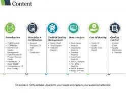
Always stay ahead and be a winner with our content PPT presentation examples. This presentation layout of content planning and execution strategy PowerPoint can be used to display multi stage process such as core strategy, workflow, governance, structure and substance. This six staged icon can be used to represent quality management system audit PowerPoint ideas, integrated quality management system diagram info graphics or for quality management system improvement PPT samples. Our content PowerPoint presentation info graphics has been designed by our professional team members to showcase various stages in the business process such as business overview, sales performance, project updates, competitive analysis, and future perspective. With the help of this focus on content marketing presentation deck you can map out differnt stages in the business like research customer segments, keyword research, content strategy, optimize and promotion. Draw your thoughts on template with our content marketing campaign layout example and address the doubts of your business stake holders. You will always stay ahead with table of contents slideshow themes to emphasize everyone's contribution in achieving goals. Download this detailed professional content marketing slide and pay close attention to each and every aspect. Get on the bus with our Content Ppt Presentation Examples. Get to your destination in good time.
People who downloaded this PowerPoint presentation also viewed the following :
Content ppt presentation examples with all 5 slides:
Give an account of heroic deeds with our Content Ppt Presentation Examples. Generate interest in human history.
FAQs for Content
Honestly, just nail three things: consistency, readability, and white space. Pick 2 fonts max and actually stick to them. I swear, half the presentations I see look like a crayon box exploded - keep your colors simple, maybe 3-4 tops. Make sure people in the back row can read your text without squinting. High contrast between text and background is clutch. Oh, and don't cram everything together! White space is your friend. Start with a basic grid so stuff actually lines up properly, then work on making the important bits stand out more than the rest.
Colors totally affect how people feel about your presentation - it's crazy how much it matters. Blue builds trust (great for boring financial stuff), red grabs attention but stresses people out if you overdo it. Green says "growth and stability," orange feels creative and energetic. Purple's good for luxury or innovation vibes. Pick one main color that matches your message first, then build everything else around that. Don't just throw random colors together though - your audience will notice if something feels off, even if they can't pinpoint why.
Your font choices hit people before they even start reading. Clean, readable fonts make you look legit and help everyone follow along. But messy or weird decorative ones? Total distraction. I've literally watched great presentations bomb because someone used Comic Sans for budget data - brutal. Size matters too since people in back rows need to actually see your text. Also, high contrast helps a ton. Don't go crazy with fonts - maybe 2 or 3 max. Make your text hierarchy super clear so people instantly know what's important and what's just supporting details.
Okay so basically drop infographics wherever you've got those awful dense tables or paragraphs of numbers that make people's eyes glaze over. Match your slide colors and fonts though - nothing worse than some random graphic that looks like it came from a different presentation entirely. Keep everything readable from the cheap seats, and honestly? Walk people through it when you're presenting because even good visuals need context. Oh and use the same icon style throughout - consistency matters more than you'd think. I always run mine by someone else first since what makes sense to me doesn't always click for others.
Honestly, I'd stick with visuals for anything that's tough to explain - charts, diagrams, before/after shots. Save text for quotes or when exact wording matters. That whole 6x6 rule? Six bullets, six words max each. I mean, I ignore it half the time, but it's not terrible advice. Your slides should back up what you're saying, not steal the show. If everyone's reading instead of listening to you, that's a problem. Here's what works for me: sketch out your main points first, then figure out what actually needs to be shown versus what you'll just talk through.
Oh totally! So like in education you're all about clear objectives and keeping people engaged - nobody wants to fall asleep in training. Marketing's different though - it's pure storytelling and making people feel something, you know? Healthcare presentations are way more strict since you need solid data and can't mess around with compliance stuff. But honestly, who you're talking to matters just as much. Executives want the big picture while technical folks need all the nitty-gritty details. I always think about what that specific industry actually cares about first, then figure out how to make them trust what I'm saying.
You want templates that won't fight your story for attention. Clean layouts with tons of white space work best - bold images, simple fonts. Timeline formats are perfect for journey stories, and before/after setups nail transformation narratives. Honestly? Skip the super fancy templates. They're just distracting noise. Hero's journey frameworks are solid gold for challenge-solution presentations. Oh, and figure out your story structure first - that's crucial. Then grab a template that makes your key moments pop instead of stealing the spotlight. Some of those minimalist designs actually pack more punch than the flashy ones.
Keep your animations subtle, seriously. Nobody wants flashy spinning stuff when they're trying to read. Gentle fades or slides work great - around 200-300ms timing feels natural. Only animate things that actually help, like highlighting a button on hover so people know it's clickable. Skip anything that bounces or repeats forever (honestly, that stuff is annoying). I always test by asking: does this help users get stuff done faster? If it's just there to look cool, ditch it. Consistency matters too - don't mix a bunch of different animation styles.
Honestly, just use a template. They look way more professional than anything I could make from scratch - and I've tried, trust me. The colors actually match, fonts don't look weird together, and everything's already formatted properly. Without one, you'll spend forever messing with spacing and design stuff instead of working on what you're actually presenting. I mean, unless you're secretly a graphic designer? Find something that fits your vibe, then tweak the colors or add your logo. Way easier than starting with a blank slide and staring at it for 20 minutes.
Dude, consistency is everything if you want to look professional. Same fonts, colors, spacing throughout - otherwise your audience gets distracted by the visual mess instead of listening to what you're saying. I've watched presentations where every slide was completely different and it was painful. Your brain just processes consistent stuff better, so people actually remember your points. Stick with maybe 2-3 slide layouts tops. Also resist going crazy with fonts midway through (I'm guilty of this lol). Makes such a difference between looking polished vs. last-minute scramble.
So the biggest thing right now is clean, minimal designs - tons of white space and bold fonts that actually pop. Interactive stuff is everywhere too, which honestly makes presentations way more engaging. Data storytelling is having a moment where charts need to tell actual stories, not just dump info on people. Accessibility finally became cool (about time). Dark mode presentations are pretty much standard now. And thank god we're moving away from cheesy stock photos toward more real-looking visuals. I'd start with cleaner layouts and bigger typography - easiest place to begin.
Honestly, the clickable hotspots are game-changers - you can drop polls right into slides or add drag-and-drop stuff. Interactive timelines work great too. I'm obsessed with doing "choose your own adventure" moments where people vote on what we cover next. Keeps things interesting, you know? Hover effects on graphics are pretty slick, and there's this cool feature where audience responses pop up on screen as they type. Oh, and those quick quiz questions between sections? Total lifesaver. Just start with one interactive thing per presentation though - don't go crazy right away.
One chart, one point - trust me on this. Bar charts work great for comparing stuff, lines for showing changes over time. I've sat through way too many presentations where someone dumps their entire spreadsheet onto one slide and calls it a day. Your text needs to be huge - think "person in the back row squinting" huge. Colors should actually mean something, not just rainbow vomit. Always write a title that tells people exactly what they're looking at. Oh, and definitely practice explaining each chart out loud first. You'll catch the confusing parts before your audience does.
Oh man, this is huge for content strategy! Japanese audiences want super formal, detailed presentations with tons of context. Americans? Total opposite - give them bullet points and get straight to the point. Germans are all about data and thorough docs, but Brazilians connect more through relationships and stories. Colors can mess you up too - red screams "lucky" in China but spells danger here in the West. Honestly, I've seen brands totally bomb because they didn't think about this stuff. Always dig into local communication styles first and test everything with native speakers before you go live.
Honestly, just go with PowerPoint or Google Slides first - everyone knows how to use them and the template features are solid. Canva's where it's at though if you want something that looks actually good without being a designer. Their stuff is genuinely impressive. Adobe InDesign is overkill unless you really need that level of control (and have time to learn it). Oh, and Figma works great if your team's already using it for other projects. My advice? Pick whatever platform people will actually be presenting with, then build from there.
-
Amazing product with appealing content and design.
-
The content is very helpful from business point of view.