

Content presentation examples





Try Before you Buy Download Free Sample Product
 Impress Your
 Audience
 100%
100% Editable
 Save Hours
 of Time


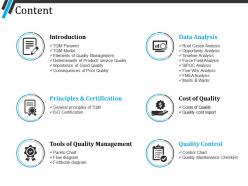
Showcase the entire topics that have been covered in your PPT presentation with the assistance of this creative Content Presentation Examples. Present the different topics in front of your audience in a synchronized way. Lay down a clear path for the presentation made with the assistance of this content PPT template. The outline PowerPint slide design will help you organize all the critical elements in a logical order. By putting everything you want to present in one space, you can see your ideas and points side by side more efficiently. By incorporating this overview PPT diagram the presenter can easily display all the key points to the viewers. Illustrate the topics related to total quality management that have been covered in your presentation . Showcase the tools of quality management, quality control, cost of quality and the other key points related to the topic by downloading this introductory PowerPoint slide show.
People who downloaded this PowerPoint presentation also viewed the following :
Content presentation examples with all 5 slides:
Execute the judgement with our Content Presentation Examples. Ensure implementation of each individual clause.
FAQs for
Honestly, three things will save you: visual hierarchy, consistency, and not stuffing everything onto one slide. Size and color should guide people's eyes to what matters most. Pick your fonts and colors early, then stick with them - I've seen way too many presentations that look like a design tornado hit them. One main idea per slide, that's it. Oh, and do the phone test! Hold your phone at arm's length - if you can't read your text from there, people in the back row definitely can't either. Trust me on this one.
Dude, stories just stick in people's brains way better than random facts or bullet points. Your audience actually connects emotionally when you turn data into something with characters and conflict. I bombed so many presentations before I figured this out - like seriously put people to sleep with my spreadsheets! Now I structure everything like a journey. Start with a problem they face, show the struggle, then boom - your solution becomes the hero moment. Even just saying "picture yourself as a customer trying to..." makes boring abstract stuff suddenly click. It's honestly kind of crazy how well it works.
So visual hierarchy is just directing where people look first, second, third, etc. Size, color, and contrast are your best tools here. Pick your 3 most important things per slide and make them pop - bigger text, brighter colors, whatever works. You know how newspapers do headlines then smaller subheads? Same concept. Without this structure, honestly everything just blends together and looks chaotic. People won't know what matters most. Oh and positioning helps too - top-left corner naturally gets seen first in most cultures.
Dude, colors seriously affect how people react to your presentation. Blue's your safe bet - builds trust and keeps things calm, perfect for work stuff. Red grabs attention but can stress people out if you go overboard. Green feels balanced and suggests growth, orange is energetic and friendly. Purple screams creativity or luxury vibes. Honestly, I think most people don't realize how much this stuff influences them subconsciously. Dark backgrounds with light text help people focus better. Bright colors energize but might be too much. Just pick 2-3 colors that actually match your message and you'll be good.
Only use images and videos that actually support your points - don't just throw stuff in to look fancy. Make visuals big enough so people in the back can see (learned this the hard way once). Test your tech beforehand because it WILL break at the worst possible moment. Honestly, I've seen too many great presentations ruined by someone going crazy with transitions and sound effects. Keep formatting consistent but simple. Always have a backup ready - screenshot your key slides or save them on your phone. Trust me, you'll thank yourself later when the projector inevitably crashes.
Honestly, just figure out who you're talking to first. Younger crowds want quick, visual stuff and hate formal language. Older audiences? They actually want the details and don't mind if you sound professional. I bombed a global campaign last year because what worked here was totally wrong for other regions - cultural context matters way more than I thought. Executives care about ROI and numbers upfront. Tech people want you to get into the weeds. Switch up your examples and tone for each group, then test different versions to see what actually gets people engaged.
Break complex stuff into smaller pieces - tackle one idea at a time. I always start broad then get specific. Analogies help tons (data flowing like water through pipes is my go-to, probably overuse it honestly). Charts and diagrams are lifesavers. People zone out fast with dense info. Check in constantly - those blank stares mean you've lost them. Don't be afraid to backtrack and explain differently. Short sentences work better than long rambling ones. After each section, tie it back to your main point so they don't forget why any of this matters.
Dude, font choice is everything! Arial and Helvetica are your best friends for screens - way easier to read than serif fonts. Though honestly, serif can look pretty clean in print. Size matters too - go at least 16px or people will squint and bounce. Good contrast is obvious but I see so many sites mess this up. Oh and please don't use like 5 different fonts, it looks messy. Two or three max. I always check how it looks on my phone first since that's where most people read stuff anyway. Makes a huge difference in whether people actually stick around.
Ugh yeah, I totally get this! Switch things up every 5-7 minutes or people zone out hard. Questions work great, or polls if you can swing it. Move around too - don't just stand there like a statue. I bombed a presentation once because I did this boring 20-minute data thing and literally watched everyone pull out their phones. So embarrassing. Try the "rule of three" - max three points per section, then do something interactive. Oh, and pauses are your friend! Sounds weird but silence actually grabs attention way better than rambling nonstop.
Honestly, start keeping a feedback log after every presentation - total game changer for me. I used to just wing it too. Look for patterns in what works vs what bombs. People zone out during data dumps? Mix in stories or better visuals next time. Watch their body language during the actual talk, not just what they say after. Short feedback works too - pacing, clarity, did they seem engaged? The trick is actually using what you learn instead of just collecting comments and forgetting about them. Sounds obvious but you'd be surprised how many people skip that part.
Honestly, templates are a game changer. You'll save so much time not building decks from zero every single time. Your whole team stays on-brand without even thinking about it, and nobody forgets those annoying little details since they're already baked in. When someone needs to jump in and edit your slides, they won't have to redesign the whole thing either. I'd start with maybe 2-3 good ones for whatever presentations you do most - like, I wish someone had told me this years ago because wow, what a difference.
Okay so body language - don't cross your arms or fidget, keep gestures open and natural. Mix up your voice too! Slow down when you're making big points, then pick up the pace for lighter stuff. Eye contact is huge - scan different parts of the room so nobody feels ignored. I totally bombed a quarterly review once by speaking in the most boring monotone ever, so trust me on this. Oh and definitely record yourself practicing beforehand - you'll catch weird habits you didn't even know you had.
Contrast is huge - dark text on light backgrounds, that kind of thing. Your fonts should be at least 16px or people will squint forever. Structure your headings right (H1, H2, etc) and don't forget alt text for images. I swear everyone skips that part but screen readers need it. Oh, and some people navigate with just keyboards, so make sure buttons and links work that way too. Honestly? Just run everything through a contrast checker first. Catches most problems before you even start coding.
Oh man, this stuff is way trickier than most people think! Western audiences want everything super direct - bullet points, clear headings, get to the point fast. Asian cultures though? They actually want more context and relationship-building first. It's not slow, it's respectful. Middle Eastern audiences expect formal language, while Scandinavians are brutally straightforward (honestly love that about them). Don't forget reading patterns change too - right-to-left vs left-to-right totally shifts your layout. Colors mean different things everywhere. Test with locals before you launch or you'll probably mess something up.
Ugh, the worst thing you can do is cram your slides with a million bullet points and then just read them word for word. People hate that. Also, know who you're talking to! Don't explain basic stuff to experts or throw around fancy terms with newbies. Here's what actually works: stick to 6 bullets max, 6 words each. Practice talking around your slides, not reading them. Oh, and this is key - before you even start, figure out what your audience needs to actually learn. Like, what should they remember tomorrow? That question alone will save your presentation from being total garbage.
-
Helpful product design for delivering presentation.
-
Really like the color and design of the presentation.